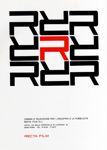
1969 Magazine Advertisement
Recta Film
"Cinema e televisione per l’industria e la pubblicitá"
Italy
Via Pink Ponk

1969 Magazine Advertisement
Recta Film
"Cinema e televisione per l’industria e la pubblicitá"
Italy
Via Pink Ponk
100,000 copies of Esquire’s October 75th anniversary issue will sport the "World’s First E Ink Cover". The video is pretty amazing; I’ve seen Kindles and other E Ink-equipped gadgetry before, but this is a pretty stunning application of the technology. Whether it is relevant and/or functional as a concept remains to be seen. There are already some people raising interesting questions as to this potential trend’s impact. Whatever the case may be, that cover is pretty damned cool looking.
Via Engadget
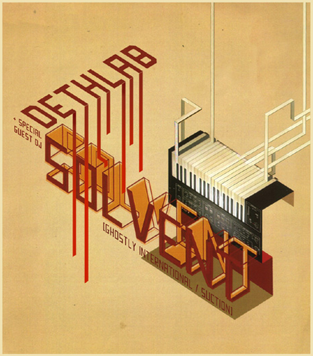
Our friend over at Burnlab did this flyer a few years back, still to this day it might the best flyer to come out of Michigan. Michael Doyle runs an experienced music/culture blog called BURNLAB.
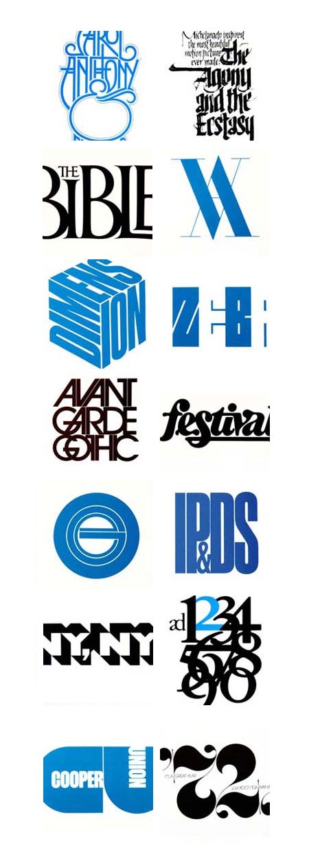
Peter Gabor has posted a Tribute to Herb Lubalin just to remind us all of how inferior our design skills really are. There are 11 pages of Lubalin’s work spanning all the way from his logos and branding up to his more conceptual art and photography. It’s a rather thorough collection and a good starting point if you’re looking for inspiration from one of the original masters of our medium. Link
On a side note, Gabor’s tribute prompted me to brush up on my Herb Lubalin Trivia by going over his Wikipedia entry. I was shocked to find that he passed away at age 63. Maybe seeing another of my design heroes, Wim Crouwel, looking fit and sounding sharp at age 78 in the Helvetica film gave me an unrealistic ideal of longevity, but I always thought of design as the sort of trade you could still be plugging away at and actually producing relevant work well into your 60’s and 70’s (desire permitting, of course). It’s a shame he passed so soon and it’s incredible what he was able to achieve in the relatively short time he had. I wonder what his thoughts on the digital revolution would have been? And perhaps more importantly, how would he have viewed the resurgence and near ubiquity of his famous typeface (Avant Garde) in the past decade of graphic design?
Update: Daniel asked a good question about Avant Garde Alts in the comments. A lot of people have asked the same thing in the past so I thought I would post up the various sources for those character sets. Click here to view the comment
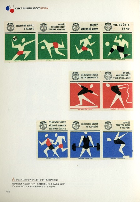
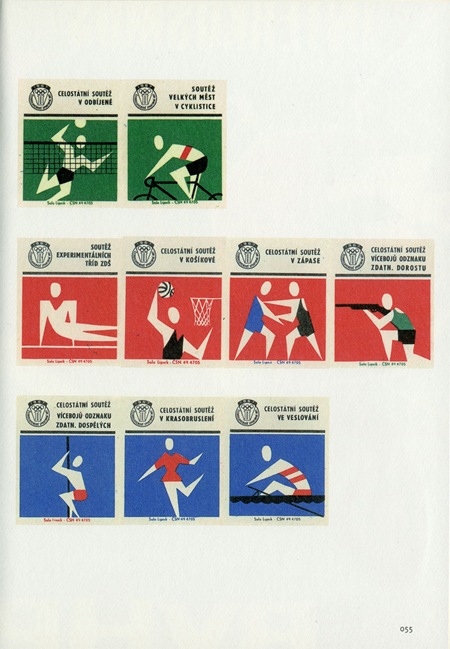
These Czech Olympic matchbooks are excerpted from one of my favorite design books, Cesky Filumenisticky Design. I don’t know much about these other than that they date from 1967. I’m also not sure who designed them since the book is in Japanese. I ran it by my friend and she said the caption says something about the name "Peter Togram". Not sure, fill in the blanks if you can read that caption.
Alex Cornell is a student at the Academy of Art Graduate Design MFA program here in San Francisco and he also helps me out around the studio with various design and music related things (in addition to being a designer he’s also a ridiculously talented guitarist and a knowledgeable sound engineer).
Recently he brought over a project he was working on to get some critique. Since I never went to school for design it was great to get a glimpse inside the classroom through his project and also very interesting to hear what his professor thought of my input. I had a great time working with him trying to refine the project so I thought it would be nice to have him do a process piece for the blog. I think this serves an apt companion to the Making of Obama post; a good counterpoint written from the student perspective. I am sure many of you were/are design students yourselves so you can relate, seems to me like the professor does a pretty good job of impersonating a client. The following article is his account of the process of creating the piece and working with his professor to complete the project.

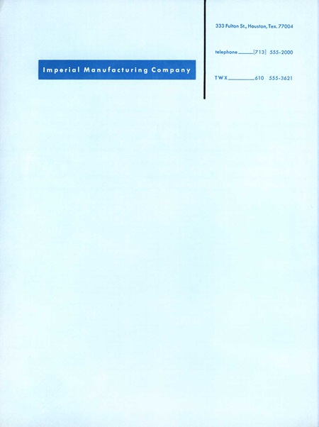
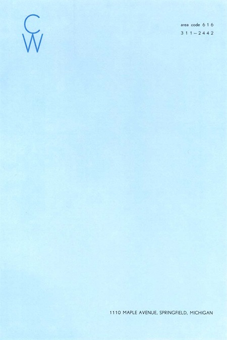
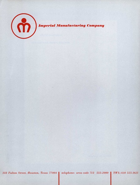
Afiler’s Flickr has some excerpts from a book by Ladislav Sutnar aptly entitled How To Show Telephone Numbers On Letterheads. As you may have guessed, the book features various examples of type placement in letterheads. It’s a very nice set of classic examples of a dying art form and is designed by one of the key architects of information design. I’ve always seen letterheads as a great opportunity to get away with being a minimalist in an otherwise standard design scenario. It’s pretty easy to convince a client that clean, efficient design is the answer in the case of a letterhead as most of the page is required to be blank by default. Of course they will probably still ask you to make the logo bigger. View the entire set on Flickr
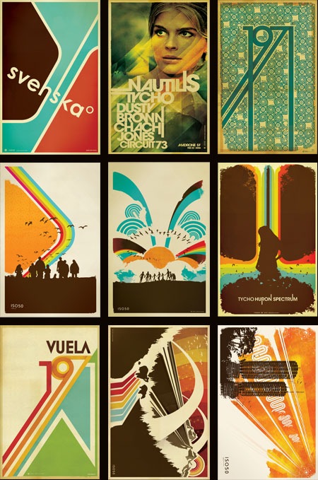
The prints you see above have all been reprinted and restocked over at The ISO50 Shop. Many were out for quite some time and they usually move fast once back on the shelves, so if you’ve been holding out for your favorites to be in stock, now’s the time.
I often get asked where I get my prints made so I thought now would be a good time to touch on that subject and go into a little more detail about the process. I have all of the small format posters done at a print shop in Sacramento, CA called Blue Moon Printing & Graphics. I found the place back when I used to live in Sacramento and even after moving to San Francisco I still use them as my primary printer. They are a relatively small shop so the service and attention to detail is far beyond anything you’ll find at some of the larger printing companies. I’ve found that personal attention to the output is the key element in getting your prints back looking the way you intended. It’s very difficult to make the transition from what you see on your screen to a printed piece of paper and no matter how well calibrated your equipment is you’re always going to experience a shift in color, saturation, contrast etc. The trick is to tweak the original file and the printer itself to try and compensate for these shifts and it’s important to find a print shop that is willing to work with you through this process.
I have the prints made on a digital thermal press which is essentially a toner-based process. I really like the output of this process because in the darker areas the toner builds up a thicker layer, giving an almost screen-printed effect when viewing an area of high contrast (such as a transition from cream to dark brown; the dark brown will appear to be painted on top of the cream background). The other advantage of the digital press (as opposed to offset) is that there are no plates involved so proofing and tweaking is a much quicker (and cheaper) process. You can adjust the file and run off a new proof in about 5 minutes as opposed to etching new plates and resetting the press as you would in an offset scenario. The only real downside of this process is the format limitation, the prints can only be 12"x18" at the largest. You are also limited to the type of paper you use as the toner won’t adhere to coarser papers; although I like to use a natural tone cover stock which is pretty smooth so this is not a big issue for me. The natural tone stock also has a yellow cast to it so that the yellow range in the lighter areas of the image is boosted. It gives the image a sort of aged, authentic feel which I think takes a bit of the edge off the digital output.
Blue Moon does have a traditional offset press but they just recently got it and I’ve yet to test it out. If you’re looking for a good printer I highly recommend them, and since they can do the whole proofing process via mail it doesn’t really matter where you’re located (my friend in New York does all his printing through them). You can find more information at their website: http://blumoonprinting.com.
I’ll be doing a post on monitor calibration soon in which I will go into more detail about preparing work to be printed and working with color profiles and printers…stay tuned.
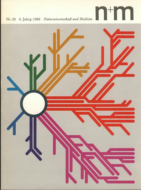
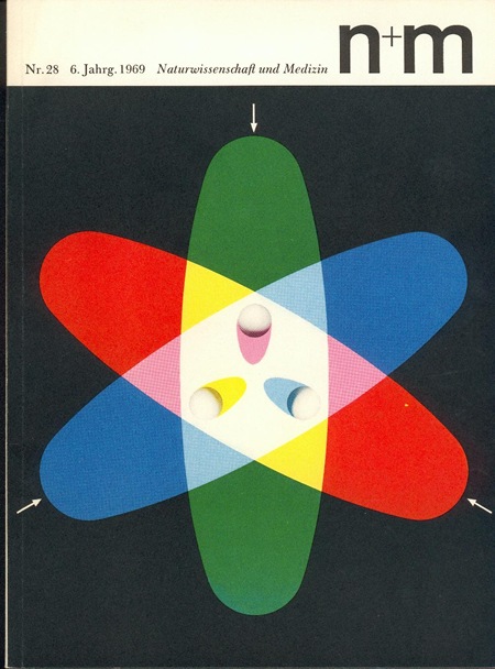
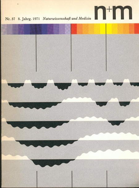
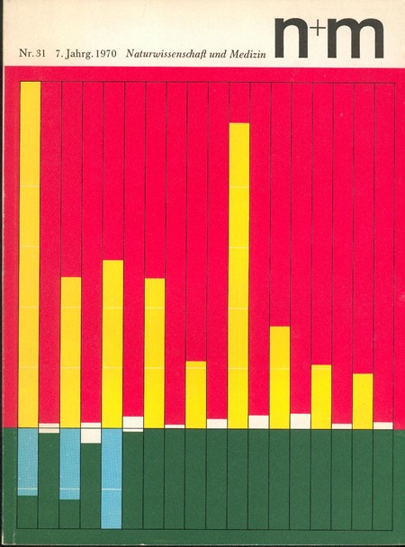
Some more brilliant covers from N+M (Naturwissenschaft und Medizin) Magazine. They were designed by Erwin Poell in the late 60’s. These are such incredible examples, not only are they beautiful, but they are no doubt conveying some extremely complex concepts through information design. There is apparently a book covering Poell’s work (via Thingstolookat):
Title: Entwürfe für den Alltag. Typografie, Grafik-Design, Art Direction
Author: Erwin Pœll
Year: 1992
Publisher: Birkhäuser Verlag Basel
ISBN: 3-7643-2758-8
Also check out Things To Look At’s article on Poell and the N+M covers.