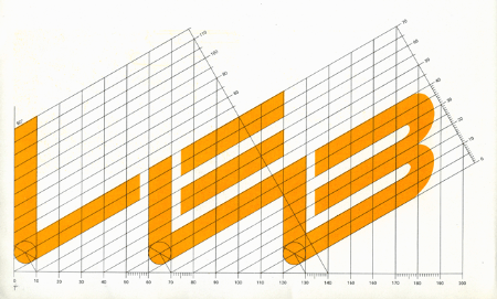
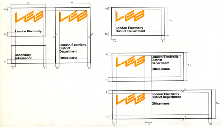
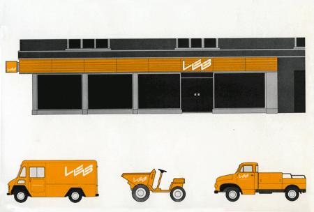
Some British logo design and great grid action via Alki1.
Posts in Print
LEB Logo
Destroyer’s Rubies
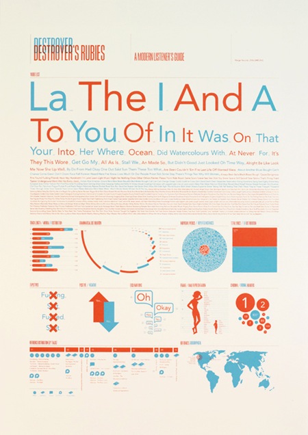
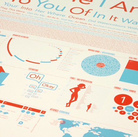
Jez Burrows’ expression of ‘Destroyer’s Rubies’ by Destroyer. They’re sold out but you can at least read a bit more about the idea behind them at Jez’s site. Great typography and color. Via FFFFOUND
Ken Garland: Going Metric
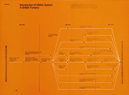
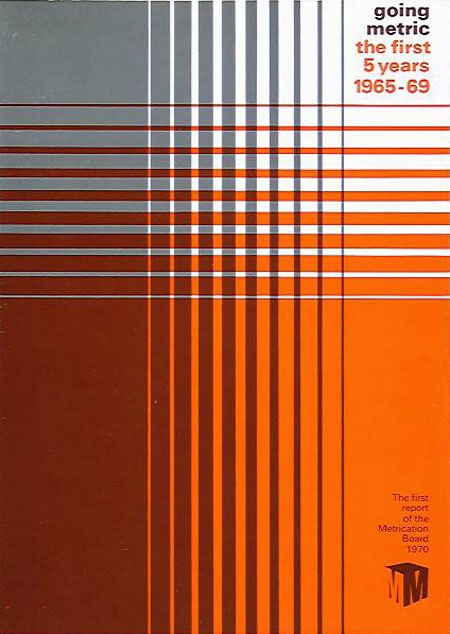
Some very nice information design going on in the top example from Ken Garland’s Portfolio.
When I was in grade school the U.S. was trying to convert to the metric system. Obviously, it didn’t quite work out as planned. We used to have metric study sessions for a few years when the conversion attempt was at it’s strongest, but it seemed to sort of lose steam by the time I got to middle school. It’s really a shame; inches suck, and so do quarts. The conversions and units never really make sense, they’re always these arbitrary ratios. Metric is so clean, you can deduce any conversion based solely on the latin prefix and you don’t have to factor in the length of some king’s foot when you’re trying to measure things. But I guess that all goes without saying. Everyone else also have way cooler plugs than us, but that’s a whole other post.
Ken Garland: St. Pancras ’66
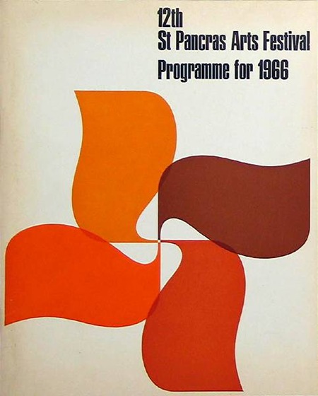
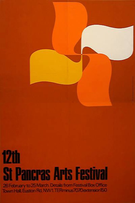
Just a couple examples of the influential work Ken Garland was doing in the 60’s and 70’s. See more at his portfolio. Sorry for the quality on the second one, couldn’t find a large version so I had to scale it up.
Rinzen: 50 Exhibition
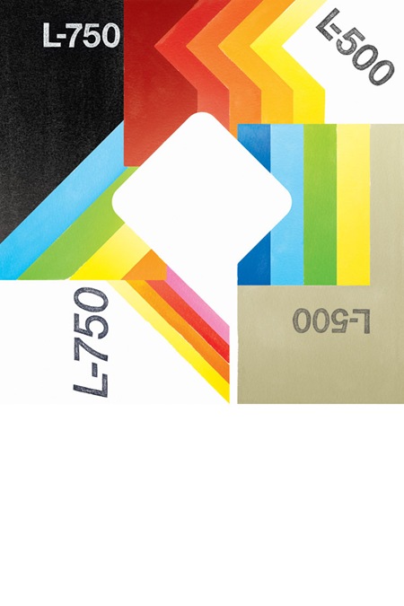
Event poster for 50 Exhibition via Blanka Supersize.
Citroen 1974
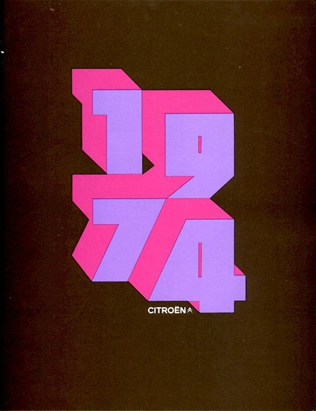
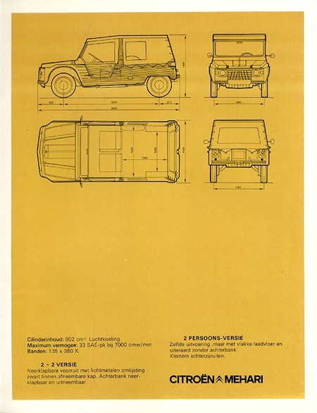
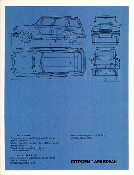
Cover and pages from the 1974 Citroen Brochure. The cover is absolutely amazing.
Spirograf Posters
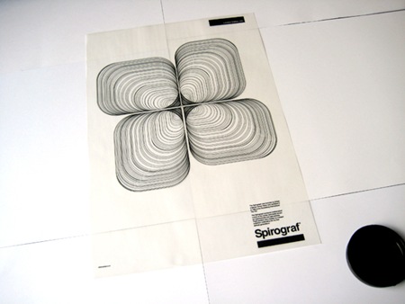
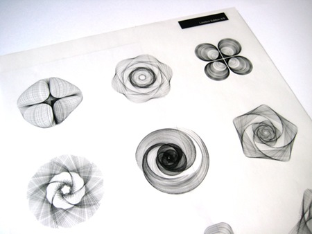
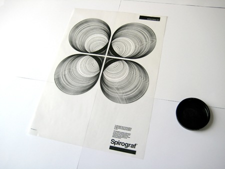
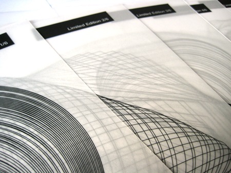
These Spirograf posters by Greig Anderson (Effektive) are absolutely wonderful. I love when people use techniques or styles that have laid dormant or were just overlooked as passé to create new and exciting design. Also check out the rest of Greig’s work, it’s all very good.
Via ffffound.
Saul Bass Matchbooks
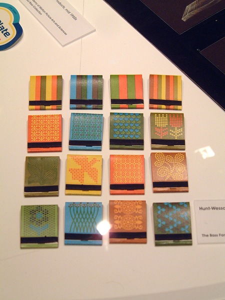
In addition to these matchbooks, Insect54 has a nice gallery of other Saul Bass work from the Design Museum on his Flickr. Loving these designs / color schemes. It’s incredible how well they compliment each other. Nice touch that the top row are like the color keys for the rest.
Hoffman-La Roche: Esanin
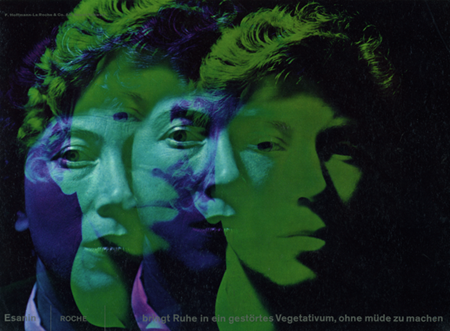
Hoffman-La Roche commissioned this ad featuring photography by René Groebli for the anti-anxiety drug, Esanin. At first glance I really didn’t grasp how amazing this composition is. If you really study it you’ll see some incredible typography and layout. I love the image, the various faces blending to create these almost psychedelic colors is very striking. Those crazy Germans, why do they have to be so good? You’re making us all look bad.
Via Alki1 on Flickr.
Serious Business
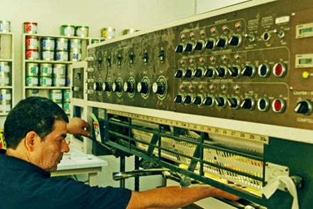
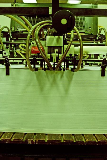
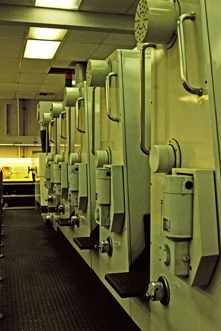
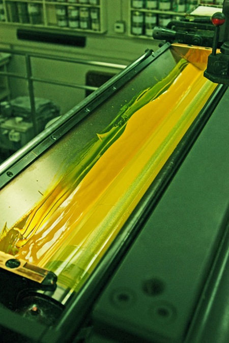
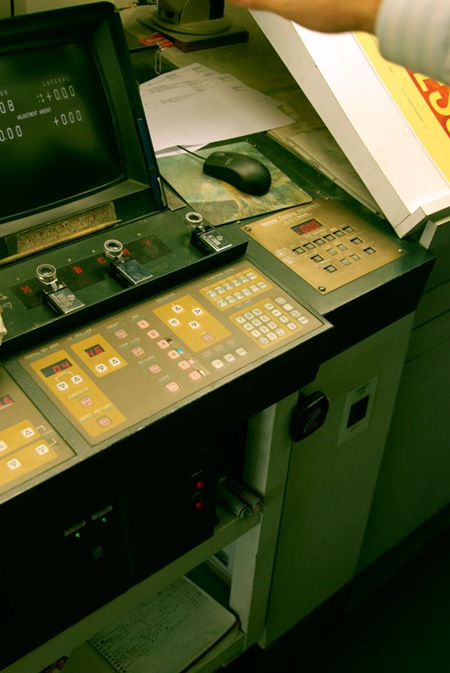
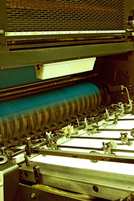
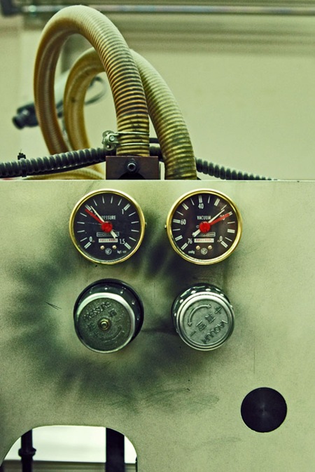
I’m at Continental Colorcraft in LA for the Obama printing. The proofing is complete and the presses are running at full tilt. As the title suggests, they aren’t playing around at this place, the press is the size of a small house. Some really cool 80’s era industrial design going on, great knobs and dials (the first shot looks like a Moog Modular, can’t go wrong with that). Not trying to be a tease (as some of you commented on the last post) but you can catch a couple small glimpses of the print up above.