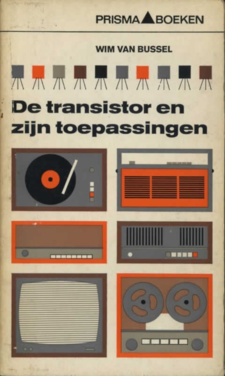
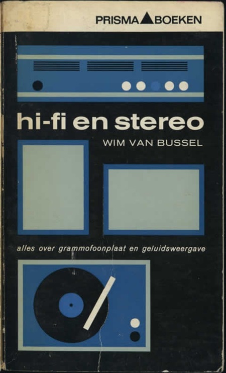
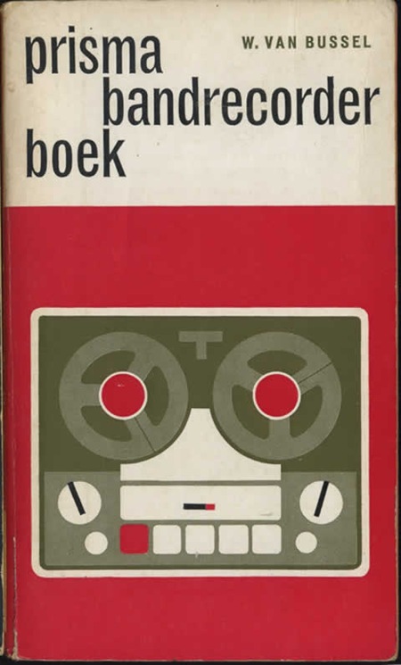
Some really nice modernist book covers featured over at Defunkt. I love this style of illustration, Mike Mills took a similar tact for the Beastie Boys Stereo Speaker poster. And of course, you really can’t lose with Trade Gothic.
Via Monoscope
Posts in Print
Prisma Covers
Canadian Design = Good: Pt. 96 / 970,567
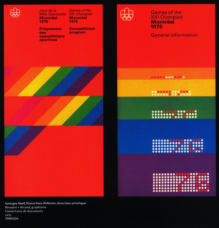
When will it end? Apparently never. I think it’s time I just give in and nominate the Canadians as completely owning the mid-late 70’s. The more I look at this sort of design, the more I realize how much it has influenced my own style. It’s funny because I don’t remember really being aware of design when I was younger and I certainly wasn’t fortunate enough to be alive (much less conscious) during the ’76 games. I guess these sorts of things just kind of seep in to your consciousness over the years through random, passing exposure without you completely realizing or understanding it’s impact.
At any rate, I envision my dream space as a large, concrete floored, open room with 3 story ceilings, all white, with these printed massive banner size hanging all along one side. I think the other side would be wood paneled in a light walnut with a flush installed Bang & Olufsen circa 1976 Beo system right in the center. Sprinkle in a healthy dose of vintage Hermann Miller, some Dieter Rams-designed Braun appliances here and there and things would be starting to look right. Maybe a wax figurine of Jakub in his ATMSPHR promo photo get-up and Jarvis Cocker glasses would be encased in a Perspex cylinder somewhere, perhaps animatronics would be involved, budget permitting.
Chi Town
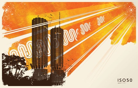
I’m sitting at SFO waiting to take off for Chicago (thanks Kiyoka), brought 3 jackets, hopefully that’s enough. The MOMI show with Jonah Sharp is tomorrow at Millennium Park, but unfortunately it’s sold out. I’m doing a set later that night as well, not sure on the details just yet but will post as they become available.
The image above features Chicago’s Marina Towers which were designed in 1959 by Bauhaus alum Bertrand Goldberg. I created the illustration (sans towers) originally as an album cover for Tha Fruitbat and then later adapted it into poster form which is available at The ISO50 Shop.
Stamps Of Helvetia
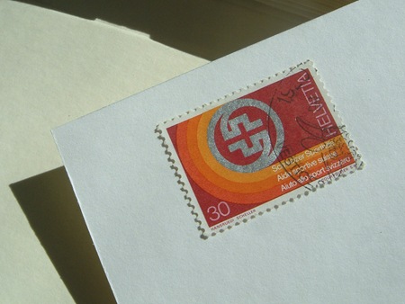
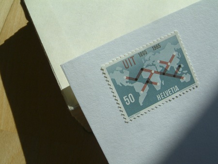
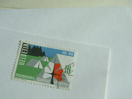
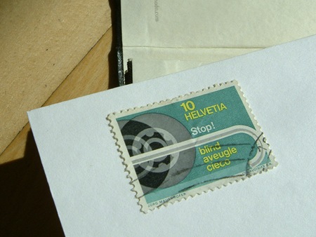
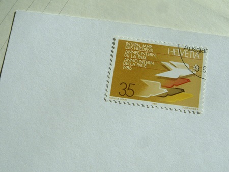
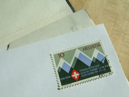
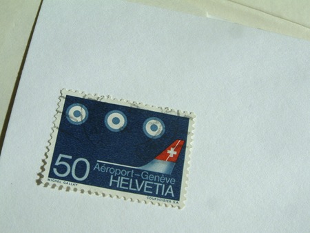
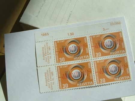
Collectively, the Swiss are, of course, de facto print design gods and they’re no slouches in the stamp department. These great examples are from AceJet’s Flickr, would love to have poster versions of all them. Particularly that very top one, simply amazing. If I ever got an envelope with a stamp even half-way resembling that I would frame it and never open it.
Black Mountain: In The Future
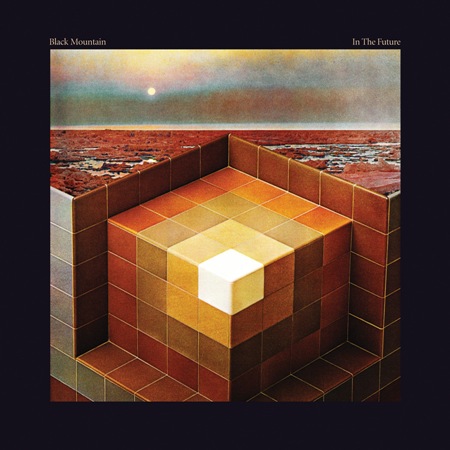
This is infinitely rad. It’s like my dream shower / bath on acid in another solar system. When I first saw this I thought it was some 70’s cover, but it’s brand new, came out this year. Nice work whoever did this, anyone know the designer / photographer? It looks to me like a collage of old photos, but not quite sure. I don’t know how they made bathroom tile and some random landscape look so sinister, but way to go, something really dark going on here. The type choice is perfect too; I always try to hate on serif fonts and then I see one used well like in this example and realize I need to use them more often.
Update via James in the comments:
"It was designed by Jeremy Schmidt, the keyboardist for Black Mountain. Here is an excerpt from an article in Exclaim magazine:
Schmidt has a long history in visual art and previously designed covers for Black Mountain singles, as well as those for his own projects. “For Black Mountain, the cover was intrinsic to making the record,” says Schmidt, who through cutting and pasting images, eventually came up with the design of a Rubik’s-type cube embedded into chilly, rust-coloured terrain. “It’s meant to very much look and feel like a classic album cover, in the sense of a gatefold LP. I wanted to make something that was kind of epic but not typically psych looking — something a bit more austere than that, a little more modern, but a little old looking as well. So that’s how I arrived at that geometric alien landscape sort of thing.”
Julien Pacaud
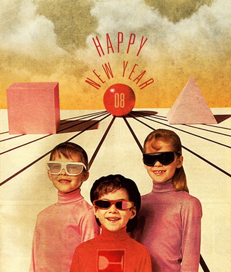
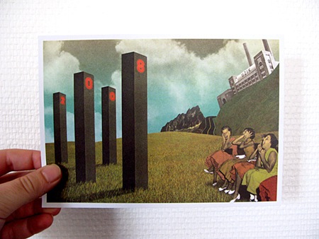
Been seeing Julien Pacaud’s work around a lot lately, It’s hot. Check him out here. Jakub, you drooling over that top one? I can see it on your wall already.
Meet The World


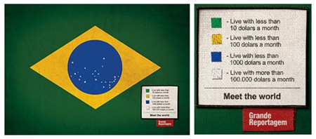


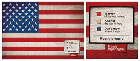

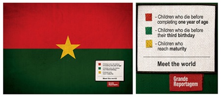
Saw this on FFFFOUND today, really very clever. Loving the vignette on the flag photos and the concept is spot-on. Using the flags as information design in this context is so poignant. Incidentally, I used to be obsessed with flags, had them hanging all over my room as a kid. Guess I’m still a sucker for them.
"Icaro Doria is Brazilian, 25 and has been working for the magazine Grande Reportagem, in Lisbon, Portugal, for the last 3 years. He was the author of the flags campaign "Meet the World" that has been circulating the earth in chain letters via e-mail…"
– Quoted From Brazilian Artists.net
Dream Chimney: Sleevery
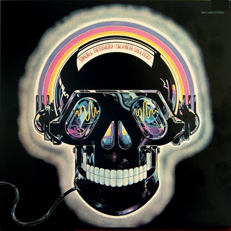
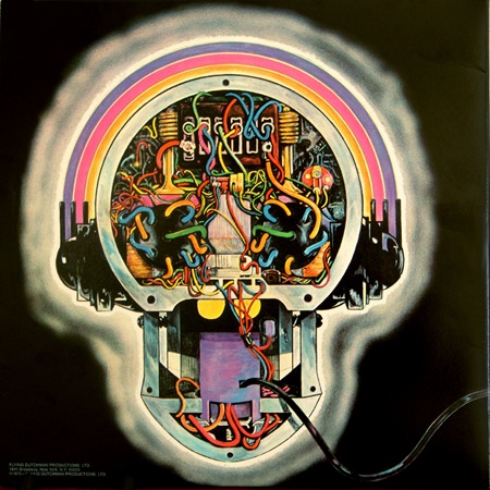
You may remember Broker / Dealer from this post. Along with some friends, they maintain a site called Dream Chimney which has recently launched a new section called "Sleevery", featuring all manner of cool record sleeve design. Have a look around, some interesting stuff in there.
The D’s Have It…
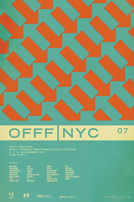
So after going through all the comments on the contest post for the OFFF NYC 07 print, it looks like the general consensus has swung in favor of version D (pictured above). After all of that, I’m still not 100% convinced which I like best. So I will be eventually printing a few versions, but the first to go out will be version D.
As for the winner of the contest; there were a lot of great analysis and it was hard to pick just one that said it best, so I picked two. And the winners are…..
Jacob Rubin (hrubinj)
Stephen Lynch
They will each receive a signed edition of the print along with some other stuff from the shop. I’ve also picked a few runners up who will be getting some Tycho MP3s for their efforts. Thanks to everyone who weighed in on this, so many great comments and good advice. This was definitely a good learning experience.
Espacios Publicitarios
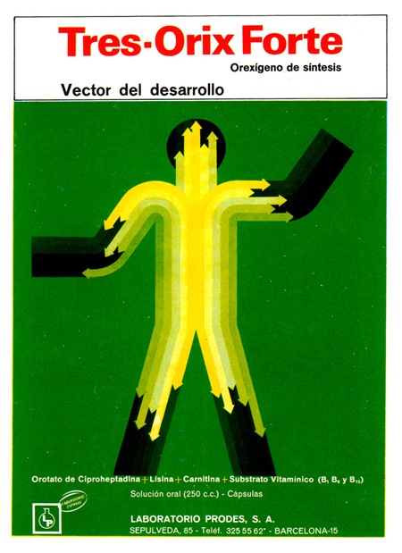
 I’m always amazed by the number of pharmacies in Spain (they’re everywhere) and also by the package design of the products in the pharmacies. They aren’t quite as good as these examples anymore, but still a whole lot better than we have in the states.
These images, from ex.novo’s "Espacios Publicitarios" Flickr set featuring 60’s and 70’s Spanish ads, were sent my way via Andrew Standfield. I absolutely love the illustrations. Would love to do a redesign or incorporate then into a poster.