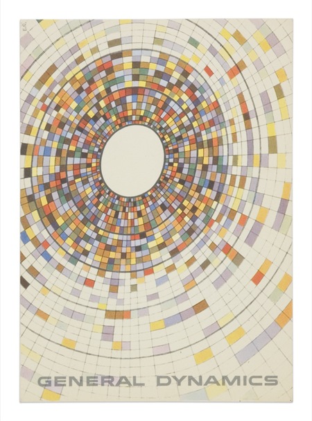
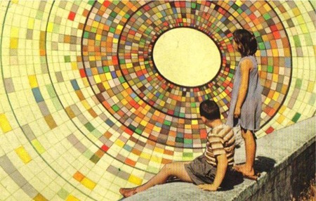
The top image is a General Dynamics postcard by Erik Nitsche. The lower is from Joel Johnson’s flickr page. The background illustrations in each appear to be essentially identical save for some rotation. If you look closely at the children in the lower one you can see they are superimposed rather poorly (note the black outline from the sloppy clipping path). I wonder if this was someone appropriating the artwork or if this was some General Dynamics-sanctioned variation of the original (doubt it). Interesting either way; I think I like the yellowed, saturated version on the bottom best. The composition of the top example, of course, is superb.
Posts in Print
Erik Nitsche – God’s Eye
12.03.2007
EIF 1973
12.02.2007
Jimmy Turrell
11.29.2007


Illustrator Jimmy Turrell has updated his portfolio, really like his style. You may remember the lower image from this post, Jimmy was kind enough to send in the illustration by itself.
General Dynamics
11.29.2007
Expo67 Pt. 2
09.25.2007
CBC 1975
03.11.2007
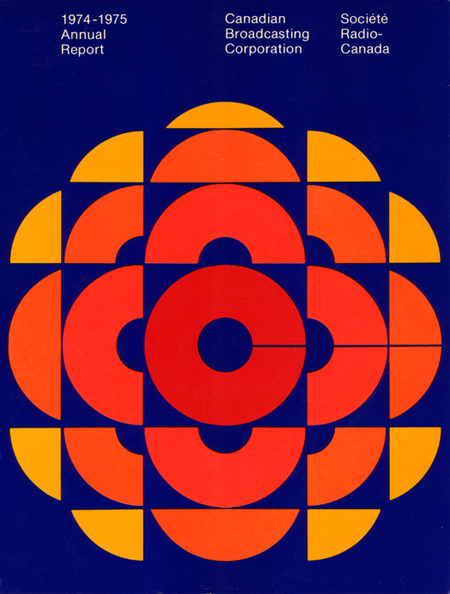
CBC Annual Report 74-75 graphic. The forms are incredible but the blue is a bit too royal-blue for my tastes. With a more muted color scheme and a shift of the blues into the aqua realm this would be on a whole other level. But I am assuming if you found a copy of this today, it would have faded just enough to look pretty amazing.
