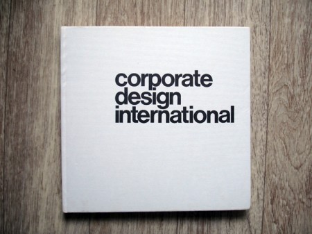
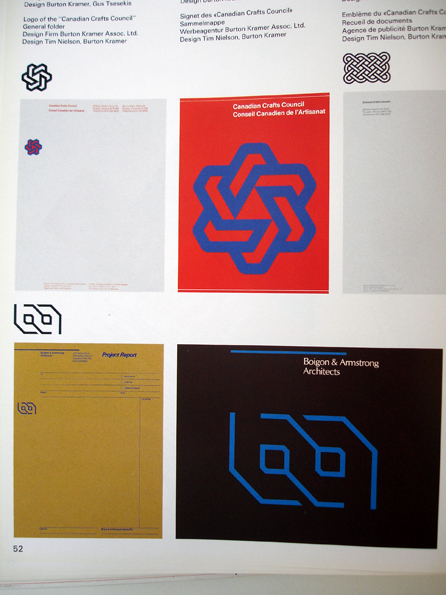
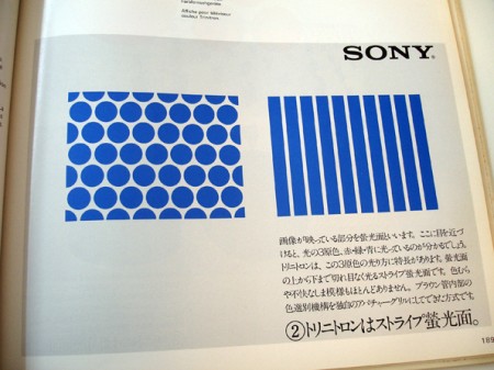
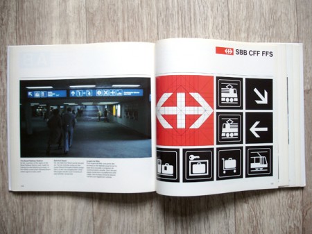
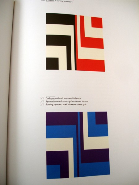
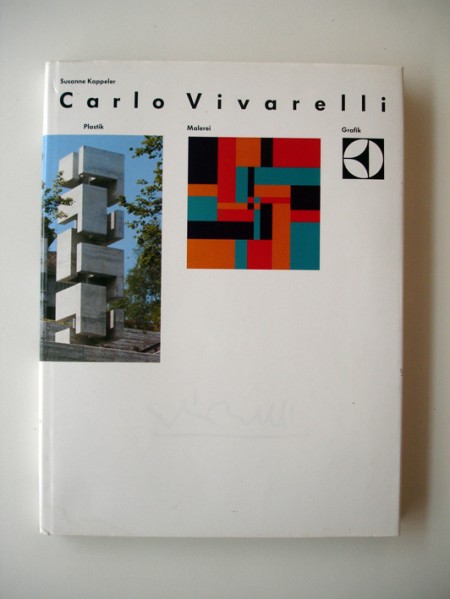
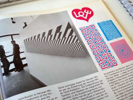
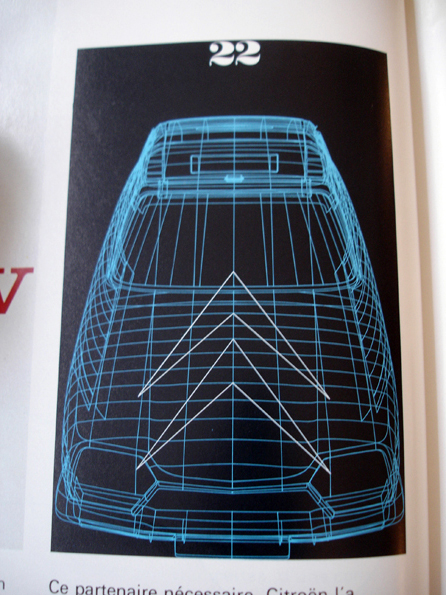
Unbelievably unbelievable Flickr set going on over here. Can’t get enough, that Sony stuff in particular is amazing. Want prints…
Posts in Print
ABC Verlag
New ISO50 Intern: Jon Wong
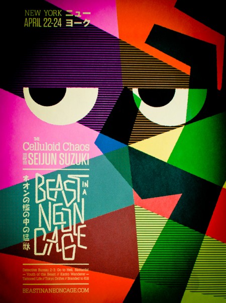
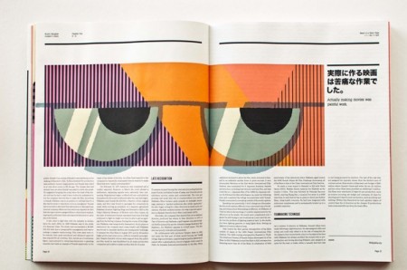
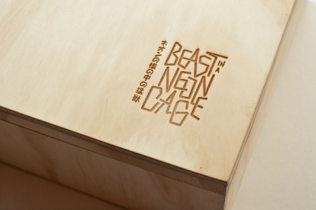
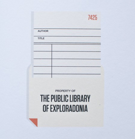
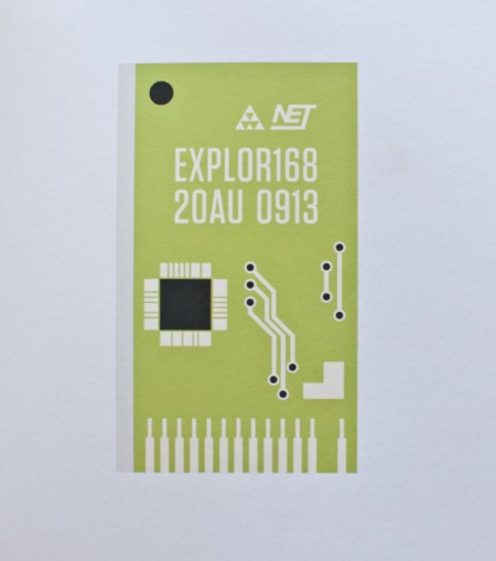
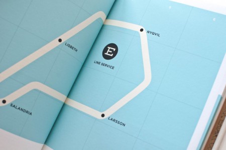
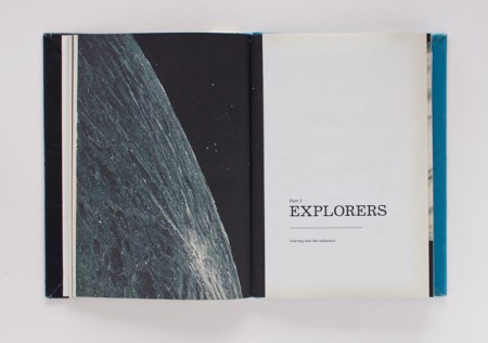
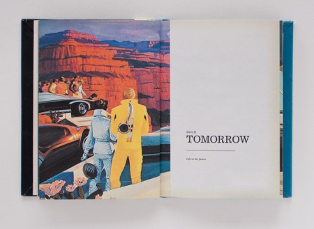
I’d like to introduce everyone to the new ISO50 intern, Jon Wong. Like Alex before him, Jon is a student at The Academy of Art, San Francisco. When I first met Jon I was pretty much floored by the quality of his work. Nothing he showed me gave any indication that he was still a student so I can’t imagine where he’s going to take things as he progresses and refines his style.
Above are a few examples of his work from various school projects. All of these came in book form and were masterfully executed. It took some real scrutiny to reveal that these weren’t real, published books. He even pulled off a very convincing aged paper vignette effect on the pages of his Explorers of Tomorrow hardcover. More projects should be going up soon, Jon just started photographing his work and got his Behance page up (I think he’s putting together a Cargo page right now too).
So please give a warm welcome to Jon, he will be sharing with us his inspirations and experiences as a student over the coming months.
More at Jon Wong on Behance
Wim Crouwell Archive
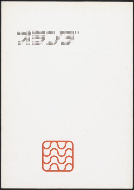
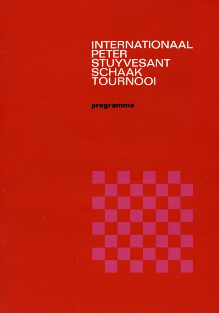
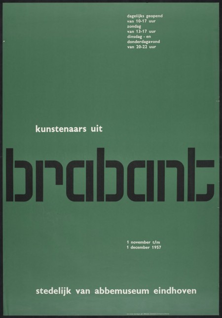
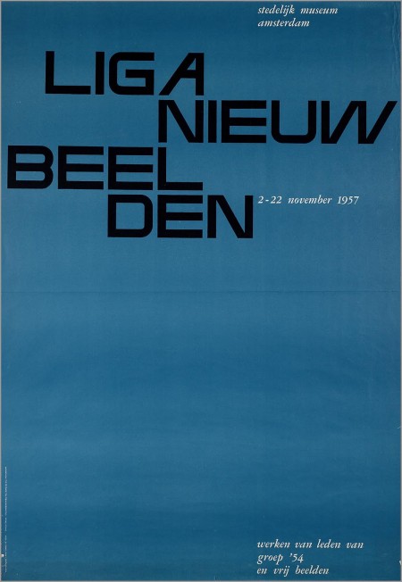
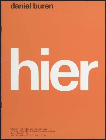
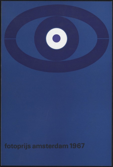
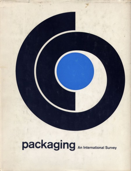
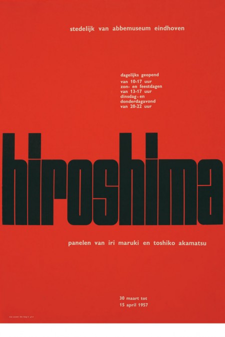
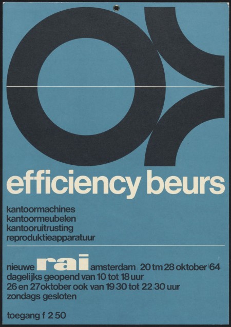
Fire up your Epsons, the Dutch site Memory of the Netherlands has an extensive high-res archive of Wim Crouwell’s work up for your downloading pleasure. All the recognizable classics are in there along with a lot of stuff I’d never seen before. I didn’t know it was possible but I now have even more respect for one of the true masters of graphic design.
That top one is incredible, I’m going to Genuine Fractal that immediately tomorrow and try to get a solid print out of it. On a side note, my friend tried to translate and said it spells out “olanda” so we’re thinking it says “Holland”. Can anyone confirm this?
Memory of the Netherlands Archive via Wanken and Flyer Goodness
The Five Vignelli-isms
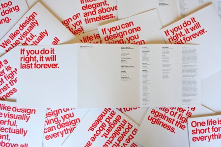
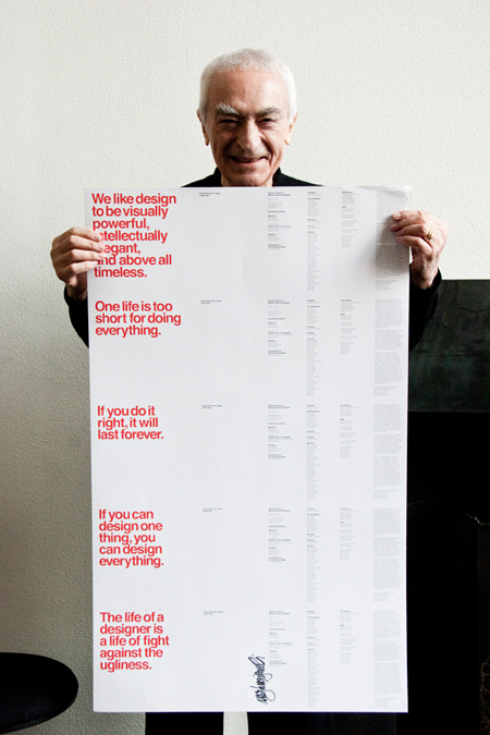
On the evening of Tuesday, March 8, The Architectural League gave its President’s Medal to Lella and Massimo Vignelli. The award (past recipients of which include John D. Rockefeller, Jr., Hugh Ferriss, Joseph Urban, Richard Meier, Robert A.M. Stern, and Robert Venturi and Denise Scott Brown) was given to the Vignellis “in recognition of a body of work so influential in its breadth that it has shaped the very way we see the world.”
Pentagram’s Michael Bierut, an Architectural League vice president who began his career over 30 years ago as a junior designer at Vignelli Associates, designed the the program we see here. The five different covers featured a quote from Vignelli printed in PMS Super Warm Red and set in Helvetica of course.
So why are these five Vignelli-isms important?
When I first came across this I immediately saw five lessons to live by rather than just five miscellaneous quotes. They appear self explanatory but read each and give it a moment alone in your mind:
One life is too short for doing everything.
We like design to be visually powerful, intellectually elegant,
and above all timeless.
If you can design one thing, you can design everything.
If you do it right, it will last forever.
The life of a designer is a life of fight against the ugliness.
Posted via Wanken
The Graphic Design of Urgency
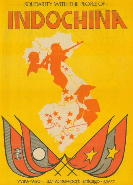
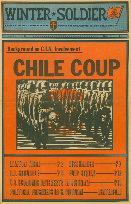
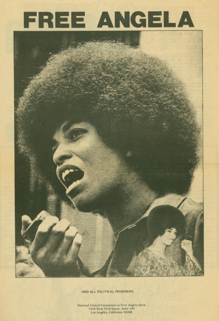
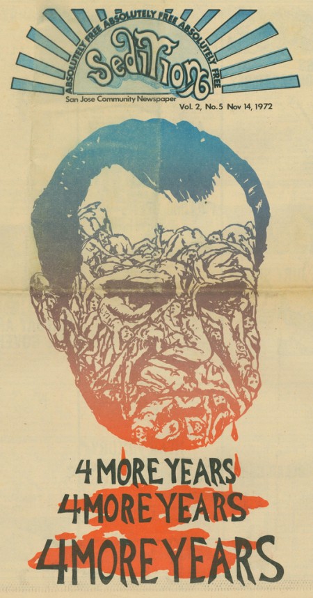
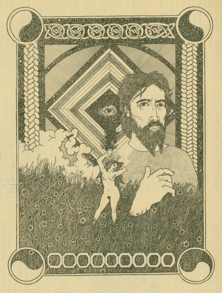
Recto|Verso has a great piece up entitled Radical Newspapers and ‘The Graphic Design of Urgency’. F.A. Bernett Books (who’s staff runs the Recto|Verso blog) came into possession a collection of 184 issues of Mid-century leftist literature spanning seven decades and have posted some choice specimens. The collection is apparently for sale; any interested parties can get in touch at the site.
Ryohei Kojima
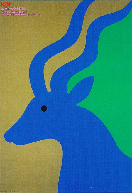
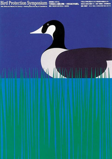
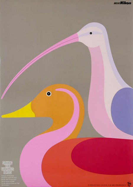
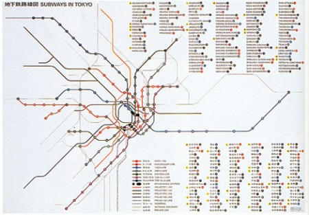
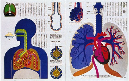
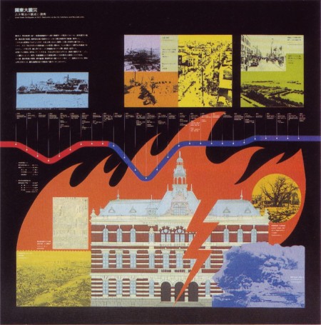
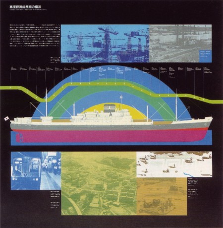
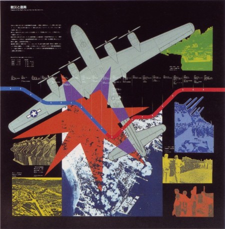
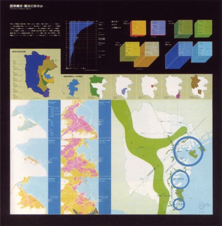
Beautiful work from Ryohei Kojima, a Japanese designer operating in the 1970’s.
Via Grain Edit additional images via 50 Watts
72 Olympics Passes
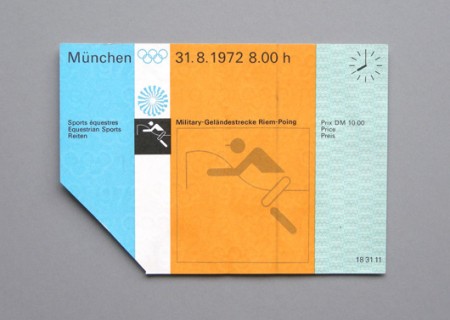
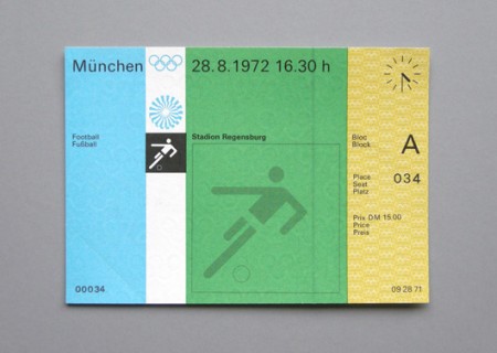
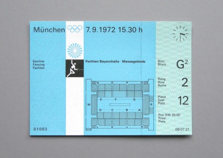
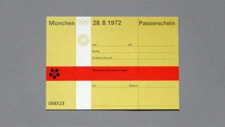
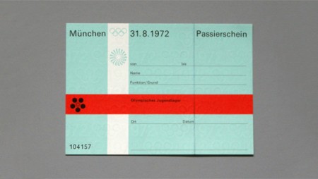
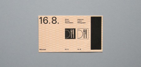

Shelby’s Blog is running A Week of the 1972 Munich Olympic Games feature and the second installment is pretty epic. This collection of ticket passes from the ’72 games were designed by the legendary Otl Aicher and feature the classic pictograms for which the Munich games are known.
I’m not sure why, but tickets of all kinds have always piqued my interest and this set may be the best I’ve ever laid eyes on. But forget the tickets, would just love some high-res copies of these photos for framing.
Indic & Indian Scripts

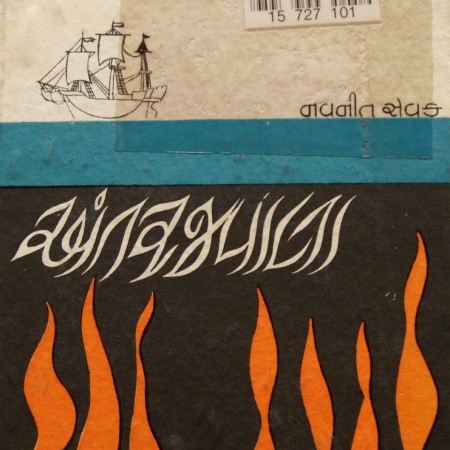
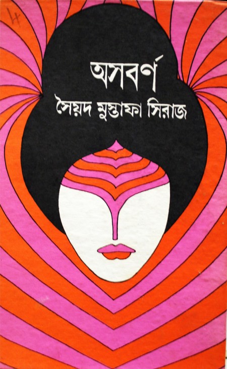
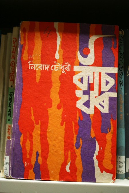
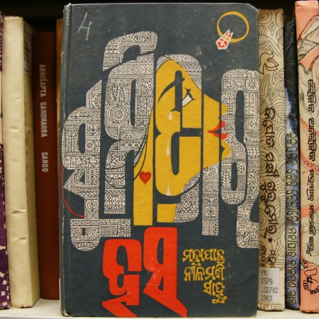
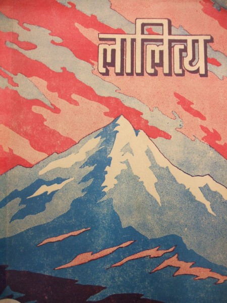
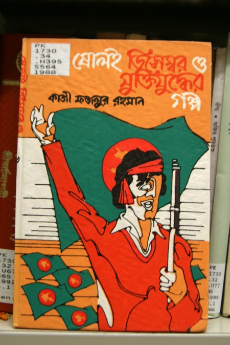
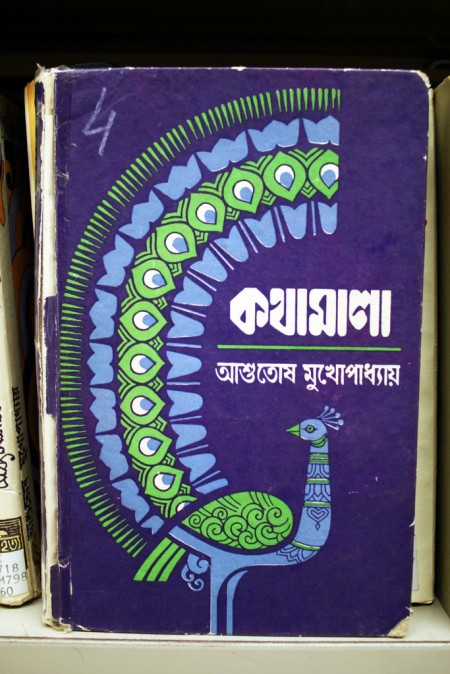
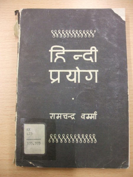
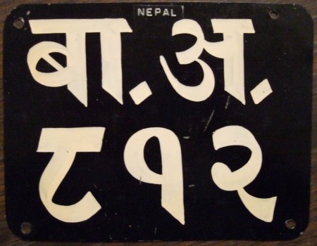
Flickr Pools can be a great resource for delving deeper into a visual theme or style and the Indic & Indian Scripts Pool is no exception. At least here in the US, the Latin Alphabet is pretty the only game in town when it comes to design so it’s easy to forget that their are whole other character sets out there. And while I’ve never encountered a project that called for any of these, it’s definitely inspiring to see such fluid characters and layouts.
From the Pool description:
“Indic scripts are Brahmi-derived scripts, This includes scripts used outside India, like Tibetan, Sinhala, Thai, Khmer, Burmese. Is this group for Indic scripts, or is it just for scripts used in India? If it’s the latter, then Arabic would count but Sinhala wouldn’t.”
The Importance of Artifact

httpvhd://www.youtube.com/watch?v=Dmop7EAY1Zg
While digging around for more info on the “found” work of Vivian Meier, I stumbled onto Todd Bieber’s video detailing his discovery of a roll of film in Prospect Park. He shows some of the (well shot) photography and wonders if he’ll ever find the people who took them. While this is an interesting story, I didn’t find it all that poignant until I read Peter Kirn’s take on Create Digital Motion.
Indeed, we are losing touch more and more with physical media. Perhaps this is a good thing for many reasons, but as a musician I struggle with the most meaningful way to release my work. I grew up focusing on the media as a sort of physical manifestation of the art that it contained. Perhaps it was just my childhood fascination with all things printed and ephemeral, but I do feel a definite disconnect now between myself and my –all digital– music collection. I personally like the idea of a physical object to represents an otherwise unsee-able art form.
I realize that we are marching inexorably towards a physical media-free future (and for most of us, we’re already there), but I’d love to see more ideas like IDEO’s C60 Redux concept; an RFID music system that plays on the strengths of physical and digital media. A system like this might not always be as practical as purely digital music, but I for one would love to experience music at home this way.
More at Create Digital Motion, NPR, TechGear
Kyle Tezak
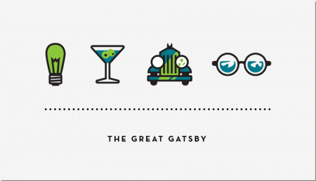
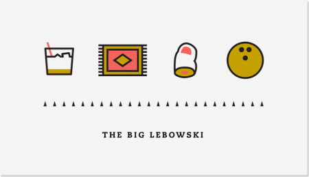
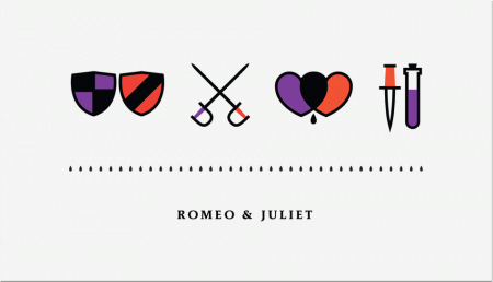
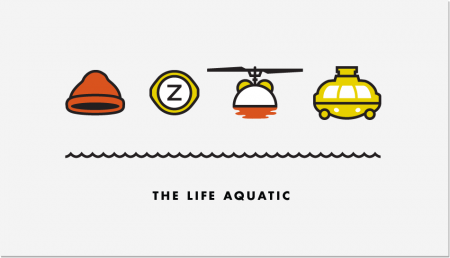
Kyle Tezak designed these icon collections to represent select films. Each film appears to get four icons, two colors, and a unique type treatment. You can see some of his work in-progress for this project on his Dribbble page.
I’m aware there are countless other projects that reduce films down to a few graphic elements. I particularly enjoyed this one because the elements are icons, not just squares and circles (albeit cleverly chosen ones). I find icon design trickier than poster design, and I am impressed with Kyle’s clear adeptness at the former.