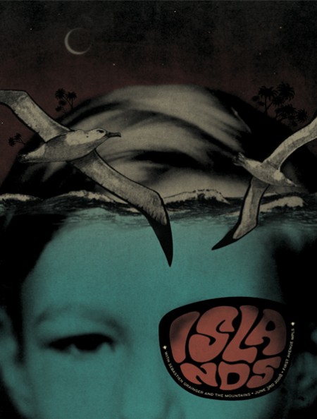
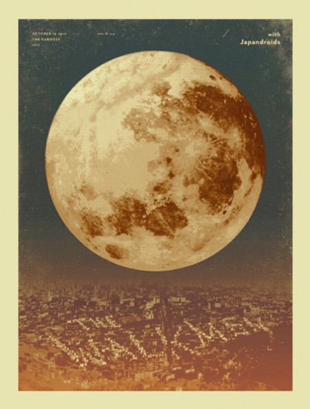
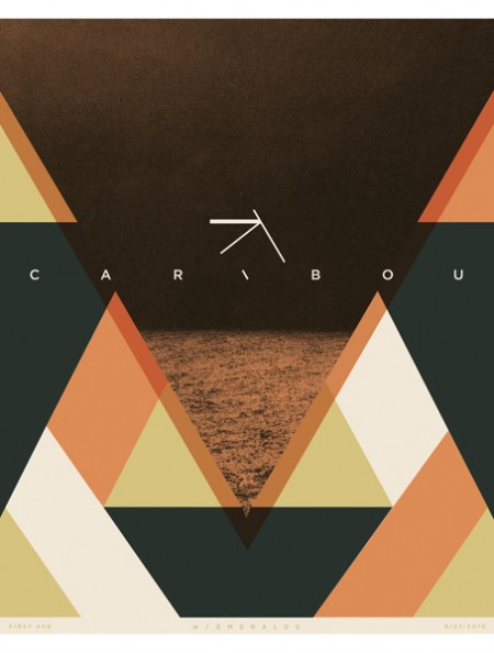
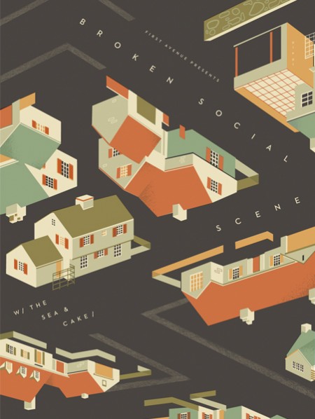
I’ve been admiring Paul Gardner’s band posters this morning, great use of color and execution of ideas that aren’t too literal or same-y, you know like owls and hand drawn guitars, urgh I hope to see more posters like this around Brooklyn. I noticed one in there though that is a bit ISO50 Terrabyte-ish but i’ll pretend I didn’t see it.
Posts in Print
Paul Gardner Band Posters
Marco Suarez
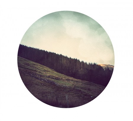
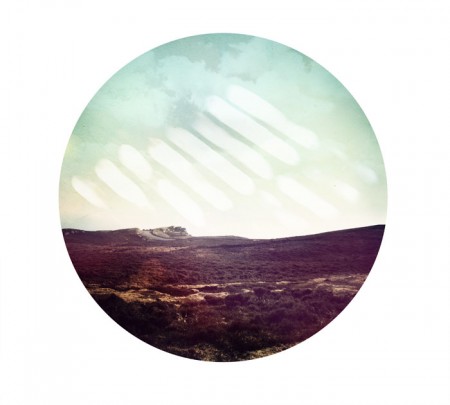
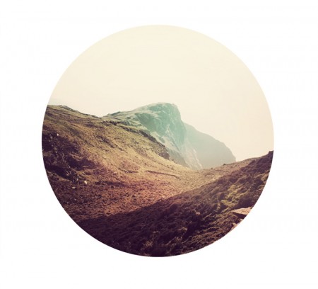
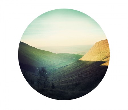
This is a cool series by South Carolinian designer Marco Suarez. Great colors and composition, and the circle canvas gives them that little something extra. It might ruin it, but I’d love to see a little bit of type sprinkled in the outskirts. Nothing crazy, maybe just some cool looking numbers.
Muni Fast Pass
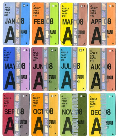
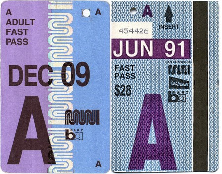
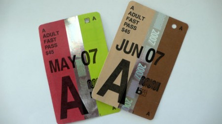
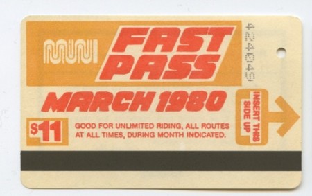
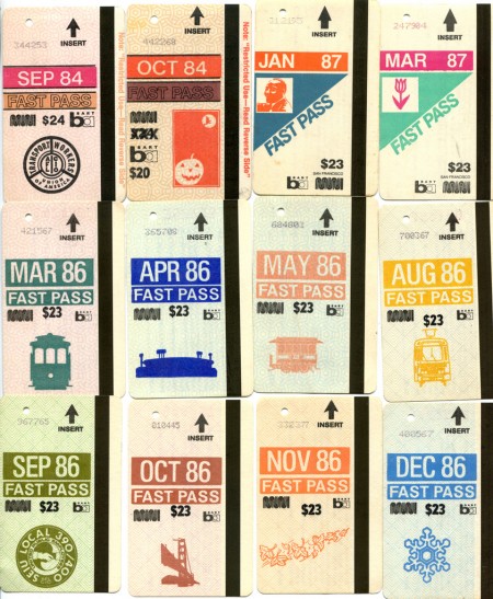
Its a shame that Seattle doesn’t have transportation passes as beautiful as these Muni Fast Passes from San Francisco. The muted colors and typography of these have really caught my eye.
Found via Flickr
Erik Nitsche
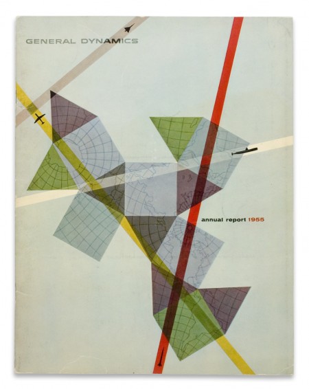
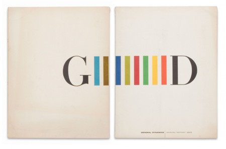
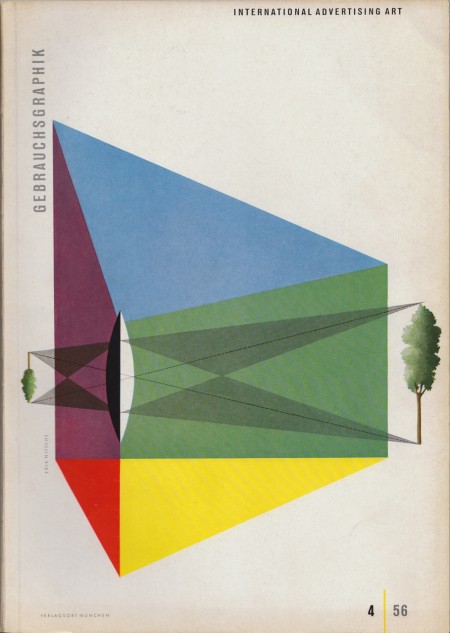
Clearly we’re fans of Erik Nitsche as we’ve posted a number of times about his work in the past. These three pieces are some of my favorites. The first and second were annual reports completed in 1955 and 1959; the third is a cover that was designed in 1956.
It’s really a shame the Flickr stream that held Nitsche’s work is now down. These images were found here.
Ross Berens
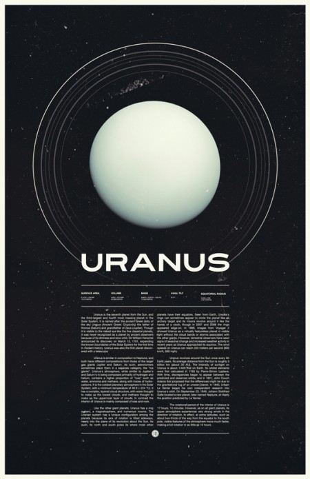
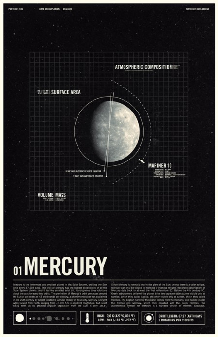
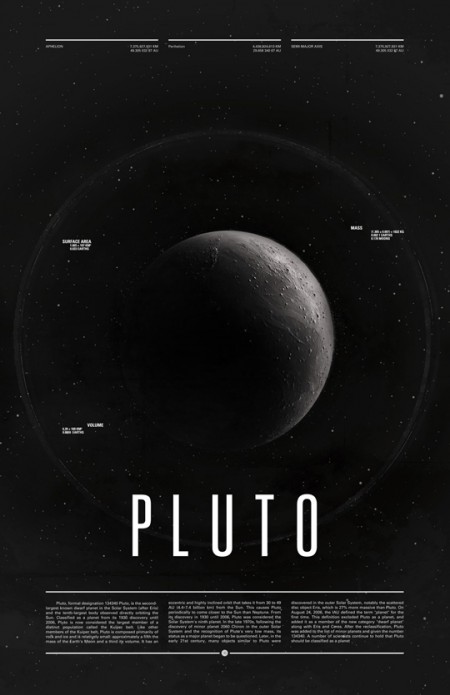
Ah yes Outer Space, one of my favorite subjects. Ross Bernes does it justice here in his Under the Milky Way series. These have been floating around the blogosphere for some time, but I only recently discovered Mr. Berens and his many talents (and at such a young age!). As he mentions on his site, these were each done in 2-3 hours — I wonder what he could do with a whole day. I was also very impressed with the logo for his blog, NVSBLTY.
via dspn
Franco Grignani
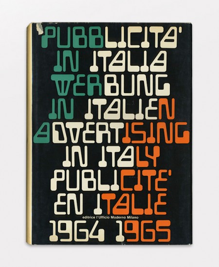
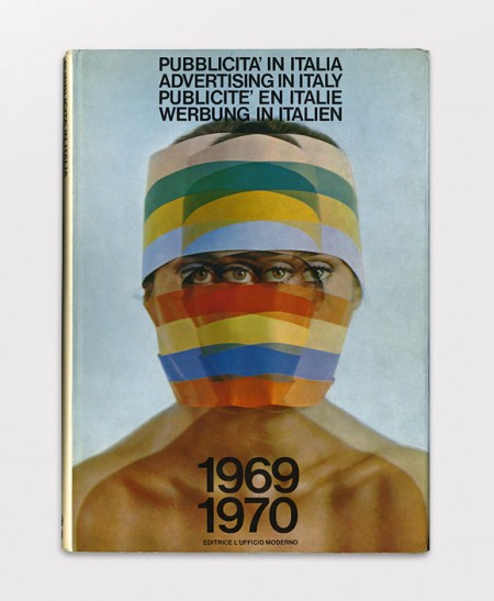
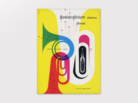
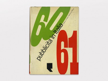
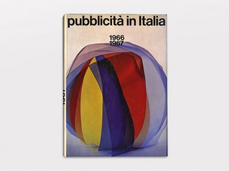
We’ve covered some of Franco Grignani’s (Italian, 1908-1999) work here on the blog before, but I recently ran across some very nice new scans over at Display. Some of these I hadn’t seen yet or was unable to locate high enough resolution images to post. Inspiring stuff; and a quick Google image search reveals the debt modern graphic design owes this man.
Images source Display via Junkyard.dogs
Mimmo Castellano
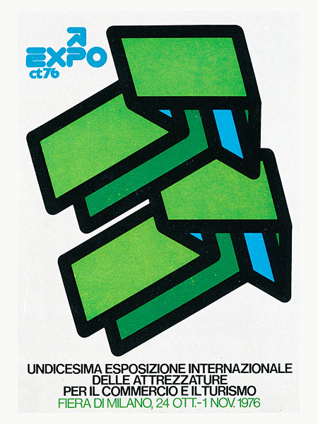
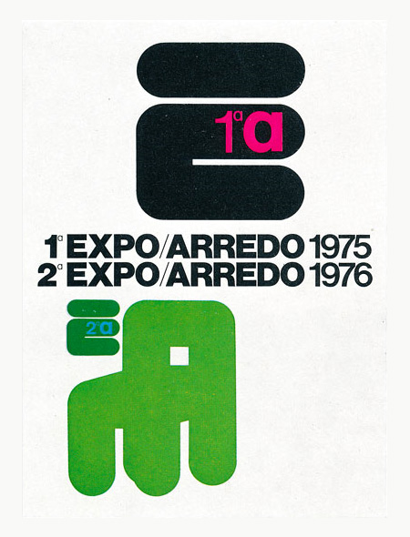
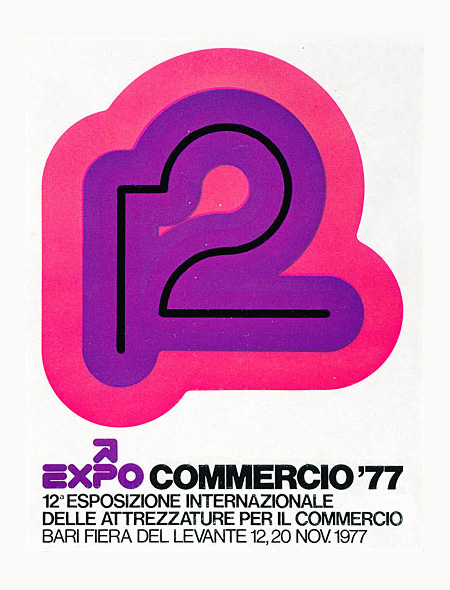
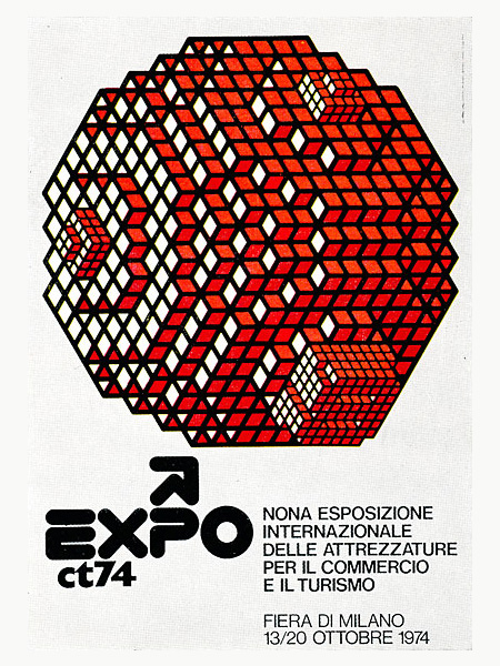
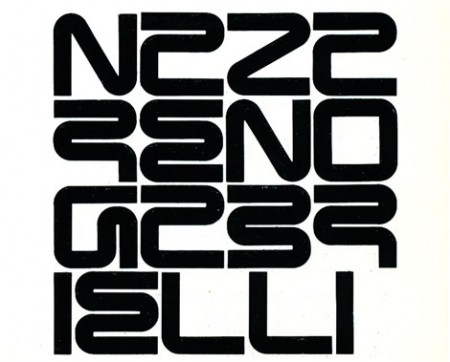
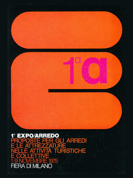
After years of digging around for interesting posters it’s easy to foolishly assume I’ve seen everything good there is to see. Then I come across work like that of Italian designer Mimmo Castellano and am once again reminded that you’ve never really seen it all. The images are from this GrainEdit post where, unfortunately, they do not mention the source. I would love to find which book they got these scans from, or better yet, where I can get my hands on some full size prints. If anyone has any suggestions, let me know.
via GrainEdit
Johnny Selman BBCx365
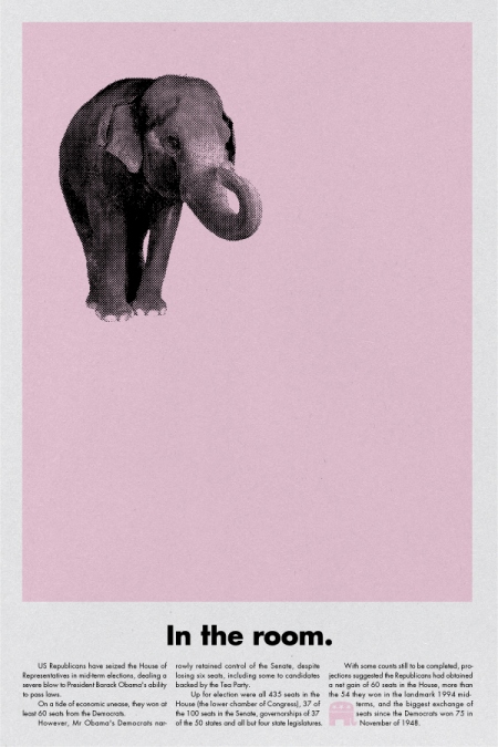
Fellow Academy of Art graduate student Johnny Selman has taken on a rather daunting project: design a poster a day for one year, using content based on a headline from the BBC news website. His project is meant to raise awareness of global current events using the immediately more accessible visual language of posters. Ideally the poster for the day intrigues you to read a story you might have otherwise ignored. He doesn’t make it very easy on himself either, as he only allows the use of 10 flat colors and no photography, all within the one day time limit per poster.
If you live in San Francisco, you can come check out the project in person tonight (12/16). Johnny will be celebrating his 100th day out on Valencia Street (between 17th and 22nd) with the first 100 posters displayed in storefront windows.
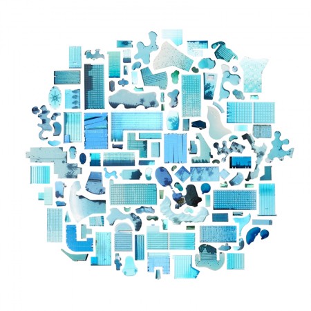
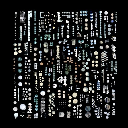
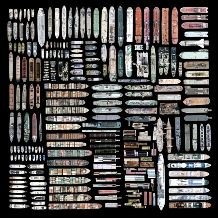
Jenny Odell Satellite Prints
104 / Le Cent Quatre
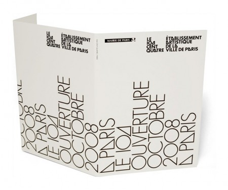
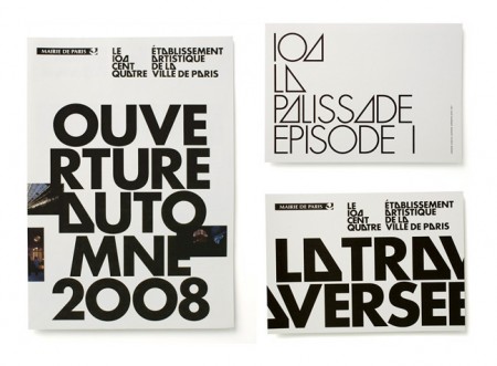
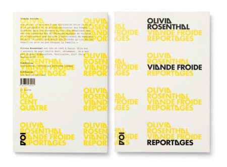
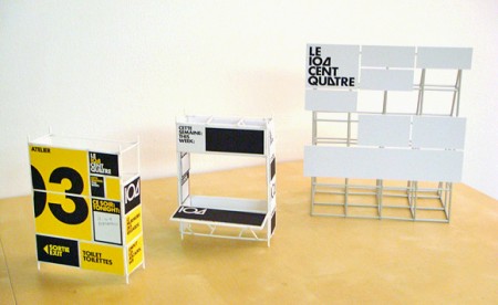
Experimental Jetset are without a doubt one of the most talented and consistent design studios working today. Every time I visit their site I am awestruck by some project or another that I missed the last time around. 104 / Le Cent Quatre is one such project. As with much of their work, there’s something so familiar about the typography and layout yet it remains fresh and engaging. These guys are the masters of subtle perfection.
Be sure to check out our interview with them from earlier this year.
