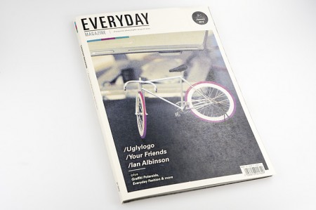
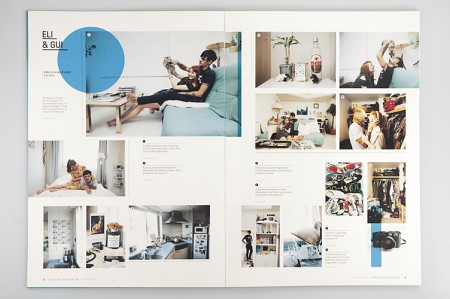
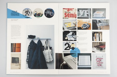
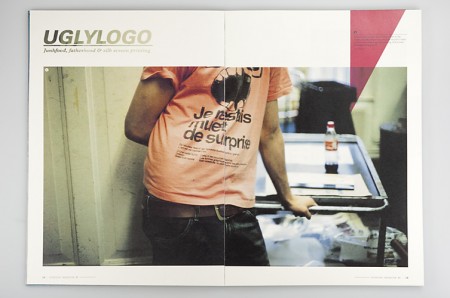
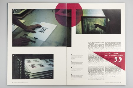
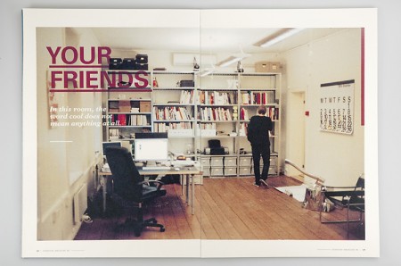
Everyday Magazine is a magazine that focuses on the behind the scenes of creative folks. I find the design to be quite relaxing and the inner pages to be nicely laid out. The project was created by Mikael Floysand as an assignment at Westerdals School of Communication.
Posts in Print
Everyday Magazine
The Infamous Press
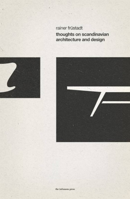
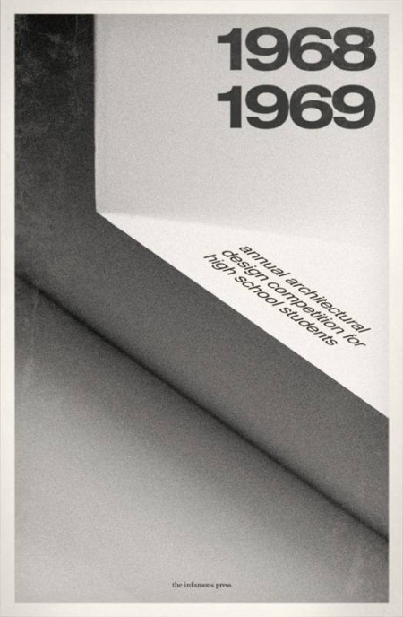
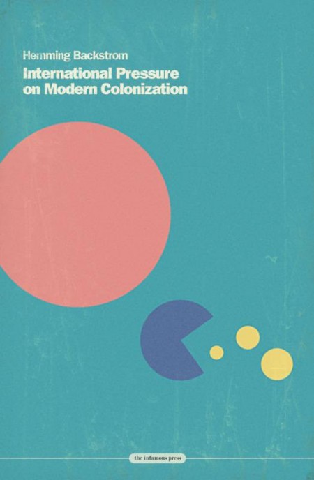
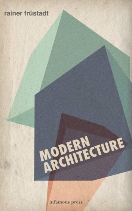
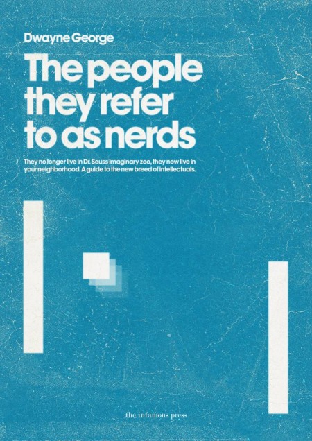
These book covers are part of the Infamous Press book cover concept collection. Designed by Morton Iveland.
via Minimalissimo.
Chillout Sessions
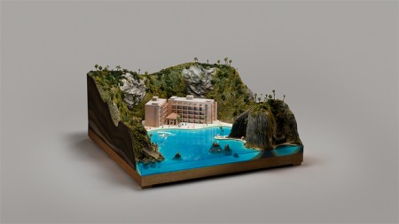
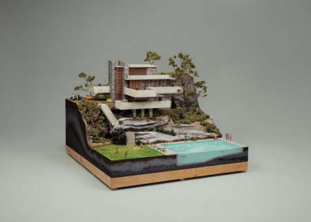
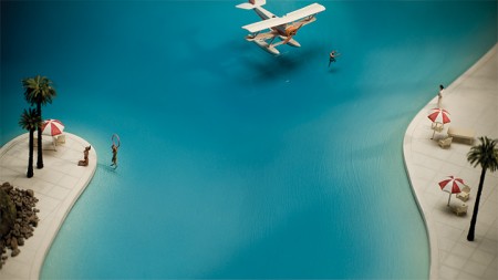

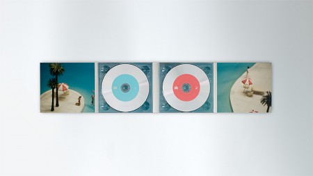
Both of these little worlds are part of the artwork created for the most recent Chillout Sessions: a compilation disc series put together by the Ministry of Sound Australia. The diorama-like concept was developed by Collider (design by Andrew van der Westhuyzen and cinematography by Brycen Horne). They decided to switch up the packaging after the first 10 discs:
The new Sessions concept involves miniature ‘worlds’ literally creating a package holiday that has both escapism and a sense of humour. [link]
I want to shrink down to size and move into one of these miniature worlds. As a concept I LOVE this. It was executed exceptionally well; from the world construction to the photography, this is a concept pulled off in every sense. Be sure to check out the video version of each: XII XI
North America Wildlife
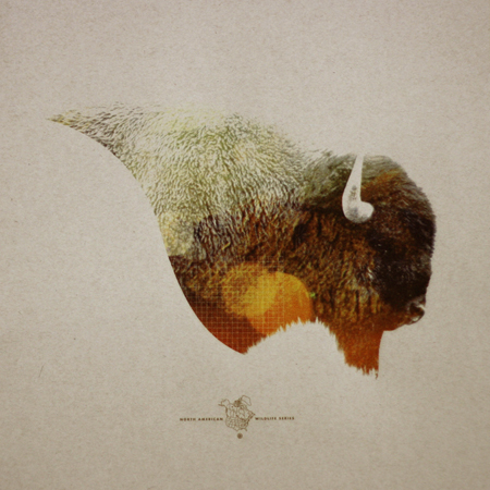
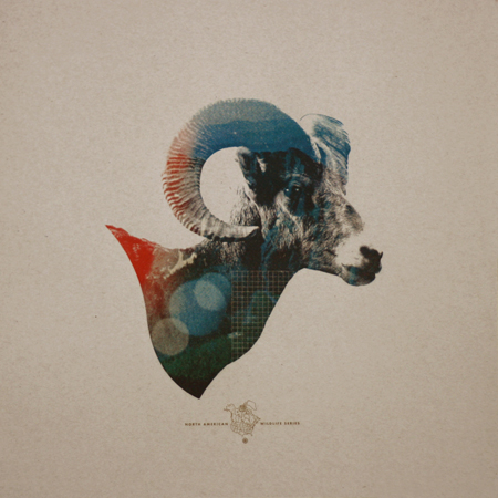
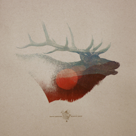
Mark Weaver has got to be one of the most consistently stellar (not to mention prolific) designers I know. I saw his “How To Destroy Angels” cover printed tinty tiny next to a review in Rolling Stone and knew immediately, Mark Weaver! The prints above are from his North American Wildlife limited edition series. They are for sale on his shop as of this week.
Be sure to also check out Mark’s answer to how he overcomes creative block: …”To achieve full creative potential I must sit in the woods, watch Mad Men, and listen to Boards of Canada simultaneously.” One of my favorite answers.
FWS Posters
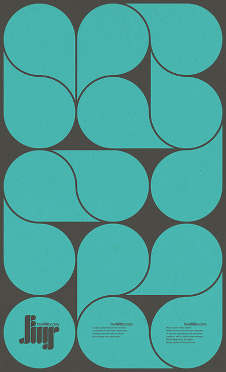
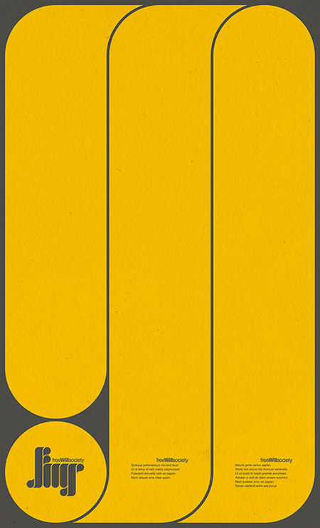
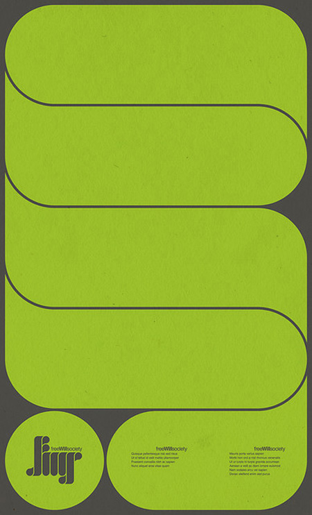
More visually stimulating work by Mihaul Mihaylov. This time in poster form. I particularly enjoy the repetition of shape curve from the logo to the main graphic elements.
See more of his work on Behance.
Toko
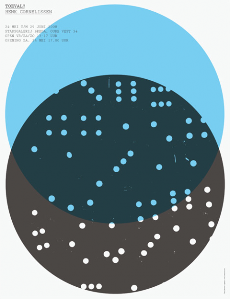
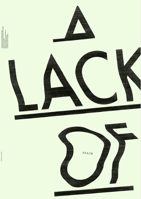
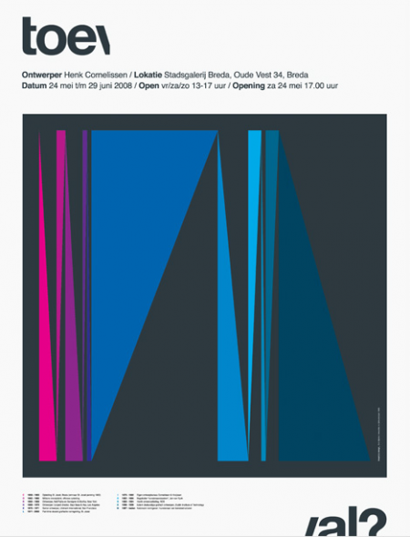
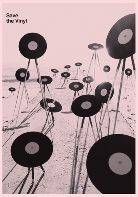
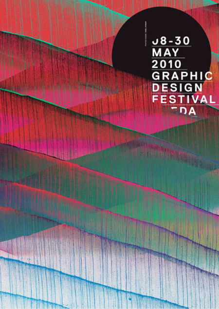
Toko is a multidisciplinary design studio based out of Sydney (formerly Rotterdam). Their work is difficult to pin down as they exhibit design prowess in many styles and mediums. In the works above you may notice a consistent ‘distress’ to each poster — whether it be a simple fade or a TV-like distortion. Almost looks as if the posters were laid out and then tampered with by some visually gifted distress-gremlin later on. I especially love the “A Lack of Space” piece.
Also notice they are sporting one of those ever so shiny .nu domain names.
NDK Research
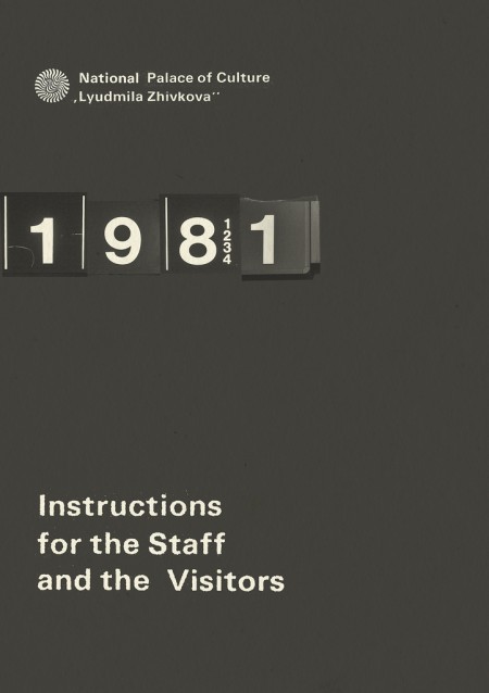
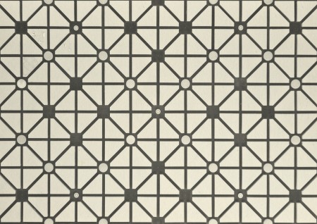
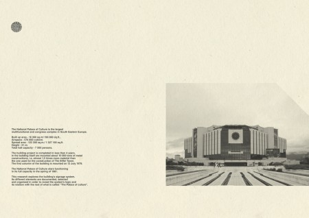
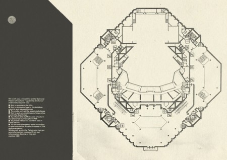
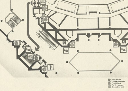
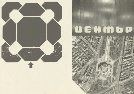
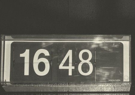
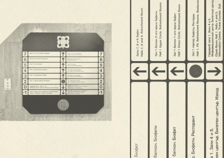
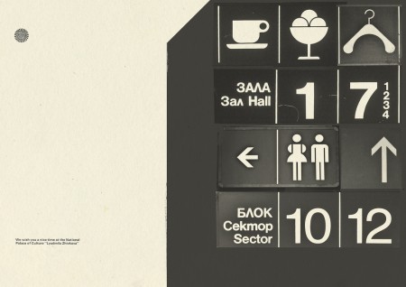
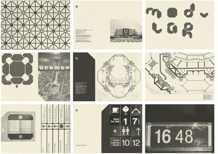
This project was created by Bulgarian designer Mihail Mihaylov. The project is an exploration of The National Palace of Culture’s signage system. The project is very stylistically pleasing, but I really wish there was more information to fill in the projects gaps.
The Visual Mixtape
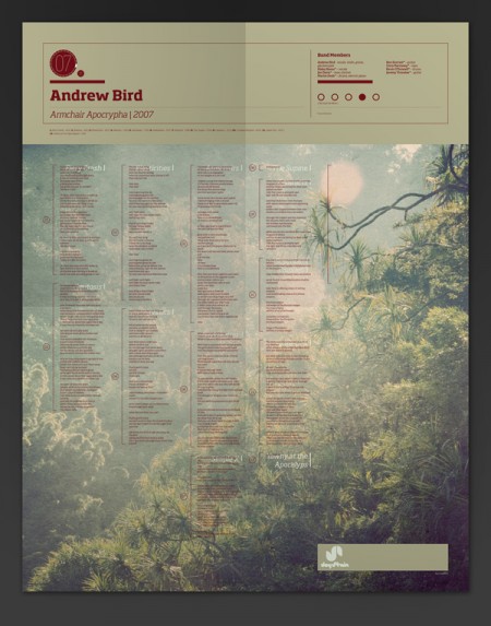
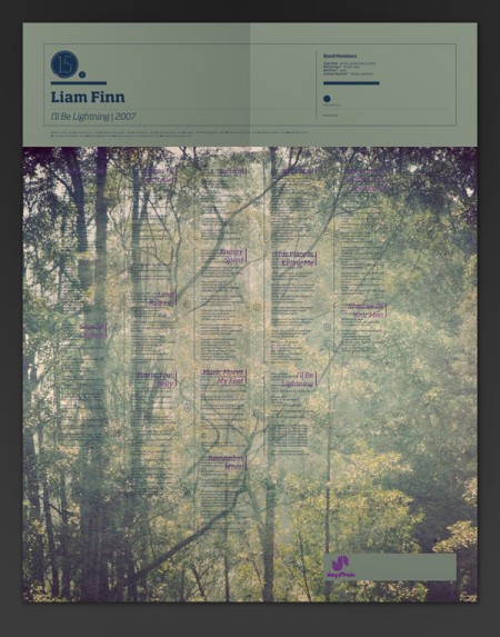
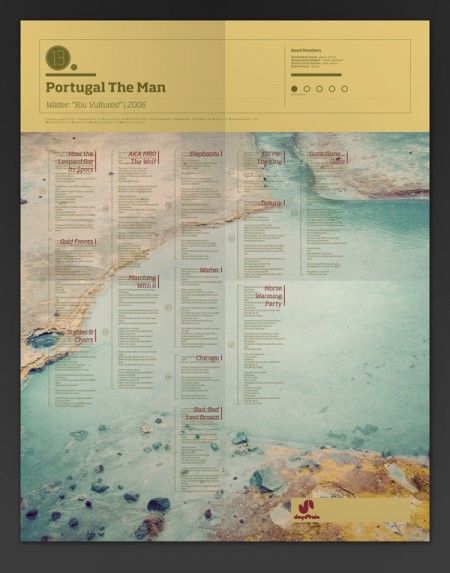
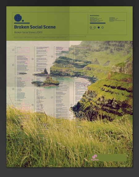
The Visual Mixtape is a series of self-initiated posters by Noa Emberson. The series contains a staggering 25 variations, all with very intriguing color palettes and images. The lockup stays largely the same, but the artist and song list changes with each poster.
See more of my favorites after the jump.
Qus Qus
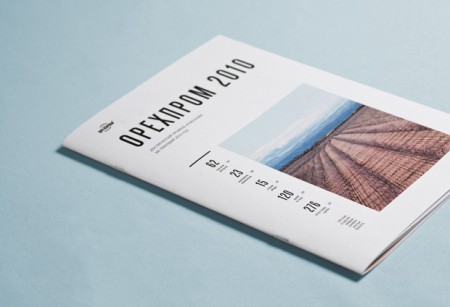
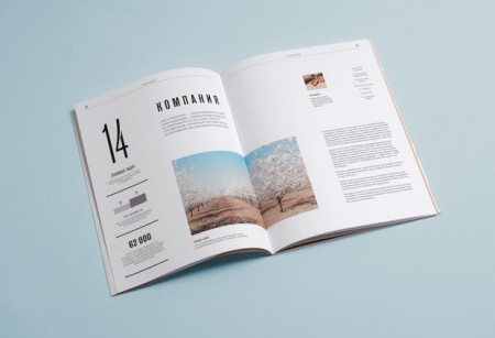
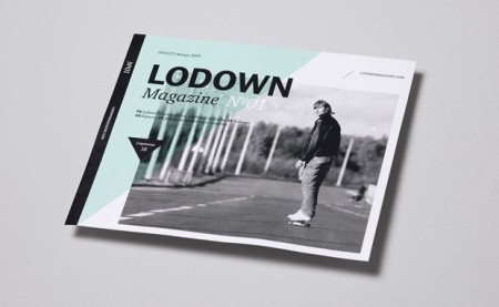
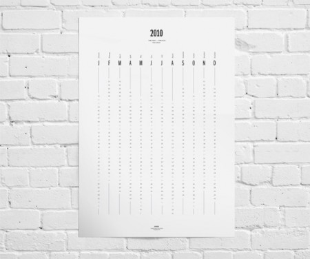
Qus Qus is the design studio of Dima Kuzmichev. This work is super clean — I feel like if I ran a corporation of any kind, I would have Dima do my annual report. Especially if we were based in Iceland and wanted to make our wind power turbines seem sexy. There is a cold perfectionism at work here. Great grid work, some beautiful type, pretty much everything you need. I was also really impressed with the logowork. The one for Artisanale was my favorite (and the name sounds awesome to boot).
Marian Bantjes
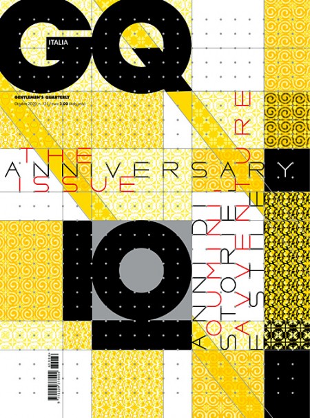
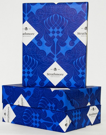
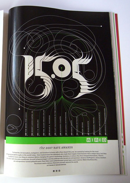
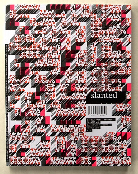
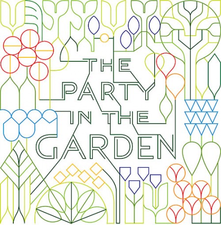
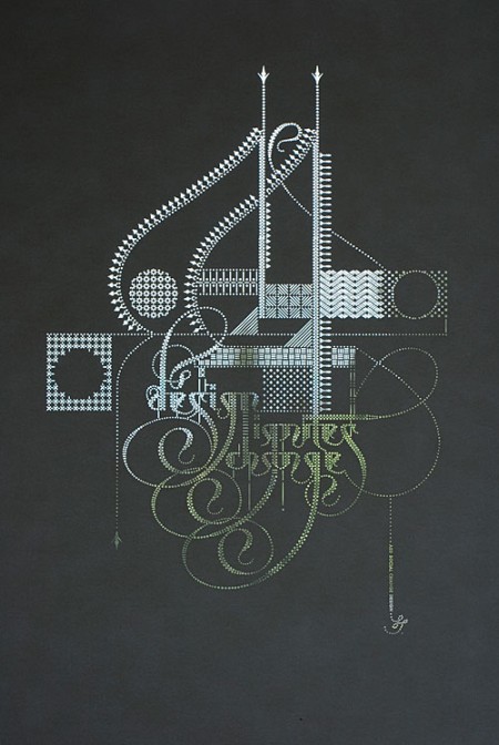
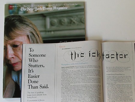
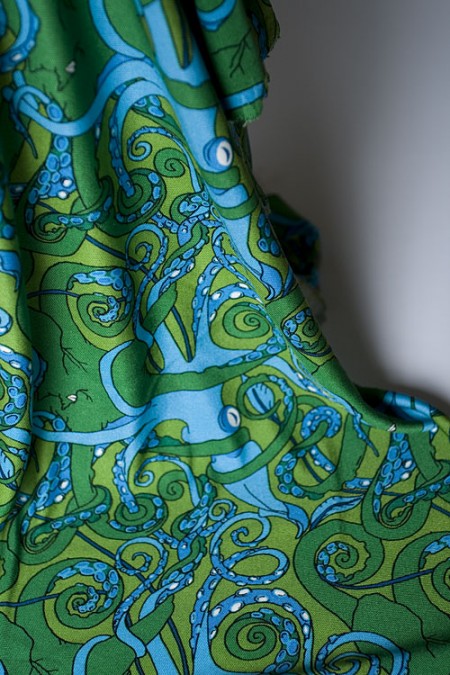
Marian Bantjes is one of those designers whose work I’ve seen often but never put it all together as being from the same artist. Browsing her very deep portfolio you’ll find everything from high school savant ballpoint pen drawings to hyper-maximalist pattern collages. Everything in it is overflowing with passion and Marian’s unwavering reverence for detail is truly something beautiful. Check out her portfolio for more. Also check out Marian’s TED talk (via Leigh)
Via @Nopattern, which is perfect because it’s interesting to note the overlaps between some of their word art.