 One of the reasons I enjoy creating on my iPhone, is it takes me out of my usual process. The image above I created with Fuzel It’s similar to Grid Lens but lets you make your own slices that you can load up with images. The lines are the slices I made and then I added a tringle to each slice. (I added the clouds with Blender). This is all fairly simple to do in Photoshop with masks but not nearly as simple to manipulate. Being able to tap points and change their size as I’m moving them around feels much more “organic”. I find the results are less forced and there seems to be a more natural progression of the design. I recently switched from a mouse to a tablet which I find much more natural, but you really cant beat direct contact with the screen. Posted by: Seth Hardie Instagram: @hallwood
Posts in Process
Tired Of The Mouse
Geometric Design
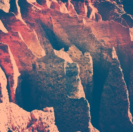
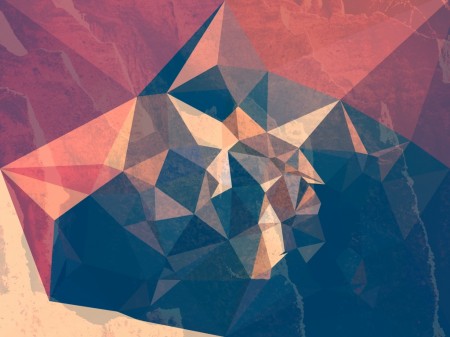
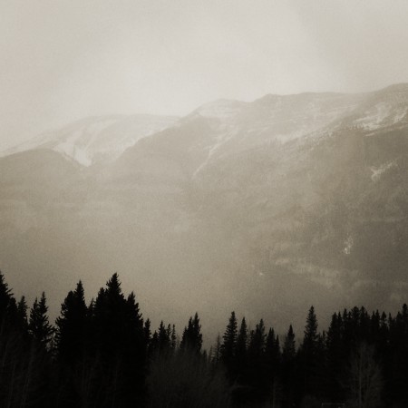
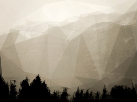
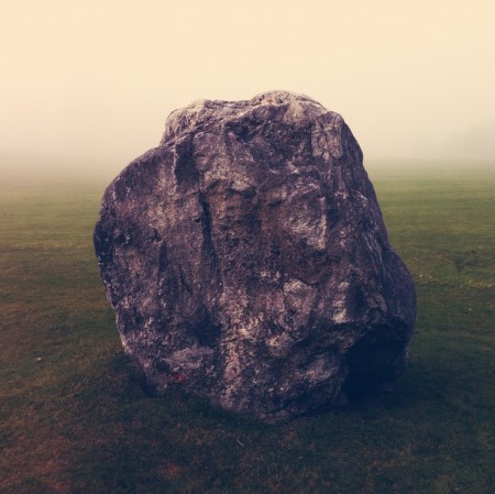
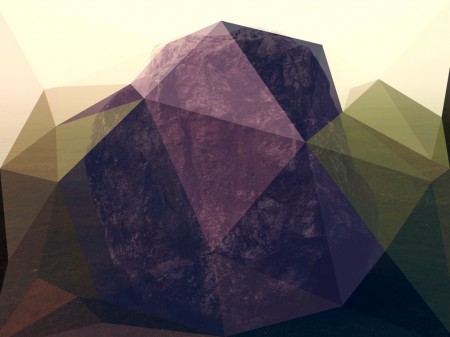
Its hard not to notice the growing popularity of geometric shapes in design these days. A quick search on Behance and you really cant deny it. My laundry detergent even has a pattern of colored triangles on it (which is probably why I bought it). So at the risk of flooding the design community a little more, I have to share an iPad app I stumbled on the other day. Its called Poly.
Some before and after examples of what the app can do above.
All images by Seth Hardie
Instagram: @hallwood
Poly app Here
UberConference: Process Post

It’s been such a long time since I posted! This is largely due to the fact that I’ve been head-down on my company’s most recent product, UberConference, for the last few months. UberConference is basically a visual interface for audio conference calling. You can see who’s talking, who’s on the call, and control it completely via the desktop (and soon mobile) UI. We recently won the TechCrunch Disrupt Battlefield competition — you can see our pitch and presentation here.
I haven’t written a process post in a very long time so I wanted to talk a little bit about the UberConference process here. I’ll talk about the UI development as well as the video work. Keep reading to see the rest of the process. You can follow me on Twitter here for more frequent updates. Oh also, for a good time, call (424)-226-3111.
The 300SL (or: Homologation & You)
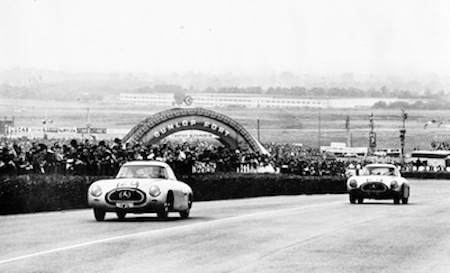
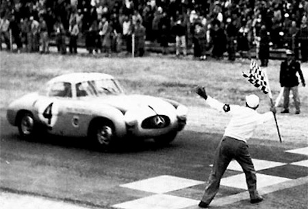
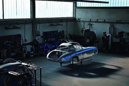
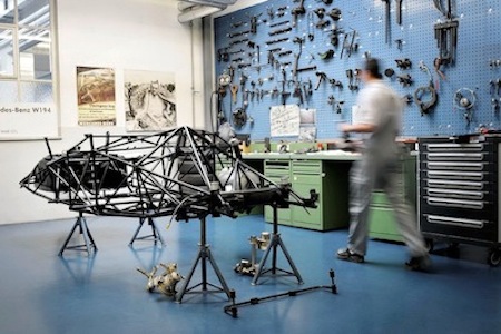


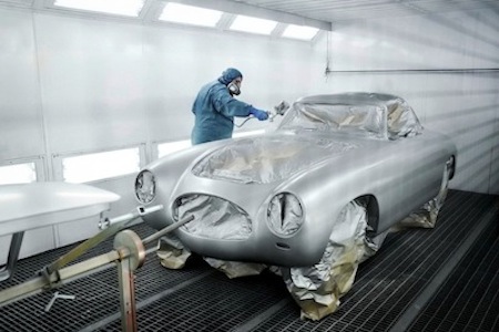
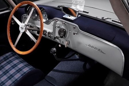

In sports car racing, there is a wonderful thing called ‘homologation’. Manufacturers hate it, car collectors love it. It means that in order to enter a car in sanctioned sports car races, it has to be based on a production model. Without going into a lengthy explanation, just appreciate the fact that it has brought the world some of it’s most prized street-legal race cars. The 300SL is undeniably one of the most iconic. In 1952, Mercedes Benz was feeling ambitious and decided they wanted to win alot of races. So they built an incredibly streamlined, lightweight, and reliable race car using some of the most exotic materials at the time – the homologated street version that was sold to the public a complete afterthought. It was then entered it into many of the most prestigious, and difficult, endurance races of the day. They succeeded, taking 1-2 victories at the 24 Hours of Le Mans and the Carrera Panamericana to name a few. Above are a few photos of the 300SL in action at the aforementioned races (the 2nd of which is the variant used in the trans-mexican rally, where the windshield had to be reinforced with wrought iron bars due to ‘buzzard collisions’). The second group of photos are of the oldest 300SL in existence, serial number zwei. It never saw any racing, rather it was used as a training car for the very capable Hermann Lang & Fritz Reiss (along with the rest of the Silver Arrows) who went on to take many checkered flags. Dragged out of the broom closet by Mercedes, it underwent an extensive 9 month restoration for it’s 60th birthday, and in celebration of the new SLS AMG. What a timeless example of German design – both in form & function.
Immersive Cocoon and The Making Of
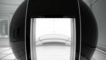
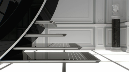
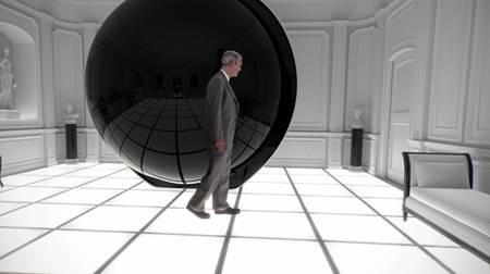
Keir Dullea encounters a mysterious object, in a scenario reminiscent of the penultimate scene from Stanley Kubrick’s 2001: A Space Odyssey that he appeared in over forty years ago.
For the 2001 : A Space Odessey fans that we probably all are, the faux trailer or commercial, Immersive Cocoon. This piece has been out for a while, but I recently came across the Making Of video. It really gives great perspective on not only how this was made, but the large amount of CG work that was done in the piece. Have a watch of Immersive Cocoon above, then the Making Of below.
CutLaserCut: We Make Your Ideas
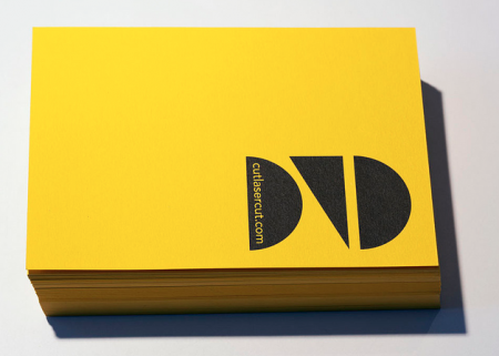
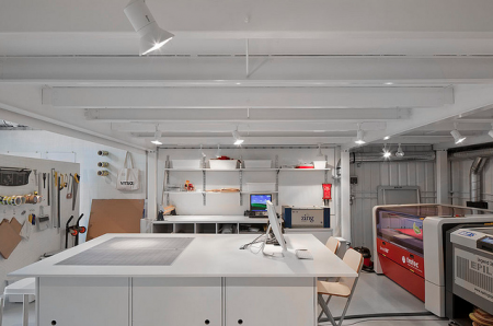

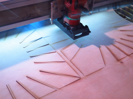
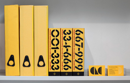
Many of us artists/designers/musicians love dreaming about our ideas becoming a physical piece that you can hold, touch, gift or make available for others to have. I really appreciate the printers, warehouses and studios that have to deal with our minds and files. So here’s to CutLaserCut, a well branded youthful laser cutting company that I dream of using someday soon, check out their Flickr and keep these physical type of companies close, I hope to see more creative uses of what they offer in the future and thats up to us.
The Violet Crown App At SXSW
With everyone heading to or already at SXSW this week and next, I thought this would be a good time to post about the location aware music apps that Bluebrain has been doing. They’ve already done one for The National Mall and Central Park ( Listen To The Light ), the new one The Violet Crown is based around Austin and SXSW. Basically it’s, as Bluebrain describes it, “a musical composition, available exclusively as a free iPhone app, that uses the phone’s built-in GPS to alter the music as the listener traverses the area – each street and intersection is tagged with various pockets of sound, turning the festival grounds into a musical ‘choose-your-own-adventure’.”
You can download the free app here through iTunes.
It’s a really cool concept and as of yet, I haven’t been able to try out the other versions from The National Mall or Central Park ( Listen To The Light ), The Violet Crown will be the first.
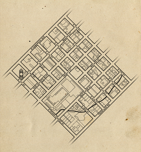
For those that can’t make it out to SXSW this year, I dug a little further to get some more of the background on The Violent Crown app and some process. Ryan Holladay of Bluebrain went over the technical info and he sent me a few screen grabs and a map from the programming end of things. He also did a breakdown of how it works, which I think is really interesting.
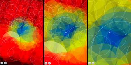
“What you are looking at in these shots is the app simulator running running on our desktop — this is a way that we can remotely test the music without having to be in Austin and simulate the experience of, say, walking from one block to another and hearing how the music changes. As you can see, there are many in a single area, often with so many overlapping that it’s difficult to tell visually where each of them are located. The crosshairs in the middle represent the location of the listener, the various circles indicate the size of the audio track and the colors the state the audio is in: Blue, as you probably guessed, is playing, while yellow is cued and red is disengaged.
Because, by design, the app basically has to be ready for whichever direction you move, what we have is a system that prepares the audio to be dropped in at any given point and at the correct interval by preloading audio in every direction within a certain proximity. So, for instance, if you were to begin walking from Frontage Rd towards Congress Ave, halfway up 4th Street it will have prepared the tracks waiting for you when you arrive at Red River Street. But, when you reach an intersection, the audio to your left and right is also waiting for in case you chose that direction. Once it’s realized you’ve moved on, it drops those tracks to save processing power until you turn around and re-approach.”
To see what it’s all about check out the Making Of video below, which gives you a detailed explanation of what it does and how they actually built the one for Central Park ( Listen To The Light ).
Solipsist Full Length Film
Andrew Huang’s full length version of Solipsist is now available to watch above. I posted a few weeks ago on the trailer, which I was astonished by alone, but now the full version is up. This piece is nothing short of astonishing from photography and post to sound design. I won’t say too much more, but I will say that you might want to close out of Photoshop for about 10 minutes and fullscreen this.
Also, for those that are interested, here’s the making of that’s equally as interesting.
Inspiration from new tools
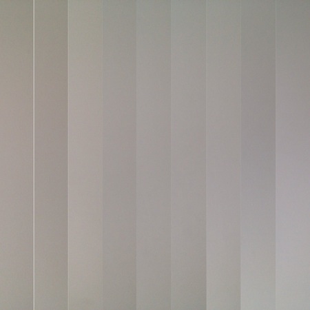
I’ve been having a good deal of fun editing on my iPhone lately and its even spilled over into some of my design work. I recently discovered a great little app called Grid Lens (well worth checking out), and created a custom grid for myself of skinny columns (Some inspiration from this painting) and took a sequence of photos of a white wall… It turned out like this (see image above).
I figured I was onto something and brought it into Image Blender (another invaluable app) and started layering it. First horizontally and then diagonally. I ended up with this:
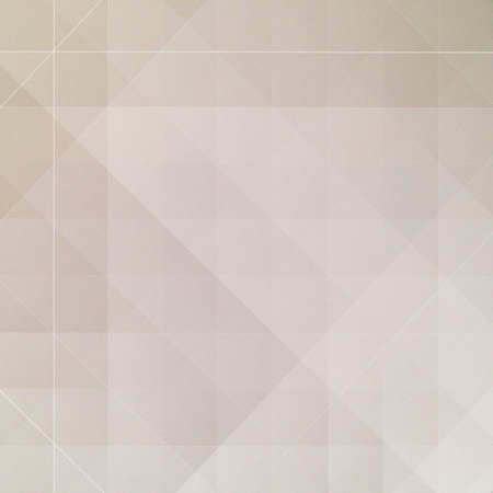
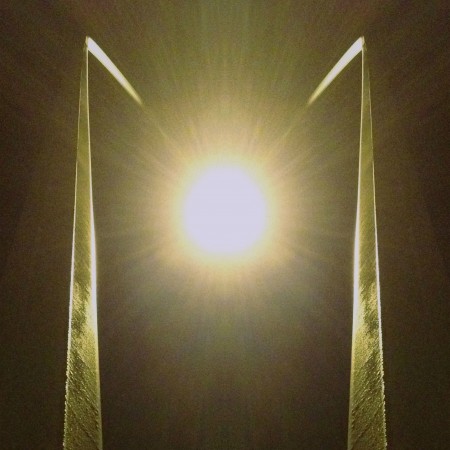
This got me pretty excited, especially because it started with a photo of a white wall… I then layered it over another photo that I mirrored for more symmetry and ended up with this:
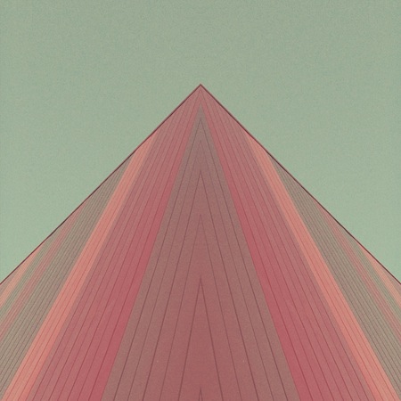

I find accidental creativity to be some of the most exciting, especially when it comes together quickly, when you almost cant keep up with it.
A few more examples of the same technique:

I am working on a logo right now and I figured this is great application to try out this same technique. I did it all in illustrator but the inspiration came from a $2 app.

Tools that fit in my pocket fit much better into my life.
All images by Seth Hardie
Find me on Instagram here: @hallwood
Explorers of Tomorrow / Process Post
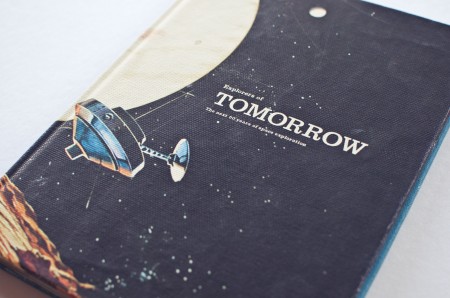
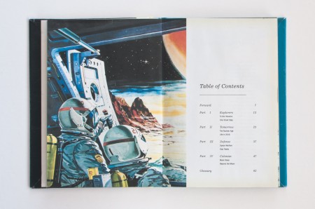
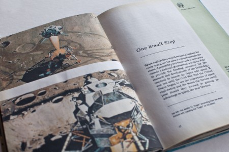
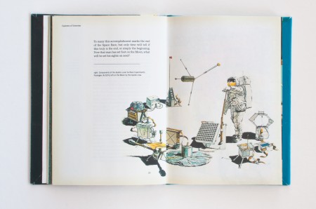
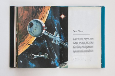
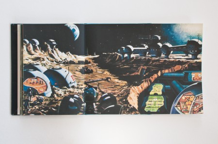
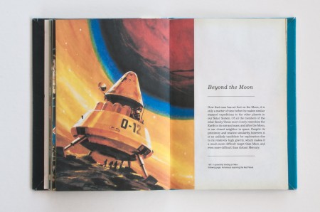
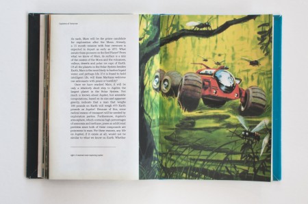
Explorers of Tomorrow is the title of the first book project I completed at the Academy of Art University in Spring 2009. Up to this point our projects consisted of posters and small printed materials, so this was the first time we were pushed to develop a consistent visual language and extend it across multiple pages. The assignment was to take a subject of interest, research its future 10 years from the present, and display our findings in a book.
Growing up, one of my favorite books was Automobiles of the Future by Irwin Stambler. Written in the 60s, it imagined the automobile in the 80s, 90s, and even the new millenium. The book was a window to a strange parallel dimension, where everything inside was a streamlined, pastel version of reality. Its pages held promise, for the future of automobiles was about more than spark plugs and oil filters, it was the story of man’s struggle to better himself. At the same time, it was very naive and simplified the world of tomorrow to a utopia that answered all of the problems facing their society. It never considered the possibility that the future would have its own set of obstacles to overcome. But that was its biggest appeal to me, to see the ways our society had advanced so far from their wildest dreams, yet fallen short on its fundamental ideals.
Space exploration has always been a fascination of mine. With that in mind I began to think about our future. 2019 will mark the 50th anniversary of the Apollo 11 flight, and I thought it would be interesting to look at the future of space exploration 10 years from the present, but from the perspective of writers in the past. Specifically, I wanted to look at how a society that had just landed on the moon would view space travel in the future: how would our idea of 2019 compare to a society’s that looked to the stars for answers?
