Posts in Process

Hoyle Rebranding / Process Post


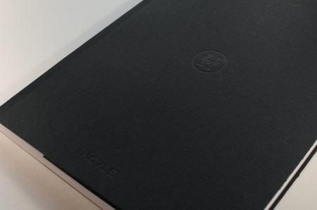
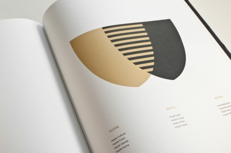
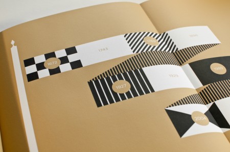
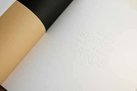
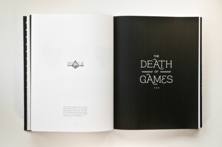
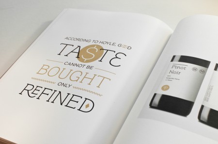
Continuing my new year’s resolution, I wanted to share my experience working on a rebranding project for school. This project was completed over the course of Spring 2011, and the assignment was to choose a dying or defunct brand and breathe new life into it. Throughout the semester we developed a logo, letterhead, visual identity, and brand extensions for the revamped company, and the final deliverable was a brand guidelines book. Alex described his process working with Playboy, and I highly recommend you check them out if you haven’t yet.

I had a lot of fun designing the deck of playing cards for Beast in a Neon Cage, so I thought it would be interesting to work with a playing card company. Once I chose my industry, I looked at brands like Kem and Copag and ended up choosing Hoyle. Hoyle is part of the United States Playing Card Company, which also owns the Bicycle and Bee playing card lines.
(more…)

The Importance Of A Good Crop

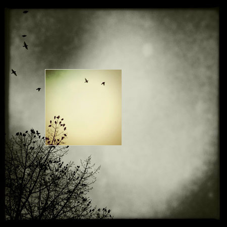
I’ve been taking pictures with my iPhone for about a year and half now and I’m continually surprised at the things I’m learning and new techniques I’m discovering.

I barely used to crop at all, especially when editing my DSLR photos. I was always (overly) concerned with resolution and making sure I didn’t lose any.

Enter lower resolution iPhone with a fixed focal length…

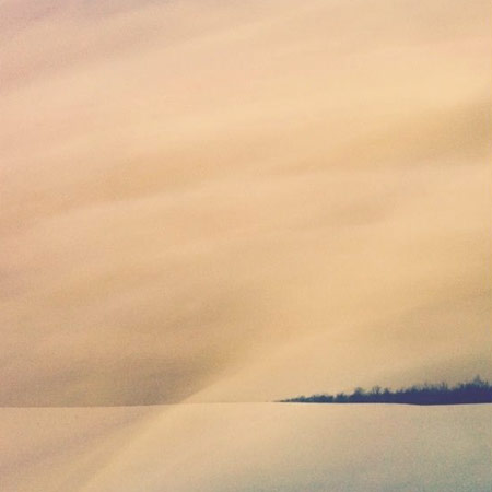
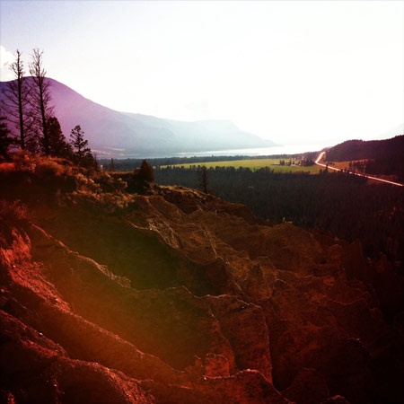
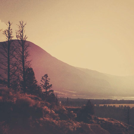
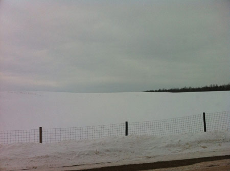
As I always have my iPhone on me this is how I take most of my photos these days. I often find my self on the other side of a river, across a huge field or just a little too far away from a mountain. This has literally forced me to crop in closer to get the photo I want. Because apps like Instagram publish quite a small image I don’t care as much about resolution anymore (although this can be frustrating later).

Having this “freedom” of no longer caring so much about resolution has encouraged me to crop more and often I find myself revisiting photos that I had written off, only to discover post crop a new favourite photo. Where I was concerned about resolution before I’m now concerned about the final composition. Now I just need a 50mp camera thats fits in my pocket!

Original

Cropped

Original

Cropped

Original

Cropped

Original

Cropped

Original

Cropped

All images taken and edited on the iPhone and posted on Instagram by Seth Hardie.

Find me on Instagram here: @hallwood

Beast in a Neon Cage / Process Post


I’ve been meaning to write up process posts for some of the work I’ve created while studying at the Academy of Art University, and now that it’s a new year I figured it would be a good time to get started.

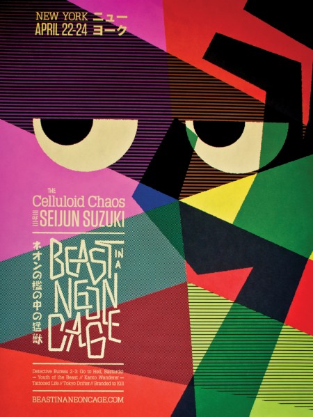
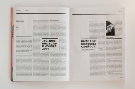
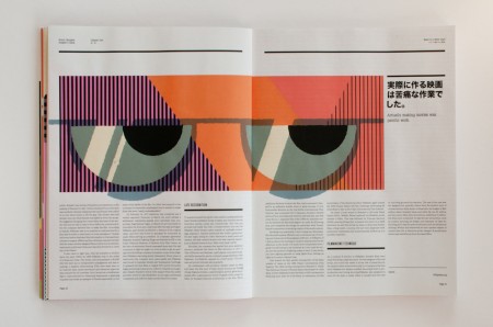
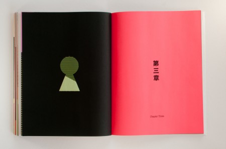
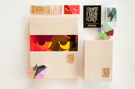
Beast in a Neon Cage is the name of a hypothetical film festival I created during the Fall 2010 semester. The assignment was to create a festival for a director of our choice and develop a brand and visual identity to extend across multiple pieces including: a poster, catalog book, DVD set, soundtrack, letterhead, schedule, tickets, signage, website and numerous products. Previously, Alex wrote about the process of designing his festival for Wes Anderson here, here and here. Instructors at AAU continue to use his festival as a benchmark for a successful project.

(more…)

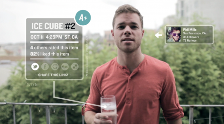
Jotly: Share Everything with Everyone


UPDATE: It was fake, but now it’s real. And it’s going to win everything. Download it now.

Ever since I started working in startup land, I’ve felt the need to ingratiate myself in the ever-buzzing world of *tech*. This means staying up on other companies, the blogs, and the general Silicon Valley scene. This can be very repetitive. People get funded, apps get released, and companies buy things. Sometimes a conference happens. Having spent the better part of the last few years neck-deep in this hullabaloo, I figured it was time to parody it.

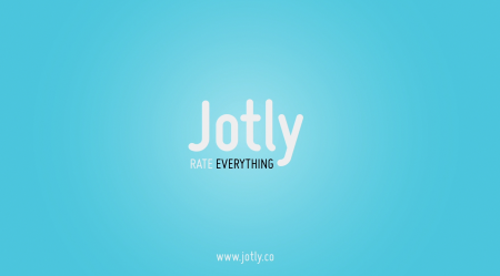
As I’ve written before, I currently am working on Nosh. Download it now please, it will give you some context. One of my periodic jobs is to drum up support for our beloved application. Of course we do this the normal way (press releases etc), but when I have a free weekend, I like to try and make something crazy and unusual to help things along. I call it the Skunkworks project (achieve victory by any means possible). We had great success with the 404 page, and the Jotly project was my next move. Continue reading for the full process behind the project.

(more…)

Hiring: UI/UX Designer


I’ve written about a few of my recent projects (404 Film, Nosh Promo, Firespotter Logo). These were all completed for Firespotter Labs, which is the startup I cofounded earlier this year. We started out with four of us and we are now thirteen, primarily engineers. Up until now, I’ve been the only designer. We are growing fast and the design needs of our company are such that one visually-minded pixel crusher is no longer enough. We are looking for another full-time interface designer.

Firespotter Labs is a startup. We are looking for someone that enjoys this kind of atmosphere. I’ve written a little bit about what it’s like and I couldn’t endorse it any more positively. Our first app launched about one month ago, so we are primarily working on it, but we have a couple other products in development that will need a lot of love.

If you’re interested, please email me at jobs[at]firespotter.com and use the subject line “Design Position”. We are looking for someone with a strong skillset in user interface design. Usability is key. If you can make things that look awesome as well, rock and roll. Please include a link to your portfolio and/or Dribbble. If you’ve worked on sites or apps in the past, it would be very helpful if you could link these as well.

We are hoping to fill this position as soon as possible.

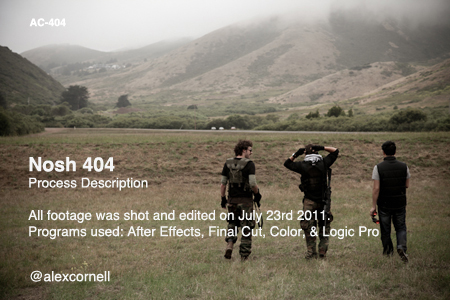
Nosh 404: Process Post


There’s always been an arms race of sorts, between startups, surrounding their 404 pages. Often times sites do something unusual on this (hopefully) seldom viewed page. When we first started working on Nosh, we had a lot of fun brainstorming ideas for our 404 page. We wanted it to be crazy and I think it ended up being just that.

Above you will find the video that became our 404 page. It’s loud, crazy and weird. Definitely the most fun I’ve had on a Sunday in a long time. I’ve written up some production notes here — if I miss anything feel free to ask in the comments and I’ll be sure to answer. Follow me on Twitter here.

(more…)

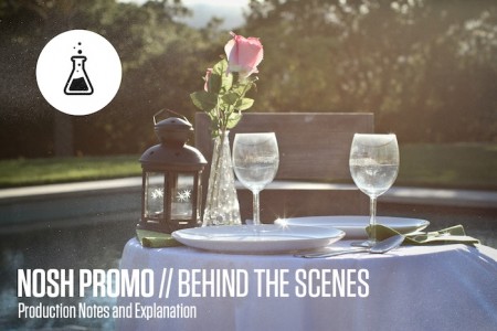
Nosh Promo: Behind the Scenes


Last week I wrote a quick post about the Nosh Promo video I made. Today I wanted to go into the production and describe all that went into its creation. Basically it was insane 25 hours from when we started, until the next morning when I exported the final video and the power went out in my apartment building (literally AS I hit export). Above you’ll see the composite I put together to show how each step of the post-process contributed to the final video. View the final video here or at the bottom of this post. I’ll describe each step in detail after the jump.

(more…)

Launch Day: Nosh


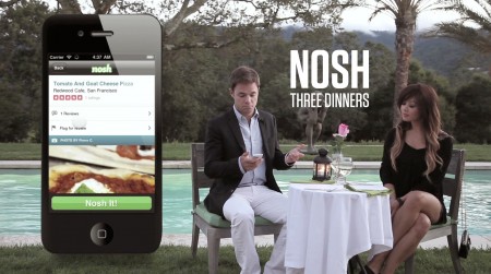
I don’t think I’ve slept in days. Today our company launched our first app: Nosh. Above is the promo video I made a few days ago which will give you a quick little intro. I plan to write a few process posts on this whole thing: one on the video (which was an EPIC 24 hour production), at least one on the app development, the branding…there was an insane amount of work that went into all this that I’m really excited to share. For now though I am beyond exhausted and am going to go sleep in my chair.

Check it out and let me know what you think! You can read the Techcrunch article here. I’ll write more details later

Firespotter Logo Design Process


While it’s fresh I thought I’d write up the process behind the Firespotter Labs logo I designed. This was an incredibly fun logo to design and probably one of the quickest, at least when contrast to some of the luxurious multiple month (!) design explorations I’ve done in the past for school or other companies. That said, it was exceptionally challenging; it’s hard to take a step back and think objectively about the company you’re a part of.

Before this, I had already designed a couple logos for some of the products we’re working on now. I had to break out of the “consumer application” design mindset I had been entrenched in for a few months. For the mothership, we needed something that conveyed that we were a lab full of crazy people brewing up cool things, while simultaneously appearing to be trustworthy gentlefolk worthy of venture support.

(more…)

A Visual Life: The Sartorialist


Scott Schumann, also know as the Sartorialist, is the subject of this short and sweet documentary by Intel. It’s very well done and shows some cool behind-the-scenes of Scott’s process. I always wondered how he approaches people on the street! When I was in Japan, I saw some extremely cool fashion walking around, but was usually too nervous to ask people for a photograph (though I will say, asking in Japanese was 100% successful because they were usually laughing at me). Anyway, this documentary is terrific, and short enough that even the most ADD of you can probably make it through.

You know you never know what it is, what that the thing is that draws you to that person, but you just let it happen. It seems odd, but it’s almost like going out there and letting yourself fall in love everyday. – Scott Schumann