Posts in Products

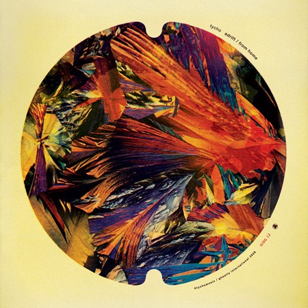
New Tycho Single Out 5/27/08

Tycho-Adrift-ARGB1998bg
Update: The single is now available, click here for more info.

The new Tycho single / b-side entitled "Adrift / From Home" will be out next Tuesday, May 27th, 2008. This marks my second release with Ghostly International leading up to the full album scheduled for next year. This single will be available exclusively through iTunes for the first month, and at all other online retailers thereafter. While Adrift is a brand new, unreleased track, some of you may notice that From Home was originally released as part of the Past is Prologue album on Merck. This is because as part of this series of singles, I’ve decided to include the extra tracks which were included on the Merck version of Sunrise Projector (renamed Past is Prologue) so that they are available individually for people who bought the original version of the album and missed out on the new material. I’ve posted a couple clips of the songs below, enjoy.

On a design note, this of course represents new ISO50 work. It’s the first album cover I’ve done in a while and I really enjoyed the process this time around. I wanted to evoke the feeling of a 45 record from the heyday of singles and go with a really reserved, minimal type treatment. It’s also meant to carry over the circle concept from the last single. Anyways, on to the music:

Tycho – Adrift

[audio:adrift_clip.mp3]

Tycho – From Home

[audio:home_clip.mp3]

More Info at Tychomusic & Ghostly International.
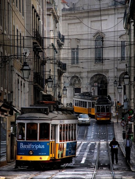
Lisbon Bound

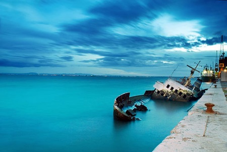
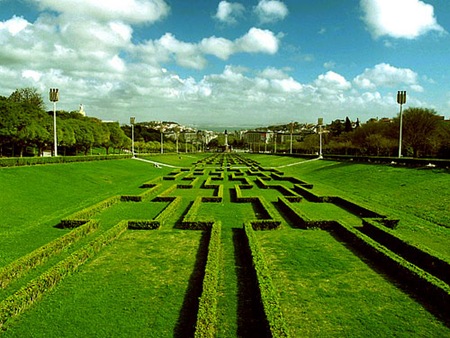
lisboa2 lisboa lis2
Headed out for Lisbon tomorrow morning for the OFFF. I’ll be bringing my camera and hopefully getting some good shots. I’ve never been to Portugal, just heard a lot of good things. If it’s anywhere near as great as Barcelona I’ll be happy. 

There will be an ISO50 booth at the OFFF Festival complete with shirts, prints, CDs, etc. Stop by and say hello if you’re in the area, the Mercadillo is free admission. See you out there!

Photos via rabataller, Matilde B. & rabataller respectively.

1976 Tri-Blend

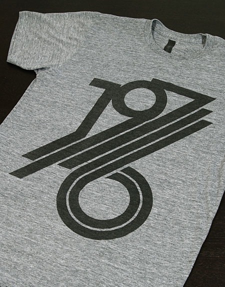
1976hgc
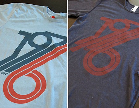
I’ve been loving the American Apparel Tri-Blend heather shirts for a while now and I’ve finally added one to the ISO50 tee lineup. If you’re not familiar with them, they have a sort of old school feel, a bit more elastic and form fitting than the 100% cotton AA stuff and a lot softer and light. A perfect summer shirt for sure. The design has been screened on without a base-coat to lend a mildly worn effect to the print, it really blends well with the heather shirt. The 1976 design is now available in Heather Gray Tri-Blend at The ISO50 Shop.  Get them while they last, this limited first run is moving fast!

ISO50: Northern Lights Print

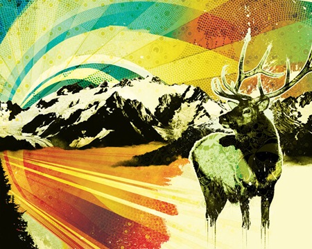
iso50-nlights
Thought I’d give the blog an early heads up: A new print called "Northern Lights" will be released tomorrow morning at The ISO50 Shop. You can get it early now, the first printing is only 200 and they’ll go fast once the newsletter comes out tomorrow. Get yours now!

All the Computer Arts readers may remember this was the illustration I did for the cover a couple years back. It also ended up as a line of snowboards for K2. I’ll post some pictures of the various formats it saw life as once I get home tonight.

The D’s Have It…

iso50-offfnyc07-d
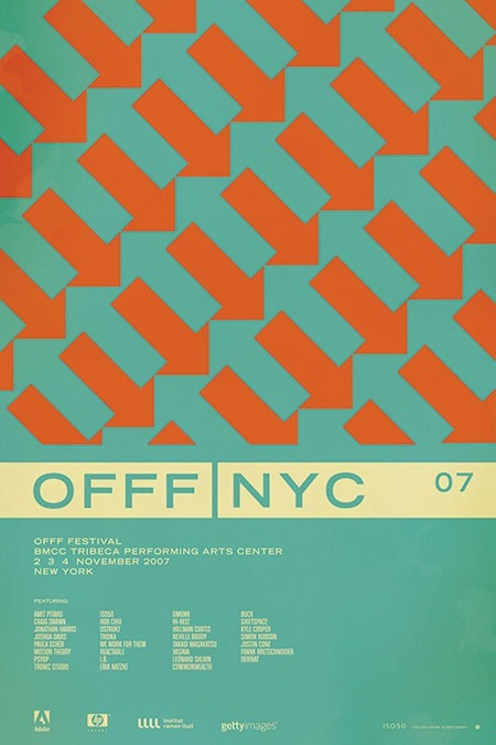
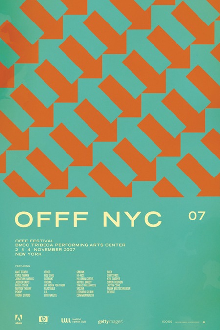
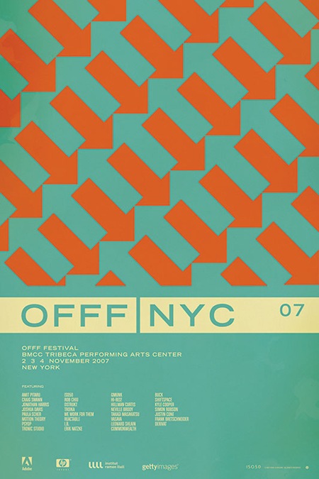
So after going through all the comments on the contest post for the OFFF NYC 07 print, it looks like the general consensus has swung in favor of version D (pictured above).  After all of that, I’m still not 100% convinced which I like best. So I will be eventually printing a few versions, but the first to go out will be version D. 

As for the winner of the contest; there were a lot of great analysis and it was hard to pick just one that said it best, so I picked two.  And the winners are…..

Jacob Rubin (hrubinj)
Stephen Lynch

They will each receive a signed edition of the print along with some other stuff from the shop.  I’ve also picked a few runners up who will be getting some Tycho MP3s for their efforts.  Thanks to everyone who weighed in on this, so many great comments and good advice. This was definitely a good learning experience.

Design Democracy: OFFF 07 NYC

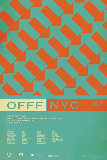
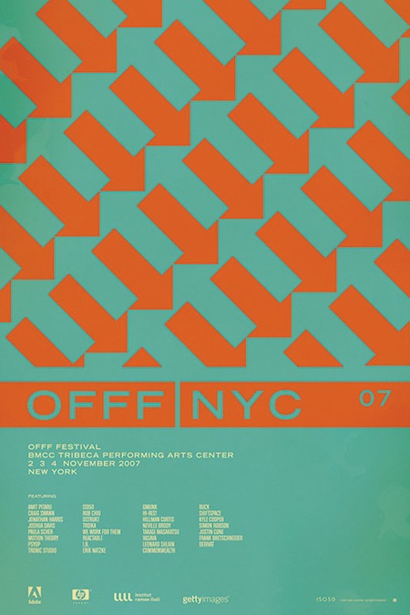
ISO50-OFFF_NYC_07AISO50-OFFF_NYC_07B ISO50-OFFFNYC07_C ISO50-OFFFNYC07_D

VOTING IS NOW CLOSED!
Thanks to everyone who participated, I really appreciate all the great feedback. I will be going through and picking a winner over the weekend, you will be notified via email if you’ve won.

UPDATE: As per Damo’s request this is now a contest. The best analysis will receive a signed copy of this poster. You must enter a valid email address in the email field when placing your comment so you can be contacted if you win (the email address is not viewable by the public).  If you’ve already entered a comment but did not enter an email address, just place another comment with the email and reference your original comment.  I can see the IP address you post from to match them up. This contest ends this Friday, Feb. 15th.

UPDATE: After considering some of the early responses to this post (namely Jacob’s) I’ve added two more versions for your consideration.

So I have been putting together a batch of prints that will be released over the next few months. Included is the poster from the OFFF 2007 festival in New York. There have always been multiple versions and I’ve really had a hard time deciding which I like best, and consequently, which will get printed. So I thought I would try a little experiment and let you guys choose your favorite. They are shown above in order: verions "A", "B", "C", and "D". Let me know which you like best by sounding off for A, B, C, or D in the comments. Or you could just say they are all terrible and to start over. Click the images above to view larger versions of each.

My 2 cents: At this point I think B, C, and D are the strongest. B has a cleanliness and reservation about it that I like. The type is able to stand on it’s own and given that it’s Trade Gothic Bold Extended, that’s a very good thing. But I think the solid bar in C and D really pulls things together.  Right now I am really leaning towards C just because it feels so cohesive. The top portion is reserved for the red / orange color and the bottom, informational portion has the cream. I think this links the main title and the arrow design together nicely and makes the overall composition feel more like a single unit whereas some of the others seem a bit broken up.

Click here to cast your vote in the comments

1976 is Back

1976back
The 1976 shirt and thermal are both back in stock along with the Past is Prologue shirt.  These are the final days of the Holiday Sale so get over to The ISO50 Shop while it’s still on!

The Daydream / The Disconnect – Proper

itunes1
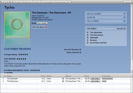
As many of you noted, iTunes originally only posted "The Daydream" as a single; "The Disconnect" was supposed to be included as the B-side.  The error has been fixed; the single now shows up as a new item with both songs included. Unfortunately it is now missing all the original comments and ratings.  At any rate you can now get the full version of the single here.

Others have asked whether there is currently any alternative to iTunes for purchasing the songs.  Ghostly released the single as a 2 month exclusive on iTunes, so when that time is up it will be available everywhere, including right here for direct purchase.

Reprints

stock4
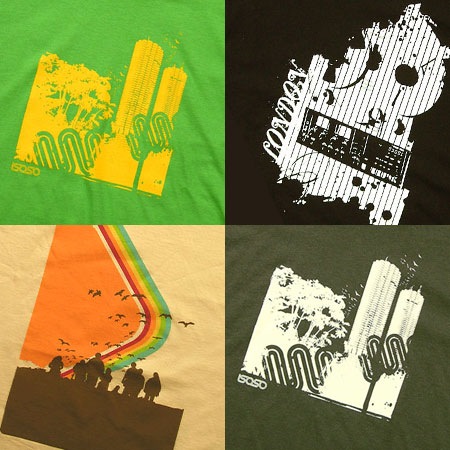
The Marina Green, Marina Asphalt, London, and Command shirts have all been reprinted and are now in stock at The ISO50 Shop.

Prints on Video

Found this on Youtube.  By Joaquim who, if I’m not mistaken, comments on this blog now and then.