Posts in Products

Gallery+Show – Saturday in Sacramento

Cover
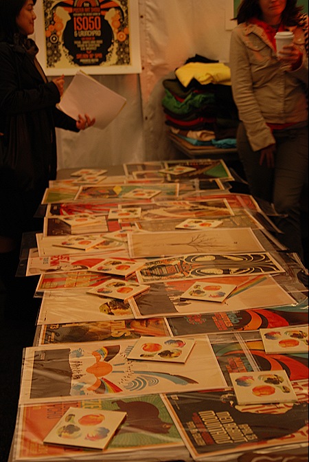
I’ll be doing a poster show at Sacramento’s Artisan Gallery this Saturday, 11/10/07.  There will be large format Giclee versions of many of my prints on display as well as a lot of 12×18" show posters.  All will be for sale along with prints from the shop and t-shirts. Afterwards I’ll be doing a Tycho set with visuals and all.  Try to make it out, it’s free and it’s a very cool venue so should be a lot of fun.  This will be part of Sacramento’s "Second Saturday" art walk which is always a great time. The show runs from 6-11pm.

Saturday, November 10th, 2007
6-11pm
Admission: Free / All Ages

Artisan Gallery
1901 Del Paso Blvd
Sacramento, CA 95815
(916) 648-0260
ISO50 @ OFFF NYC – FINAL DAY

DSC_0014
Today is the final day of the OFFF festival in New York.  I want to thank everyone who came out to see my talk on Friday and the workshop on Saturday.  I’ll be around all day Sunday so if you haven’t already, stop by the ISO50 booth (right in front, no OFFF ticket needed) and say hi! I’ll also be playing a Tycho set Sunday night at the OFFF after party.

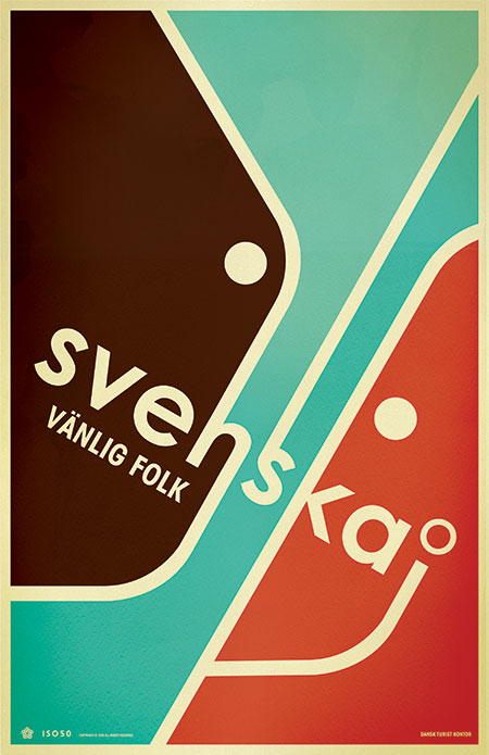
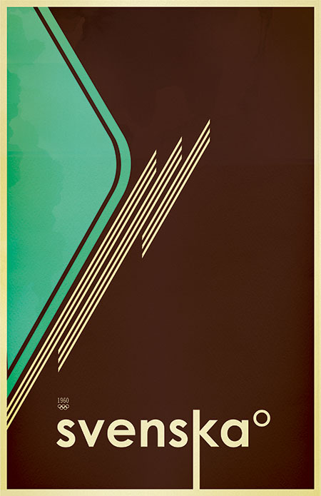
SVENSKA 2 ALT

svenska2b
Alternate version of Svenska 2. All you Danes out there please correct my grammar!

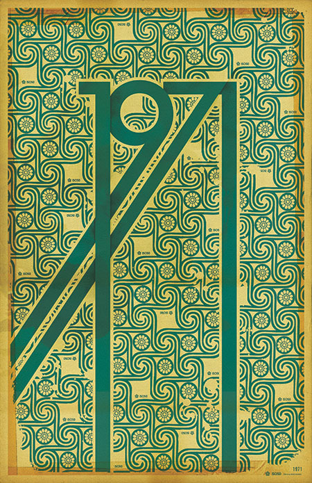
1971 – Reprinted

iso50-1971c.jpg
The 1971 Print has been reprinted and is now in stock at the ISO50 Shop.
A lot of people have asked me what the significance of the year 1971 is (no, it’s not the year I was born). Hunter S. Thompson’s “Fear and Loathing in Las Vegas” first appeared as a two part series in Rolling Stone magazine that year. Wikipedia sums up the main theme of the book which was based on these articles:

“It explores the idea that 1971 was a turning point in hippie and drug culture in America, when the countercultural movement no longer had momentum and its innocence and optimism of the late 1960s turned to cynicism.”

This print sort of juxtaposes the design ideals of the 60’s: the earth-tones and swirling, psychedelic, patterns; with the harsh, solid forms of the gothic lettering.
Oh, and also 1971 just looks badass all stretched out like that.

October ISO50 Newsletter


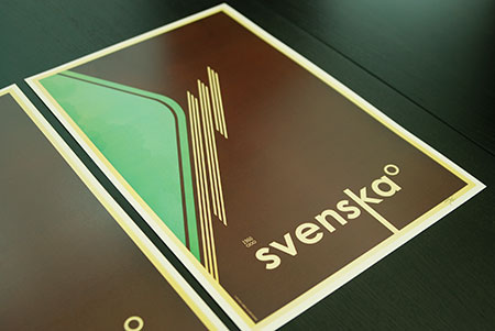
The October issue of the ISO50 Newsletter is out now and among other things, announces the release of the “Svenska 1B” print (pictured above). This third and final version in the Svenska series is available now at the ISO50 Shop.
The newsletter also covers details on the upcoming New York OFFF festival and the upcoming Tycho single release date. You can read the newsletter here or sign up here to get the latest delivered straight to your inbox monthly.

OFFF NYC 07 CATALOGUE

offfcat.jpgofffcat_1.jpgofffcat_2.jpgofffcat_3.jpgofffcat_4.jpg
Just finished the cover for the NYC OFFF festival (New York – Nov. 2-4, 2007). This is the book that’s given out to all attendees and features work by many of the speakers and presenters at the festival (might have to squint a little to read the titles better). I’ll be hosting a workshop / lecture, all the details are here. It will be a similar workshop to the one I did in Barcelona this summer and will be focusing on technique with a lot of deconstructions and hands on examples of my process and theory. As with Barcelona, space is limited (230 people per workshop this time), but unlike Barcelona the workshop is included in the cost of the festival pass, there’s no additional registration required, it’s just first come, first serve. You can snag tickets to the Festival here, as of this posting they are nearly sold out so get on it! As stated in an earlier post, there will be an ISO50 booth for all three days of the festival with shirts, prints, and music. See you in New York!

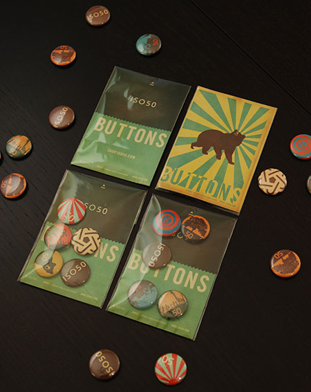
ISO50 Buttons

iso50buttons.jpg
Buttons!

Avant Garde + ISO50


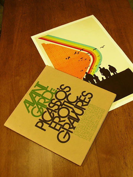
Avant Garde Magazine #8 next to the Command Print. Thought they made a nice pair. Avant Garde was a short lived art/culture magazine in the late 60’s-early 70’s. The magazine itself always had great art direction and layout, but it’s main contribution was, of course, Herb Lubalin’s logo which was the basis for the ITC Avant Garde typeface. This has always been a very controversial font in the design world, many claim it is overused and abused. Lubalin himself thought the face was misunderstood and overused, rendering it something of a 70’s cliché. Whatever the case may be, I have found it to be a striking and versatile font in my own work. The Madrone print is a good example of how I like to use Avant Garde, it’s strict forms and tight angles make perfect building blocks for large scale use.

Svenska Version 1B

ISO50 - Svenska Version 1B
This is a variant of the Svenska print I did that has yet to make it into printed form. I will be posting random variations of some of my released work to hopefully give a better look at the process of working through a design and refining the various elements. The original Svenska print is here and version 2 is here.

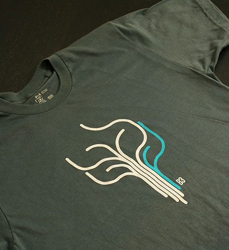
New ISO50 Shirt – Paths 2

ISO50 - Paths 2
The new “Paths 2” shirt is available now at The ISO50 Shop. It’s printed on an American Apparel Asphalt tee and features an Aqua / Cream colorway. Check it out >