Posts in Random Nostalgia

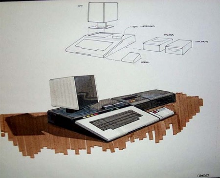
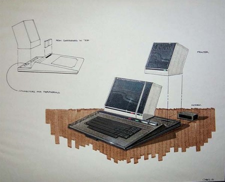
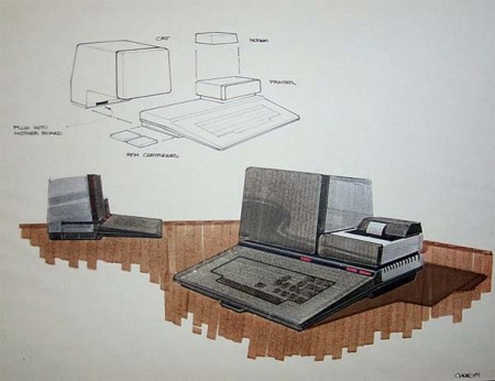
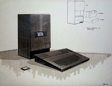
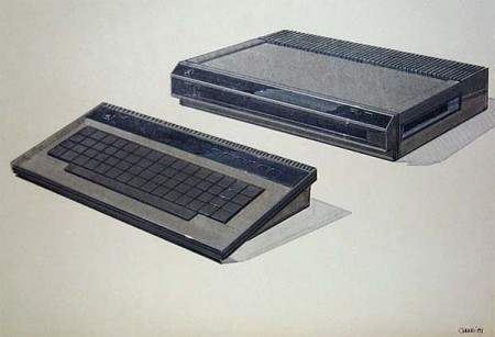
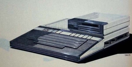
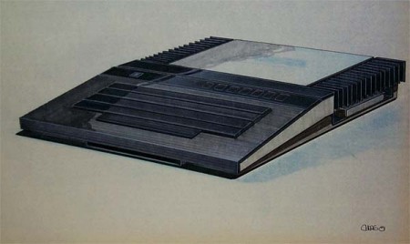
Atari Computer Concepts


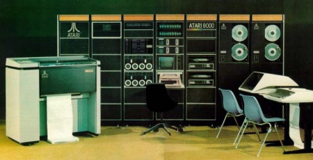
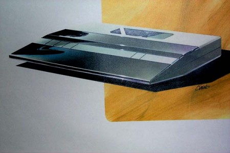
You may find this entirely crazy but growing up I was only graced with the opportunity to play an Atari once. Even though I wasn’t born in the 70s and barely born in the 80s, the Atari console seemed really cool but I still never owned one. I hope I’m not the only one out there that wasn’t able to log hours on an Atari as a kid. Looking back at them now, I would have bought the 2600 in a heart beat for the sake of the small yet stylish wooden veneer accent.

These drawings were really making leaps and bounds between concepts. In some of the drawings parts were nixed and replaced with other ideas. The cooling fans for example get moved back and forth as the concept progresses. Seeing stuff like this is very inspiring; it gives me a target to aim at for progressing my own sketches for future projects.

Images via Colorcubic & Atari Museum.

(more…)

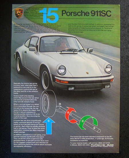
1980s Vintage Porsche Ads


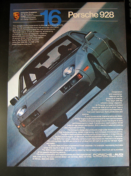
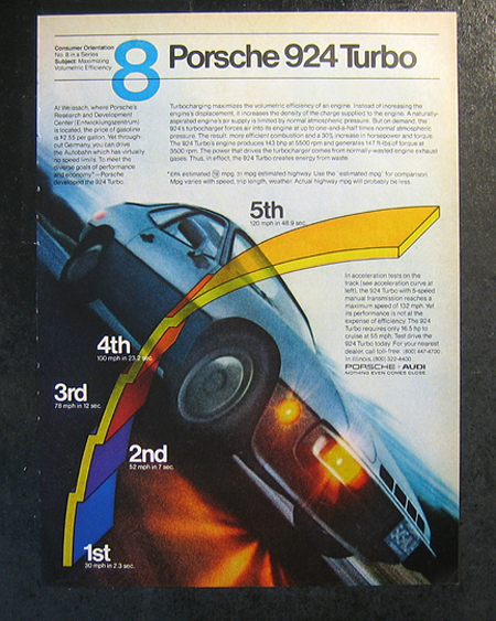
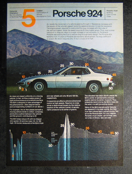
It’s funny how a lot of those things that you thought were boring when growing up, are now actually really fun things to do. I never would have thought I’d spend a sunny Seattle Saturday sifting through tubs and tubs of posters and ads. But its a damn good thing I did because I found these vintage Porsche ads. I was tempted to purchase all of them but instead I wrote down some info and looked them up online. All of these ads I found on eBay and were from the 1980’s. A few of them might be late 70’s, but it’s tough to tell.

The thing I really like about these ads is that they feel authentic. That’s not to say that ads nowadays aren’t authentic but there is certainly more than enough CGI being done to them. It also seems like it’s rare to see such nice large type of this treatment in ads anymore.

Sander from the comments informed us that Helmet Krone was the designer behind these ads—more info here.

(more…)

Atomic Rainbow Over Honolulu


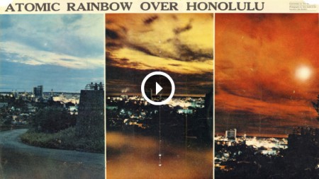
Just caught this on NPR and was reminded of a couple great films: the William Shatner Narrated Trinity and Beyond (The Atomic Bomb Movie) and Nukes in Space: The Rainbow Bombs. Both were excellent docs that featured meticulously restored film footage from US atomic tests on land and in space (and also anywhere else they could make up a reason to blow up). The space tests are particularly (eerily) beautiful, the title Rainbow Bombs is very apt.

Happy 4th!

Alex Varanese


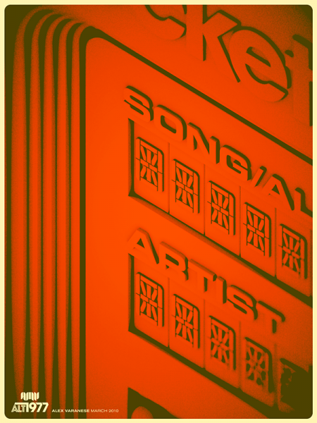
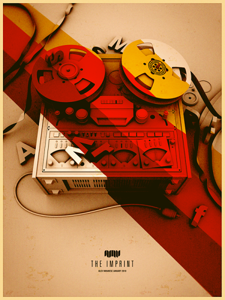
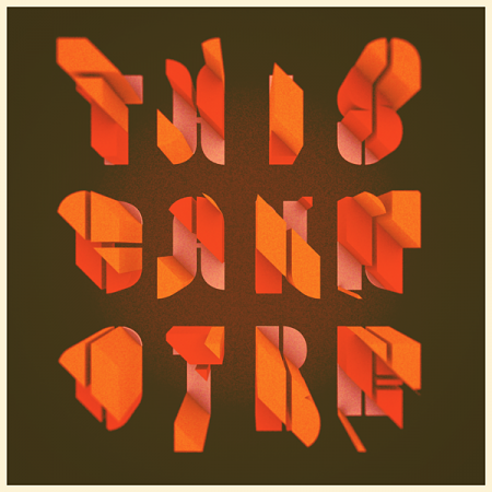
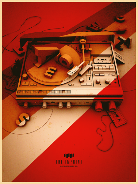
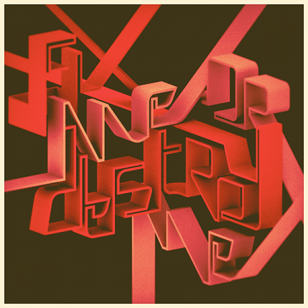
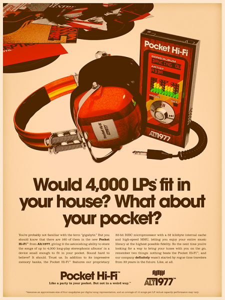
We’ve posted on him in the past, but I’ve seen Alex Varanese around a lot lately so I thought I’d put up some more of his work. He made a splash on Reddit yesterday, making it all the way to the front page (which, for the uninitiated, is sort of a big deal — at least among geeks and programmers) with his recent Alt/1977 series. This sort of overt retro-ism doesn’t always settle well with me (Yes, perhaps the pot calling out the kettle, but I’m a fan of restraint in these circumstances), but Alex executes so well you can’t help but take notice. His mastery of the orange spectrum is unquestioned and while there is a bit of borrowing from the James White bag of tricks — and with some of the type-centric work, maybe more overtly so, Alex Trochut — it is a very focused and impressive collection of work. I don’t think I’ve seen 3D meld so well with this sort of textured print aesthetic in a while and the noise he’s getting in those color fields is spot-on.

Check out more at Alex’s Behance and check out this process piece Alex did for Signalnoise.

Expo 67 Passport


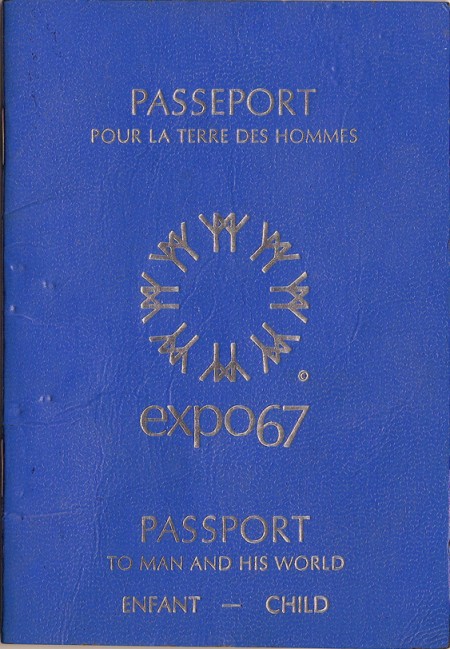
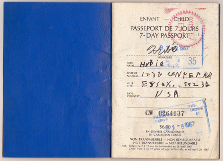
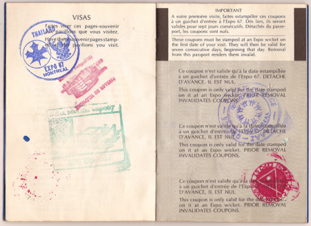
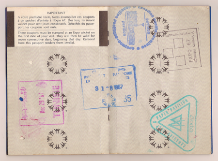
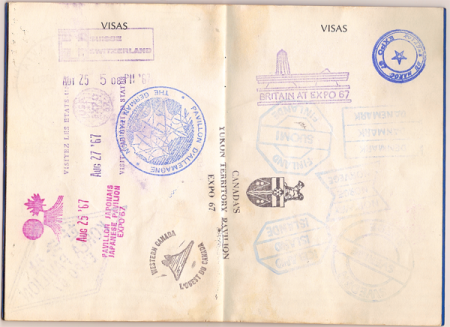
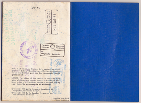
As evidenced by the various posts I’ve made on the subject, I’m quite fond of all things surrounding the World’s Fair Expositions. So when I found this gem on Ian Henry Smith’s Blog, Smallcano, I was pretty blown away. For someone who has fetishized all manner of official documentation since childhood, seeing an artifact that somehow combines the ideas of a passport and a 60’s-era World’s Fair Expo was pretty much the holy grail. The stamps send this thing over the top; it really doesn’t get any better. And check out the Habitat 67 stamp on the last image! I swear I’m going to get a tattoo of one of these.

According to Ian from Smallcano, he found this thing while “rooting around in [his] parents’ basement”. For me, this is basically the equivalent of those old stories about digging up a cigar box with a Honus Wagner in it. My only gripe is that the images are scans and not photos; scans don’t do objects like this justice. So Ian, if you’re reading this (I found the link through a comment he left here), thanks so much for posting these, but please shoot the passport on a nice wood table or something, a’la Insect54. That is, if you have the time, we’ll all thank you!

Via Smallcano

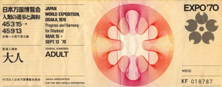
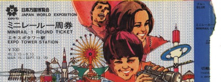
Expo’70 Ephemera


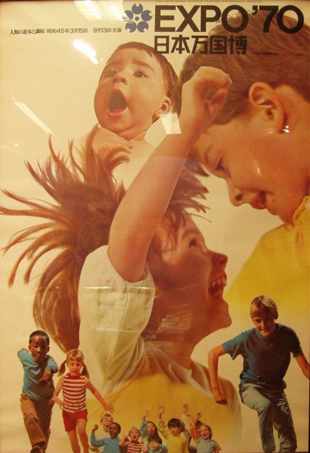
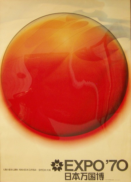
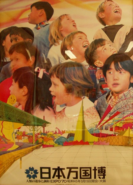
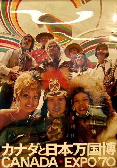
A nice collection of posters and tickets from the Expo’70 in Osaka Japan. I’ve been looking for proper scans of these posters forever but I settled on these corrected versions from this flickr set. Anybody know where you can score some copies of these? I found this one on eBay, but not really the style I’m looking for. Nothing I love more than 70’s phtography blow-up with bold Helvetica over top. It’s always a little sad to see stuff like this and realize how rare it is; it’s a shame there isn’t some sort of high res vintage poster repository.

On a side note, Canada: you always have great design instincts but I have to say, you really blew it on this one. Winking Caucasian Indian? Also, what’s with the attempted Geddy Lee up in the corner? Couldn’t you get the actual guy to be in your poster? But I guess not all 70’s Canadian bassists were in Rush. You saved it with the type lockup on the bottom though.

Images via Sanue and Lilakanarie

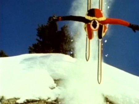
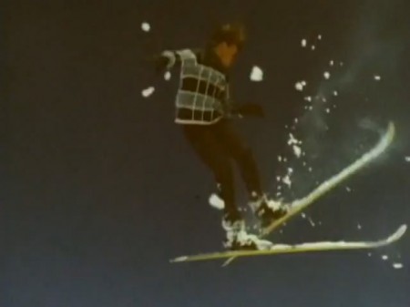
History of Ski Aerial Acrobatics

httpv://www.youtube.com/watch?v=5L2Zdaq9PA0


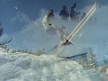
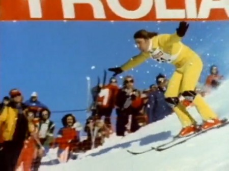
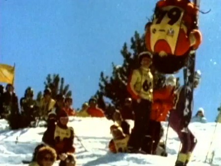
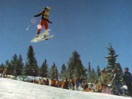
After watching the Winter Olympics I found this History of Ski Aerial Acrobatics pretty amusing. The whole thing is basically just a bloopers reel of guys eating it off of jumps. Towards the end they start nailing the landings though and the super-8 style film is pure vintage goodness. Check the awesome lens flare at 3:24.

Video Link | Via Bruno Aeberli

Studio 1.0


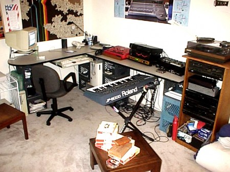
We’ve had the “Random Nostalgia” category on this blog for a while, but I think this is the first time a post has truly fit the bill. I was searching around my hard drive last night and stumbled upon this gem from my past, the photo you see above (sorry for the poor quality, I can’t find the original photo I scanned this from). I’m not quite sure, but this is probably from sometime around mid-1999 in Sacramento. This was the firs time I assembled what I would consider a proper studio, although it was just my bedroom (you can see the futon folded up in the right corner). I think before this I had a Roland MC-303 and SP-202 set up on a dresser in the corner so this was a big step up from that. This was also when I started using a computer to record; I had previously recorded everything into an ASR-X Pro sampler which could handle about 6 minutes of audio. I would then record the outputs of that to Minidiscs (still have a huge box of those I need to sift through).

This was before I really started designing but if you look closely you can catch one of my very early visual influences on the left wall. I rescued that tapestry thing from a dumpster; it depicts a waterfall made of rainbows. Pretty bad I know, but looking back I realize that color scheme and subject matter informed a lot of my earlier work. Not sure what happened to it, must have lost it in a subsequent move. The same goes for the other stuff, the only things I still have around are the computer keyboard, the grey box in the stereo cabinet and the wooden table in the foreground. I gave the keyboard stand to Dusty Brown and I saw it at the show in Sacramento this weekend, nice to know it’s still alive and well with the same Renthal sticker on it. As for the other stuff, it was either sold on eBay or junked (the milk crates that are holding up the desk, for example). Here’s a kit list of what I can make out from the picture:

– ASRX-Pro Sampler / Sound Module. Used this to make Science of Patterns a few years later.
– Roland JP-8000 Synthesizer.
– E-MU Orbit Sound Module (don’t ask why I owned this)
– Yamaha Stereo EQ
– Gemini 4-channel DJ mixer
– Sony MD recorder

Crazy story about the JP-8000, I put it on eBay about a year after this shot was taken. The winner of the auction was from the area so he came out to pick it up. It turned out to be Shaun Lopez, we ended up becoming friends and he still does mixing work on my tracks today (Daydream, Adrift, Disconnect to name a few).
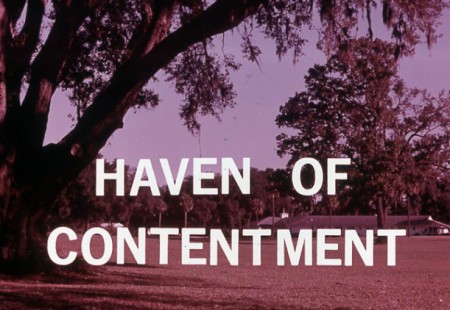
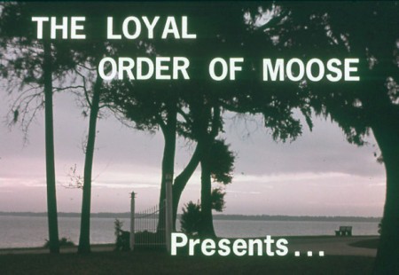
The Haven of Contentment


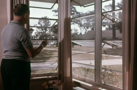
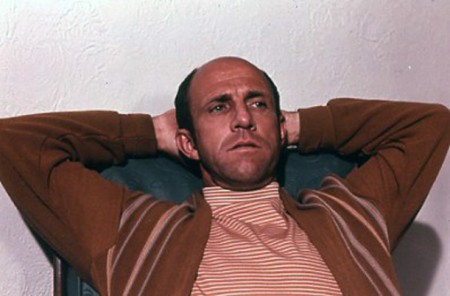
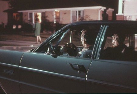
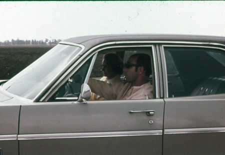
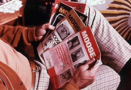
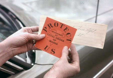
From Square America — the same people who brought us the excellent “IBM Slides: 1975” — comes this set of images depicting what seems to be a Moose Lodge-sponsored neighborhood watch program of some sort. I love hand-set type like that; so perfectly imperfect.

Also love the name, reminds me of this.

Vintage Ski Ads Pt.2: Skis


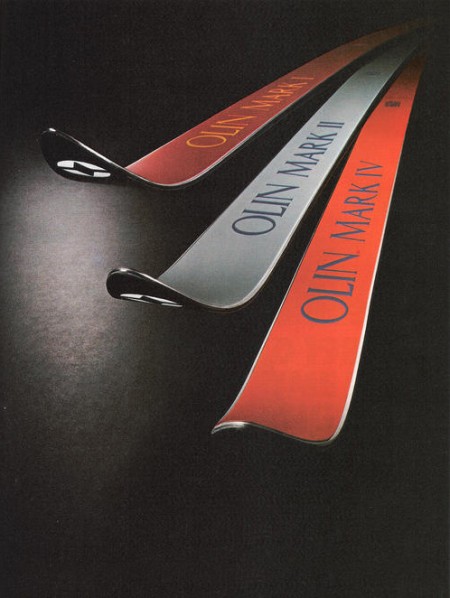
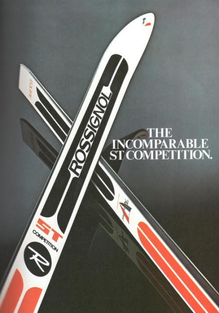
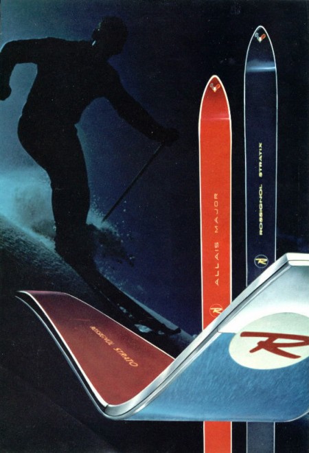
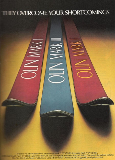
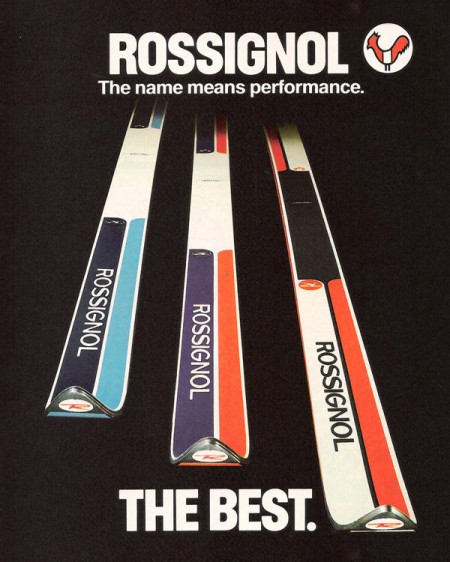
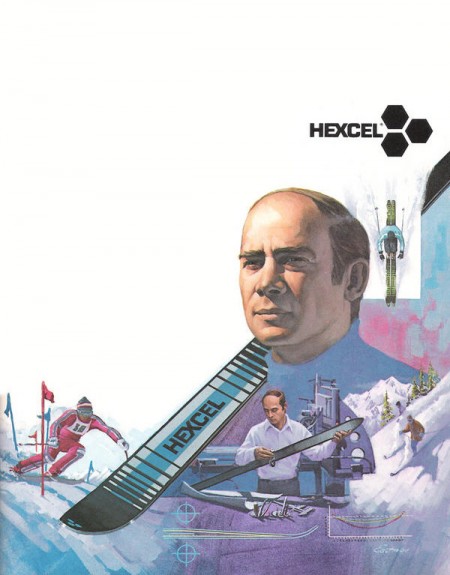
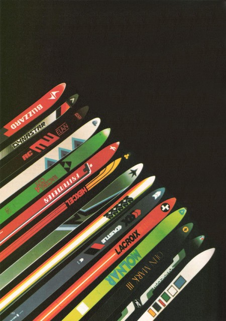
In part 2 of the Vintage Ski Ads Series I chose some that focused in on the skis themselves. When I see skis these days they either look like pop culture threw up all over them or they were designed by the same guy who makes the info graphics at the bottom of the ESPN screen. Looking at the examples above it’s plain to see they had a little more appreciation for subtlety and a sense for classic design back in the day. Either that or the printing methods were such that they were limited to simple shapes and colors and the designer in me is just picking up on that.

When I think about it, this could be the case with a lot of older stuff. I think we as designers often appreciate unintended aesthetic elements; things that were a function of necessity or limitation rather than deliberate design decisions. A good example would be vintage audio equipment. I think the Neve Sidecar is one of the most beautiful inanimate objects ever created. But when you really look at it you realize it was designed by engineers; pretty much every design decision was dictated by necessity and function. So I must be reinterpreting that as physical beauty creating a connection between the idea of an object’s functionality and it’s aesthetic beauty. In other words, maybe I only like how it looks because I appreciate how it works (or in this case, sounds). Then again, I have some gear around the studio that I love the sound and functionality of but is just downright ugly to look at.
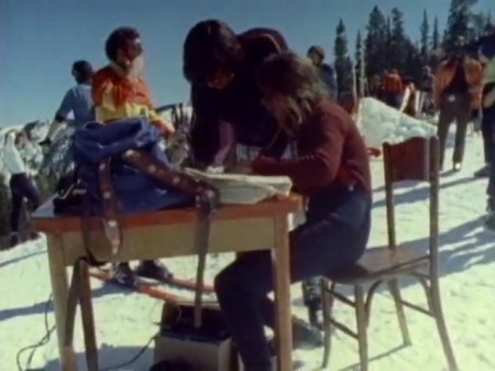
Anyways, all those Rossi’s are incredible. This whole style needs to make a comeback, but it seems these days people need to be beaten over the head with design instead of left to appreciate its finer points on their own. I’m not saying there’s not a place for busy, crazy graphics on skis — I myself have designed several busy, crazy skis — I just wish there were more like these to choose from. I guess it’s a different industry, no longer do guys in mock turtlenecks with comb-overs get all scientific and wear collared dress shirts while developing new skis in the lab, now it’s just this guy and a Nintendo DS in a dark room.