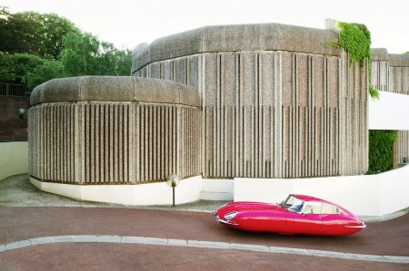
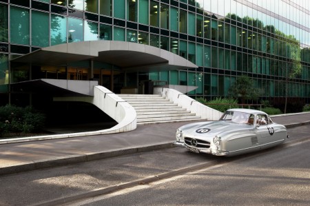
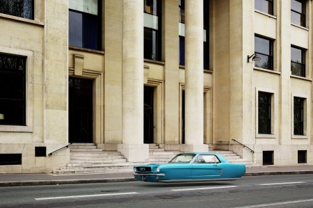
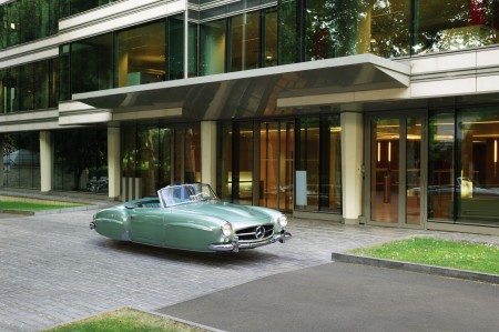
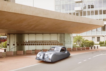
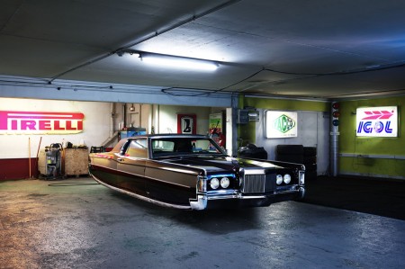
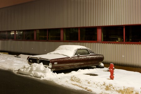
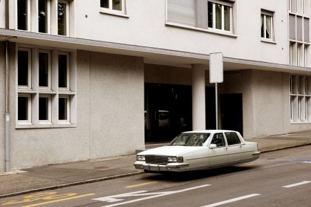
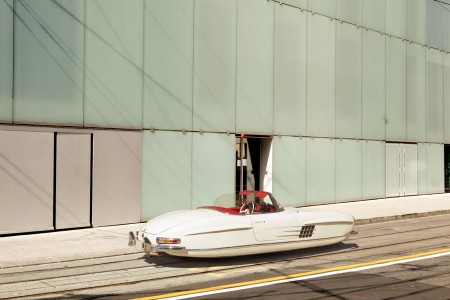
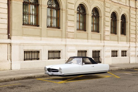
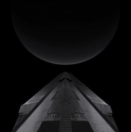
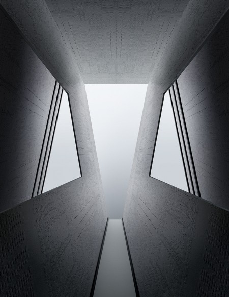
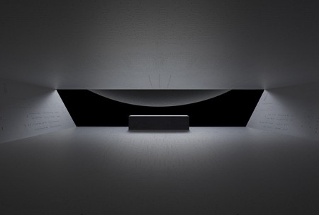
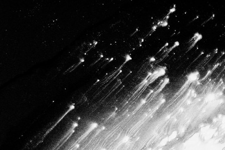
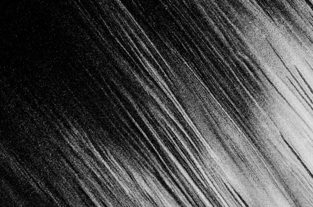
French photographer Renaud Marion created the Air Drive series, to show how he imagined in his childhood what cars would look like in the 2000′s.
Posts in Series
Air Drive
Adrift on the Hourglass Sea
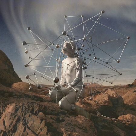
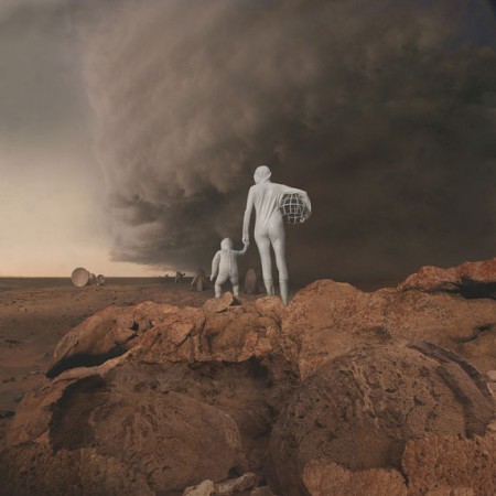
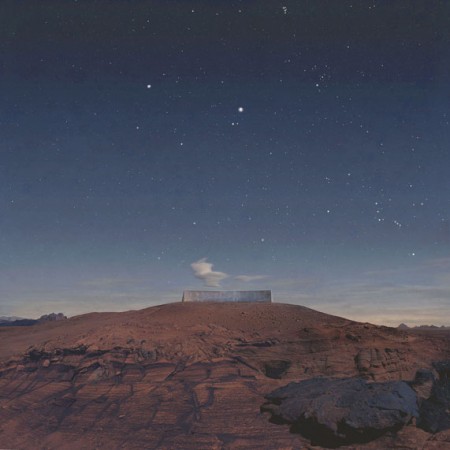
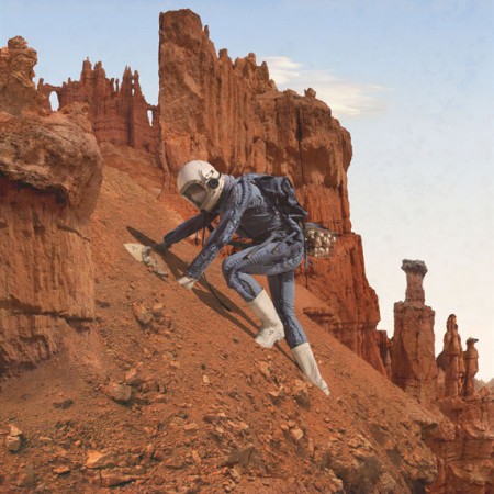
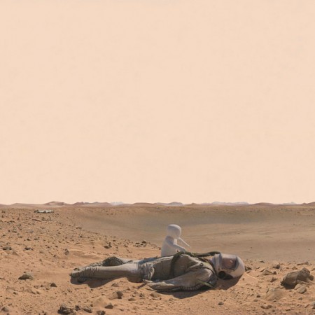
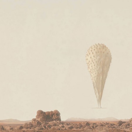
Kahn & Selesnick’s amazing martian-inspired photo series, gluing actual photos of the martian landscape taken by NASA’s Spirit & Opportunity rovers, with WWII bunkers, concrete sculptures, vintage russian space helmets, and landscapes in Nevada and Utah. Mmmm.
Weekend Inspiration: Alberto Seveso
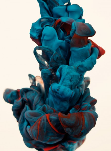
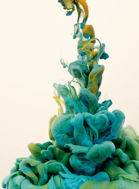
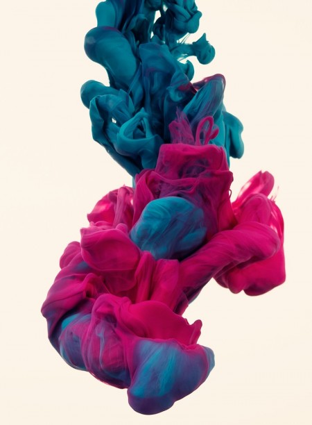
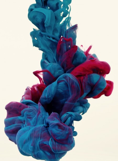
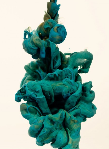
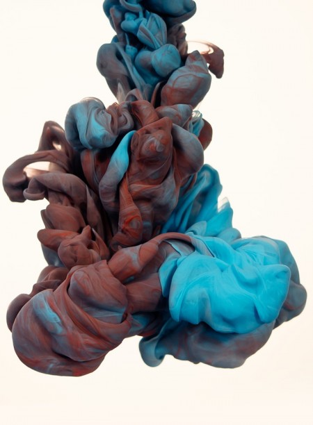
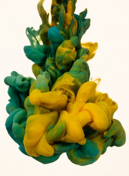
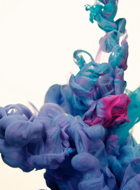
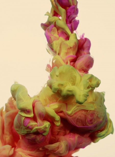
Italian artist Alberto Seveso was born in Milan, but is now working as a freelancer in Portoscuso, Sardinia-Italy. In his series a due Colori Seveso experiments with high-speed photography while trying to find a new way to make something beautiful using ink and water. Loving to play with colors and tones, this series embodies the concept of stopping time through ink in the image.
Found via Ignant
Weekend Inspiration: Nick Frank
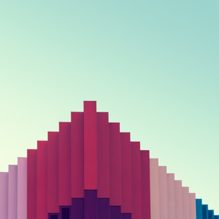
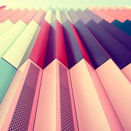
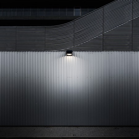
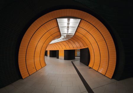
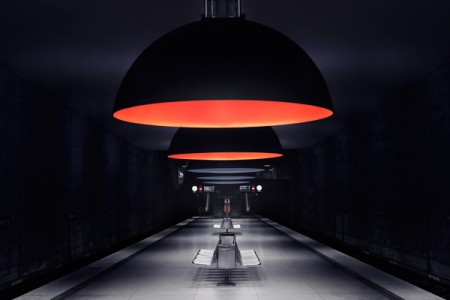
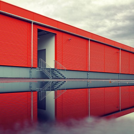
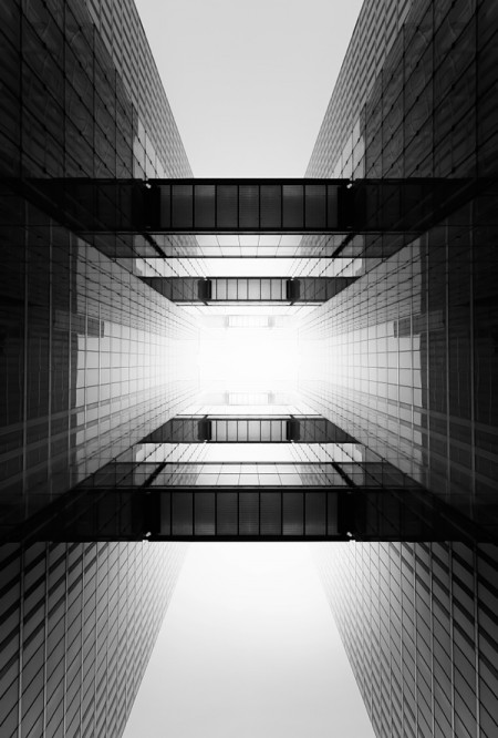
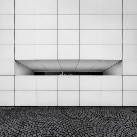
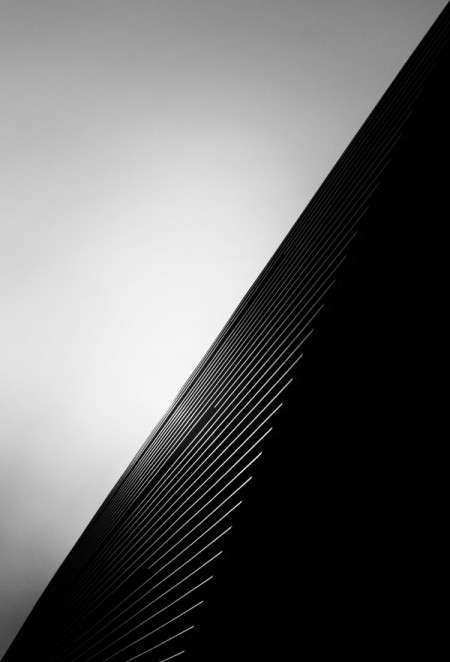
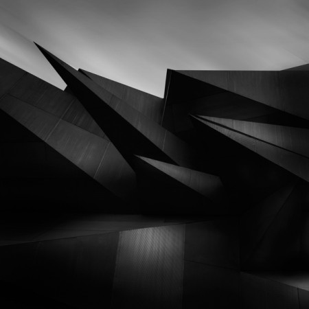
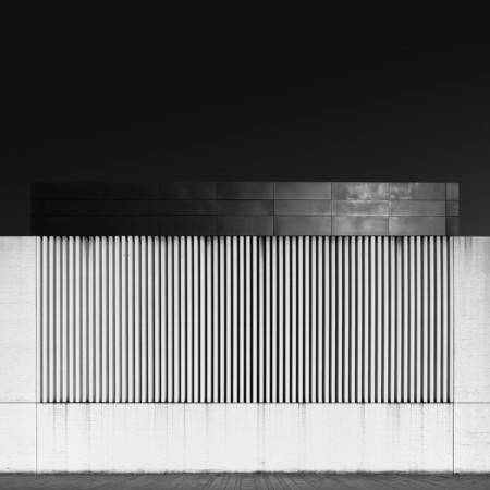
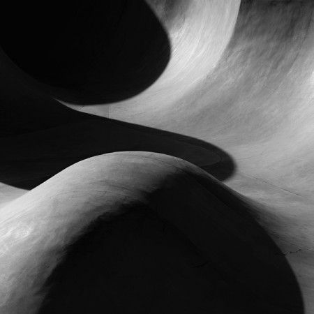
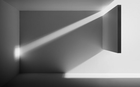
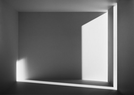
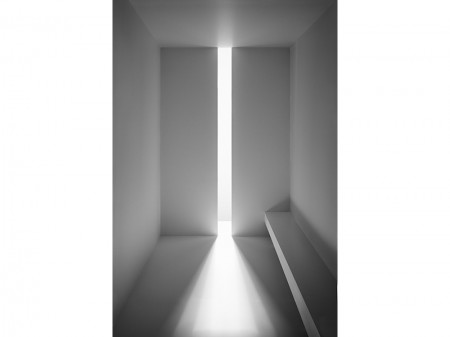
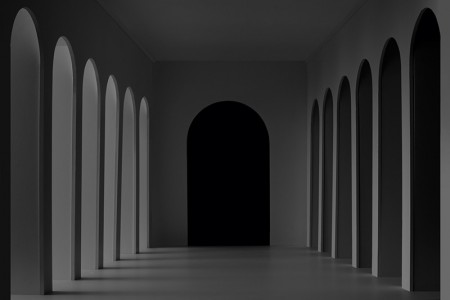
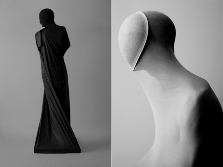
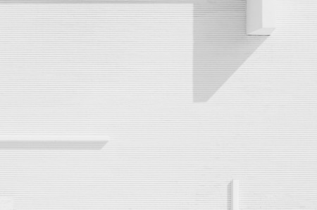
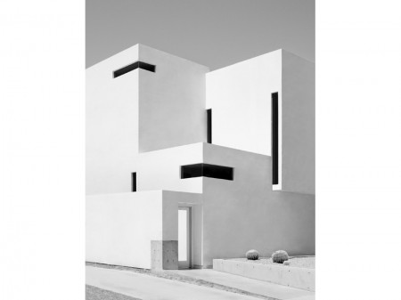
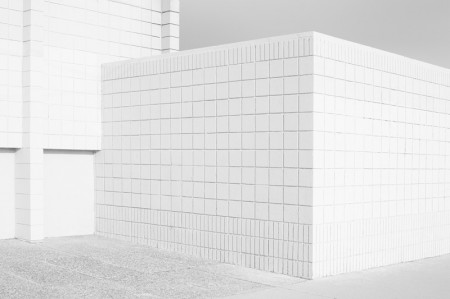
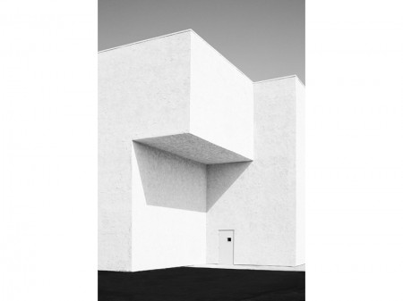
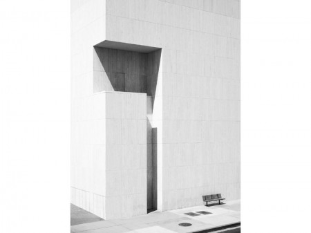
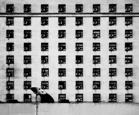
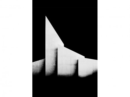
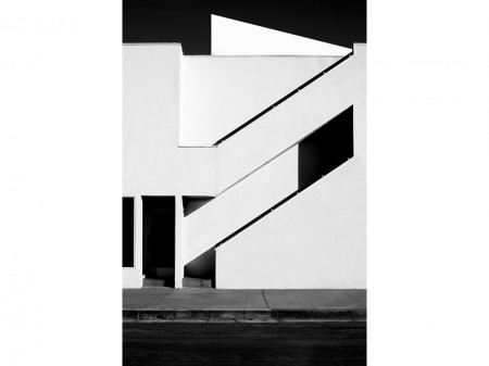
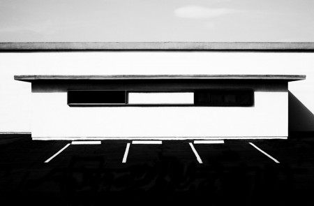
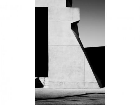
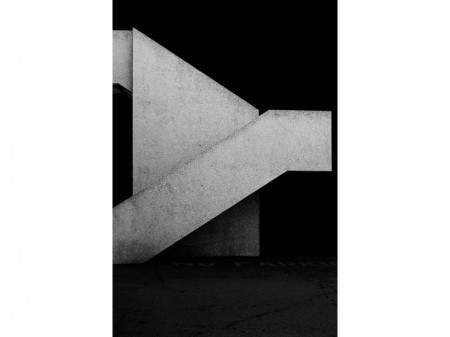
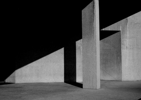
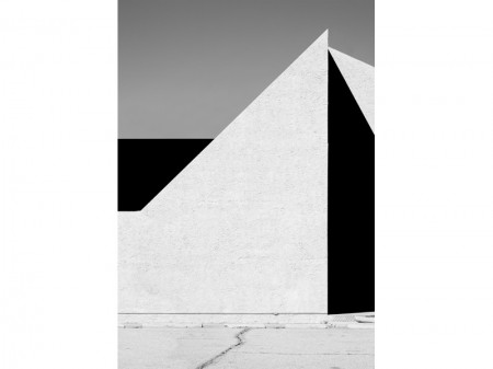
Beautiful abstract urban photography by Munich based artist Nick Frank. Reminds me of blog favorites Matthias Heiderich & Kim Høltermand.
Weekend Inspiration: Li Hui
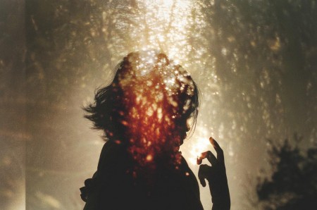
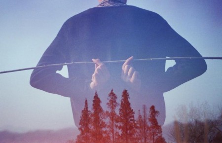
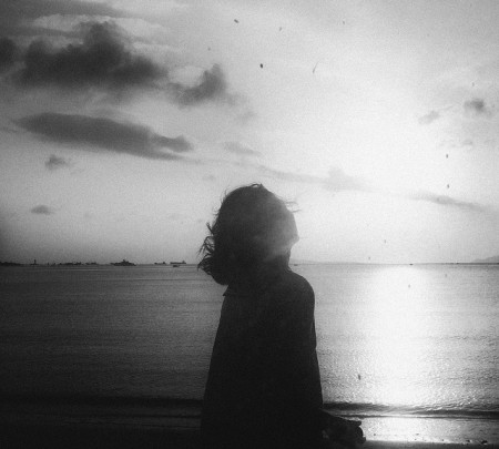
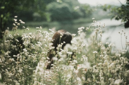
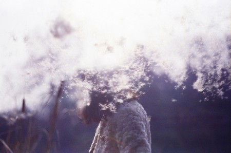
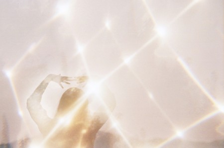
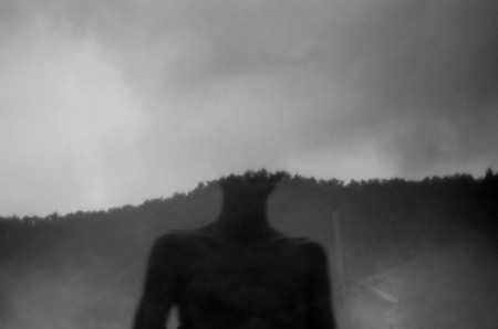
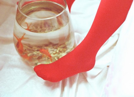
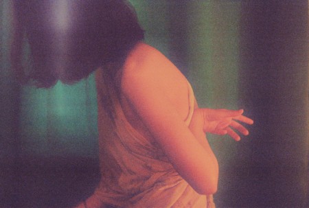
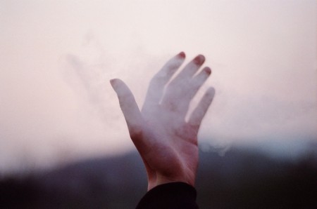
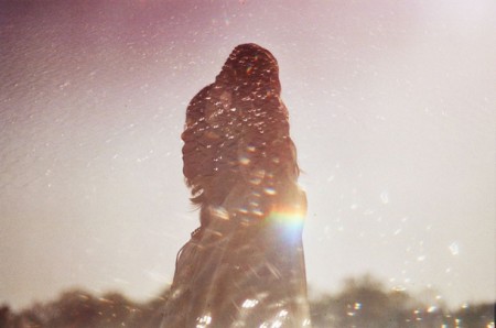
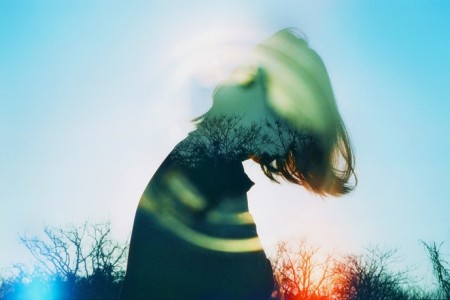
Li Hui or Hui+ as I’ve also seen referred to as, is a self-taught Chinese photographer who creates moody, often double-exposed, dreamscapes using a couple film cameras: Nikon FM2 & a light-leaked Canon AT-1. What apparently started off as a hobby to fend off loneliness, has turned in to a career.
For more images, take a look at Li Hui’s Flickr.
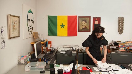
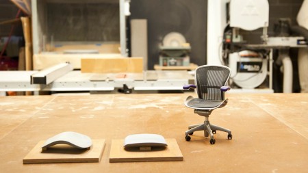
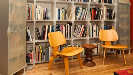
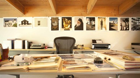
Herman Miller Why Design Series
Why Design is a great video series by furniture company and all around design icon Herman Miller, which profiles some of it’s best designers:
At Herman Miller design is the language we use to ask questions and seek answers to the problems our customers face. The design process is a journey into the unknown—or as George Nelson once quipped, “I have never met a designer who was retained to keep things the same as they were.” Before we decide what we do and how we do it, we like to begin by asking the question “Why?” In Why Design, a new video series, we explore the world through the eyes of our designers, and share something of why we value their point of view.
Each Monday morning, from September 10th through October 29th, Herman Miller will launch a new designer profile at Why Design. The series includes:
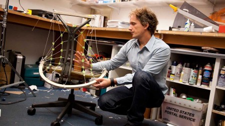
9.10.12 – Yves Béhar – “Surfing Is Like Improvisational Jazz”
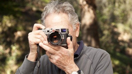
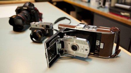
9.17.12 – Don Chadwick – “The Camera Becomes an Extension of Your Eyes”
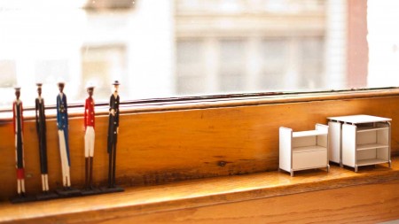
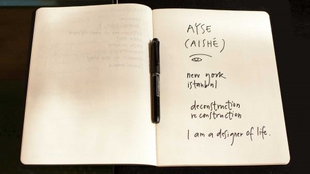
9.24.12 – Ayse Birsel – “Your Life Is Your Most Important Project”
10.1.12 – Irving Harper – “Paper Is a Versatile Medium”
10.8.12 – Gianfranco Zaccai – “Great Food Should Be Like Great Design”
10.15.12 – Studio 7.5 – “Design by Its Nature Is Collaborative”
10.22.12 – Steve Frykholm – “It’s the Breaks That Allow My Mind to Refresh”
10.29.12 – Sam Hecht + Kim Colin – “We Need Contrast and Tension to Be Able to Create”
Weekend Inspiration: Nicholas Alan Cope
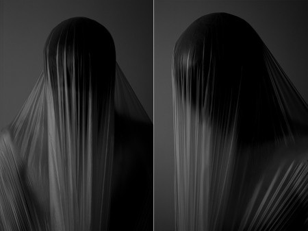
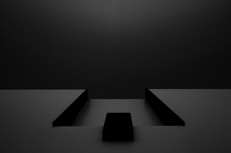
Really enjoying the work of Los Angeles based photographer Nicholas Alan Cope. There is a sense of eerieness in his work, as well as just the right amount of “darkness”, although there are a few examples of his work I came across that were a bit too much and gore for my taste. All in all, impeccable use of lines, tones and texture.
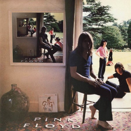
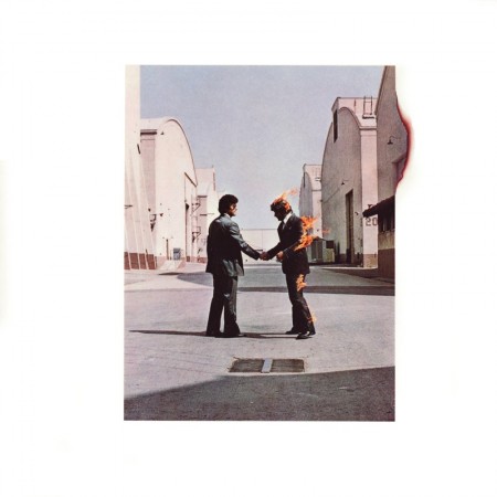
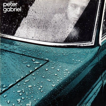
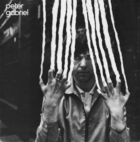
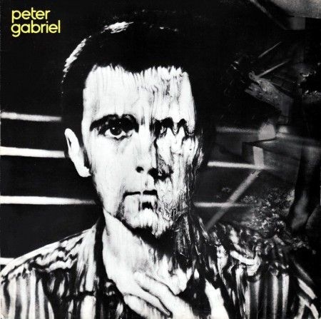
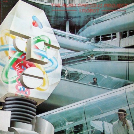
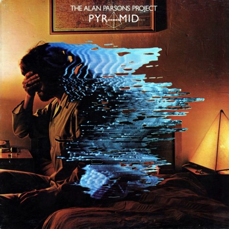
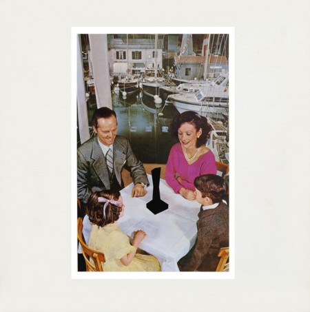
Weekend Inspiration: Hipgnosis
As a kid, a lot of my time was spent either drawing or rummaging through my parents vast music collection. The latter becoming more of bed time ritual, as every night I would listen to an album(s) until I fell asleep, literally, until I fell asleep, which meant that the next morning my Dad gave me his usual: “Jonathan, you’re going to go deaf if you continue to fall asleep with those headphones on…” speech. This ritual turned to obsession when in 4th grade I received my first Sony Walkman. Night to night I would pick out a new tape to listen to. At first, I started listening to albums that I had heard my parents play on one of many weekend camping trips or long drives to our lake house, but when I started running out of familiar names, I would choose solely on a what the album’s cover looked like (unbeknownst to me at the time, this would be one of the main reasons I would become a Graphic Designer). As I got older and became more familiar with certain artists, photographers and designers, I came to realize that 90% of the album covers I had fallen in love with as a kid, were designed by a group by the name of Hipgnosis.
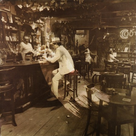
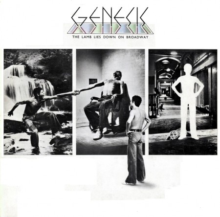
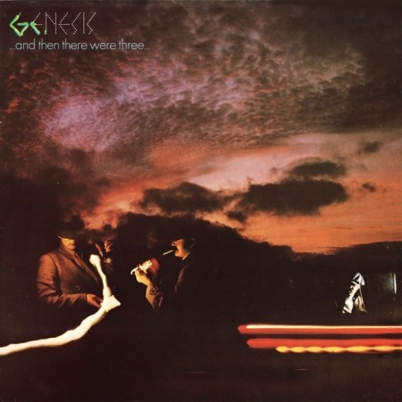
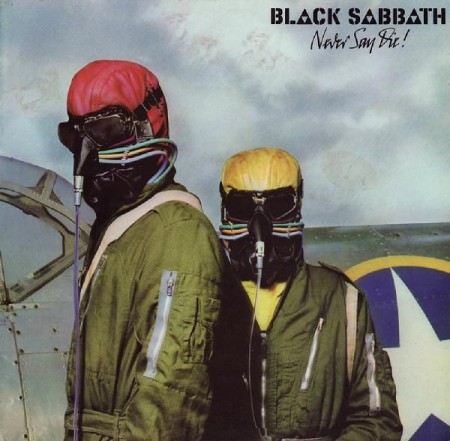
Hipgnosis was a British design group responsible for creating some of the most iconic and recognizable album covers of all times. Most notably for bands and artists such as Pink Floyd, T-Rex, Led Zeppelin, AC/DC, Scorpions, Yes, The Alan Parsons Project, Genesis, Peter Gabriel, ELO, just to name a few. The group consisted primarily of Storm Thorgerson and Aubrey Powell, and later, Peter Christopherson. The group would dissolve in 1983, though Thorgerson still works on album designs, and Powell works in video.
The groups approach to album design was strongly photography-oriented, and they pioneered the use of many innovative visual and packaging techniques. In particular, Thorgerson & Powell’s surreal, elaborately manipulated photos (utilizing darkroom tricks, multiple exposures, airbrush retouching, and mechanical cut-and-paste techniques) were a film-based forerunner of what, much later, can be called “Photoshopping”. Hipgnosis used primarily Hasselblad medium format cameras for their work, the square film format being especially suited to album cover imagery.
Another trademark was that many of their cover photos told “stories” directly related to the album’s lyrics, often based on puns or double meanings of words in the album title. Since both Powell and Thorgerson were film students, they often used models as “actors” and staged the photos in a highly theatrical manner. Many of Hipgnosis’ covers also featured distinctively “high tech” pen and ink logos and illustrations (often by graphic designer George Hardie), stickers, fancy inner sleeves, and other packaging bonuses. One of the unique extras created by Hipgnosis was the specially printed inner sleeve for Led Zeppelin’s “In Through the Out Door LP”, a “black and white” affair that magically turned to color when dampened with water (tying in with the main cover’s photographic theme).
The groups contribution to album cover designs and packaging can best be described as more of a legacy than anything. A legacy that definitely shaped a generation and set the bar for future album design for years to come.
Weekend Inspiration: Reuben Wu
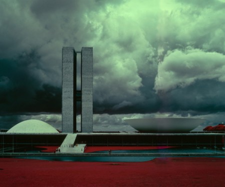
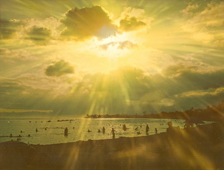
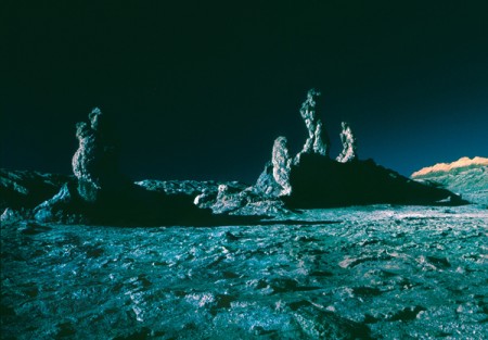
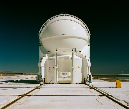
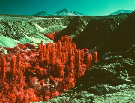
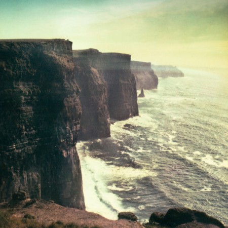
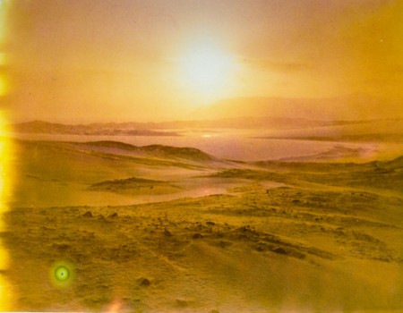
I just recently found out that Reuben Wu, aside from being a British DJ, producer and keyboardist for Ladytron, was also an avid photographer. Apparently the story goes that he started getting a bit more serious about photography when he decided to document his personal tour experiences and making the most out of being a musician on the road, while visiting some remarkable locations. Since then, he’s has amassed an impressive collection of cameras, which he has modified, spliced and pushed to their limits, all in the name of experimentation and discovery. This has resulted in a diverse and unusual and almost other-worldy like body of work, from urban architecture, to desert and remote landscapes.
Be sure to check out more of Reuben’s amazing on his Flickr.
Big thanks to Wendy Stenzel at NEST Artists for supplying the photos and info regarding Reueben Wu.
Posted by B3PO (Jonathan Marsh)
Weekend Inspiration: Leif Podhajsky
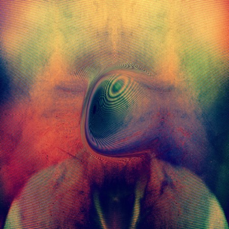
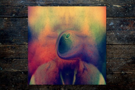
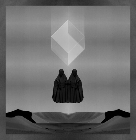
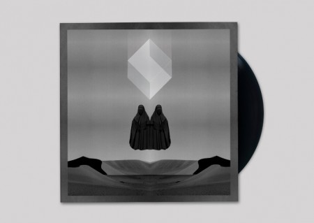
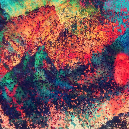
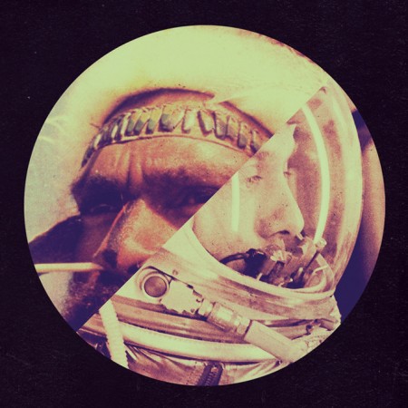
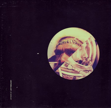
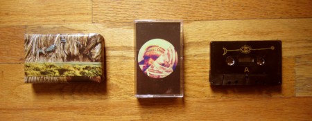
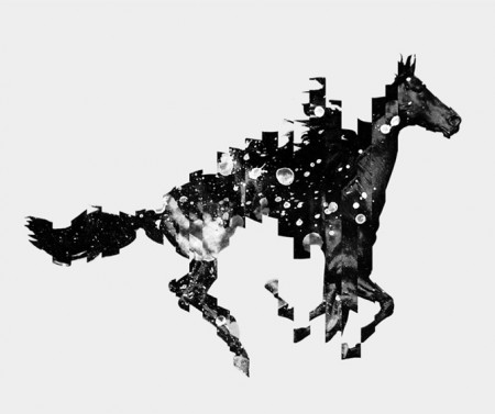
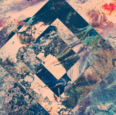
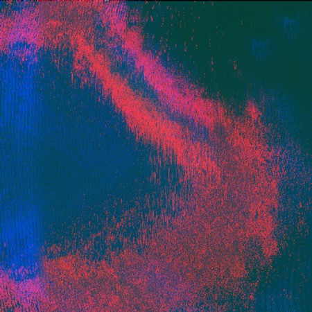
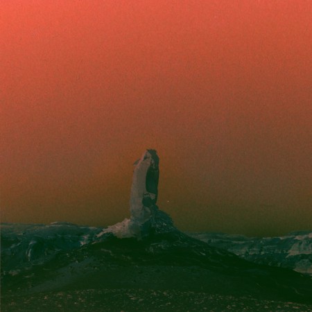
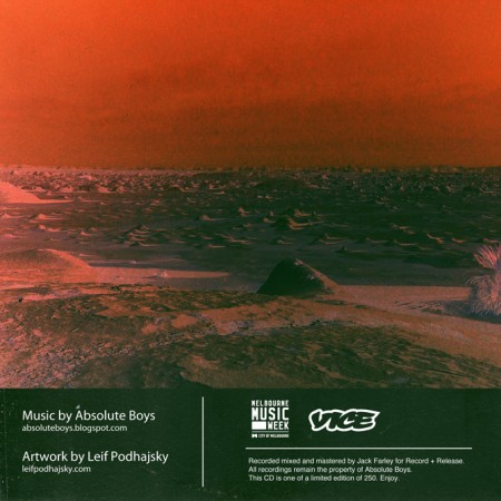
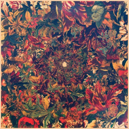
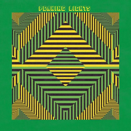
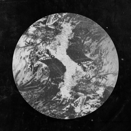
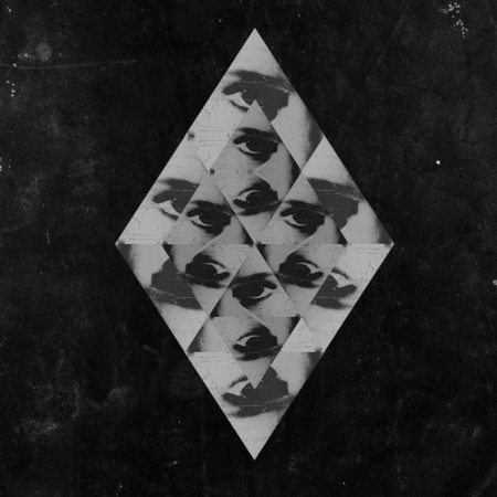
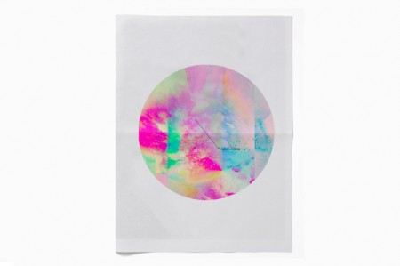
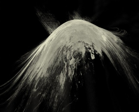
The amazing work of Australian artist and creative director Leif Podhajsky has been posted about here on the blog before, but I thought I would feature him again, this time as the subject of this week’s Weekend Inspiration. I have found myself revisiting his portfolio frequently over the past few weeks, In particular for his amazing album covers, as I’m working on a few myself.
He also launched the Melt Blog and has been experimenting with video and visuals.
Posted by B3PO
