Posts in Software

Photoshop CS5 64-bit Benchmarks


I know I’m always taunting you Mac users about your lack of 64-bit (I develop primarily on Windows 7 but have a few Macs for various purposes, mostly live shows). But now that CS5 is here you are free to bask in the unadulterated glory of full memory allocation that us Windows users have been enjoying since CS4. John Nack has put together some benchmark numbers that should give you a rough idea of the performance gains you can expect. As Nack points out though, these gains will only be seen by people working with larger files, tasks like web design won’t benefit much. You can check out the numbers here: Photoshop CS5 64-bit Benchmarked

On a side note, my overall experience with 64-bit has been favorable in the graphics realm, but for music I use a 32-bit installation. For music production there isn’t much of a benefit from 64-bit unless you’re doing a lot of sampling, it’s mostly about CPU and disk speed for recording and effects. The DAW software I use to record — Cakewalk Sonar 8.5.3 — still isn’t as stable as I’d like it to be when bridging 32-bit VSTs (many of my favorite VSTs have not been ported to 64-bit native yet) so I’m sticking with 32 for the production of this latest album I’m working on.

Plancast Process Updates


The little penguin made his iPhone debut last week with the release of the Plancast iPhone app. Everyone is at SXSW right now spreading the word and drumming up support. I designed some emergency t-shirts and business cards for the excursion and I’m excited to hear how it all went. Should have some pictures of that material this week — I’ve yet to see them in person due to the time/production constraints. Plancast also had a big article in the New York Times a few days ago which was exciting to see. If you look closely, you can see a wee version of the logo in the screenshot. Too bad the penguin didn’t hit the front page!

When I wrote about this project last week, I forgot to mention how different the post-production time has been compared to my normal project routine. For just about every one of my process posts I’ve written here, the work has always been completed in school for an assignment. Once the project is complete, it’s over as far as just about everyone is concerned. It’s been exciting to see this one continue to evolve in the real world — like winding one of those wind-up toys and setting it on the table.

Mousepaths + Hiroyuki Hamada

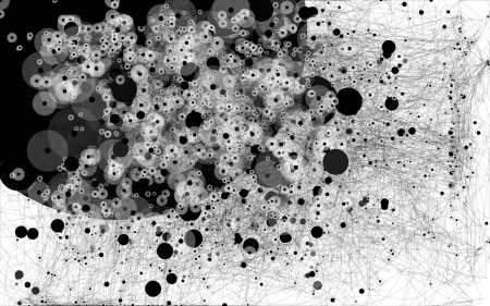
Feltron's Mousepaths over 24 Hours


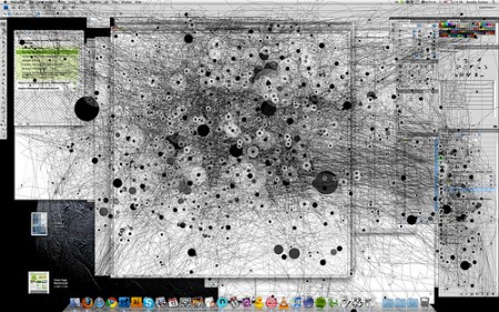
Anatoly Zenkov (3 Hours Working in Photoshop)


My mousepaths while writing this post

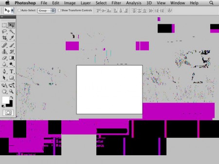
These images are recordings of mousepaths using a Java applet by Anatoly Zenkov. In addition to being an interesting aggregation of usage data, they look pretty cool (especially the ones over shorter time periods). The third image is my mousepaths while writing this post. The most telling are my frequent trips to the corners to cue my Exposé actions. Important to note that the black spots are where the mouse stopped for a period of time, not clicks as I thought at first. You can download it here: PC Version | Mac Version.
“S” – save image. “R” – restart.

via Feltron

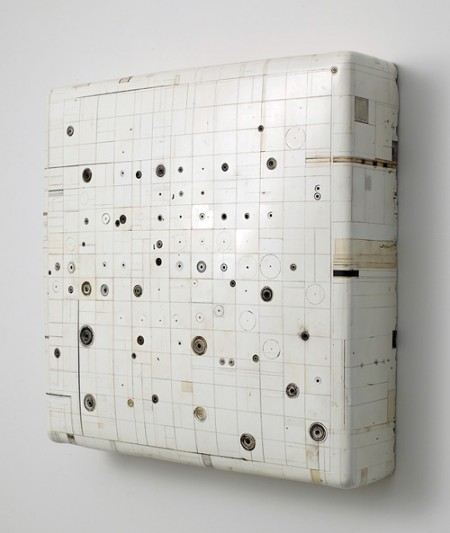
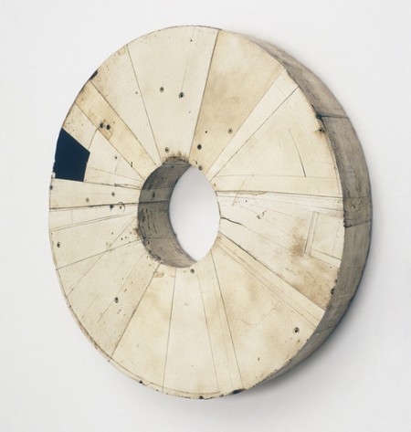
Hiroyuki Hamada


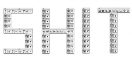
The last two images are pieces by Hiroyuki Hamada. Completely unrelated yes, but when I saw the mouspath images I immediately recalled these from a couple weeks ago on bdif. I’d worry about you if your mouseclick data looked like this.

10/GUI

Picture 1

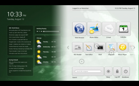
These days there seems to be a never-ending stream of “next-generation” graphical user interfaces being by trotted out by experts. Unfortunately for us, most seem to be fundamentally flawed in some way or another. They’re usually too expensive, ergonomically unsound, or otherwise impractical for whatever reason. I’ve worked with multi-touch systems before and while novel, they never seem to live up to the promise of “mouse-killer”. Sure, Microsoft’s multi-touch tables might make ordering drinks all super futuristic at some point, but no one wants to use Photoshop for 8 hours on a Ms. Pacman table. It seems the humble mouse — that tired paradigm of human-machine interaction we’ve been shackled to for decades — isn’t going down so easily.

There is hope though. Today I saw a video outlining 10/GUI, a new kind of graphical user interface that “aims to bridge this gap by rethinking the desktop to leverage technology in an intuitive and powerful way.” Whether or not it can attain that lofty goal is anyone’s guess. What really struck me about this particular system was the pragmatism exhibited by it’s developers. They’ve mixed in a healthy dose of innovation with tried-and-true familiarity to come up with a very compelling compromise that has me wanting to see more. As a musician and graphic designer I wonder if a system like this could ever address all of my needs, but I suppose I’d have to get my hands on it to really know. The main problem with envisioning the potential success of a new interface like this is that the current software we all use was created for the mouse. It’s easy to dismiss 10/GUI when comparing it to how I am accustomed to interacting with my computer, but if the applications I use were rewritten with an interface like this in mind, who knows how powerful it might be.

At any rate, the video is worth a watch, it’s an exciting proposition and perhaps a glimpse of what’s in store down the road. The actual demo beings around the half-way point. Video

What do you think? When, if ever, will we see any of these next-gen interfaces in our workflow? Finally, if something like this was available now, would you use it? Sound off in the comments

Via Ignore The Code | Official 10/GUI site

Genuine Fractals

gf1
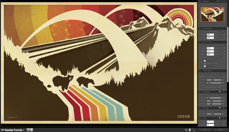
I’d heard of Genuine Fractals — onOne Software’s scaling plugin — from Tim at Blue Moon Printing but I had yet to try it out for myself. It’s basically a plugin for Photoshop which uses a proprietary algorithm (as opposed to Photshop’s built in resizing modes) to enlarge images. I was pretty skeptical but finally decided to try it out tonight when faced with some daunting upscaling projects.

I’m in the process of working through some older posters and sizing them up to the larger formats. For a long time I created all of my prints at 12×18″ (or thereabouts, depending on the format) as my computer just couldn’t handle anything bigger. For many I’ve been able to go back and recreate them, but some elements in the posters are scanned from smaller sources and just couldn’t be scaled up (e.g. the sky background in the above example. It’s made from a photo of a textile which is of a finite size and I don’t have access to anymore). So I figured now would be a good time to give Genuine Fractals a try. To my amazement it handled everything I threw at it beautifully. The interface and workflow are dead simple: you just initiate the Genuine Fractals dialog from the File > Automate menu, resize, click apply, and you’re done. It’s even fast, about the same speed as Photoshop’s resize command. There’s not much more to say as the results really speak for themselves. Simply put: Genuine Fractals can scale your images up to 1000% larger without any noticeable degradation. That’s what it says on their site and from my experience I’d say that’s absolutely true.

Genuine Fractals excels at photographic imagery, but that’s to be expected. With complex raster images it’s easy for imperfections to hide amongst all the shapes and colors. I thought the true test would be it’s ability to scale up flattened vector images. That is, vector shape and text layers flattened into raster images. I am doing this just to better illustrate how clean the scaling is but Genuine Fractals can actually handle multi-layered images (text, raster, and vector shape layers), scaling each layer individually and maintaining the original layer type. Meaning, if you feed it a document with a raster layer, a text layer, and a vector layer, it will use it’s algorithm to scale the raster data but will also scale the text and vector layers without rasterizing them. All the layers will be maintained as they were in the original document, they will just be scaled up. For my purposes, this is what makes Genuine Fractals truly powerful.

Here are some of my results. I know, none of this is very scientific but it’s a small glimpse of how well this program works. See the subtext under each image for a description.

Original Image

Original Image


Photoshop Resized

Photoshop Resized


Genuine Fractals Resized

Genuine Fractals Resized


Original Text

Original Text


Photoshop Resized

Photoshop Resized


Genuine Fractals Resized

Genuine Fractals Resized

As you can see, the lines are still crisp and defined with the Genuine Fractals enlargements. It’s not exactly perfect when compared to the original, but it’s a greatly improved alternative to Photoshop’s native scaling algorithms. My only question now is: At $700, why doesn’t Photoshop have this kind of power built in? New features like content aware scaling are nice and all, but I’d much rather they spent their R&D money on core functionality like this.

You can download a demo of Genuine Fractals from their site to try it out yourself. At $150, the software is a little too pricey for casual use, I’d say this is more for print shops and professional photographers looking to scale up their work for large format printing.

Ghostly Discovery 1.05: International

ghodisc
The Ghostly Discovery App has been garnering all sorts of praise and even more downloads since it’s July launch. When we first posted on it a lot of you had noted that it was not available overseas. Well the announcement just came down that with the release of version 1.05, the app is available internationally. The best part is that it’s still free! Get yours now

Ghostly Discovery App

gd1
03_PlayScreen-2
10_WebAppFavorites-Firefox
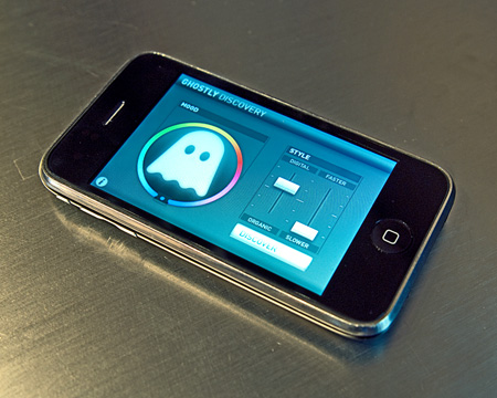
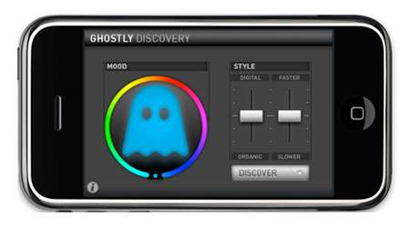
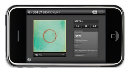
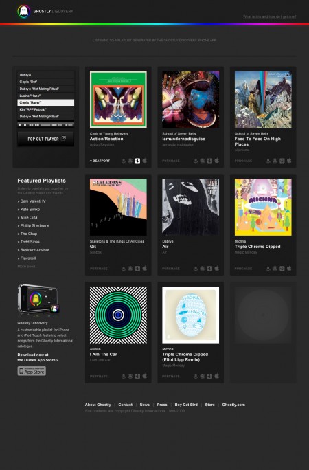
Here’s something to keep you busy over the weekend: The Ghostly Discovery App for iPhone. The free app allows you to create streaming playlists from the Ghostly catalogue by choosing a “mood” via a spectrum color wheel and a “style” via fader-like sliders. It’s sort of like Pandora but instead of picking a specific artist, you use the mood and style of the music you’re looking for as a starting point. And of course, you can find some Tycho stuff in there too. Check it out here

Update: Sorry, but as many of you pointed out in the comments, the app is not yet available internationally. Ghostly is working out the international licensing issues and it should be out soon. You can sign up to be notified when it is available by entering your email at the bottom of this page.

Delicious Library

mmm_delicious.jpg

So, I’m sure most of you have heard of Delicious Library already, but the mastermind Wil Shipley released the iPhone companion this morning (iTunes link), along with v2.1.

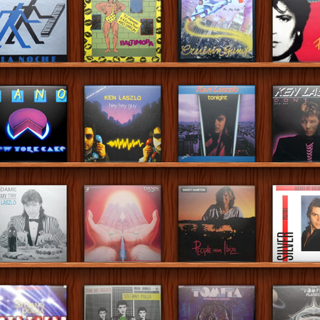
Delicious Library has a lot of neat features that I simply don’t use, but the best use I’ve found for it so far is cataloging your vinyl collection. Unfortunately you have to manually enter everything, as well as find the album art yourself… but it’s really handy to have your collection in a lusciously designed searchable beast in your pocket.

library_iphone.jpg

It’s $40, but the demo let’s you add 25 items so you can play. The iPhone app is free.

Also, be sure to check out this fun stop-motion video introducing the iPhone app.

A Week With Windows 7

win71
win72
If you follow this blog you’ll know that the past year of my life has seen me running a veritable gauntlet of operating systems on my new-ish PC. I’ve run XP32, XP64, OS X, Vista32, Vista64, Server 2008×64, and now, finally, I am running the superb Windows 7 64-bit. Yes, superb, I didn’t expect it either. Although I did notice marked improvements in Vista/Server 2008 over XP, I always felt there was a compromise somewhere and it never felt quite as stable as I’d like. So it was with great anticipation last week that I followed my friend Dusty’s advice and installed the Windows 7 beta. It’s only been a week since the upgrade but I have really worked this thing hard and I am happy to report that it’s been the most stable and responsive OS experience I’ve had yet and outshines all of the examples mentioned above.

Although the beta program is “officially” closed, there’s no shortage of Windows 7 torrents to be had. Even Microsoft has tacitly endorsed the torrent acquisition method, honoring these versions with legitimate serials upon registration (although these serials are only valid until the final product is released). The install was a snap, it was very similar — but seemlingly even more streamlined — than with Vista and it’s right up there with the speed and ease of an OS X install routine. Once installed, it boots up very quickly and everything about the experience is very much “straight to the point”. Gone are the nags, pop-ups, and wizards (I hate wizards) of Vista/XP past, now virtually everything is disabled by default, letting the user choose what features they want. I usually spend the first hour of a new XP/Vista install going through and optimizing the settings, disabling services and generally clearing out the bloat and cutting the fat. With Windows 7 that process took literally 2 minutes, I only had to disable a few notifications and one of the more annoying features of the Aero theme (the slowly animated minimize/maximize of the windows).

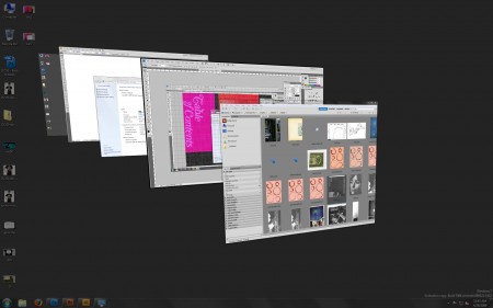
Speaking of the Aero theme, Microsoft have “borrowed” liberally from the OS X “Aqua” interface on many fronts. From Windows 7’s new dock functionality to it’s feeble attempt at some sort of expose-esque functionality, they’re obviously taking cues from the success of their Mac brethren. While I think the new dock is very successful, I think the Windows expose falls flat. In fact the one big thing I still miss about OS X when working in Win7 is the show-all-windows / show-desktop hot corner functionality of the Mac; it’s just so damned useful. Unfortunately, the Windows 7 knock-off is not quite there.

Anyways, back to the install. I had all my fonts and the full CS4 suite loaded within 15 minutes and was tearing through 3GB PSB’s (Photoshop Large Document Format) shortly thereafter. In my experience Photoshop stability (and stability in general for that matter) is greatly improved in the new Windows. I also found noticeable (but not incredible) processing performance increases. Where I think Windows 7 really shines though is file handling and disk read/write functions. Saving and opening very large PSD’s has dramatically improved over Vista. Vista’s much maligned file handling was sluggish and inexplicably slow across the board. I’ve heard they had some sort of base-level DRM checking built into the core of the OS. That could be BS, but whatever it was it was a real problem and they’ve fixed it in Windows 7.

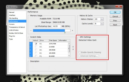
The icing on the cake came when I started working with Adobe Bridge CS4. In both XP and Vista I had horrible issues with Bridge, so bad that I had to quit using it. Every session would result in a crash, without fail, across the board. Every OS I have used until this point just didn’t play well with Bridge. But it seems to like Windows 7; I can churn out previews of PSB files in excess of 4GB in size with no problem. Thousands of NEF RAW files in one folder render to thumbs without a hitch now. Either of those would have choked Bridge half the time in the older OS’s on the same hardware. One glitch I’ve found is that the GPU acceleration in Photoshop is not working (see image below). It doesn’t recognize my video card as openGL capable even though I have the Win7 beta drivers installed, which was working fine under Vista. I suspect this is something that will be fixed sooner than later though through a driver update. Although now that the GPU acceleration is disabled and everything is running so smoothly, it makes me wonder if it was contributing to any instabilities I was experiencing under Vista. I guess that remains to be seen though.

A quick side note about the image below: Notice where it says “Available RAM: 7216”, that might be the number one reason I ditched the OS X install I had on this very same machine. PS is still 32-bit on OS X and therefore cannot utilize even half of that amount of RAM.
gpucrop
To be fair I haven’t put Win7 through it’s paces for audio yet, all of my testing has been with graphics apps only (Photoshop, Illustrator, Bridge, etc.) Next week I will be loading up Sonar and all the VST’s and giving that a spin. But Dusty, who uses Windows 7 solely for audio, has assured me that — with Ableton Live at least — it’s performing far better than Vista or XP on the very same machine. As a lifelong PC user (I do have a Macbook Pro, which I absolutely love for everything other than work) this is such a relief. Yes, Vista was a dog out of the gate, but anyone who has used it lately can’t help but recognize that Microsoft has gone a long was to fix the problems that plagued it and with Windows 7, I think they’ve finally gone the distance and realized the operating system that Vista was meant to be. I also think a lot of budget-minded creatives can now breathe a collective sigh of relief that the OS of choice for people who don’t have $4000 to spend on a computer is back.

So how about you, anyone else been using Windows 7? What have your experiences been so far? Sound off in the comments

Update: As Peter Stoinov pointed out in the comments, the much-improved Windows 7 Release Candidate comes out May 5th so you might want to hold off installing until then.

Update 2: Microsoft has announced that it will be offering Windows 7 RC1 free to the public for one year. Awesome.
Adobe UI Gripes

psdgripe1
psd

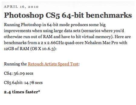
A friend that I used to work at Adobe with sent me this Adobe UI Gripes site yesterday. I really can’t say why I find it so amusing but maybe it’s just nice to see someone going through the same frustration I feel sometimes with Adobe apps. I guess when you’ve essentially monopolized the creative software market like Adobe, you make a pretty easy target for stuff like this. Anyways, it’s a fun read and there are gems like this sprinkled around here and there. I’ve encountered a lot of these before and just asked why, but I’m not sure I ever got as worked up as this. Link

Realistically, I really only have a few problems with CS4. At the top of the list would be Bridge. Somewhere around CS3 Adobe decided to cripple Windows machines and remove the thumbnail icon viewing capability from the OS file explorer thereby forcing you to use Bridge (pretty clever). This wouldn’t be a big deal, I actually like Bridge a lot, only problem is it crashes nearly every time I use it for more than 10 minutes. There’s a fix for 32-bit windows installs but not for 64-bit so we’re left with the generic icon when trying to browse PSD’s in explorer. A couple others would be the permanent hand icon mode (you’ll know it if you’ve encountered it…thankfully there’s any easy fix: reset warning dialogs, but why?) and the delay in dragging content from one tabbed window in Photoshop to another tabbed document, you have to hold that thing up there for waaay too long. How about you, what Adobe bugs do you love to hate?