Posts in Typography

Buffalo ‘66 Stills

BUFF1
BUFF2
BUFF4-1
BUFF7
BUFF25
BUFF16
BUFF11

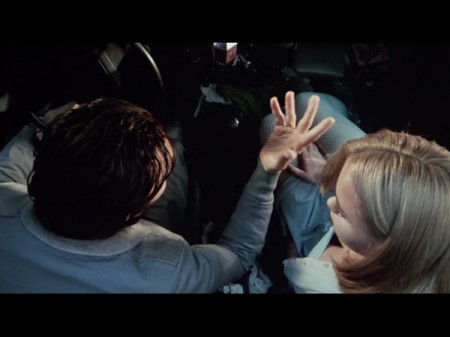
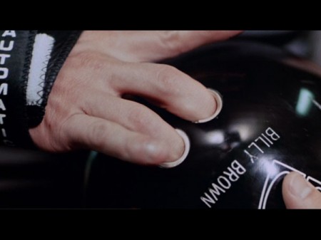
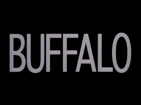
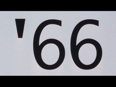
I’m posting these stills from Buffalo ‘66 partly because they’re awesome and partly because it’s a good chance to tell the story where me and Dusty saw Vincent Gallo at my neighborhood market on a Tuesday. It was surreal, I think we must have been staring uncontrollably because he was in line and had this look on his face like “are these idiots going to ask me something or stab me?” (all love knife style). We also saw him with Sean Lennon at a bar once and got some horrible blurry iPhone shot of him and Dusty. So I guess that makes us officially stalkers now.

By the way, Whatthefont says “Buffalo” is Prelo Compressed Medium. Not quite sure though.

Stills via the always incredible I Love Hotdogs.

Hans Gremmen

hans
hans23
hans2
hanss
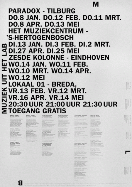
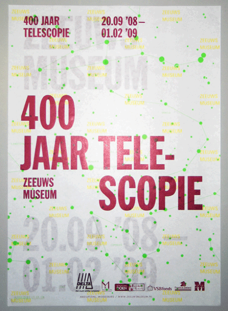
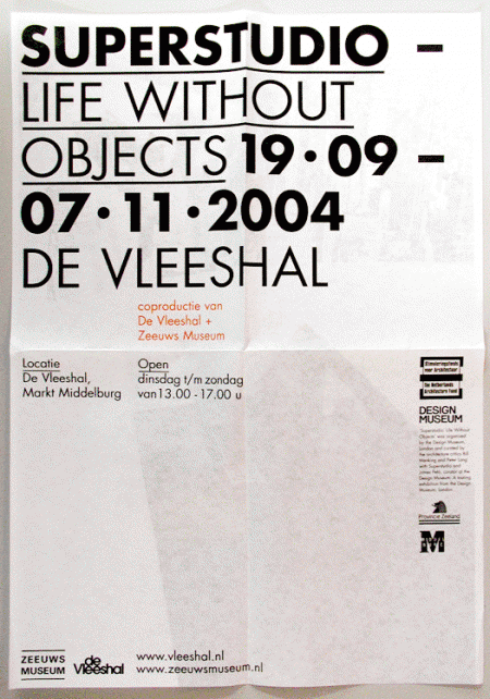
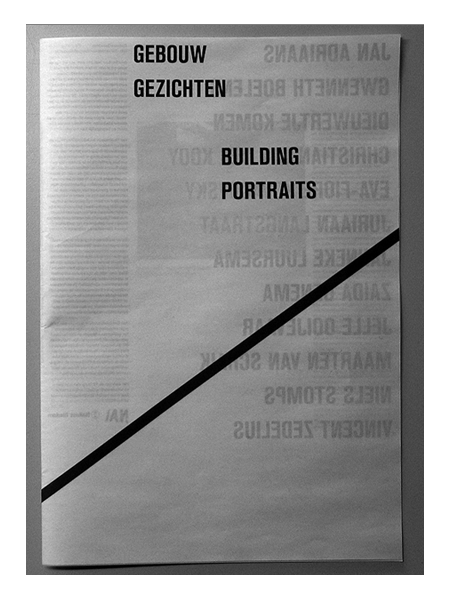
Assorted posters by Dutch designer Hans Gremmen. I love posters — like the first one — that are just PACKED with all sorts of information and data. Really gives the designer a chance to show off their typographic skills and hierarchic sensibilities. I especially enjoy the tendency for the asymmetrically balanced composition; really makes for that much more of an interesting poster.

Also worth noting is Gremmen’s portfolio site which randomly generates a selection of eight of his works. An interesting approach to be sure; I like the concept of an ever-changing front page, though it was a little tough to find the specific work I was looking for.

Typographische Monatsblätter

090908_ruder_tm1
090908_ruder_tm3
090908_ruder_tm2
090908_ruder_tm4

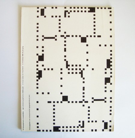
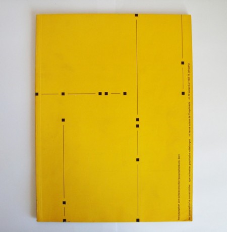
Typographische Monatsblätter 10, 4, 8/9, 12. 1955


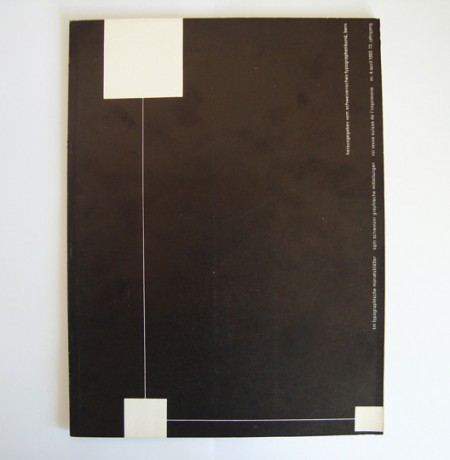
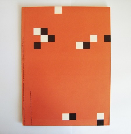
In keeping with this week’s (completely unplanned) typographic theme, I thought I’d post these excellent covers by Emil Ruder. I’d love to see someone try to get away with type layout like this on a client project.

Some additional info (apparently translated) from 80 Magazine:

“in 1953, TM held a competition to design a cover series, inside layout and advertising pages. 12 people took part, including the basel typography teachers emil ruder and robert büchler. the TM jury report on ruder’s entry:

‘the designer if his competition work chose the square as design motif, wich also resonates again in the page layout. this cover series is designed with sparkling fantasy; bold and new, far way from tested solutions, in a darling refreshing attemp. […] a really new solution which could have an interesting change from the arrangement up to now’

five covers by emil ruder were applied to break the monotony of the winning entry of robert büchler”

extracto da revista-libro ‘ruder typography ruder philosophy’. idea magazine 333. vol. 57. marzo 2009. xapon. issn 0019-1299 +

Via 80 Magazine

Photo Lettering

alphabet-thesaurus-1
alphabet-thesaurus-6
alphabet-thesaurus-9
alphabet-thesaurus-5
alphabet-thesaurus-2
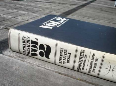
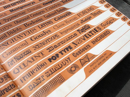
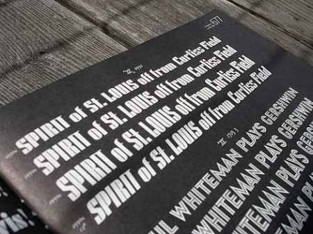
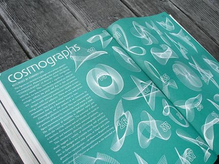
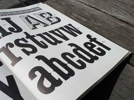
Grain Edit has a great post on the upcoming Photo Lettering Site from House Industries. When I first saw the headline for the original post I was half hoping for some sort of digital way to achieve that awesome blurred edge style from old movie titles and magazines. Sadly, that wasn’t the case. But the reality was just about as good, a bunch of great until now defunct vintage typefaces. The Photo Lettering Site is not fully operational yet, but you can check out some posters featuring some of the fonts here.

In Praise of a Typeface: United

united
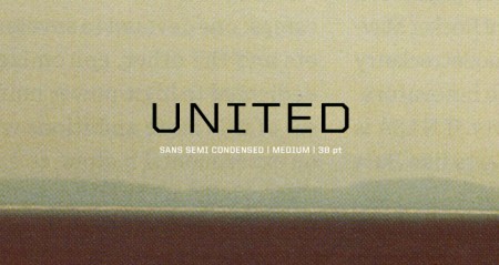
United by House Industries has been my go-to typeface over the last few semesters. It is a massive family — 105 total fonts (three styles, seven weights and five widths). This variety makes it an incredibly versatile collection. I really hate it when I find a typeface that I love, but find it missing a crucial weight or style. (DIN for example — would love to be able to wield more styles). United does not have this problem. I’ve used it on many projects (a few you know; ISO50 EP, Mega Cities book) and in each case the variety allowed it to be implemented in a unique and effective way.

I discovered it a long time ago while searching for the typeface used in a Nike ad (can’t recall which one, but it was amazing). I don’t actually remember if United was employed in the advert, but if you spend any amount of time searching around the typography of the sports world, you are bound to come across United at some point (Fox, I’m pretty sure, uses it for in game football graphics). There is an obvious resemblance of a few of the weights to a very collegiate look, which might be a turn off for some people, but the rest of the styles make up for this ten fold.

The most exciting part for me has always been the fact that each style has five different widths. I love condensed or extended widths and it’s nice to find a worthy competitor to the standards (Univers, Trade Gothic etc). When you need an extra touch of personality, especially if the project skews toward the technical or urban, United does the job nicely.

I don’t know many other designers (at least at school) that use it regularly and I thought I’d spread the word a little. Finding a new typeface is always pretty exciting, so hopefully if you haven’t tried United before, you can give it a shot and experience the sweetness. Anyone else have any hidden gems? I haven’t come across a new super typeface in a while — would love to hear about what people are unexpectedly enjoying these days.
Helvetica vs. Arial

JvVkK
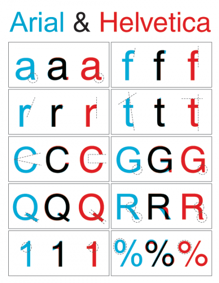
Nothing too involved here, just a simple diagram outlining the key differences between Arial and Helvetica. You can find the full alphabet overlayed here. Just in case you’re unfamiliar with the unique history these typefaces share, here’s an in-depth analysis. And here’s the battle mode.

Via Swissmiss, who’s workspace is way cleaner and more Helvetica-ish than mine:

Tina Roth Eisenberg of Swissmiss

Tina Roth Eisenberg of Swissmiss

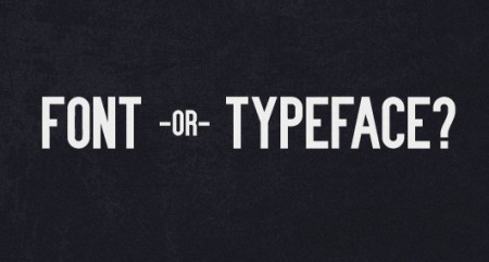
Font or Typeface?

typeorfont
Alex and I were discussing this a while back so it was nice to see the whole subject wrapped up in a nice post over at Shelby White’s blog. Now you can annoy the hell out of all your non-designer friends by constantly correcting them when they use “font” incorrectly. Be sure to start off with “Actually…..”, people love that. I liked Nick Sherman’s take the best:

“The way I relate the difference between typeface and font to my students is by comparing them to songs and MP3s, respectively (or songs and CDs, if you prefer a physical metaphor).”
– Nick Sherman

For a while I thought font was sort of a dirty word, like it really didn’t have any proper usage when talking about design. Typeface still sounds better but it’s nice to know that font does have it’s own place in the world.

Link | Additional Reading

Lettering Art In Modern Use

Raymond_Ballinger_DSC_6932-590x392
Raymond_Ballinger_DSC_6965-590x392
Raymond_Ballinger_DSC_6945-590x392
Raymond_Ballinger_DSC_6973-590x392
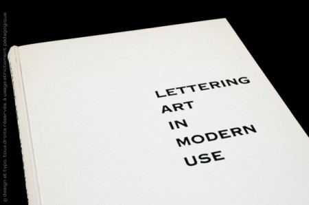
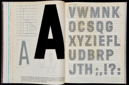
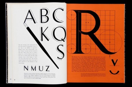
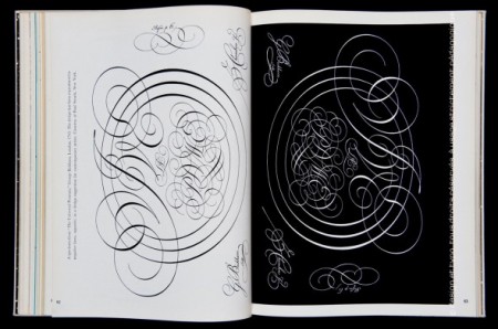
Sébastien Hayez’s Designers Books blog has a great post on Lettering Art In Modern Use and various other design-related books. I love that last one; I was at the printers the other day looking at some samples and they showed me a letter-pressed wedding invitation with that same script style. It was embossed into the paper with inlaid gold leaf, so nice.

Via Surfstation

Typography of the Fashion World

The Fashion Center
In honor of the currently unfolding (ha) Fashion Week in NYC, I thought I’d post on some of the terrific typography at work in the fashion world. When I first got into design, I used to think the typeface for the Louis Vuitton logo was the epitome of graphic design. I remember writing everything in Futura Medium for a good month (even research papers, nothing was spared). These days, I still to pick up the occasional GQ or etc just for the ads — usually can pick up a few interesting things. There are always a number of logos that catch my eye, continue reading to see some of the marks that resonate most.

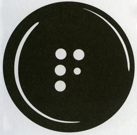
The mark for The Fashion Center (above) is perfectly simple. How brilliant to utilize the button holes to form the F! This is probably one of my favorite logos of all time. What it comes down to for me is that the 5th button hole is slightly smaller than the rest — this subtle scale shift makes the whole thing. Developed at Pentagram.

(more…)

Klas Ernflo and My Favorite Letters

goya
cano
davinci
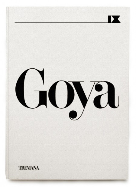
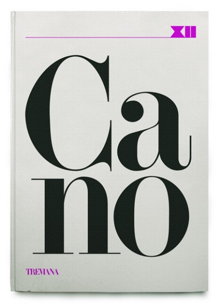
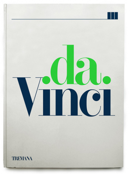
A few rejected book covers by Klas Ernflo. Beautiful typography at work here — I especially can’t get over how amazing the uppercase G is in the top image (looks like Didot, but I’m not positive). Surprising (and not at the same time) that these were rejected by the publisher. I would have bought them on the spot, regardless of their contents!

Recently I’ve been trying to determine my favorite occurrence of each letter of the alphabet. I’ve picked a few, like the “G” seen above, but most letters remain up in the air. The eventual goal will be to have a list of 52 shapes; representing my absolute favorite renderings of each letterform, upper and lowercase. After that I guess I’ll move onto symbols and numbers (I already know my favorite “7” — Clarendon). A few other examples might be the “W” from the Westinghouse logo, the lowercase Avant Garde “a”, and maybe the “H” from Scott’s recent post.

Would love to hear everyone else’s favorites! It’s hard I know, to narrow it down outside of the context of application, but I’m sure there are some standout letters for each of you. Let us know!