Posts in Typography

Vintage Book Covers

IMG_0256
IMG_0251
IMG_0283
IMG_0260
IMG_0249
IMG_0281
IMG_0278
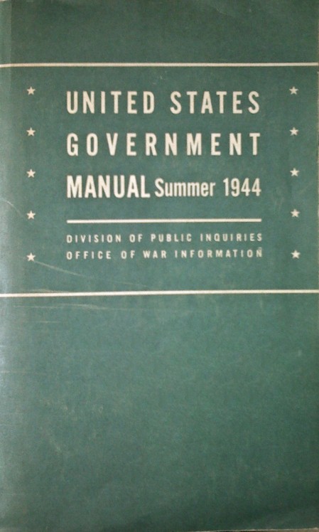
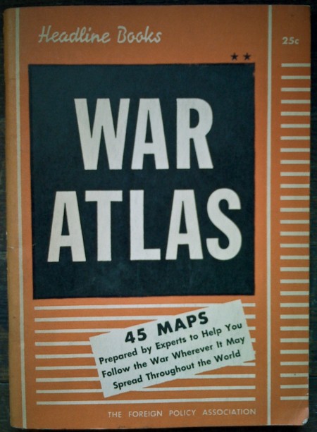
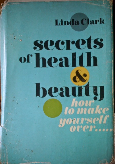
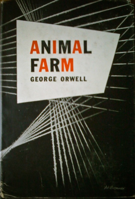
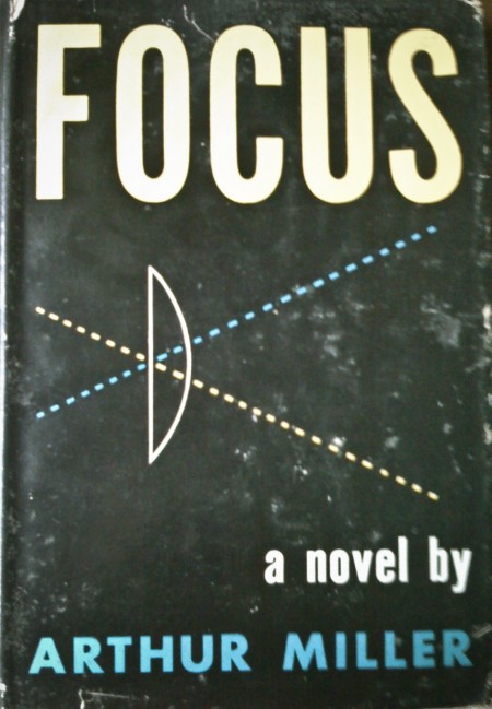
I was exploring the depths of my basement the other day and came across these books. My favorite is the first one, but I think they all have something interesting going on. (I remember the Animal Farm cover from Scott’s post a while back.) The typography of each cover is worth noting — especially the beautiful implementation of the lowercase Carousel on the “Secrets of Health…” cover! The ampersand in particular is pretty amazing. As much as I love Bodoni and Didot, Carousel has a few extra twists that make it more exciting to me.

Sometimes I wish I didn’t live in a design centric city; all the used bookstores were plundered long ago of anything with cool design at work. It is a rare occurrence that I find something worth buying at even the most remote vintage bookshop. Got out here too late!

Apologies for the iPhone photos — it was all I had at the time and I couldn’t pass up the chance to snap some shots. Also worth noting is the price of some of these…when was the last time you paid 25c for a book?

Font Purging / 39,447 to 50

30type
I have 39,447 fonts on my computer. Or at least I did, up until about 30 minutes ago when I cleansed my machine of all the typographic nonsense that was polluting my list. I had thought about doing this font purge for some time, but hesitated, just in case I might one day need to design a document using the official Jedi Knight font, or something similarly ridiculous.

I remember hearing Massimo Vignelli say in the Helvetica documentary that he only uses about three typefaces. I was embarrassed at the time, thinking of my infinite list compiled over many years of dafont downloads and “BEST FONTS!!!” torrents. I guess I considered myself a typeface collector and I worked hard to “get them all”, even if I had no idea of what use some of them would ever be.

As I progressed through school, I noticed that just about everything I had ever designed used the same 5-10 typefaces. Every time I opened Illustrator I scrolled endlessly past hundreds of handwriting fonts, “distressed” fonts, you name it; always searching for the same go-to options. When I did deviate, the work usually suffered.

After much deliberation, I widdled my list down and trimmed the fat as it were. No longer will I be tempted to use weird knockoffs of Gotham or Helvetica clones. I consider myself much better off because of this — not just because it’s easier to manage a smaller list — but because the typefaces I kept are good typefaces. They’ve stood the test of time, and are the result of a tremendous amount of hard work and development by expert typographers. I know something about each one; who designed it, where it came from etc. In this way it’s a bit like my iTunes library; I probably have about 60,000 songs, but mainly listen to a few selected playlists. I have thousands of songs with a play count of “zero”. Why I keep them around I have no idea.

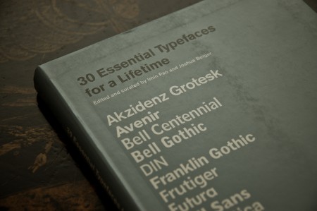
The book pictured above is 30 Essential Typefaces for a Lifetime by Imin Pao and Joshua Berger. It’s a good place to start if you are considering a font purge of your own. (Though I disagree in a few places; for example I would not include Trajan on my list). My final count is now about 50 typefaces; a much more manageable number I’d say. It’s not Massimo’s magic number — I don’t think I could survive on three alone — but scrolling through 50 sure beats scrolling through 39,447.

note: I, and and many designers I know, tend to use the terms “font” and “typeface” interchangeably. Technically this is incorrect as they are not the same thing. Both this and this article do a good job illustrating the difference. Old habits die hard for me; I didn’t actually know there was a difference until about a year ago, so it’s taken some time for me to change my language.
Best of Custom Lettering

2417571073_071a15b0ca_o
3601892645_656cf3bd7f_o
fastcode
569201224544552
lett2

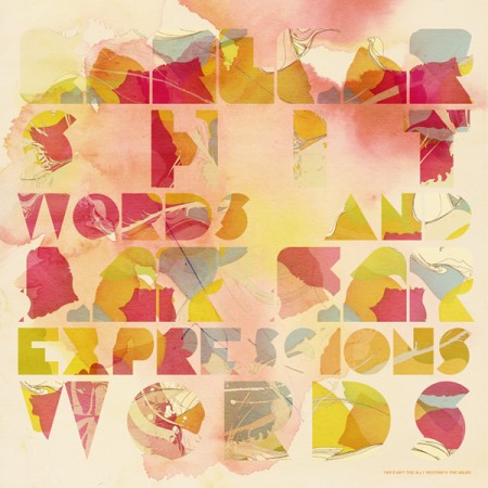
Lettercult — site dedicated to “custom letter culture” — has posted a “Best of the First Half of 2009” list containing many great examples of custom typography. Some inspirational stuff in there: Part 1 & Part 2.

Aron Jancso

3514352622_42114fec5c_o
3596642644_ed50d5ea87_b
2252183004_dbb68999a2_b
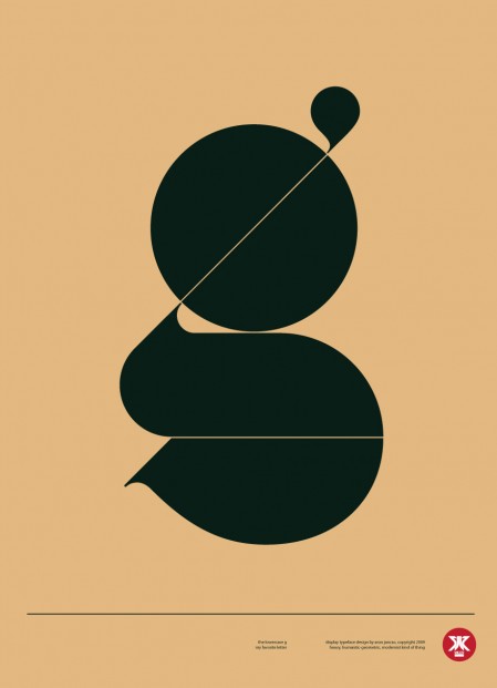
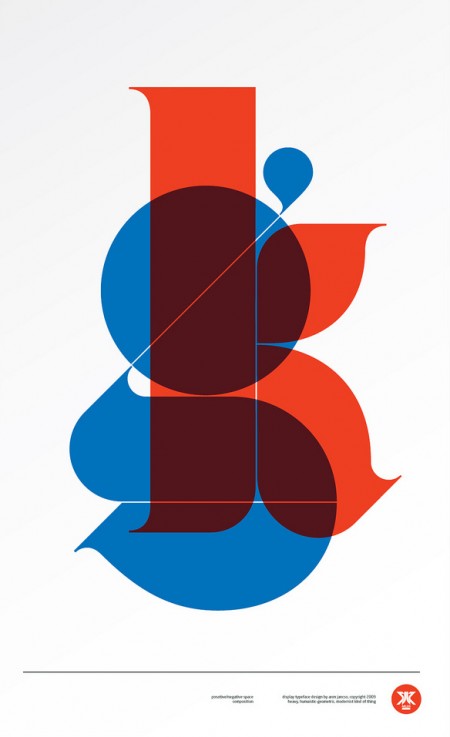
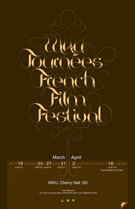
I had seen Aron Jancso’s “g” poster on Buamai earlier but just recently saw more of his work. Very impressive mastery of typography. Check out his Flickr for more.

Some Vintage Film Titles

laura1
sisters1
susp0
susp14
susp15
contempt6
bluelagoon10
wait21
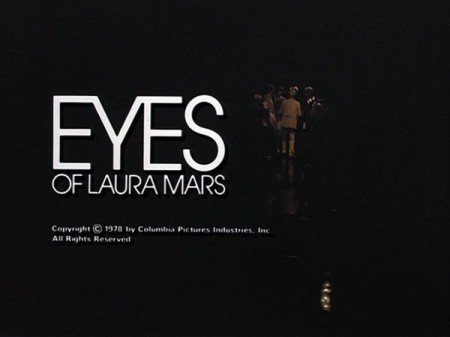
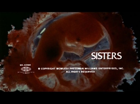
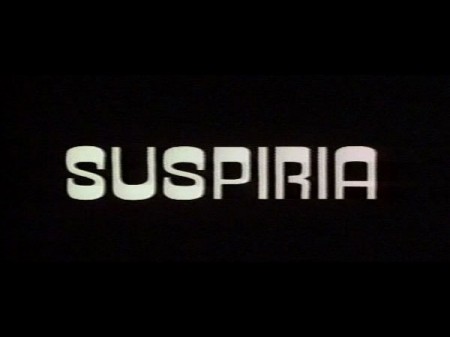
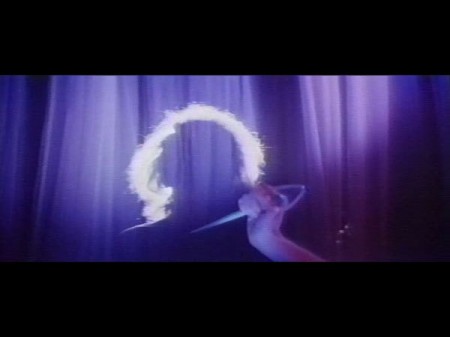
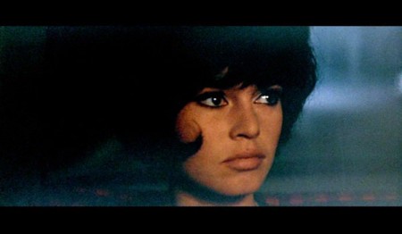
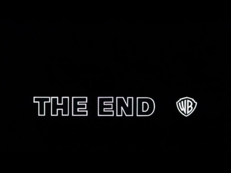
Came across this today via @grainedit’s Twitter. The I <3 Hot Dogs Blog has some great stills from classic films up. I love how type renders when it’s hand set and transferred to celluloid. If someone could make a filter that lent that perfect edging effect to type in Photoshop I’d be the first in line for it. I once met a guy who printed out all his type first, then photocopied it with an old Xerox, then scanned it back in. He got great results, I need to find a way to do that with film.

8 Simple Ways To Improve Typography

8
image7
Antonio Carusone from the always excellent Aisle One Blog has written a great article covering the various problems we as designers face when setting type and how to best approach them. The article focuses on using web-based CSS solutions for type layout, but the concepts covered are universal to typography and can be applied to print layout as well. The hanging quotes part is great, but they’re missing the part about “hanging T’s”, I always have trouble with that one. Link

2 Periodic Tables for designers

periodic table of typefaces
psd-poster
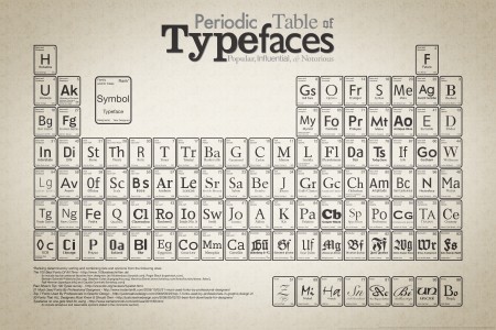
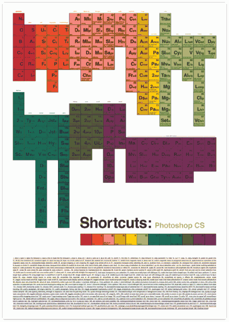
I’ve been seeing these 2 Periodic Tables floating around, the larger version of the typeface one is pretty fun to look over and I guess the Photoshop CS shortcuts one is a poster and there’s also ones for Illustrator and InDesign as well.

A Trip to Europe ’63

3324076785_48a28b4206_b
3324918674_c8eb591b88_b

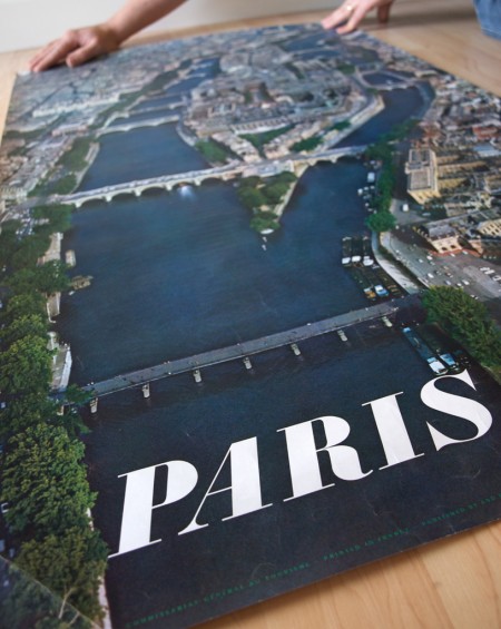
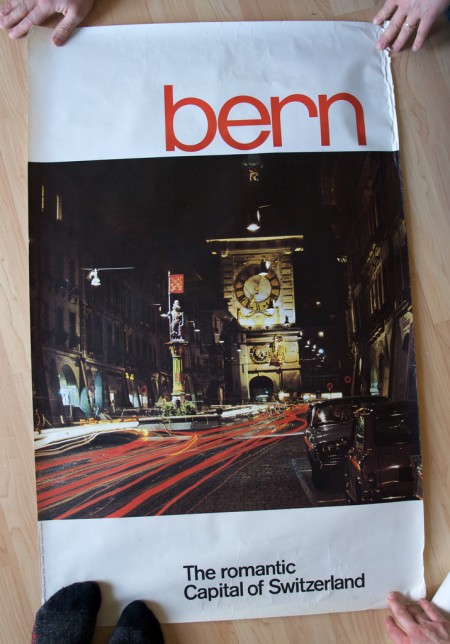
Stephen over at Mid-Century Modernist posted shots of some great European travel posters sent to him by his late father. Apparently the posters had remained in the shipping tube for a few years until discovered during a move. Thanks for sharing Stephen, and thanks to all your friends for holding them down in the shots! (what is that like 3 people holding the Bern print down?) Link

bodini
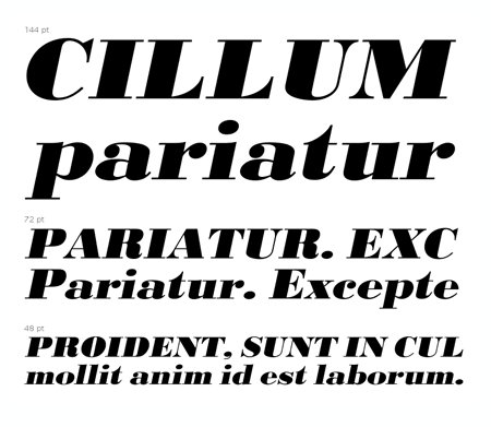
And in case you were wondering, the “Paris” font seems to be URW Bodoni Extra Bold Extra Wide Oblique. There are some slight differences but I am assuming these are artifacts of the digitization perhaps? I hate it when I see a classic font used like this and then find the modern version and it’s just a bit off. “Bern” seems to be PL Brazilia Three.

WhatTheFont – iPhone App

img0341
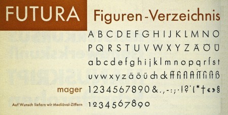
MyFonts released an iPhone version of their WhatTheFont identification tool last week. It has a very simple and easy to use interface. You basically just take a picture of a font, crop and upload it, and it will run the characters through a recognition database and give you possible identities for your mystery font. Works well so far (at least it was able to recognize Futura above), but it will be interesting to see how it does with some more challenging typefaces.

Image via 20th Century Type

Michael Bierut – Design by Hand

115805043_c5dac1db3c_b
A great article by Michael Bierut about how things have changed in the world of design since the incorporation of the computer. An excerpt:

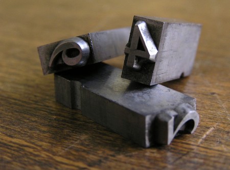
Design work that would have taken me a week in 1980 can now be done on a personal computer in less than an hour. Cutting and pasting, when needed, is done in the basement, often by interns. I get the impression that this kind of work, to which I once applied myself with the pride of a master chef, is now viewed as a chore like dishwashing. (The New York Times)

image via threedots