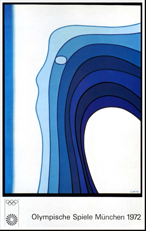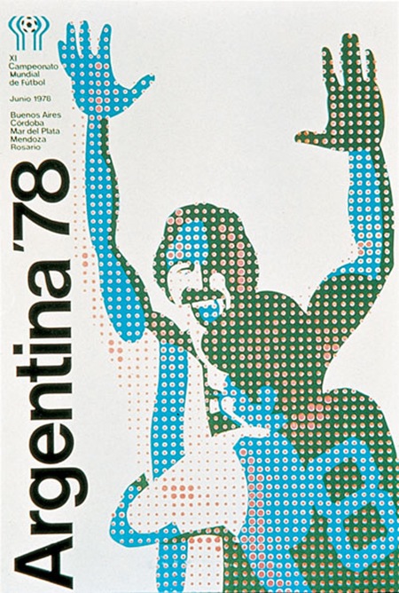
Very cool poster from the ’78 Argentina World Cup. If anyone has info on the artist behind this post it in the comments.
Posts in Uncategorized
Argentina ’78 World Cup Poster
Olympische Spiele Munchen 1972
Otl Aicher – Munich ’72
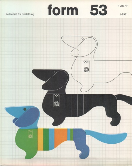
Another image by German Designer Otl Aicher who was responsible for the branding of the ’72 Munich Games. All of this stuff is amazing. I am not a huge fan of the Dachsund mascot, but this is about as good a treatment you could give to such a concept.
Simply do a Flickr Search for "Otl Aicher" and your head will explode. Incredible stuff, some really nice shots of the London Aicher exhibition. I just can’t get over how contemporary these colors and forms are. None of it feels dated, could have been from a pitch for 2012, if the people who oversee those sorts of things still had any taste that is. Seems like all the stuff now days is targeted at the lowest common denominator. All of the recent stuff I have seen for 2012 is throw-away, middle of the road with compromise written all over it. Aicher’s campaign is thought provoking and timeless, obviously a good argument against the design by committee ethics I have to imagine produced this sort of output.
Munich 1972
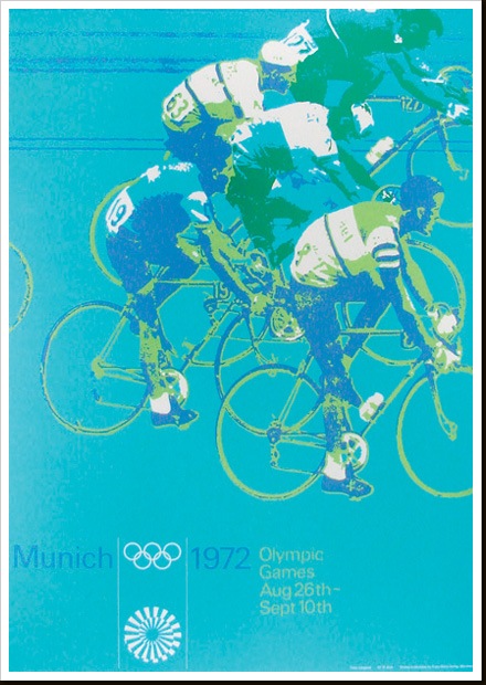
Part of a series of posters from ’72 Munich games by Otl Aicher. I’ll post some more examples in the coming weeks. These must have had a very modern feel when they came out, the colors certainly contrast the prevailing palettes of the time.
1972 NY Transit Map
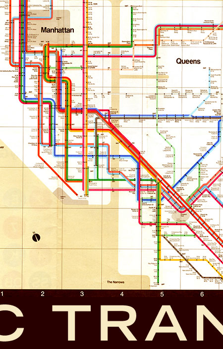
A 1972 map of the New York Subway system. Going to be using this a lot in a couple weeks so thought I would post it up. This is of course based on English graphic designer Harry Beck’s original topographic map of the London Underground (as Paul Mison pointed out in the comments, this is a later version of the map, not Beck’s original). This style of map was revolutionary at the time (1933) since it eschewed the geographically correct maps of the age for topographic representations of systems.
“A schematic diagram rather than a map, it represents not geography but relations. It considerably distorts the actual relative positions of stations, but accurately represents their sequential and connective relations with each other along the lines and their placement within fare zones.”
– From Wikipedia “Tube Map” Article
This must have been a very big logical departure for a lot of people and a lot of credit is due to Beck for having the intuition to draw the map in this new way. Of course all this is beside the fact that it’s just plain beautiful to look at and a great work of graphic art in it’s own right. To this day, Beck’s map still influences the way networked systems are represented, the above image being a great example. I don’t think many designers can claim such a revolutionary concept as their own.
Mexico 68 Stamps & Tickets
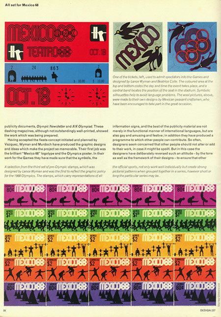
A page from Design #237 featuring various logos, tickets and stamps from the games.
Air Canada

The Canadian goodness just keeps coming.
Update via Joe Kral:
“This was designed by Dan Reisinger. Featured in an old issue of Graphis magazine.”
NFB 76/77
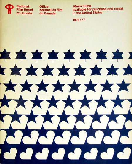
Sent via Jason Bustin:
“I’m in the process of moving and I came across an old National Film Board of Canada catalogue that was made available for American residents wishing to order 16mm films from the NFB in 1976/77.”
These evolving, MC Escher style designs are great. Especially love the motion metaphor tie in with the NFB. The bowed text at the top is an artifact of correcting for the angle at which the photo of this piece was taken.
I never realized it until I started posting all this stuff, but Canada seems to have a very strong legacy of graphic design, something for which I am not quite sure they are getting their due credit. I didn’t study design in school, is Canadian design a part of the curriculum of most design programs? If not, it should be. Just scroll through the recent entries here and you’ll see lot’s of great examples. I have a lot more coming too.
High Ceilings
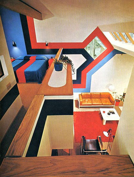
Love vaulted ceilings, love skylights, love plenty of angles. Is this a home or a cabin? Not sure of the details on this, if anyone has any info let me know in the comments. Obviously a few things could have been handled with a bit more restraint (never been a huge fan of oak), but overall it’s a great feel. If some crazy design comes off the wall and turns into a bed, you really can’t complain much. $20 says there’s a matching Porsche parked out front with perforated leather driving gloves in the console. Seems to be some variant of the Marcel Breuer Wassily Chair in the foreground, name that couch.
Whenever I see setups like this I always wonder who lived in them, did they actually get much use out of the place? Wonder what it looks like now….probably totally gutted and replaced with stock art fake paintings and plastic floral arrangements everywhere.
Update: Via Fisker in the comments “The picture is from the book ‘Decorative Art 70s’ published by Taschen
Tokyo 1964 – Track
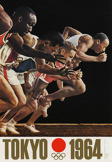
One of the original posters from the 64 Tokyo olympics. Simple and effective, the gold/red color scheme is perfect. Love the grain of the photo, yet another beautifully organic phenomena we have lost to the digital revolution.
