httpvh://www.youtube.com/watch?v=uzEzuS8i2i4
httpvh://www.youtube.com/watch?v=IFUxC2yMpyg
Happy T-Day.
Posts in Video
Snatch The Gravy Up
Patrick Daughters for Grizzly Bear
httpvhd://www.youtube.com/watch?v=tjecYugTbIQ
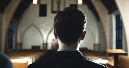
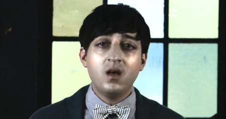
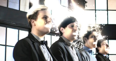
Grizzly Bear’s last album, Veckatimest, has been on constant rotation over here for a while now but I had somehow missed this Patrick Daughters directed video for “Two Weeks”. It’s been haunting me ever since, I can’t stop watching it. At first it’s seems a little strange, but it’s just so beautifully shot and somehow very fitting for the vibe of this song. I love effects like these (the big eyes, etc) where you can’t really tell what’s going on for a while, it’s so clean and subtle. Warp has a full HD version posted up on Youtube here that really highlights the attention to detail. I love seeing such simple compositions that are so moving. This is all essentially one shot and it’s got me glued to the screen. The rest of Daughters’ videography reads like a who’s who of indie music, with work for bands like The Shins, Feist, Snow Patrol, and Interpol among many others.
Windsurf – Weird Energy Video
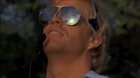
Highlights:
– 1:38 Caped shirtless dude grabs floating guitar
– 3:33 Guy with Uzi doing frisbee tricks
– 4:42 Cymbal crash synced with car explosion
– Every Jeep and helicopter chase scene
Whoever compiled this deserves a medal made of platinum and diamonds, enjoy your weekend.
P.S. There’s also this via pZimmer.
httpvh://www.youtube.com/watch?v=XOBbmdJTLdE
New Audion – Hecatomb promo video
This is mind numbing (in the very best sense of the word) next level presentation of club music with the added installation element. Tour dates listed here, hope to see you at the New York one, LA and San Francisco dates this week.
Graphic Designer Vs. Client
WARNING: While hilarious, the language used in the above videos is NSFW.
“I have made a mock up myself to help you in Microsoft Word. Just one other thing — seeing as I’m only going to use one of the ten designs you are going to do for me, I would like to pay 1/10th of the £3.50”
I was rolling on the ground watching this. I laugh at these videos in that “oh yeah, SO true” sort of way, but am not really comparing it to any of my past jobs. It’s almost as if this sort of client relationship is understood on some sort of primal level for designers. You hear enough stories and it may as well have happened to you. Anyway, this is hilarious; the automated-voice delivery is perfectly weird. The way they say “Microsoft Word” is fantastic.
The Prisoner – 60’s British Spy TV
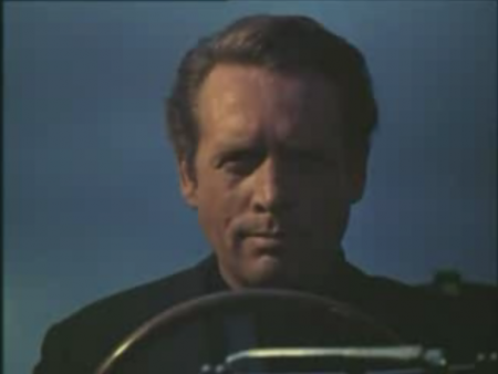
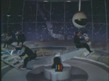
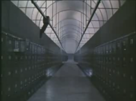
Sad to think that never again will we ever get to discover such a look and feel in a TV show, elegance and hi end style in the aesthetics won’t ever reach this level again, especially with what is on TV now.
Man Must Explore / Tom and Tim Muller
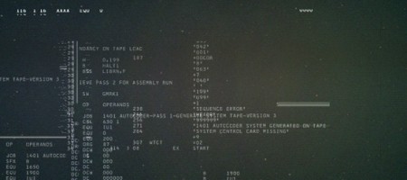
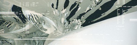
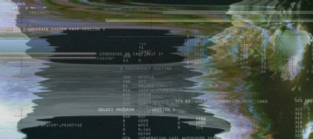
Easily the coolest advertisement for a fragrance I have ever seen. Tom and Tim Muller put this together as part of the campaign for Diesel’s new fragrance Only the Brave. There are many other videos up on the site — nothing comes close to this. (Though Si Scott’s could be cool in a few weeks.) This video, in addition to being flat out gorgeous, really captures the essence of the phrase only the brave. The Apollo 15 Mission connection is a perfect match:
As I stand out here in the wonders of the unknown at Hadley, I sort of realize there is a fundamental truth to our nature. Man must explore.
UPDATE: Tom Muller has written a post detailing this project on his blog. Great to hear a bit more about this fascinating project.
Kings of Convenience – Boat Behind Video
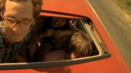
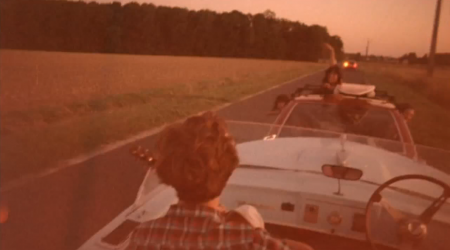
What can I say that hasn’t already been said about these guys, best feel good music video of the year.
Rock Band Abbey Road Commercial
httpvhd://www.youtube.com/watch?v=XpQkEF4WhJk
This is one of those things where I am in awe of the technical achievement but the whole idea behind it makes me want to drive off a cliff in a ’78 Blazer playing Sgt. Pepper’s on 8-track. It’s easy to say John Lennon would be rolling over in his grave if he saw this, but then again time does funny things to people. At any rate, The Beatles have always been idols of mine so this is still a treat, even if it is some cynical alternate reality where they’ve all been recast (two posthumously at that) in their prime as hucksters for some half-assed video game cavorting around with Hollywood-extra hipster stereotypes and generally making my whole childhood feel nauseous.
Anyways, it’s worth a watch as long as you hit stop right around the 22 second mark at which point is devolves into the zombie-mation 3D stylings that are the reason Rock Band makes me cringe. Although it could be worse, far worse.
Via Sorry Mari
Swisscom Re-Brand Film

I can’t say I’m in love with Swisscom’s new logo by itself, but I will say that the overall rebrand feels right as a whole. The type treatment is solid and the logo — although downright ugly standing still — lends itself well to motion and reinterpretation on packaging. The rebrand was headed up by Moving Brands (apparently with help from Dalton Maag).
I’m not trying to diminish what Moving Brands has done — they know way more than I’ll ever know about brands and how people perceive them, and hell, for all I know this is the best logo ever made and it’s singlehandedly going to increase Swisscom’s annual revenue by 1600% — but seeing a room full of designers standing around an idea board like that and thinking about the hours and weeks and months and millions of dollars that go into a project like this… Well, I sometimes wonder why these big corporations don’t just surf Behance for like and hour or something, find the kid with the best logos, throw him like $50K (which will completely blow his mind and make him your slave basically) and give him like 6 months. I bet he comes up with something just about as good and you saved like $20 million or whatever the hell they pay huge agencies these days. Ok, that’s probably all a bit of a stretch, but it does cross my mind, and if I become CEO of a european telecom giant you better believe I’m at least going to look into the idea. Actually, Moving Brands should have just done the same thing and pocketed the difference, all those guys would be doing burnouts in Ferraris wearing whale skin jackets now instead of standing around a chalkboard.
All that aside, what’s amazing to me is that these companies had the presence of mind and resources to film the process. I can’t imagine what it must have been like for the poor designers over at Moving Brands having some guy with a camera always looking over their shoulder, sounds like a nightmare to me. Of course, a lot of this could have been compiled after the fact, but it’s still an interesting look inside the process of high level design shops. I’ve always wanted to do something similar for one of my posters — capture it from start to finish — but I’m convinced that the second I started the camera I would make the worst thing ever and as hard I tried I would never actually catch anything good happening. Maybe that would be more fun, the time-lapse frustrated designer movie. Video Link
More details and pictures over at Brand New
Via LogoDesignLove