Posts in Web Design

Left School, Joined a Startup


You may have noticed I’ve been a little less prolific around here lately; finally I can tell you why. I’m very excited to say that as of last November, I dropped out of my MFA program and am a cofounder of Firespotter Labs, a startup funded by Google Ventures. As cool as the concept of “stealth mode” sounds to me, I am decidedly *not* used to *not* writing about what I’m doing. Finally my sneakiness is over! In this post I want to talk a little bit about what it’s been like working full time at a startup, as well what went into the decision to drop out of my design program five months away from graduation. I really couldn’t be happier.

Of course all this would be more interesting if you knew exactly what we were doing. I wrote our About Us the other day and it’s spectacularly vague, so if you want to find out a little more, there were nice articles in The New York Times and Techcrunch last week.
(more…)

Making of Designspiration.net


Nearly ten months ago, I (Shelby) had an idea that was inspired by the design community, one that I became very passionate about. The idea was to create some sort of platform to share what inspires you. We’ve seen it done before, but what I have for you is something I hope and believe you’ll really enjoy.

Designspiration is the outcome of my efforts to realize my idea, evolving into a site occupied by a diverse range of inspiration curated by its users. Designspiration or DSPN for short, focuses on the core principles of sharing inspiration and utilizes some great features; like a search function that works like a Swiss army knife, which I will discuss more in the post. Little did I know when starting this project that I would be clocking in more than 1,000 hours over the past ten months.

If you’re eager to check out the site, you can hit Designspiration.net or Ds.pn. With that said, I’m really excited to share this project and process with you…

(more…)

David Ope


httpvhd://www.youtube.com/watch?v=T710a9aADyA

Photosensitivity, Epilepsy, Seizure Warning: Some of the imagery in this post may trigger seizures or blackouts in affected individuals.

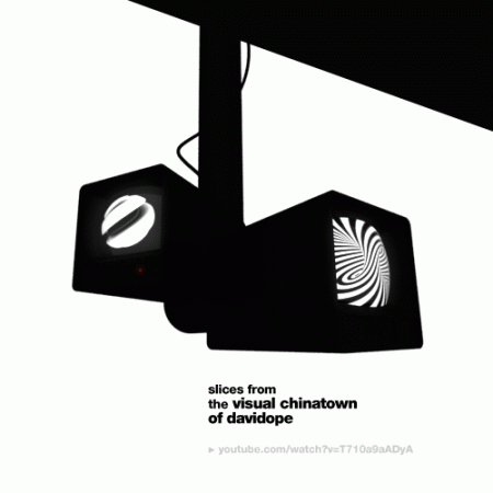
David Ope is a “Animated GIF Artist”, something I’ll admit I didn’t even know existed. He creates various mesmerizing, if not a little eye-straining, animated GIFs. Many are his own designs — mostly black and white striped compositions — but others are found media pieces featuring everything from himself as a baby to solar flares. I’ve included stills of some of his work above, click each to view the animated version — didn’t want to get all Geocities on you.

Be sure to check out his blog, where you’ll find all sorts of interesting work beyond his own portfolio, like this superb example below (possibly the best animated GIF ever made). Amazing to see people pushing a near-dead medium in such interesting directions.

David Ope via Changethethought via Sam Valenti

Bernard Barry


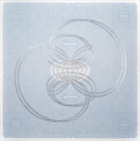
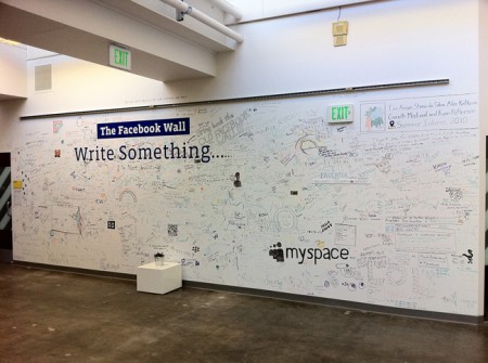
Bernard Barry is one of the principal visual designers at Facebook. A pretty sweet job I’d say. Imagine having a guarantee that your work would always reach millions of people. Barry handles the pressure nicely; his work is exceptional. If you just briefly glance at his site, you might not notice the absurd amount of detail that goes into each of his projects. The scale of each is often staggering. Barry also has cataloged his entire collection of books and movies. Absolutely worth checking out if you’re on the search for some new books.

Before Facebook, Barry worked at the Decoder Ring and I am imensly curious is he had a hand in creating my favorite logo of all time.

via dinner, earlier tonight

The New Leaf


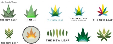
I’m not really sure what to link you to first…everything about this project is exceptionally well executed. Local design firm I Shot Him put together a very slick project (maybe “experience” is more fitting) surrounding the issue of marijuana legalization.

The project is made up of a lot of pieces: a website, a video, a process box, the list goes on. Really blown away by the complexity and creativity at work. And these guys aren’t a big shop! I Shot Him is made up a just a few MFA Academy of Art grads. Well done guys!

In addition to all of the final deliverables, they’ve outlined their process in this very detailed and thorough process piece. I am a sucker for design process articles and this one is among the best I’ve seen. I’ve included some images above, but definitely check out the full piece.

Colors of the Top 100 Web Brands


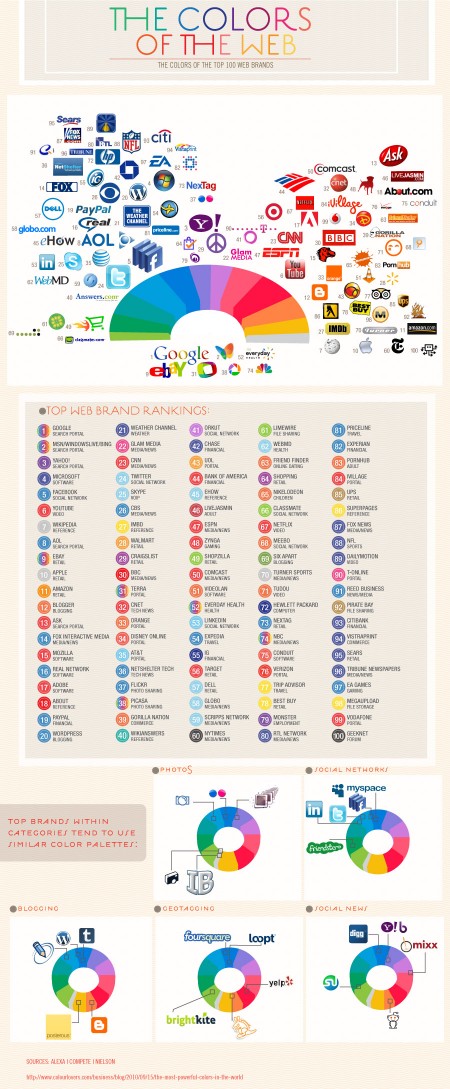
While the initial reasoning for the colors chosen may be trivial, the impact that these dominant players now have in the web world will surely influence the smaller startups that want to share in the positive color associations created by their bigger siblings

The fantastic Colourlovers put together this chart diagraming The Colors of the Top 100 Web Brands. A fascinating chart — the results of which you could probably guess — but it’s cool to see them all laid out and analyzed. Click here for the full size image.

via Josh Spear

Chrome Experiments

Swirling Tentacles by Steven Wittens


No doubt by now you have seen the Arcade Fire + Google Chrome super experiment posted today. This was awesome. Mind still blown. The site where the work was posted is Chrome Experiments and there is a ton of cool stuff there to keep you occupied for hours. (It’s my last day at IDEO this summer and I am having a hard time not playing with this every 5 minutes).

Even cooler, some of the experiments have ‘making of’ links and you can read a little more about their construction. (Warning: only interesting if you know what something like this means: for i in xrange(0, w.getnframes()):. )

According to CE:

We think JavaScript is awesome. We also think browsers are awesome. Indeed, when we talk about them, we say they are the cat’s meow – which is an American expression meaning AWESOME.

In light of these deeply held beliefs, we created this site to showcase cool experiments for both JavaScript and web browsers.

Hurts to try and conceive of all the possibilities with this type of technology. Can’t wait to see what they come up with next.

side note: I still maintain that some of the most interesting websites (in terms of rich/deep content) are those that haven’t even heard of CSS yet. I’m talking about websites that exist solely for the sake of information they host. Screw look and feel, their information needed to reach people. Something like this.

via the entire Internet

Virb


As a non-coder, and someone actually rather terrified of the “code” view in Dreamweaver, I feel it’s my duty to present notable website development platforms as they crop up. Sites like this really are a blessing for those of us that spend more time in Illustrator than Coda (give me your lunch money nerds). Virb is the newest kid on the block in this regard.

You may have heard of Virb before; their history is pretty interesting actually. What started as a social networking platform (apparently they used to be stacked up against Facebook and Myspace) has now morphed into something completely different. Strategically that was probably a good move. Now their mission is to provide the tools to build an “elegantly simple” website easily. As their CEO Brad Smith told Business Insider:

What Tumblr has done for the simplicity of setting up a blog, we want to do for the simplicity of creating a website. Sure, some people use Tumblr as their website, but at end of day its a blogging platform. We’re taking it a step further to where the entire idea is based around what we’ve always known a website to be — one location for all your content. [link]

Virb 2.0 (3.0?) feels like a mix between Squarespace and Cargo Collective, with maybe a dash of Tumblr thrown in. Overall I would say everything feels slightly simpler (perhaps to a fault) than the competition. I should mention that I am a user of Squarespace, Cargo, and Tumblr, so the Virb platform was immediately familiar to me. I haven’t really put it through the paces yet, but next time I need to create a website simply and quickly, I would consider Virb for sure.

You can rock a 7 day free trial now, but will have to pay $10 a month after that to keep things running.

Login Forms

roboto
nike
loworks
redbrick
vimeo
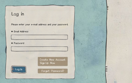
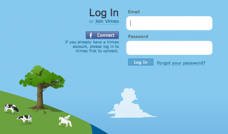
Recently I’ve been obsessing over an often overlooked part of web design: the login form. There are few sites that have aggregated examples of login forms for perusal; this one by Design Reviver is pretty good. I’d prefer the list to be more like 500 examples, but it’s easy to go in search of other cool login form designs. The ones above are fun, but I’ve yet to find one that really knocks my socks off. Anyone know of some really superb login forms?

One of my favorite trends is the use of oversized text in the forms. Tumblr was one of the first places I saw it. Scott and I discussed it a long time ago in reference to the Nike login form, pictured above. Still not sure what it is about the giant text field that feels so right — maybe it just seems to reinforce what you’re writing. Like “Yes this IS my email address. BAM.”

New Audio Player

iso50-plb
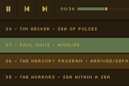
For those of you who listen to a lot of the songs here on the blog this should make your lives a lot easier. We’ve added a new audio player to the site for individual music posts which supports playlists. This means that you can just hit play and let them go without having to click each song individually. The new system is based off the same JWPlayer framework as the normal ISO50 Playlist player (top of the center column) but it will now be for individual posts as well. We will continue to update the main Playlist each month or so, but you can think of this as a new mini playlist each day. The skin is just temporary as I refine it, but all the core functionality should be there.

So far it’s only been implemented on Jakub’s recent “Top 50 Songs of 2009” series but it will be used for all music posts moving forward. So give it a try and let us know how it’s working. If you find any bugs or issues please let us know in the comments.

Enjoy!