



In my fourth post for Adobe Inspire I cover the master of retro-lofi photography, Neil Krug. Read the full article here.
This is part of a guest blogging series: Part 1, Part 2, Part 3.


In my fourth post for Adobe Inspire I cover the master of retro-lofi photography, Neil Krug. Read the full article here.
This is part of a guest blogging series: Part 1, Part 2, Part 3.



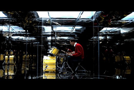
My latest post at Adobe’s Inspire Blog (where I’m guest blogging this week) is up. I focused on Photographer/Director Timothy Saccenti, who’s work you might recognize from some past posts.


As I mentioned earlier, I’m guest blogging over at Adobe’s Inspire Blog this week. Today I talked about the work and process of one of my favorite photographers, Kalle Gustafsson. Read the entire article at Adobe Inspire
By the way, Kalle has a great new portfolio up with loads of new work to look at. You can check it out at www.kallegustafsson.com
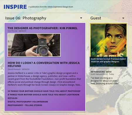
I’ll be guest blogging over at Inspire — Adobe’s Experience Design blog — this week. The Experience Design Team (XD for short) is an internal group at Adobe who develop applications and interfaces, you’ve seen their work in the form of the Photoshop CS4 and Lightroom interfaces. This months Inspire is focused on photography so I’ll be pointing out the photographers that inspire me and also talking about the roles photography plays in my own work. I posted up a short introduction today with more to come throughout the week. Check it out here.
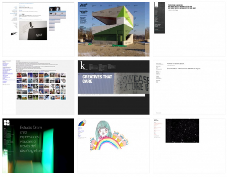
Indexhibit is the brainchild of Daniel Eatock and Jeffery Vaska. It was started in 2006 and has since become a very popular tool for artists looking to establish their online presence. Creating an online portfolio for yourself can be extremely difficult, and Indexhibit ameliorates that process by simplifying the format side of the equation. (Both of the creators webpages are good examples.) In their words:
[Indexhibit] is a web application used to build and maintain an archetypal, invisible website format that combines text, image, movie and sound…Content flows to the edge of the browser, images can be displayed as thumbnails that can be enlarged etc., this is a break from traditional fixed layout design associated with print, and a move towards an interactive experience where the user creates their own viewing experience. (link)
What is the general consensus on Indexibit sites? I’m curious to hear how people feel about the frame format from a user perspective. Is this type of layout standardization a good thing? Personally I like landing on sites created with the Indexhibit format because the work is given center stage; navigation is clear and there is nothing about the layout or format to distract from the portfolio. Obviously it’s not right for every designer, and you lose an opportunity to develop a badass format of your own, but it’s nice to have some level of clarity at work. I am tempted to implement it for my own online portfolio, if only for the simplicity, though I’m worried people might land and say “Ah, one of those sites,” and have it be distracting in a ‘played out’ kind of way. Maybe that concern is unfounded, but I’d like to hear what people think. Also, if anyone has experience installing and working with the platform I’d be interested to hear your feedback about the process.
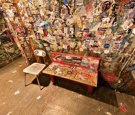

As you probably know, CBGB — the cradle of the NYC punk scene — was shut down in 2006. But not to worry, this site has got you covered with a 360° panoramic tour of the entire club photographed shortly before (or after?) it closed it’s doors forever. While this concept would surely make most of the bands who made the place famous roll over in their graves, it’s nice to know that the place is preserved in some form. The tour is solid as far as functionality is concerned (nice that it’s in Flash and not Quicktime VR) but the downright awful — and un-hideable — interface elements sort of detract from the experience. At any rate, the photos are high quality and you can zoom in and explore the very detailed shots of the interior and exterior of the club. Link




Loworks is a design company based in Japan. I’ve been on a wacky illustration kick recently, and it’s always fun to see what Loworks is up to. Their old site is one of my all time favorite website designs. It may not be the best design from an accessibility standpoint, but you can’t beat the creativity and absolute craziness at work. I wish it was still active, always made me happy. Computer Arts did a small feature on Loworks if you are interested.
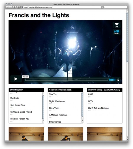

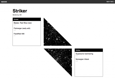
Muxtape is a new platform for bands to create profiles and showcase their music. It was originally designed as a place for users to upload MP3 mixtapes (like Apple iMixes) of their favorite music. This didn’t fly with the RIAA, and Muxtape had to shutdown in August of 2008; the year’s “most heartbreaking death” according to Wired. Rather than spend all of eternity in a futile legal battle, creator Justin Ouellette decided to switch gears and develop a new Muxtape centered around original content.
I haven’t had a chance to use it myself (new bands can only be invited by participating bands), but I see great potential for Muxtape. As a musician, I am constantly frustrated by the chaotic mess that is Myspace. If it wasn’t a necessary evil in the pursuit of a successful music career, I would gladly never visit Myspace again. The possibility of a new (and aesthetically pleasing!) platform is definitely exciting.
The layout of each Muxtape page is very simple and works off a strict three column grid. This creates a pleasing consistency between pages, and still allows a band’s personality to come through with creative implementations of the grid (without crashing my browser *cough* Myspace). It will of course be very difficult to compete with the reach and popularity of Myspace, but I think the simplicity of Muxtape’s design might be refreshing enough to draw a substantial number of users away. Some may miss the social networking component, but I like how Muxtape puts the focus back on the music and doesn’t allow for as many unnecessary distractions. Good luck Muxtape!
(via Subtraction. Great Article Khoi!)

Social image bookmarking sites are a dime a dozen these days (think ffffound, Dropular, and their ilk) but Buamai takes the concept to a new level. The brainchild of Michael Paul Young (co-creator of Youworkforthem), Buamai has thus far kept their contributor list closed — something I think is a must if you’re going to keep quality up. It seems that free-for-all sites’ content suffers incrementally as their user count rises. Buamai also has some novel sorting features along with the “Destoy” and “Mutate” options that make for some interesting modes of discovery. Here’s to hoping for an invitation. Buamai

So considering all the infinite hype surrounding it, I’ve finally been experimenting with Twitter over the past couple weeks and I have to say, it’s been surprisingly fun. I hooked the blog up so that all the posts are linked up on my Twitter page (using Twitter Tools) and it’s been an interesting way to communicate via a more direct route than is possible with the blog alone. I’ll be posting up giveaways, extras that didn’t make the blog, process stuff (pictures of the daily work), and random other tidbits here and there. It will also be the front lines so you’ll be the first to hear about anything useful or interesting before it hits the blog.
So there you have it, ISO50 on Twitter, join up! @ISO50