



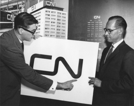

Last week I posted on the NASA logo and suggested that it might be the most iconic logo of our time. In the comments, Design+Conquer begged to differ and reminded me of an equally perfect logo. The CN logo was designed by Allan Fleming and James Valkus for the Canadian National Railway in 1960. Being an American I’ve had limited exposure to the mark, but every time I’ve come across it (usually on trains passing through when I lived in Sacramento) I’ve always been stricken by it’s minimal perfection.
CN Logo
09.26.2011


I love seeing the grid behind things like logos. I’ve been collecting examples as I find them:
https://gimmebar.com/user/trhaynes/collection/style-guides
Go Canada, and go ISO50! We salute you for the post, Scott.
Wow, their logo hasn’t changed since 1960? Most big companies seem to evolve their logo eh? I like the CN one myself nice and simple
Actually, the CN logo in the 90s did change slightly. They brought in a logo that had included the “CN worm” and a map of North America. However, it was controversial, given the politics around free trade in Canada at the time, and was quickly dropped in favour of returning the plain “worm” logo
ive noticed a few recently. but for some reason here in houston i always see santa fe and union pacific. i rarely see a CN.
Right on man! This logo is a great example of the power of simplicity. Bit nostalgic for me too.
Also just another reason to come back a play a gig!
Another Nuit Blanche?
p.s. not sure where you found it but the last photo is awesome
Being a Canadian and growing up in the prairies of the Midwest, this logo is one of the oldest examples of graphic design I can remember.
I’m guessing I grew up somewhere close to Justin Alm, above, and it’s one of those things you take for granted.
Good design is invisible, eh?
The other one on trains is the wheat logo. I’m not sure if it’s specifically Canadian, but it’s also simple and quietly brilliant. http://www.flickr.com/photos/travosaurus/33340690/