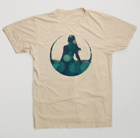
This limited edition tee shirt features artwork from the Tycho Coastal Brake release. More pics and info over here.
Coastal Brake Tee Shirt
12.06.2010

This limited edition tee shirt features artwork from the Tycho Coastal Brake release. More pics and info over here.
Comments are closed.
Nice. Are these printed by DTG or silk screened? Water based inks? Just curious.
I’m as curious as Chris is! I was going to ask the same thing
sorry, don’t like the bland color or wide crew cut. the new MIDI shirts are also techno geek not techno sheik. not happy with these new releases. =/
Hated to see it wasn’t on American Apparel. That collar looks a bit too loose for my skinny ass.
Hopefully you’ll print some of that design on AA soon.
I like it…
Just pulled the trigger on this one… I guess I’m not a true hipster t-shirt aficionado because I think it looks great…
heard a Tycho track on NPR’s All Things Considered. sounded nice!
Rick and AA, if you’ve seen me i’m a whopping 140 lbs and these crewnecks I think are better than the neck hugging American Apparel ones, Alternative might go crazy sometimes but this one I think is a nice fit, just sayin’
This is a nice design, and looks great on a shirt. After seeing this I’d also like to see the “analog visions” poster translated into a shirt design.
Although I’m not digging the Midi shirt. Doesn’t seem to fit the ISO 50 line of clothing compared to the entire collection. I don’t feel like the treatment is that unique, and has too much of an obvious and mainstream feel that you’d see at an Urban Outfitters or Pac Sun in my opinion.
I actually prefer Alternative Apparel to American Apparel. American Apparel is way to tight fitting and the neck always constricts way too much. Plus Alternative really does have that vintage look and feel. I can’t wait till the shirt arrives! Thanks guys!
@Jakub, i hear ya, just a bit too 90’s for me. And whats up with the MIDI tshirts…seems a bit too obvious and contrived for iso styles. MIDI is cold, practical and definitely not sexy…if that word can even be used to describe male oriented fashion in such an obviously male oriented blog-forum.
AA & David-
wow, refreshing to see the simultaneous presence of civility and dissent in a conversation on the internet.
So yeah, there’s always going to be two camps in the American Apparel / Alternative Apparel debate. Theses two companies make very different products and it all comes down to taste. I print a lot on American Apparel and I love their shirts, but a lot of their colors are pretty rigid (i.e. red is literally, RED) . Alternative have a sort of skewed, muted color palette with more unconventional tones, which really suits my work I think. Yes, the cut and feel are going to be different, but I felt that for this particular shirt it was well suited.
As for the MIDI shirts, I try to stay as true to the idea of creating shirts I myself would like to wear. I wanted to expand on the Vuela concept and try something sort of related but a little more complex. I also wanted to be a little more playful for once as I feel like a lot of my shirt designs are very restrained (and this is purely intentional). So yeah, I let loose with this one, and personally, I’ve very happy with it. I’ll certainly be wearing it.
It’s really impossible to gauge how people will react to something while you’re creating it, so you really have to put that our of your head and just move forward making things you enjoy. At any rate, judging from today’s activity, these seem to be two of the most popular designs thus far, for whatever that’s worth.
David-
The four color prints are difficult to work out the colors on. We are a couple tests into the Analog Visions shirt but I don’t want to go forward with it until we get them just right. Might see those for the summer.
Chris-
They are screened.
Thanks everyone for the input, as always I really appreciate the feedback (especially when it’s a little more constructive than “this sucks”)
If the Coastal Break shirt is any testament to what the Analog Visions shirt will be like, I can assume it’ll turn out fine. Thanks for the scoop on that.
am i the only one who sees the rebel alliance logo in the design?
it’s immediately what i thought of when i saw it. in a good way.
Mastodon-
I’m not super knowledgeable on Star Wars so I didn’t see that at first. But yeah, someone mentioned it when the single originally came out and I can definitely see it now. I guess it’s not such a bad image to conjure up in people’s minds.
Sweet looking tee, been hoping this design would make it to your clothing line, nice work!
This sucks… No, just kidding 🙂 I like the tone on the Coastal Brake tee. Though I’m not sure what I think about the shirt itself (fabric-wise). The grey tee that you printed the 1971 logo on, is the most comfortable tee I’ve ever owned, so if you ask me, I’d prefer if you printed all your stuff on that kind of tee 🙂 But then again… if they don’t come in the colors you need, then it’s obviously not possible to do. Well, just my two cents. Happy holidays!
The only reason I prefer american apparel is because they print on XS 🙂
The design is amazing though, got nothing bad to say about it!
Hey Scott, thanks for the clarification. I guess i like things a bit more nondescript as many tshirts these days either make too much of a pronounced statement (MIDI) or have far too much flare. (how much crap can i fit onto this product)
Btw, my sister attended your SF show and thinks you’re “hot”. I told her you wear MIDI shirts and she’ll make an exception only if you release the next album sooner rather than later. Otherwise, you and the MIDI shirt are on your own. 😉
I love the Coastal Break creative, have been wanting to see it on a tee and have bought several of your other shirts, but just can’t do a loose/relaxed fit. Guess I’m somewhat OCD when it comes to that. Great work though. Cheers.
Like it, like it, yes I do. Thanks
Just received my “Coastal Brake” t today! What a great shirt! Very glad I jumped on this one.
Who wants a tight neck line? The looser the better imo
Really happy with this shirt, fits me well in style and physical dimensions, very comfortable. Now to get to painting this room so I can finally put up my analog visions poster, 6 months after getting it…
Just ordered mine- great design and i’m glad its not on a fitted shirt for once. Coastal brake is great, can’t wait to rock the shirt. Keep up the good work.
Very cool design man. Inspiring me to get better at vector artwork. Keep it up!
Hey there! I’ve been looking around for mens funny t-shirts, that have a retro vibe, the whole vintge thing. In particular I was after some with a arcade game theme, like Pacman or Galaga / Space Invaders.
Gosh, there are just squillions of tee shirts online – no wonder it can be tough finding a really cool one – anyway, think I have now. Here they are. Whoo hoo!