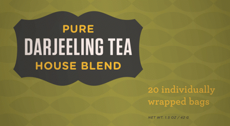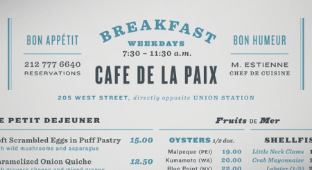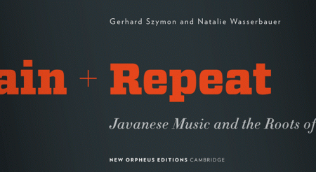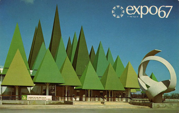


H&FJ just put out a really cool article on combining fonts. They break it up into four lessons and provide visual examples and typeface options. All the examples use their fonts, but the lessons carry over to usage with other typefaces easily.
I found the article to be especially inspiring, or at least liberating. I have a weird mental block when it comes to combining typefaces. I’ll often use two different ones, but never three without a huge mental commotion. I don’t know what it is, but I get really stressed out trying to finagle more than two typefaces into a design. Of course it depends what type of design it is. I guess I always felt like there was this mystical over-arching design rule that prevented exciting combinations of type (I know that sounds ridiculous). Anyway, something about their examples opened things up for me. It’s nice to hear it from the high authorities that this sort of thing can be this effective.
I’m also consistently amazed how good they are about talking about type; the adjectives they use are always way out of left field but completely spot on. Calling Gotham Rounded ‘cheeky’, for example, wouldn’t have come to me right away but makes complete sense once I hear it. If you recall their scene in Helvetica where they rattle off some rather satisfying descriptions of type — that was awesome.


I’ve been always afraid of combining fonts and I end up combining from the same family. I’m sure I’ll see the light here, thanks!!
I always get inspired by the font/typeface combos on their site. Everything they do just oozes class. Great article.
Definitely a good article. I always stress out when trying to find good typeface combos. Now I can put some reason to my choice instead of just thinking it looks ok!
I agree with Chad. Very classy yet stylish use of type on their site. Definitely makes me want to buy their fonts. Good lessons in being subtle and clarity.
I remember when I was taking my first typography class the issue of combining typefaces came up and I asked, “Which typefaces can you or can’t you combine?” The question sounds naive now as I become more familiar with different type, but I still find myself in Maria’s situation above^^, using two fonts and switching up the weights, etc…
I suppose that’s why we aren’t born experts? Thanks for the article, it’s very insightful!
I look forward to reading this article, it seems like the web page is down. I love the looks of those examples. I find it harder to couple color than fonts but any bit of info from an amazing type foundry is great.
Michel
Thanks for the link. H&FJ are masters! I share the same delusions about combining fonts. I still think it’s a no-no if you can’t do it well (which probably includes myself).
To me H&FJ are some of the true contemporary masters of type. I love the menu in the second example… There are so many combinations in there that go against my intuition and I would never think to use, but somehow work so well.
I read this yesterday, and its totally awesome. then i spent a good 3 hours ssearching through their archives, these guys are massively inspiring!
swissmiss certainly points to fantasic blogs..actually, shes why i read your great blog daily now!
cheers
There is definitely a voice inside my head that sounds an alarm if I want to use more than two fonts. I tend to gravitate towards verbose typefaces that have lots of different weights. While I think there is a true art to combining more than two typefaces in a design – I think that for most practical concepts – anything can be achieved with just two font familys and for me it rapidly speeds up my workflow when I commit to just using one or two familys.
I wonder what sort of data visualization you could put together based on design speed/time and how many elements you are working with. With every additional typeface that I was required to use in a design – I believe my speed would decrease exponentially.