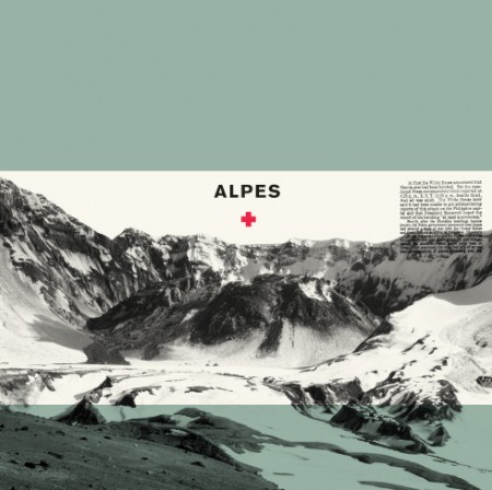
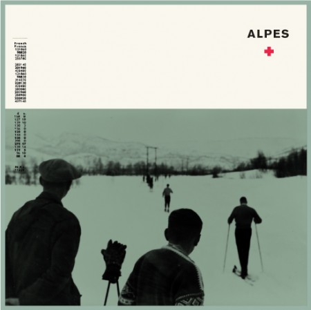
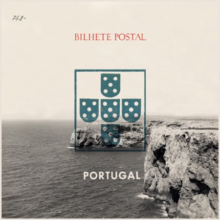
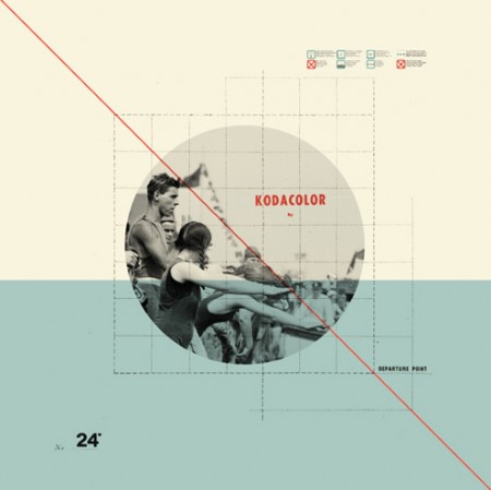
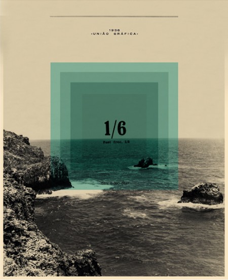
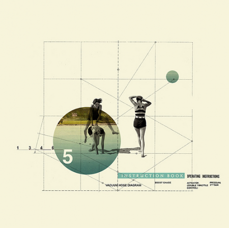
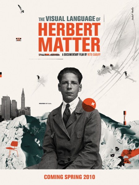
A couple of weeks ago I stumbled across these beautiful pieces by Cristiana Couceiro. I was immediately engaged by the simple, collage-like style and muted mid-century colors. There is also something about the use of monochrome mountain imagery and type that really catches my eye.
See more of Cristiana’s work on flickr.


Portugal represent.
Speaking of Portugal, love that third image.
p.s. there’s a broken link on the images – they link to 2010/06/06/ instead of 2010/06/09/ like the Comment link at the bottom does
something very satisfying about this style. Lots of folks do it, but few do it well.
An artist from my country! 😀
had seen it factured here on another occasion. But it is undoubtedly a good influence our
@Christoph I didn’t see that issue but removed the links anyhow. Thanks for letting me know.
@Gilberto, I’d be curious to know what is Portugal like?
I also met Christiana not long ago and was captured by her awesome work. Love her use of color and collage…great stuff!
Do you want other country for compare with Portugal? Or want to know how our country culturally is?
Couceiro’s work is amazing; it makes me warm inside, knowing that graphic collages can actually look slick but still retain a bit of vintage-retro grunge. Been waiting for a post on this for a long time, thanks!
Dude, another great post. Love the first two.