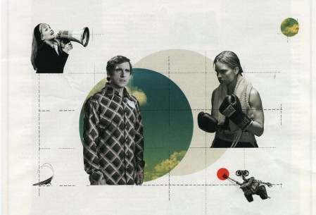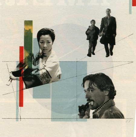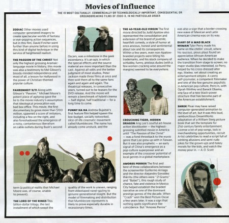


I was reading the New York Times this weekend and was pleasantly surprised to see the work of Cristina Couceiro as part of one of the magazine articles. I recognized her distinctive style from when Scott posted her work a little while back. In the capacity of the magazine article, it was interesting to see how the use contemporary imagery changed the overall impression of her work. I think it was successful — it brings context, and an slight twinge of humor to the work that wasn’t present in some of the earlier ‘found imagery’ pieces. Something about Steve Carrel especially just works for me…maybe it’s that ridiculous shirt he’s wearing.
This is probably the third time recently I’ve randomly stumbled upon the work of an artist I recognize in a magazine; I saw Leandro Castelao in a recent issue of GOOD, Mark Weaver in Wired, and someone else I’m forgetting now. It’s great to see how their work translates into an editorial environment. And great to see that magazines are supporting the amazing talent of all these artists!


Nice find Alex! This definitely has Cristina Couceiro written all over it.
Which Wired issue is Mark Weavers work in?
Also, Andy Gilmore did the front cover of WIRED not so long ago.
This is beautiful work. You’re right though, it IS kind of “warming” to see great work being published and supported in different mediums.
… a good way for a singular, consistent style to “wrap” otherwise very divergent images — without overshadowing them. i could imagine a project or two where something like this might serve as inspiration.
Am I the only one who is seeing similarities with Mark Weaver?
I very much like it, but the red dots and the explicit flatness really remind me of Weaver. Don’t know who ‘did’ it first, though.
Nevertheless, it’s very inspiring! Great artwork.