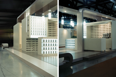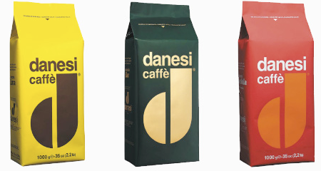


Whenever I see Danesi Caffe cups I always mean to post the brand on the blog, I don’t know if its just the D logo in brown on white that grabs my eye every time but after seeing their site and looking at the coffee bag branding i’m a fan, now I just have to actually taste the stuff.
Danesi Caffe Branding
08.09.2009


That is some sexy branding, along with their site. The coffee bean “d” is also quite catchy.
But my favorite coffee branding, by far, has to be Milwaukee’s own Alterra. It seems to be everyone’s favorite company around here, because of their economical and ecological strategy. They don’t always use the same branding, as most of their merchandise and propaganda is typically designed in different styles.
http://www.alterracoffeepro.com/
I’m a big fan of the Danesi logo as well. Simple, direct, classic.
Whoa, nice find. Those bags are straight out of the 60s. Love it!
I looooove this!!!! So makes me want to go to IKEA or something! LOL!
Lovely work both the colour use and the ‘d’ instantly recognisable and very trendy!
hi, thanks for the story – very inspirational