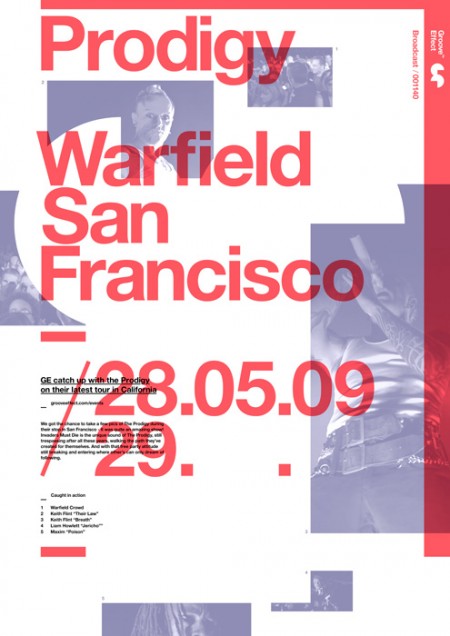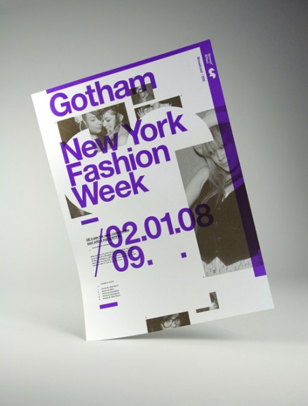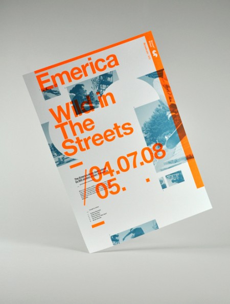


Older poster series by Darren Firth. I’ve always been a fan of Darren’s web work and recently came upon the project above while searching around for innovative ways to shoot pictures of printed work. I thought this was a cool idea; playful and interesting without being distracting. Of course the poster design is what I really like. I’ve never been able to pull off this kind of mega overlapping layout, and I always appreciate it when it’s done well like this. Hopefully going to see some new projects soon! Keep an eye out at Darren’s portfolio.
Follow up reading: AisleOne interview with Darren.


Thanks Alex, nice work done here by Darren. I do like this way of shooting printed work, definitely a great approach and makes it feel as if the work is indeed the focus.
I came across Darren’s work about a month ago. Beautiful stuff. These posters happen to be my favorite of his.
Darrens work is pretty inspiring. I love his use of negative spacing and non-traditional grid work. Darren is a perfect person to look at if you need some inspiration.
Alex, thankyou very much for the post and thanks for the kind words Shane, Greg and Patrick. Much appreciated.
these posters are great. very subtle and clean. great work Darren!