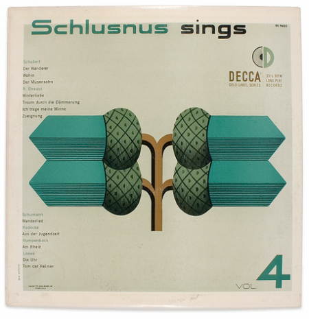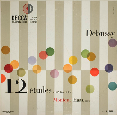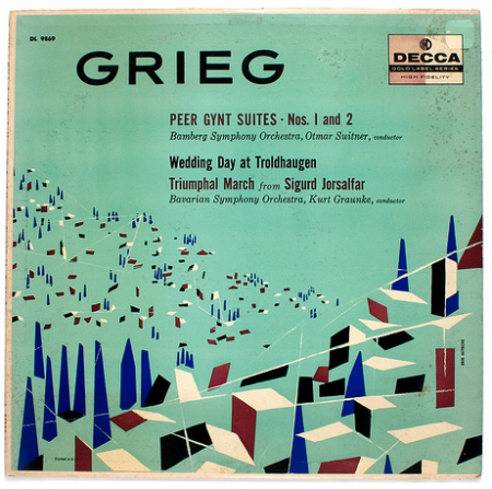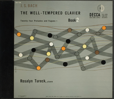


A few Decca record covers done by ISO50 favorite, Erik Nitsche. I was browsing Flickr for some or Nitsche’s work and I came across the massive assortment of images here, compiled by BustBright. I am in love with the type on these, especially the “Schlusnus sings” typeface. I’m not sure what it is but it amazing. And I always love Didot — if you browse the rest of the archive, you’ll see a lot of that.
Decca Records
10.23.2009


The Grieg cover is absolutely stunning.
You have got to fucking be kidding me with the Debussy cover.
It looks exactly like what happens in my head when I listen to Arabesque No.1 – beautiful perfection…beyond words…
http://www.last.fm/music/Claude+Debussy/_/Arabesque+No.+1
can we all just agree that Nitsche is the best? i saw a bunch of his 30×40 stone litho general dynamics prints at a poster show a while back. my wife had to drag me outta there….unbelievable in person.
I would love to see a the thought process behind these. Great Post!
I’ve been a big fan of that top image for a while now and have since fallen in love with Nitsche’s work.
I was forced to buy a vintage copy of “Dynamic America” compiled by Nitsche, with mostly his work in it…still drooling on it as I type.
Rent — Just bought that book from Amazon Used Books — looking forward to getting that one in the mail!
It’s a great book for sure. I wish there were more of the annual reports contents and posters in it, but still an awesome resource. glad to hear you snagged one.
@ Jesse,
I’ll have to see if I can find the article, but in it Nitsche did discuss some of the background info behind the sleeve’s designs. Most of them were somehow referencing the music—either visualizing their sounds or something culturally connected to the artist or songs. I do remember that the Schlusnus series uses images (the acorns) from a traditional set of German playing cards—this was meant to reference the fact that Schlusnus was singing traditional German folk songs for this particular series of records.
I can’t remember the name of the typeface the Schlusnus Signs is based upon, but its the same thing he used for the General Dynamics logo.
Probably the most underrated and prolific graphic designers ever. Erik Nitche’s volume of work is both stunning and daunting, a true inspiration for every tue thinking designer.
HMK