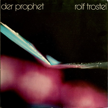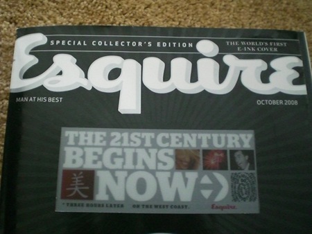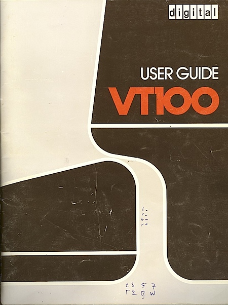
Another one from the Dream Chimney "Sleevery" archive. Loving the type, I would call that Avant Garde if it weren’t for the rotated ‘e’. Can anyone identify this or is it a custom job? Let us all know…
Not sure what’s going on in this photo, but it’s incredible and the colors are just about perfect. Wish I had some more background on this piece but perhaps someone can fill in the blanks.


Yes Scott, It is Avant Garde, and not a custom job, the rotated e is a part of the Avant Garde Pro collection, aswell as Avant Garde alternate if I’m not mistaken. You can find it under the ‘Glyphs’-section in ‘Type’ of Illustrator or Indesign.
Very well used here 🙂
Yeah I would agree, my version of Avant Garde also comes with that sexy ‘e’
Was going to say basically what Simon did… haha
I have one that is very similar called eurofurence light. The only difference that I found is that the ‘t’ is different.
Here’s the link.
http://www.dafont.com/font.php?file=eurofurence&page=1&nb_ppp_old=10&text=&nb_ppp=10&psize=s&classt=alpha
I believe it’s a typeface called Kabel. It’s main characteristics are the ‘e’ and the ‘g’. It’s been a while since I’ve seen that typeface being used.
Hey Scott, I believe the font on Der Prophet is called “Bauhaus Light” if Im not mistaken – a beautiful font from a wonderful time of design exploration. Keep up the interesting blogs and great work you do!
greetz
Jas