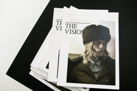
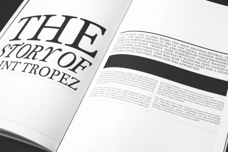
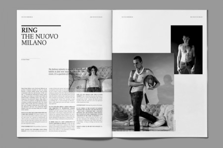
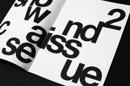
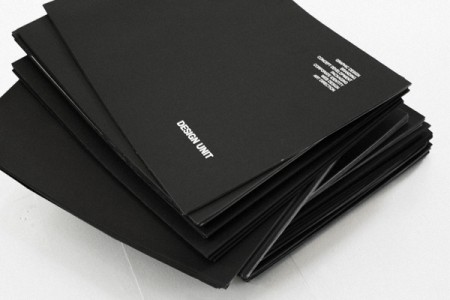
Assorted works by Designunit. One of my teachers at school likes to use the expression “swipeable” when describing cool/inspiring work. Our goal in class is to create something badass enough for people to want to “swipe” and use for inspiration. The above work by Designunit meets that criteria for me (and for people on Dropular just about every other day…). It’s been a mainstay in my inspiration folder for some time now.
My favorite medium of design is the magazine and I consistently look to them for inspiration when starting a new editorial project. They have a interesting approach to layout—grid based but still somewhat loose—and I find it to be very polished and refined. It manages to maintain a classic quality while still seeming hip and progressive. Designunit is based in Copenhagen and you can see the rest of their work on their site.



Yes these are quite amazing. Their website is packed with high-quality design projects, a sure stop for inspiration in the future. Thanx Alex for the link.
They impacted me,
Black and White world are so chic !
Every now and again I find a web site that is a real source of useful information and content. This is one of those. A rare beast indeed. Keep up the good work. Kind regards ….
Чтобы ничего не делать, надо это хорошо уметь. Ага? Еще что нибуть по этой теме охото.
я бы сказал не интересно, а разумно