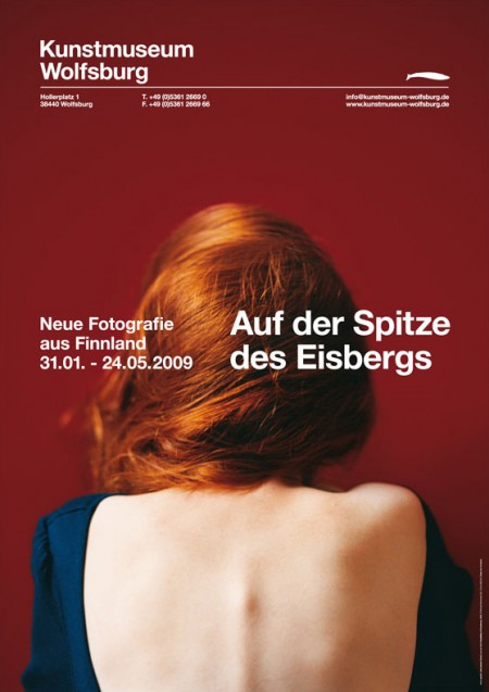
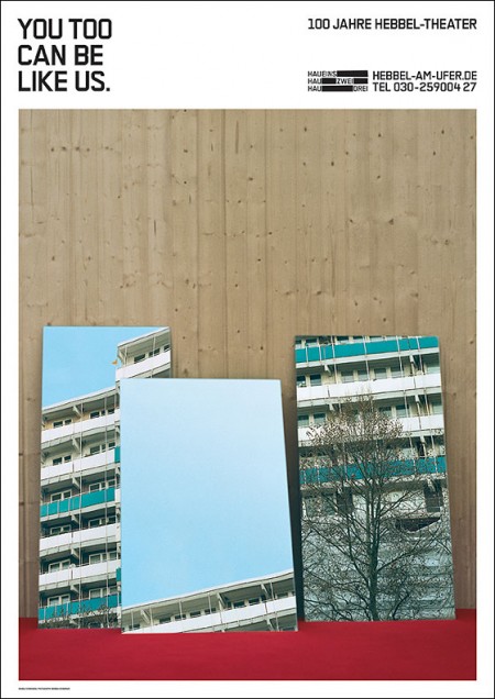
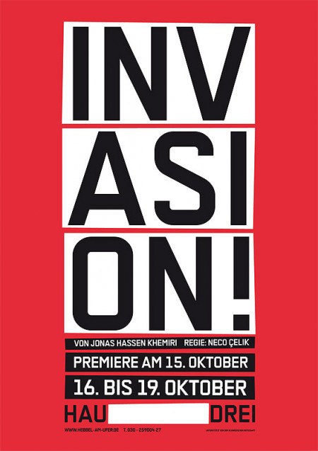
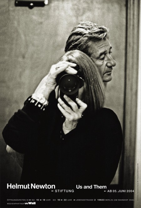
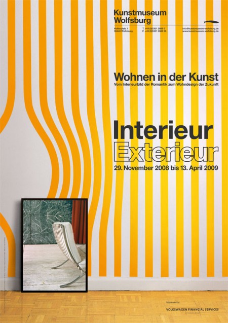
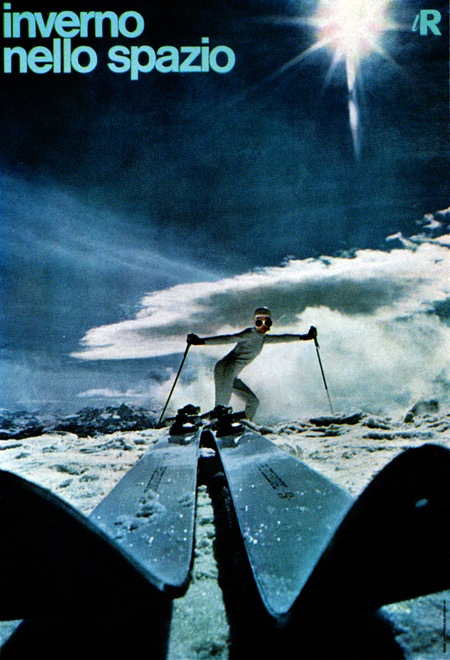
I always love finding new poster designers and Aisleone just turned me on to a great one. Berlin-based Double Standards produce some very nice poster work and posses some incredible typography skills. Check them out here.
Double Standards – Berlin
04.15.2009


wow, thanks for sharing those. very eye opening. i love them!
Yeah, i saw the invasion poster several times, when i visited Berlin last year, but didn’t knew that it was from double standards. If you like their work, be sure to check out their corporate design / cover art for Perlon records.
i found a link to the perlon covers: http://www.doublestandards.net/website/index.php?section=client&client=198
Beautiful posters, esp the Invasion and Helmut Newton ones.
Website has got a ton of stuff on it…and the type is really something to look at in each one. Is anyone else picking up on some of the quirks in the type and the way it’s arranged tho?
Wow… not much more to say about it.
INV
ASI
ON!
!
Woah… those really look cool.
Very inspiring