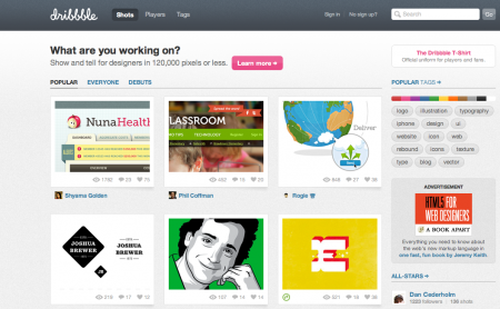
Dribbble is a place to share little snapshots of what you’re working on. It’s kind of like Twitter, except instead of being limited to 140 characters, you’re limited to 120,000 pixels. Better have a good eye for cropping!
Dribbble is show and tell for designers, developers and other creatives. Members share sneak peeks of their work as “shots” — small screenshots of the designs and applications they are working on. It’s also a place to talk design, give and receive feedback and iterate toward better work.
They exited private beta about a month ago and are in invite-only mode right now. I’m very impressed with how solid the site feels overall. Seems like they spent a really long time finessing all of the details. I haven’t had a chance to ‘dribbble’ any of my own projects, but I really like the concept and I think it could be really fun to use. If you want to try it out, you’ll need to be drafted.


This looks great! Anyone have spare invites? I’d love to get in on this. I’m currently working on creating a small design business with my friend. This would be a great tool to use for feedback from others.
I suspect this comment thread is going to turn into a begging match, so I’m going to jump in at the top. I’d love an invite if anyone’s feeling generous! I don’t have many friends who are graphic designers, so getting instant feedback with a thumbnail would be fantastic.
This looks cool, although I have my little network of design friends I elicit feedback from, and I can’t post any music-related work, I would love to use this for all the personal/freelance work.
It’d be cool if you could set up private groups or something so only certain friends could see your …ugh, dribbles. Is that possible do you know?
Is it too much to ask for a non-idiotic social network term?
i hate to be *that* guy – but while I like the idea behind this website, the design seems a little too similar to threadless.com ‘s website – from the colors to the navigation to even the logo style.
But again, the idea is there and seems neat.
I’ve been searching for an invite for ages. I feel like I’m being punished for now being all up in the internets business. However If an invite would happen to come my way I’ll come right back to ISO to share the wealth when I have a chance.
I participated one or two of—out of three I think—the original Screen Grab Confabs back in the day. It’s too bad those participants didn’t get first dibs! 🙂
Anyway, I was thinking of hustling for an invite, but I’ve just taken to doing the same exact thing on tumblr until it becomes open or I get drafted somehow. I kind of like the idea of being drafted though, but it’s hard when you don’t know anyone with invites.
I always thought the Screen Grab Confab was a cool idea.
Even if you can’t join just yet, I love that they provide RSS feeds for individual members. Convenient. I was just invited…and I’m sorry I don’t have any invites to share yet. http://dribbble.com/players/amystoddard
Hey, just jumping in the ring here. I too would love an invite. Ain’t getting enough feedback on my actual design blog so perhaps this would be a nice alternative. Just hope it doesn’t kill my blog like Twitter did my other blogs.
lol, who has time for this?!
Dribbble is just another place for the some ring of designers to have their egos stroked by eachother and a complacent audience. Additionally, all the work looks painfully similar. Simply imitating the formula shouldn’t be confused with accomplishment.
I know nobody will agree with this sentiment, but that’s part of the fun. You can take the intellectually lazy route and say I’m jealous or whatever – that’s fine. But you really should think about this and what it means for our industry.
Jake, we’re Graphic Designers. Ego is all we have.
Agreed Jake!
I really like the idea of this site, and I like the network of designers they have invited. A great tool to get feedback on your design pieces.
I sort of agree with Tardlovski here in the comments.
The only time I’ve seen this site look useful in any sense is how one UI designer (or maybe all the UI designers) seems to almost advertise the apps he’s working on. Hyping them up in a way.
But truly, all these little screenshots of gradient-filled boxes with rounded corners sitting on filter>noise backgrounds and text using Blend Mode > drop shadow 90 degree 1px, inner shadow -90 degree 1px over and over and over again… gets pretty tiring.
nice shots my friend, keep it up!