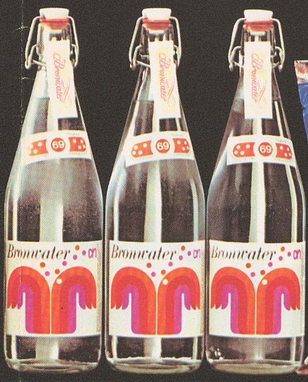
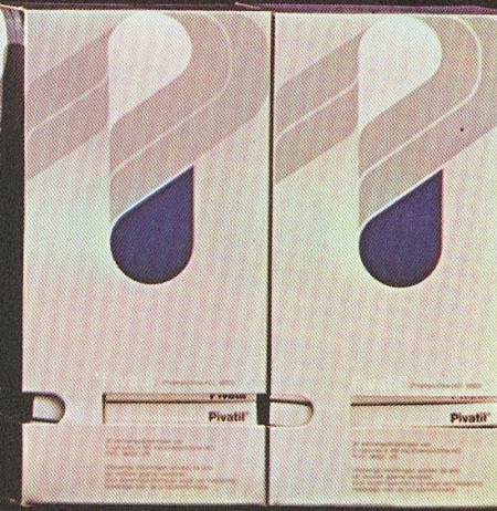
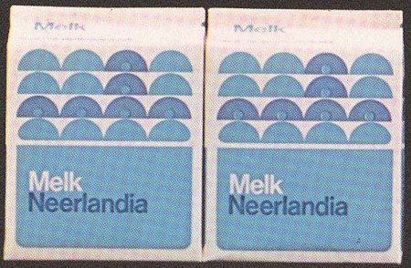
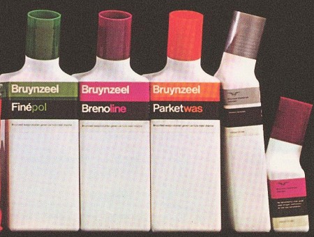
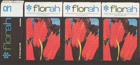
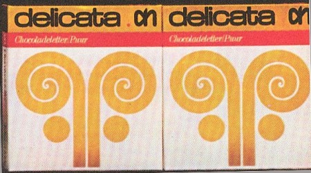
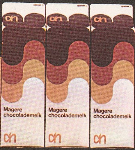
Some great examples of packaging design by Dutch artist Louis Swart. Swart got his start as early as age thirteen and was quoted at that time as saying ‘I am striving not to become the grand old man of the profession, but to close my design doors when I reach forty-five’. So not only was he a designer at 13, he was getting interviews, pretty incredible.
I recognize those Albert Hein logos in there. As I recall, the current in-house brand has not carried on this tradition.
More on Swart and his work over at the Graphic Design Museum via Grain Edit


I just checked out the Graphic Design Museum’s blog — he is quoted as saying that at 30, not 13, and it also says he got his start working at 13 for the Amsterdam Stock Exchange before going to art school. 🙂
Such a beautiful set. If only these packages still existed: https://blog.iso50.com/wp-content/uploads/2011/08/pivatil-450×462.jpg
以后经常来看版主老师的博客
我喜欢你。
又简洁不少,但看上去挺高级的,收藏一下。
that’s great! i (a dutch graphic designer) never heard of this guy. the logo of albertheijn is still quite the same, but sadly they put a ‘label’ behind/around it.. see here: http://bit.ly/rdNlfO
Nice, they still have a similar tradition, though.
If not mistaken they now cary a brand called Euro Shopper which has some nice lay-outs as well.
Might not be everybody’s taste, but on the rack they just pop out trough their simplicity.
http://farm6.static.flickr.com/5178/5525324881_58cf03700b.jpg
and a comparison with the C1000 brand which is a competing supermarket that has similar layouts for their household brand.
You can check them out here:
http://mattus.web-log.nl/.a/6a0133f1eb372a970b0147e0316fcf970b-popup
As a extra note to my previous comment. A lot more examples can be found here: http://burobraaf.nl/euroshopper#more-1134
including their old visual identity.
好文章啊。希望能尽快看到下篇文章,已收藏,呵呵!
These are great! Albert Heijn is indeed still using the same fantastic logo today. Unfortunately their product packaging has not frozen in the ’70s. Great store though!
i miss holland!