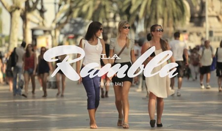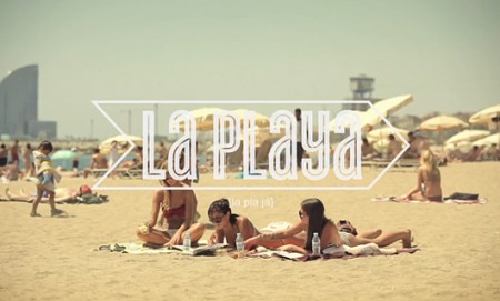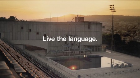


These beautifully executed commercials for EF International Language Centers were created by designer Albin Holmqvist (who did the type) and director Gustav Johansson. The typography is simply incredible; many of these frames would be suitable as posters. There are four commercials in all, the rest can be found at Albin Holmqvist’s Vimeo.
Via Wanken


a few days ago i made image captures of these frames and am currently using these type treatments, so beautiful !
These are beyond stunning!! Thank you so much for sharing them. Made my day =)
Yes! I thought you would have posted these sooner or later. So great, trying to learn after effects right now because of these.
Thanks again for the nice write-up!
Keep up the great work Scott!
Oh wow I got the chills watching those. I think the combination of the music/video with the good feelings that come from seeing someone nail the type treatment did me in. In the London one, I loved the part with the tea cup!
These videos are so banging. In that humbling kind of way. Trying to re-learn a little about images and design just from watching them.
@ Jeff: True that. That tea cup bit was so DOOOPE! I’m provoked to put in the effort making custom type for my vids 🙂
Brilliant stuff, thanks for sharing.
i love watching them!
it makes me wanna be a exchange student again..lol
i was a exchange student in US and was in
EF as well<3
Pretty sure that Barcelona video made me fall in love.
memories… I’ve been in Hastings (UK) with EF in the old 1994.
I remember their marketing material being quite tacky at the time, I’m glad they’re getting classy stuff like this nowadays.
I was really expecting “MDMA” to pop out at the end of the London movie, but I guess “Party” was more approriate.
This is so good, the feeling is perfect. I love it.
Memories of grad school not like this.
Awesome stuff. Thanks for sharing