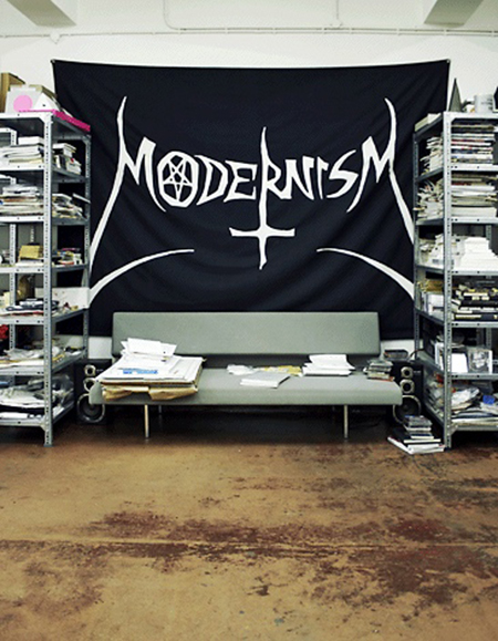
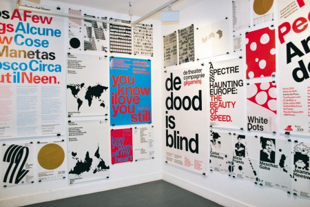
Late last year I had to pleasure of interviewing Danny, Marieke and Erwin of Experimental Jetset. Founded in 1997 and based in Amsterdam, Experimental Jetset is one of the most exciting and highly regarded studios working today. They create exceptionally beautiful work; immediately recognizable for its top notch quality and unique remixing of modernist principles and stylings. Their global renown continues to soar– most recently thanks to their part in Helvetica and the extreme popularity of their (now re-released) John&Paul&Ringo&George shirts.
A quick perusal of their website can easily turn into hours as you browse through their catalog of work and read their comprehensive descriptions of each project. In these descriptions, and especially in interviews, the depth of their reflection is astounding. They take great care to consider every perspective — whether it be a report of one of their own projects, or an answer to a seemingly basic interview prompt — their ability to discuss Design and work is as remarkable as it is fascinating. What follows is our discussion from November 2009. Enjoy!
I have always loved your name, Experimental Jetset. I know the origin to be a Sonic Youth album, but I’m curious how your opinions and conception of the name may have evolved over the last 11 years.
It’s funny, when you choose a name, as a studio, you have no idea you’ll be stuck with that name for the rest of your career. And while you are evolving, as a studio, the name remains the same. So yeah, it’s an interesting question. Indeed, the relationship between a studio and its name is a constantly shifting one. First you love your name, then you hate it, and then you realize you better embrace it. Then there are times that your name seems to exist completely independent from yourself: whenever we read the name ‘Experimental Jetset’, it usually takes us a while to realize people are actually writing about us. It sometimes feels like a completely different entity, something that exists almost separately from us.
Sonic Youth has always been one of our favourite bands, so we’re still very happy that our name specifically refers to them. At the same time, we realize that the ‘Jetset’-part in our name might come across as a bit tacky, in a sort of ‘lounge lizard’ way.
But then again, there is something to be said for tacky, silly names. Think of the name ‘the Beatles’: an extremely silly wordplay, in no way describing what the band later grew into. Or ‘the Beach Boys’: great name for a mediocre surfband, but not really fitting for Brian Wilson’s brilliance. But at the same time, these names are excellent, exactly because they reveal the beginnings of these bands. It ties these bands to their roots, which is great, we think. Likewise, the name ‘Experimental Jetset’ says something about our own beginnings, whether we like it or not.
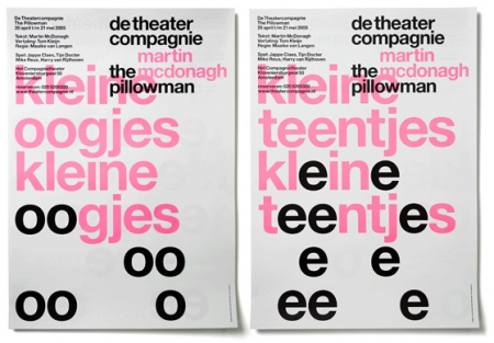
De Theatercompagnie | Posters for The Pillowman | December 2005
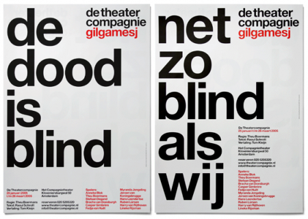
De Theatercompagnie | Posters for Gilgamesj | January 2005
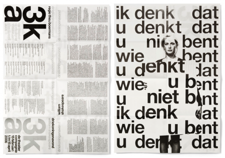
De Theatercompagnie | Driekoningenavond Promotional Material | February 2006
What are some of your favorite names of other companies (within the field or not)? Given your answers, what do you think it is that makes for a good name?
Well, ‘Total Design’ is the first name that springs to mind. In many ways, it’s the ultimate studio name, isn’t it? It’s so brutal, so merciless… It would be impossible to pull off a name like that in this current era. In general, people have become a bit too squeamish to handle such an absolute, authoritarian gesture, we guess.
As for contemporary names, we really like ‘A Practice for Everyday Life’. It’s so smart to use your studio name as a semantic bridge between the ideas of Michel de Certeau and the practice of graphic design. What we also really like is the fact that the acronym is a word in itself: APFEL, which is German for apple. And what’s cooler than an apple?
Some of our former students just started a studio called ‘Our Polite Society’, which we think is a very good name as well. And we recently came across a studio called ‘The Luxury of Protest’, which is also quite cool. There are actually loads of very interesting names. ‘The Designers Republic’, ‘Graphic Thought Facility’, ‘Life of the Mind’… It’s impossible to mention them all.
It’s actually a very good subject you brought up. In ‘The Arcades Project’, Walter Benjamin wrote that “through its street names, the city is a linguistic cosmos”. So maybe we can regard graphic design as a sort of cityscape as well, as a linguistic cosmos of studio names. We very much like this idea.
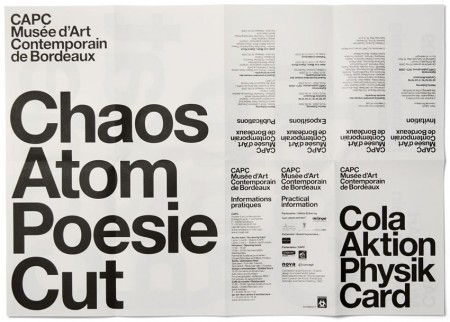
CAPC | Heimo Zobernig Exhibition Invitation (front) | September 2009
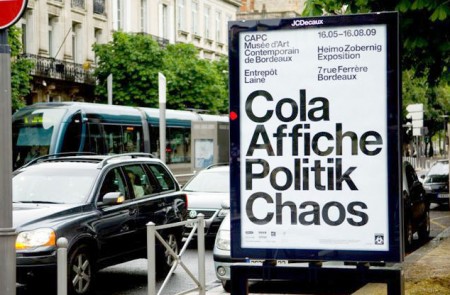
CAPC | Heimo Zobernig Exhibition Poster | Photo by Frédéric Deval | 2009
Khoi Vinh wrote an article not too long ago about the state of honest criticism in design. At one point in the article he asks, “are we really having the kinds of meaningful, constructive, critical discourses that we really should be having?” I’m curious to hear your thoughts on this issue. Do you find there is a dearth of honest and effective design critique happening in the field? How does your studio approach criticism when it comes to your own projects?
This theme, of criticism and graphic design, is a subject that we find very interesting. Although, we have to admit, the way we approach it is quite different from the approach you suggest in your question. We’re much more interested graphic design AS criticism: the idea that a piece of graphic design is a manifestation of a certain way of thinking, a certain way of ordering the world, and that, by functioning in that way, that piece of graphic design is effectively critiquing the dominant way of thinking, the existing way of ordering the world.
Or, in a similar way, we also very much like the fact that two different posters, hanging next to each other in the street, are in fact critiques of each other. To refer again to ‘The Arcades Project’: at a certain point, Walter Benjamin describes the flaneur, walking around in Paris, being confronted by the posters, signs and slogans in the streets of the city: “Under these conditions, even a sentence (to say nothing of the single word) puts on a face, and this face resembles that of the sentence standing next to it. In this way, every truth points manifestly to its opposite. Truth becomes something living; it lives solely in the rhythm by which statement and counter-statement displace each other in order to think each other”.
So that is the sort of critical discourse that we find most interesting: the dialectical exchange that exists between designed objects. We’re much less interested in this whole sphere of graphic designers publicly criticizing and attacking each other on weblogs and forums.
In a way, we even think that this brand of online peer-to-peer criticizing might be hurtful to what we see as the true critical potential of graphic design. In our view, aesthetic languages should contrast as sharply as possible. Two posters, hanging next to each other in the street, should be as different from each other as possible: the viewer should resolve the tension between these two posters him- or herself. The tension should not be prematurely resolved in online forums, in discussions between designers; it should be resolved in the head of the viewer, by a ‘third party’, so to speak. Only then, to speak with Benjamin, “truth becomes something living”.
We understand this probably sounds pretty abstract; it’s hard for us to explain it in a better way. But we can give a very personal example. We grew up in Dutch cities like Amsterdam and Rotterdam. We can still vividly remember the contrasting aesthetic languages that were surrounding us towards the end of the 70s, in our pre-teenage years. On the one hand, buildings were carrying signs designed by typical ‘late-modernist’ design groups such a Total Design. Those same buildings also carried punk graffiti, band names, anarchist signs. Precisely because these two languages contrasted so sharply, they collapsed in our heads, and we were able to formulate a ‘third position’, a sort of synthesis of two opposing languages. And it is this synthesis that became the foundation of our own graphic language today.
Now, imagine that the ‘late-modernist’ designers, and the anarcho-punks, would have resolved that tension already for us, in some kind of premature discussion… Where would that leave us? There would have been no tension for us to solve, no synthesis to strive for. There would have been no room for movement at all.
We think this kind of online peer-to-peer criticism is counterproductive on a very practical level as well. In our view, what this whole subculture of small, independent studios really needs is a sense of solidarity. It could do with less bickering, less backstabbing.
We think this whole international scene of small studios is really special, and we should try to protect it as much as possible. The independent studio is pretty much a threatened species. The catastrophic influence from branding-, marketing- and PR-people becomes more and more visible every day. Large advertising conglomerates are taking over the kind of territory that was usually covered by smaller, more cultural studios. The world has gone mad, and even the smallest client suddenly wants to work with pitches and competitions, because they believe this is the way it should be. We really think that, in the middle of all madness, we should stick together. We should use our combined energy to defend this whole subculture of small studios. We shouldn’t be putting energy in complaining about each others work. “I would have kerned this logo in a completely different way”… well, of course you would have kerned it in a completely different way. But what’s the point moaning about that in public? We all have different graphic languages; that’s the beauty of it. Why spend so much energy on what are basically small stylistic differences?
We did enjoy Khoi Vinh’s article a lot though. It’s interesting to notice how people perceive things in completely different ways. At a certain point, he writes that “it’s not hard, in design, to reside in a frictionless environment”. We couldn’t disagree more. In our own day-to-day practice, design pretty much equals friction. As a studio, you constantly have to expose your work, protect it, defend it, alter it, repair it. You have to deal with clients, curators, editors, printers, etc., and on top of that, you have to deal with a design industry that can be quite hostile towards smaller studios. It’s pretty much an uphill battle. So the last thing you need are your peers, attacking you from behind.
It’s also interesting how Khoi Vinh, elsewhere in his essay, makes the connection between criticism and honesty. While, in our personal experience, there is a really strong link between criticism and dishonesty. A lot of the people who have publicly attacked us (calling us lazy, cynical, false, nihilistic, whatnot), have later contacted us, to ask us if we wanted to contribute to their design book or little art project, or if they could drop by at our studio, to visit us. In their mails, some even described themselves as “big admirers” of our work. This phenomenon has always struck us as very bizarre. Publicly they attack you, but privately they admire you. To us, it shows that criticism is often a pose, a facade. It’s certainly not always honest.
The above remarks refer pretty much to peer-to-peer criticism. The professional critics, well, that’s a whole other can of worms. Don’t get us started on that. For now, it might be enough to quote Brecht, who described critics brilliantly: “They are, to put it bluntly, enemies of production. Production makes them uncomfortable (…) They want to play the apparatchik, and exercise control over other people. Every one of their criticisms contains a threat”.
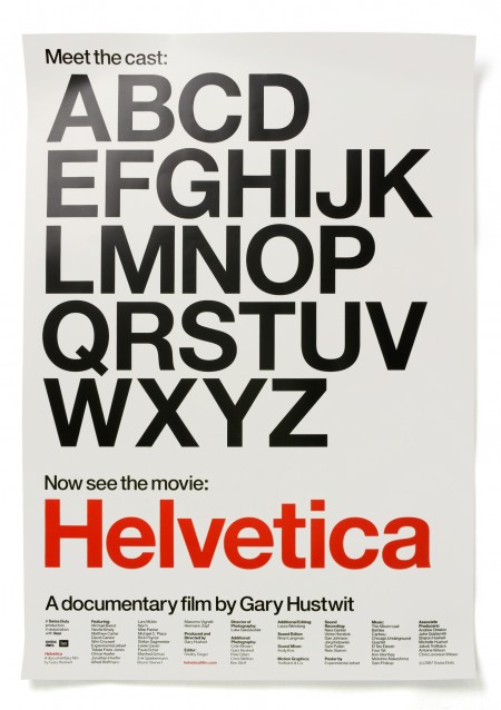
Helvetica | Posters for the Film | August 2006
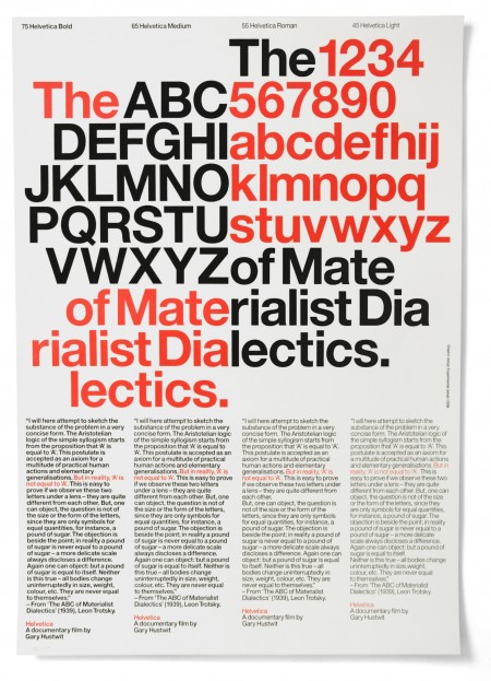
Helvetica | Posters for the Film | August 2006
Visitors to your portfolio are immediately confronted by not only a massive amount of work, but also in-depth descriptions about each project. What was the rationale behind this, as you say, “neurotic description of everything”? Personally I am all for it, but I wonder if you could elaborate on your opinion of this style of description-driven portfolio.
You know how people sometimes say that “the work should speak for itself”? We never really bought that phrase. The point is, we are quite traditional, old-school graphic designers. We design objects to function within very specific contexts. So the moment you present those objects within a totally different context, as flat digital images on a website, it’s only logical that you need some words to at least sketch the original context.
Added to that, we really enjoy ‘background information’. We love reading about artists and their methods, watching documentaries about the making of movies, listening to writers being interviewed on the radio. We like the idea that behind every artifact, behind every designed object or piece of art, there is a complete universe of ideas, references, stories. So we like to add to this ‘background genre’ by creating, on the internet, a small hidden gateway to our own micro-universe. We are not saying that everybody should read it, or like it; on the contrary, we really created our archive for the small group of people really interested in it.
We were recently reading ‘Tropical Truth‘, the autobiography of Brazilian singer/songwriter Caetano Veloso. At a certain point, he explains a couple of his songs. Now, these are songs that we already loved, even though we couldn’t understand the Portuguese lyrics. These songs were already ‘speaking for themselves’, as it were. But in his book, Caetano explains these songs, line by line, and shows all the references, all the symbolism, all the hidden meanings. And we love that. It shows that things that are already speaking for themselves, can still contain all these references, all these ideas. And even though you can’t understand them, you can still sense them. It’s pretty much like a meal. Even though you sometimes can’t really recognize the exact ingredients, you can still taste them. After the meal, you can choose to read the recipe, or not. But either way, the meal ‘spoke for itself’.
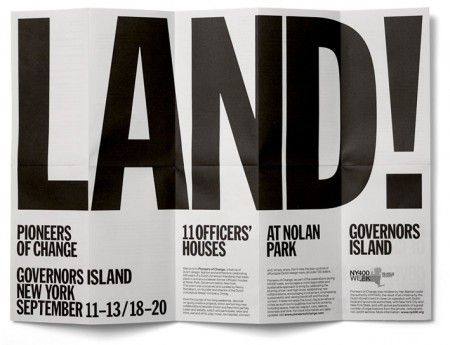
Pioneers of Change | Exhibition Invitation | September 2009
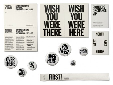
Pioneers of Change | Printed Matter | September 2009
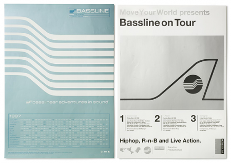
Paradiso Amsterdam | Bassline Posters | 1995-99
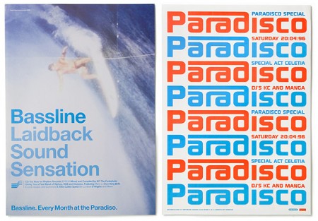
Paradiso Amsterdam | Bassline Posters | 1995-99
(Semi-related to above) How would you regard image bookmarking sites like FFFOUND or Dropular, where any semblance of illuminating description or backstory or is completely absent? In what way are these sites valuable and/or harmful to the profession?
We actually love sites such as FFFFound and Dropular. We consider the way in which we show our own designs, on our own website, as just one out of many possible ways. We also find it quite interesting to see those designs completely decontextualized, almost disembodied, as part of a long string of unexpected associations, as happens on FFFFound.
We once read an interview in which Thurston Moore (of Sonic Youth) described the sensation of being featured in heavy metal magazines: “it feels like being shot into a pinball machine”. That’s also pretty much the feeling we have, being featured on sites such as FFFFound.
Now that we think of it, maybe a website such as FFFFound, by staging such an ongoing, dialectical exchange between opposing aesthetic languages, has a larger critical potential than all those weblogs and forums where designers are complaining about each other’s work together.
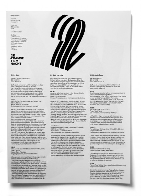
Second Amsterdam Film Night | Program Front | December 2004
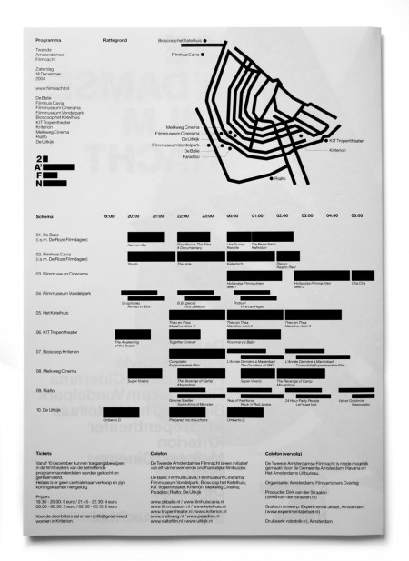
Second Amsterdam Film Night | Program Back | December 2004
What was one of the most valuable lessons you learned at Gerrit Rietveld? What advice might you have for current students looking to get the most out of their design program?
It’s not really a tactic or strategy, just an observation: a lot of the things we learned at the Gerrit Rietveld Academy only made sense after we graduated. We were late-bloomers, we guess. It took a while to let it all sink in. Also, in retrospect we have to admit that we were pretty mediocre students. It was only after graduation that everything clicked, that it all made sense.
Apart from being students, we also have been teachers at the Rietveld Academy, between 2000 and 2009. As teachers, we have seen all kinds of students. Mediocre students, who turned out to be late-bloomers, and became brilliant designers long after graduation. But also brilliant students, who just peaked too early, and burned out even before graduation. It’s not a general rule or something: we have also seen brilliant students who turned into brilliant designers. But the point that we are trying to make is that every person develops in a different way. The way a person is as a student doesn’t necessarily predicts the sort of designer he/she will be after school. So let’s hear it for the late-bloomers!
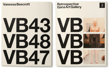
Gana Art Gallery | Vanessa Beecroft Retrospective Book | February 2007
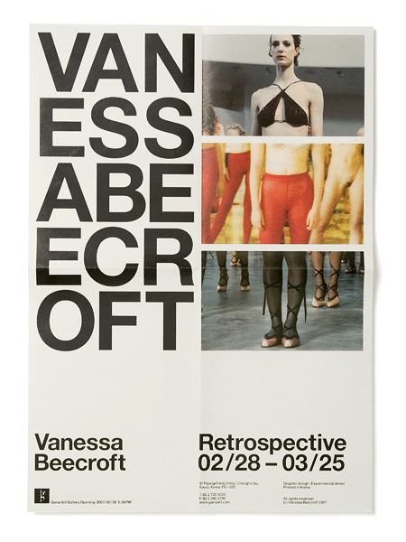
Gana Art Gallery | Vanessa Beecroft Retrospective Poster | February 2007
How often do you travel? Any locations that are currently most appealing and/or inspiring to you?
Last year, we travelled quite a lot. Peru, New Zealand, Ireland. And we visited the US a couple of times: Miami, Minneapolis, New York, etc. All these trips were related to either lectures or workshops. While, as a matter of fact, we are not really good public speakers at all. We feel really uncertain about doing lectures. So it’s a weird trade-off: you go through one hour of pure hell, and in exchange you get to travel, you visit exotic places, and meet friendly people.
People ask us to do lectures quite a lot, and in most cases we have to turn down those requests. It just takes up so much energy, to write and prepare a lecture. We are extremely nervous weeks before the lecture, and we feel very embarrassed weeks after the lecture. It also takes up too much time; we cannot afford to spend all our time travelling, while we actually should be in the studio, working. It can be also quite expensive: obviously, your flight and hotel are being paid for, but there are always lots of other expenses, especially if you want to stay a couple of days longer, which we usually do.
So yeah, in general we turn down a lot of requests. But sometimes people approach us at just the right time, and in those cases we accept the invitation. There isn’t really a logic to it: sometimes we accept the invitation, sometimes not. It’s all a matter of timing and luck, actually.
A recent lecture we did in Minneapolis, at the fabulous Walker Art Center, can actually be seen online.
(As you might notice, we were incomplete during this lecture. This movie shows only two-third of Experimental Jetset. Erwin managed to escape).
Anyway, to get back to your question. We really like Los Angeles. Driving around in the hills, looking at the bizarre houses, listening to KXLU on the radio, looking at record sleeves at Amoeba, browsing through zines and books at Ooga Booga and Family, eating incredible good vegetarian food, seeing bands at The Smell, not to mention the beautiful weather. It’s relaxing just to think about it.
Experimental Jetset, 15.11.2009
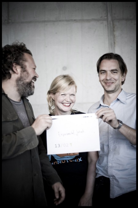
At TypeSHED11, New Zealand / Photograph ©2009 Pat Shepherd
I’d really like to thank Danny, Marieke and Erwin for taking the time to participate in this interview. If you are interested, there is much more Experimental Jetset out there on the web. Here are some links:
Home page
Experimental Jetset on Facebook
John&Paul&Ringo&George Shirts for Sale @ Publik
SBook6 Interview
Fill/Stroke Interview
AisleOne Interview


Good article. Experimental Jetset has been one of my favorites.
Great answer to my personal request.
I liked their idea of design criticism/dialogue by simply creating and letting design speak for itself in the environment. Great interview.
I love their perspective on studio names. Thanks for sharing!
I can’t remember if it was the lovely members of the Be A Design Group podcast of years since gone, or the dashing duo of Aesthetic Apparatus, but one of them gave advice about the naming of a small studio.
I can’t remember the exact wording but to paraphrase: “Name yourself as you’d name a band. Because it’s the closest thing your going to get to being a rockstar.”
And since I totally hit the submit button too fast, I forgot to say…
I LOVE their work.
Wow that is pretty awesome. Their work is amazing!
“We design objects to function within very specific contexts. So the moment you present those objects within a totally different context, as flat digital images on a website, it’s only logical that you need some words to at least sketch the original context.”
Couldn’t agree more, I wish more designers did the same thing.
Thanks!
Wow, lots of great stuff in this one. One of the things I’ve always really admired about Experimental Jetset is how articulate they are, it’s interesting to read how self conscious they actually are about public speaking. Outstanding interview, thanks for sharing.
Great interview and great studio.
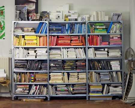
Man…those books. I sort mine by colour too but it doesn’t look anywhere near as good as theirs.
Great interview.
Love this statement:
“behind every artifact, behind every designed object or piece of art, there is a complete universe of ideas, references, stories”
I love your blog.. very nice colors & theme. Did you design this website yourself or did you hire someone to do it for you? Plz reply as I’m looking to construct my own blog and would like to find out where u got this from. thank you