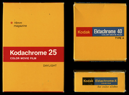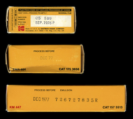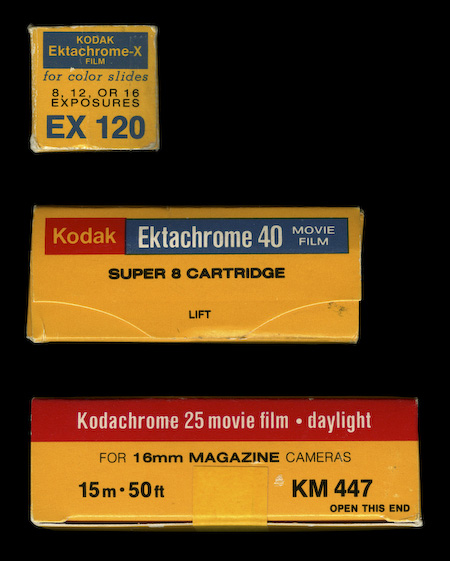


The always excellent Watsonian — who also brought you the Super 8 packaging — have posted these beautiful examples of vintage Kodak film packaging. Every time I see something like this the first thing that pops into my head is “Why doesn’t more commercial packaging look like this anymore?”. I then tell myself “If more commercial packaging looked like this you wouldn’t find it as interesting.” I think that point could be argued but you can’t argue that strictly from a design standpoint, these are just plain better than this crap.
I guess the next question though is whether some kid in 30 years will think the more recent example is better, but I seriously doubt it. I really feel like more attention was paid to the quality of design before the age of computers, I guess the practitioners were just more skilled given the level of training required. Now it’s “have Photoshop will travel”, which obviously cuts both ways. What do you think?
Via The Watsonian (who is apparently a cat)


I think people have a tendency to be nostalgic. We think now that the old packages look better, because of their simplicity and elegance. We like the flaws in them- the coarse paper, unmatched colors, noise, slight blur, things that were considered technical limitations at the time but now are charming. As for what will happen in the future and what people will think about now vs the 70s-80s is what we think now about a ’50s Cadillac vs a ’80s minivan. Which one is better? Neither, because they serve different audiences. But they are both iconic for their period.
But anyway, they don’t make *anything* like they used to 🙂
I don’t think that this is a matter of skill, package design is as subject to fashion as any other form of design.
Look at todays toys… its like an explosion of candies… I so dislike it.
Packaging is the same, just a war of the attraction, the more color the more attention from the numb eye.
Everything today is just too much, its like taking peoples as kids for ever. I dream of the day it will explode and come back to simple and pure, brilliant basics… I love Macs
my first thought falls to: now there are thousands of ridiculous fonts. now there are thousands of ridiculous gradients.
And drop shadow, it’s ridiculous…
Anyway, I do appreciate being a canadian because we have No Name Brand groceries. Basically, every single product is branded with pure yellow and black Helvetica saying the name in English and French. Very little else is there, and I personally think it’s brilliant.
Google images found me this:
http://smartcanucks.ca/wp-content/uploads/2009/05/phpwgi3cvam.jpg
I think that it has to do a lot with the marketing executives within these companies. Now days it seems they will try to inject anything they can to influence the buyer into quickly making a decision based on what they take a quick glance at. Which in turn results in horrible packing design.
For something like this I believe it takes a few seconds to study in order to appreciate its greatness. I can’t tell you how many times I’ve walked into places such as whole foods, gazing at interesting packaging design even though the product is way out of my price range, or totally unrelated to my interests all together. (I’m not sure if Marketing VPs are trying to reach our kind of audience, or they simply don’t care as much) But the initial look at something appealing (such as great packaging design) will immediately still capture my interest, however it will take a few seconds for me to let it sink into my mind.
But I do believe there is a fine line it what is perceived now days as a “cheap” package design. and a very “nice” package design. Let us take Walmarts “Great Value” packaging re brand. It could have possibly utilized the same thinking behind this Kodachrome packaging. However it is pulled off as a remarkably cheap and dull look. It could be from this fact that most marketing departments do not wish to take their chances on missing the mark. (if that’s the case, they need way better designers)
@ Brennan
Word to the no name.
@ Scott
Kodak actually still has great packaging like this. At least they did a couple years ago when I was still buying photography supplies.
On the topic of old design vs. new, you’re absolutely right. Design is becoming laughable. I don’t know what’s worse, the all things shiny and embossed corporate side or the shitty helvetica love poems side of things.
There is a certain allure to buying an item with this kind of stoic, utilitarian, yet artfully designed packaging. Especially something technical like film. I think it makes you feel like you are actually engaging in something useful and worthwhile rather than merely buying a box of fabric softener. Imagine buying an amplifier vacuum tube in a box with flowers on it…
Yeah Scott, glad you found this post as well. It’s scary how far graphic “effects” have saturated the market in every direction. Apple seems to be one of the few who still realizes negative space does exist in package design. Smart type, wise color choices and a thought out use of space should stand the test of time.
Ha, and yes Watson is a cat and narrator at The Watsionian. We Humans at the medium control try to keep up to him…
I have serious doubts that this vintage package would sell more than the actual one. We have to design for the public, not the designers. And the public finds more appealing the gradient/dropshadow/colorful stuff.
I think the vintage packing is simply flat (pun intended) out better than contemporary drop-shadow and lens-flare infused design. Sadly, movies seem to be going the same way as design these days, and by that I mean the industry is blinded by the notion that 3D is better. Or perhaps the industry knows their design is crap, but as Marcelo says, the packages are made to sell, and 3D movies and 3D effect-ridden packages seem to be the real sellers.
Although, General Mills is printing their cereal with vintage designs right now, and I have to say these boxes really stand out on the shelf.
Personally, I think trends come and go. In a world of flat, minimal design it will be the lens flare that stands out. In a world of lens flares and drop shadows it is the flat, geometric color field with perfectly knocked out type that catches the eye.
There is really no substance to any claims that modern package design is cheap and unskilled.
Designers didn’t just get up and leave these companies, they have remained and continued employ the latest and most effective strategies when designing packages. Modern package design includes a mix of postmodern-corporate and now a purist revision that includes 1960s/70s/80s era design choices, simplicity has its place, complexity has its place. Don’t doubt these companies aren’t looking for effective designs in their marketing, lens flare and drop shadow works, plain and simple.
I personally love these old packages, however it’s obvious I only find them more interesting because in comparison to my surroundings their simplicity stands out. They had their time, and it’s passed. It’s best to claim inspiration from them because of this than to advocate the return to the techniques and principles used to make them.
Consider yourselves part of a smaller, more aware group – it’s always easier to be creative when the following is filtered.
*they have remained and continued employing
*don’t doubt these companies are
I still shoot that Super 8, still comes in the same box, but yeah the design is wayy better. I was gonna do a knock-off tee a while back. Maybe I should go back and do it!
David:
I totally agree from experience. No matter how hard I tried and how many options I would show the client, I have had some projects end up miles from where I would personally prefer them.
A valuable tool is learning how to speak to CEOs, or sales and marketing people in their own languages. When you have straightforward information, facts, and maybe some statistics, and can speak intelligently about what a design will do for their bottom line, that can make up for the times design won’t sell itself. Its a sad reality that not everyone cares about design, but those that don’t typically do care about profit and you can speak to either when necessary. Of course that takes skill and experience to know your design will actually do what you say it’ll do.
Yuichi Hibi, a photographer based in NYC has printed on expired paper. Makes his photographs dark and nostalgic.
A design competition waiting to happen?
I think the old packaging is better. Not only is it still appealing today, but I think it get’s the info you need across quicker and more clearly.
Also, I love film, it’s such a shame it’s a dyeing format. 🙁
June 2005 was a sad day for us super8 shooters, and for the shelves, when Kodachrome 40 was discontinued. Such a versatile film in so many lights. It was/is our go-to film, now the ebay and antique store hunt is on. However the expired film we shoot from the 70’s has some amazing results and the packaging colors are even more unsaturated with age.
Thanks Scott, this post has inspired interesting and valuable responses. Perhaps I have a little to add as an MBA (very fresh).
This packaging is all about segmentation and experiential psychology. It is likely designed both for the entry level photographer as well as for the bright/busy Target environment. The flowers picture on the new packaging was designed with ‘experience’ in mind – it is meant to cue the shopper’s subconscious that by purchasing this product they will enjoy the experience of taking vibrant pictures.
We are a different segment… and we seek different experiences.
The path a customer takes from first surveying a wall of products to making a purchase decision is extremely complex. And the psychological research of the day points to experience as a driving factor, at least in packaging like the type we’re discussing.
All that said, I’ll be the first to admit that much of the packaging we see today really is just bad, both artistically and from a marketing/profitability standpoint. That’s likely because creating good packaging is a bit more difficult than recognizing bad packaging…
Sorry, this is slightly off topic, but has anyone else been messing around with Hipstamatic iphone app? Although a far cry from the old school instant film, it’s sure a lot less expensive and still very fun to play with.
I agree with comment #1. it was exactly right on the money about nostalgia.
http://www.flickr.com/photos/jagodens/4405169120/
I got this one for about 15 dolars together with camera 😉
When You get so old film in Your hands, You’re aftraid to make a photo with it 😉
great blog!