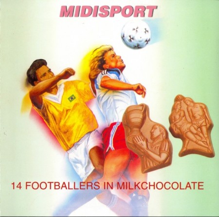
Midisport
Uwe Schmidt aka Atom TM designed most if not all of the inserts for his legendary techno imprint Rather Interesting under the credits “design sampling by linger decoree”. The CD booklet for Midisport – 14 Footballers in Milk Chocolate is a favorite example of the deadpan humor, fearless oddity and demonstrative detail found throughout the Rather Interesting catalog both visually and musically.
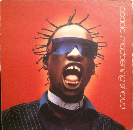
Acacia
A beautifully shocking portrait that we love. I still always look twice when shuffling through house crates. From 1997, the ‘Monsieur Guy a Paris’ mix of Acacia’s Maddening Shroud from this 12″ remix ep is a perfectly cunning piece of french house.
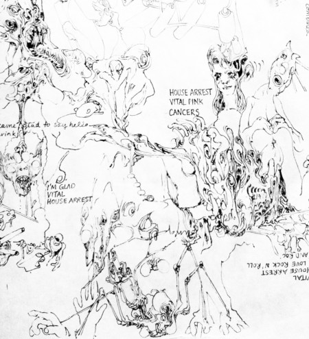
Ariel Pink
We love Ariel Pinks drawings of detailed sexual dysmorphia. The original drawing used for the My Molly 7″ is in Austin’s personal art collection. Here Ariel musically clones a song by an asexual man with “This Night Has Opened My Eyes” (Smiths cover).
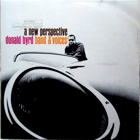
Donald Byrd
Donald Byrd (Donaldson Toussaint L’Ouverture Byrd II, Detroiter 1932-2013) leans suavely aloof behind his spaceage sportscar on the cover of A New Perspective. This is a favorite cover by graphic designer Reid Miles who created all of the Blue Note album covers in its first 10 years of existence thereby inventing the classic look of the legendary jazz label. Ironically Reid Miles did not particularly like jazz.
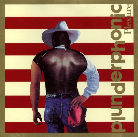
Plunderphonics
The art for Plexure by Plunderphonics (John Oswald) which blends the defiant stances of Bobby Brown, Bruce Springsteen and Garth Brooks is an icon of the “audio piracy as compositional prerogative” movement. This is Urge (Marianne Faith No Morrissey).
[audioplayer post=32842]
Once in a while we have artists that we post about Guest Post music they’re listening to. Today we did something a little different had Jensen Sportag share their favorite album covers.
Jensen Sportag’s “Stealth Of Days” is out now on Cascine, available on vinyl.


That’s no space age sportscar, that’s a late model XKE.
plexure is a giant document. i don’t have it anymore, sadly it was stolen from me along with many other rarities, including some AMM and Parmegiani cd’s.
i like that byrd photo but it bugs me that he’s basically sucking face with the text. i think a bit of restraint on the text size and proximity would have let the main element (the photo) sing alot more. IMHO :?)