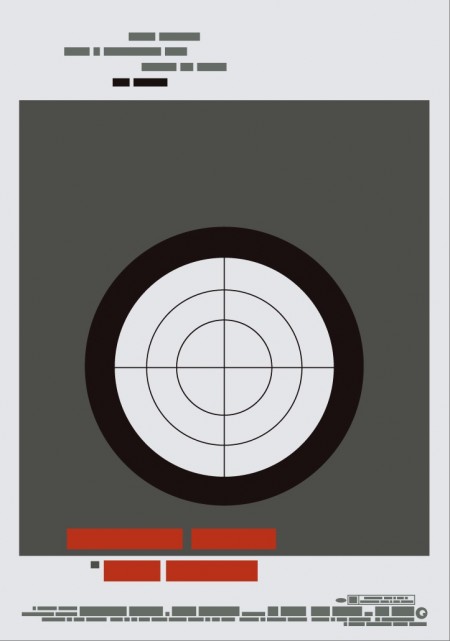
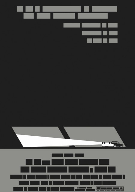
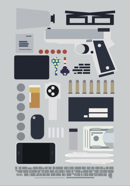
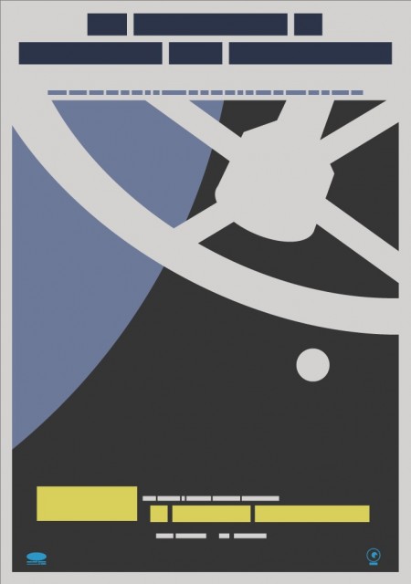
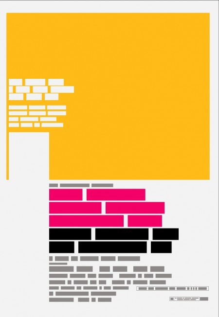
Film the Blanks is an ongoing design experiment that takes existing film posters and abstracts them down to their core elements. The project has garnered much press over the last few months, and I figured I’d post up some of my favorite pieces. I like the work because of the visuals, but there is also a strong participatory component that sets it apart. Each time a “blank” is uploaded to the site, users are invited to guess which film the abstraction represents. In some cases the solution is obvious, but it’s often remarkably difficult to discern which poster is hiding behind the blocks. Eventually clues are released and points are awarded to the successful guessers. It’s an exciting format for a design project; one that takes a strong concept, built around a fairly standard medium (poster), and twists it into something unique and engaging.
You can find all the posters in the Flickr set. You can also buy a few over at the Buy the Blanks store.


Good idea for a site. The posters remind me of British politicians’ expense forms.
Love this, Alex. Also reminds me of “web without words” that I blogged about (my blog is design based w/a playlist to support the design)
http://www.heyjoy.com/2009/02/speechless.html
http://webwithoutwords.com/blog/facebook/
Keep up the inspiring work + tunes~
Joy (aka HeyJoy)
What a novel idea! Could make out the 4th one in the list… it’s 2001: A Space Odyssey, right? Not too sure about the others.
The 3rd one seems vaguely familiar… can’t pin it down.
Found it very enjoyable. What a great new way to look at some pretty old designs.
<3 these! So vague but so accurate!