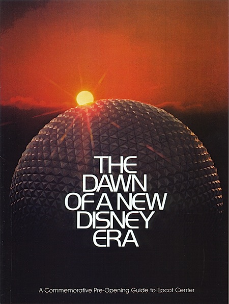
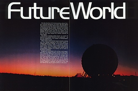
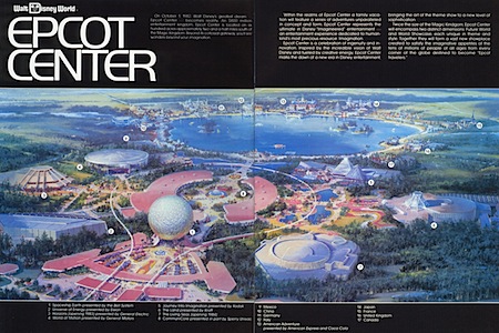
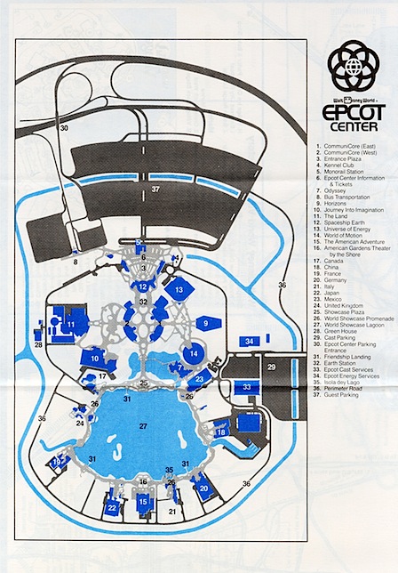
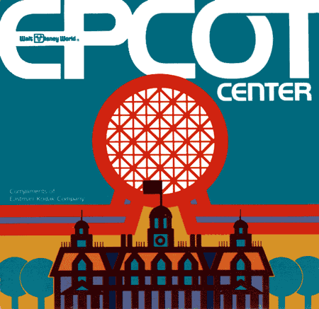
 I’m flying out to Florida this afternoon to play the Connext show on Saturday. I’ve never been down there before so I’m pretty excited; unfortunately I’ll only be in town for the weekend. When I think of Florida I think of Crocket, Tubbs, and the Epcot Center. Although I won’t be going to Orlando on this trip, I thought now would be as good a time as any to post some shots from the original Epcot Pre-Opening Guide. I’m loving the logo, and bonus points if you can name the typeface they’re using.
Scans Via Jeff B


These are awesome. Kind of reminds me of those old Lego sets that were set in space. Some space civilization that started with M.
Funny thing about that font- A friend of mine was doing a project based on Disney last year and needed to get a lot of Disney-like fonts. This was one of them and he ended up using Handel Gothic for the logo. Most of the letters looked right, but the R looks a little different.
Oops, forgot the link:
http://www.linotype.com/89198/handelgothic-family.html?subviewmode=FONTS&samplestr=EPCOT+CENTER
(R looks OK)
world font?
Right with you Scott – Crockett and Tubbs – where are the Miami Vice pictures!? I’ve just finished re-watching season 2.
Wow. I think it’s really interesting that at the very beginning, they tried to brand EPCOT (it used to be an acronym) as almost a corporate world’s fair. That first image you posted could be the cover of any Fortune 500 annual report in the eighties. It probably speaks to the branding confusion that Disney experienced building the park. They never really articulated what EPCOT was supposed to be, and although it always seemed like a really cool idea, I distinctly remember being there and wondering what the point was. For a theme park, it always seemed short on “theme.” Great images. Thanks for posting these.
Originally, Epcot was supposed to be an actual functioning experimental city.
http://www.the-original-epcot.com/2008/05/progress-city-model.html
Then after Walt died the company turned it into just another theme park with the “never ending world’s fair” theme. The original design was pretty cool and actually kind of insane and forward looking.
scott you are the man. and so is jakub.
Thanks for posting these. They are awesome! I really love the classic WDW look but especially of EPCOT. These rock. Please keep them coming.
Wow, what an incredible find. I think Alex Cornell is right, the font seems to be Handel Gothic. I used it a few years ago on Web site project here: http://www.winetastetv.com