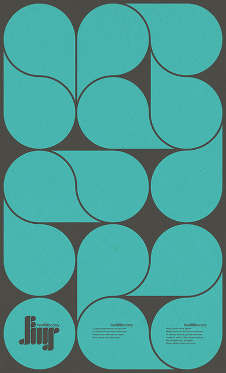
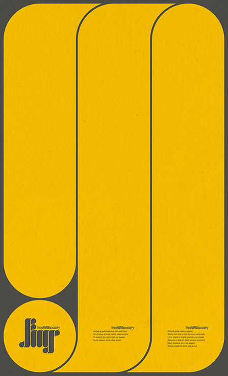
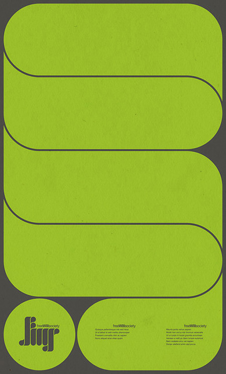
More visually stimulating work by Mihaul Mihaylov. This time in poster form. I particularly enjoy the repetition of shape curve from the logo to the main graphic elements.
See more of his work on Behance.


More visually stimulating work by Mihaul Mihaylov. This time in poster form. I particularly enjoy the repetition of shape curve from the logo to the main graphic elements.
See more of his work on Behance.
Comments are closed.
I love the colors. Thanks for sharing Shelby.
Nice work. These kind of remind of the work stapelberg und fritz did for eight ears.
http://www.klangundkleid.ch/img/covers/freshcuts/15-08-2009-14-05-47_Eight-Ears–.jpg
I really like the middle one. The colors and design are spot on.