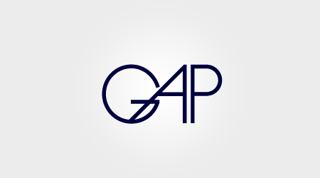
First Place: Roger Schami

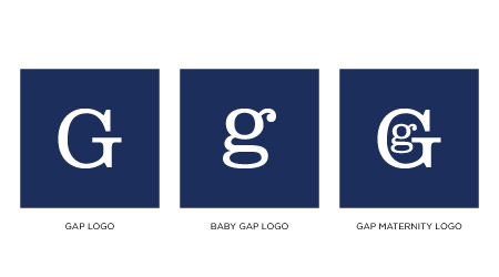
Second Place: Steve Juliano

Third Place: Benoit Henken
The votes are in and we have our top three Gap Logo redesigns. A varied bunch to be sure. Congratulations to our winners Roger Schami, Steve Juliano, and Benoit Henken! You will be notified by email with information regarding how to collect your prizes.
Honorable mentions to both Jason Caldeira and Chris Reynolds, who scored fourth and fifth place respectively.


Im interested to know who you voted for Alex…
随便看看,欣赏下
g a p set in avant garde alternates? really? i cant wait to read the write up on his whole rationale behind it.
Really?! I don’t know about this. Poor taste
sooo…this is what we all think is a better alt than Gap’s chosen mishap that everyone was bitching about?
Hmm… Im not criticizing the winners designs as they are just preliminary ideas and it was the voting that made them win but I think that next time a big corp replaces a logo everyone just needs to shut it…
not a particularly great improvement.
I don’t care about or have any respect for The Gap, but here’s my opinion:
Going to the iso50 front page and seeing the chosen winners did make me think,”Really? Those are the picks?”.. But after scanning through all the entries, I must say, I agree that the above Avant Garde entry looked the most suitable for the brand. Do I think it could be better? Absolutely.
Alot of the entries were clever, but just because they’re clever doesn’t mean they sit strong enough to fit the brand. If you quickly look over each entry and monitor your immediate reaction, whilst keeping in mind the vibe of The Gap, you’ll probably conclude that none of these entries could be a final product, but the ones that came the closest were the ones that were chosen.
It’s Gap. Gap. Not the Gap.
not that the first place is poorly crafted, but isn’t it basically the same as how Laird & Partners set the new logo in Helvetica? I could easily see a professor telling that student that their design was average, but didn’t do anything extraordinary.
I think 2 and 3 were great concepts for Gap. As for the winner, I’m not so impressed. When I went to check out some of the the winners links above I saw Roger’s Avant Garde poster on his site. Was he really thinking about the brand or is he just really into one font right now?
Design by committee (or in this case vote) is always a dubious procedure.
#2 is the clear winner. It’s thought out. It is clear. It is memorable. It is what the Gap should be using immediately! I hope those execs are reading this blog…
Hmmm… I know this contest was held to show that the new GAP logo was bad, but I agree with the others, not sure about how much better these are.
FAIL
Number 2 is my favorite. The concept was thought out. The design incorporates the whole Gap family…Gap if you’re listening, use this logo NOW!
Number 2 is brilliant. If you are going to change your logo – it should be this great.
#2 Makes me smile. It is creative, timeless and exactly what the Gap brand needs!
I’m really surprised #2 didn’t beat out #1. It has so much more personality and versatility – it’s a whole identity rather than just a logo.
I’m not one for changing logos or packaging, I cling to the warm, fuzzy retro memories of my youth … but #2 really seems to capture the brand’s offerings in a very cute, minimalistic way. Very cool.
Number 2 is cool. The rest drool.
I like the second place winner!!! that’s so clever! Way to go Steve Juliano, whoever you are!
How #2 isn’t #1 baffles me. Brilliant. Gap – please consider. THIS is branding.
#2 is clearly the best design.
I clearly prefer #2 as it is all encompassing with Gap’s tiers – very cheeky and well done.
1st place = great, 3rd place = brilliant!
These results are disappointing. There were clearly better suited logo’s. I’d be more interested in which logos the writers of this blog thought should have taken 1st, 2nd, and 3rd.
Criminy… Just when I thought I had seen the last of Avant Garde.
Honestly like the current Gap logo. Not sure what the purpose for the change is…
Think I like #3 the best.
GAP logo in AVANT GARDE is so lame!!! It tells you something about the crowd that looks at the ISO50 now… trend followers and lame zombies.
I was really hoping that the ISO50 crew would be picking the winners, not that the same people who submitted the often dubious logos would be allowed to then turn around and vote on them.
I do, however, very much appreciate that IS050 did a free giveaway, thanks guys.
Hate to say it, but these are all terrible.
Wow, disappointing results. There were clearly better submissions?
agreed, what a sad turnout.
i mean, avant garde…seriously?
#2 is hilarious!
#3 is expected (as a joke)
#1 won only b/c the ISO guys have a boner for AvGarde
I called it too, winner by humor.
I’m just as surprised as all of you. I really did not expect to win first place especially due to the amount of thought and time put into the design process. Nonetheless, I really appreciate winning the contest. Thanks for the print and the tee Scott! By the way, the font is called Myld from YouWorkForThem. Very similar though.
The A in #1 looks like an animal that got its leg caught in a trap. Arbitrary kerning now equals “thoughtful design.”
John (#34), it’s not arbitrary kerning, it’s an echo of the famous Lubalin design of Avant Garde:
http://en.wikipedia.org/wiki/Avant_Garde_(magazine)
The first one is just MYLD with the A pushed in further.
Congrats to the winners. It would be nice to see Alex’s or Scott’s top three pics, just to get their perspective.
really? avant garde?
im really happy GAP pulled back their logo
Now that ISO50 has turned into a music blog (see for yourself), it’s obvious that this will happen. Poorly design posts. I’m afraid of the results anyway. So many so called “designers” always talking about other designers works and when the time is right, they deliver a ton of garbage.
It’s sad, really.
The #1 winner has clearly outdone everyone else. His logo is simple, sophisticated and classy. It definitely shows an understanding of the image that Gap is trying to portray.
looks like facebook logo.
not bad but not special to me
How come this website did not post all the submissions. Fair? 😛
Apparently people who do not design are still enjoying their right to vote.
@KEVINBARCELONA
sorry, bro, but I’m pretty sure it was professional designers that voted #1 in. Non designers would have gone for #2. Think about it…
That said, I think #1 is significantly better than most of you are giving it credit for, although it should not have won the entire contest.
Nice job to all. To those of you that ‘hated all the designs’: we only had a week, it was just for fun, nobody here has shopped at Gap for years, did I mention that it was just for fun… so relax.
None of them are impressive. First one is tired, second one recycles Herb Lubalin’s “Mother & Child”. Third is, well – yeah.
Speaking as someone who actually works at the Gap, I can say these winners do not improve upon the temporary logo. Not because they aren’t good, but because they don’t provide a solution to the companies problem. As I understand it, graphic designers are supposed provide solutions with design. Right? At least that is what I learned. You can’t randomly throw something together and say this is what they should use, because it looks cool.
The company wanted something modern and hip, demonstrating an evolution of the brand. It should appeal to a late 20s to mid 30s demographic.
Many here liked number 2, and while it is clever, it doesn’t at all fit what the company was looking for. Not to mention, technically Maternity is not a ‘box”. (Each store is referred to as a box. This why the blue box is an important part of the logo. No doubt, why they wanted it to remain.) Also, Gap Body and Gap Kids should be included.
Number 1 is clean and modern, but the A and G just look awkward together.
As far as 3 goes, there just can’t be a Gap logo without ‘GAP’. It just can’t.
I hated the new logo. I hated it less after seeing some of these submissions. Even thought it was okay. I knew what it was trying to be. And I now understand just how difficult graphic design can be.
I actually liked #17 – Simple and reminiscent of a an iconic brand. #1 is nice, but I dont think it reflects Gap in anyway. But all the logos submitted were very creative. Something with this much of a response must have been very hard to judge. So why not leave it to a vote. I would have.
defiantly a down grade
dude, I’ve stared for logo #3 for minutes, i still haven’t catch up why a simple square blue rectangle can win the contest.. nevermind, maybe I’m wrong with it.
The first and second one are terrible. Can’t believe my eyes.
how ironic this is…
Needs more Helvetty.
The winner reminds me of something…
http://www.dbcpr.com/blog/wp-content/uploads/2008/06/ap_logo.gif
#2 should be #1. God, I LOVE the maternity one so much!!!
I’m sorry, but you guys have poor judgment in choosing logos.
I’m late but… heres my version anyway >>> http://rootout.deviantart.com/art/gap-183200150
cheers
whiney designer folks = FAIL.
Sorry, but these results are rather disappointing.
http://jasonputorti.com/post/929699089/why-design-contests-are-bad
Again, bad move, and I lost a lot of respect for ISO50.
@jayparray what in the world does this have to do with ISO50? the voters are the ones that chose the winner?
I like em. Im going with 1 and 3. I saw most of them before the vote and I was not totally loving any one in particular. But I didnt see these guys and im not disappointed. I vote 3. Vote yes on ISO50!
Im looking at one and it fits well on this page.
You too two!
First place is ‘GAP’ in what appears to be a slightly edited version of the font Myld. Why is this special? “nd place, not such a bad concept. I like the idea of capitals and lowercase representing bigger and smaller in the for the brand. I believe as an early concept, not such a bad idea. 3rd place took balls to do – I don’t mind it – the lack of text can represent a gap, but then again i doubt the bublic will recognize a blue square as a memorable brand.
Personally, I’d say Jeff Knowles 1st design was the best effort. Not overly designed, and simply refined for the current age.