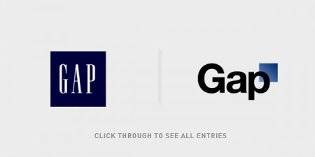
Editor’s note – In answer to some of the questions in the comments: This contest is not for Gap. We are not affiliated with Gap. Gap has nothing to do with this contest. This is for fun, not Gap. Gap will not be using any of these logos. Gap will not be forcibly entering your home and removing belongings. This is not a secret conspiracy by Gap and the Freemasons to get you to design free logos. This is not crowd surfing. I bought some socks there one time like five years ago. Also, Gap has apparently been using the new Helvetica logo for nearly a year now, everyone just decided to notice and get super pissed off when they added a gradient square this week. If you submit a logo to this contest, you retain the rights to that logo.
By now you have seen the new Gap logo. By now you have sent a “this is terrible” rant to all your designer friends. By now Gap is probably about to pull a Tropicana. (Update, they did).
OK so I get it, you don’t like the new logo. I don’t either. I want the little gradient square to fall into the gap and never come back. But I couldn’t help but think: what would I have done if Gap had come knocking and asked me for a new logo? How do you rebrand a company as ubiquitous as The Gap?
So rather than rant and rave, let’s fix this. We are a community of designers and I’m sure someone here can come up with something better. So here’s the contest:
Your Job: Design a new logo for the Gap. Assume a fairly open brief and think about where their brand is and where it’s going.
Timeframe: 1 week. Contest ends on Wednesday October 13th. Short yes, but this isn’t school, let’s work quick.
First Place: Your choice of giclee print from the ISO50 shop (size 24 x 36), a shirt of your choice (also from the shop), and a process feature article here on ISO50 (If you choose to, you can write a process piece on how you developed the winning design, which we’ll post here on the blog).
Two Runners Up: Two shirts of choice from the ISO50 shop.
Instructions: Email alex [@ symbol] iso50.com with the subject line “New Gap Logo” and attach your redesigned Gap logo. Please make sure your file is in JPEG or PNG format and clearly displays your logo. Size 450w x 250h pixels please. Center the logo, make it look nice. Limit two entries per person.
Due to the extremely high volume of submissions, entries may not be posted right away, but we’ll do our best to get them all up before the 12th!
Voting: Winners will be determined by a popular vote after the last submission date on a separate post.
Legal: All entries remain the sole property of the designer who created/submitted them.
All entries will be posted here after the jump

1. Benoit Henken
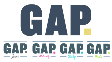
2. Andrew Lovseth
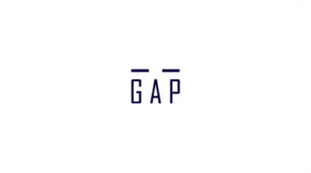
3. Atakan Seckin
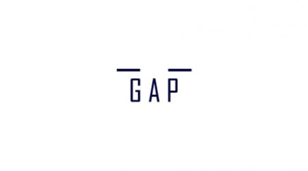
4. Ataken Seckin
5. Stephane Rangaya
6. Andrew J Clark
7. Andrew J Cleark
8. Soxy Fleming

9. Soxy Fleming
10. Evan Hensleigh
11. Jaime López
12. Jaime López
13. Stephen Jowett
14. Stuart L. Crawford
15. Matt Elleman

16. Andrew McArdle Booker
17. Ashley Oblinger
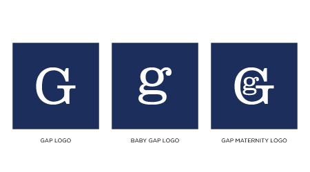
18. Steve Juliano
19. Dean Oakley

20. Greg Meehan
21. David Airey
22. Jason Caldeira
23. Jason Caldeira
24. Michael Faber

25. Fabian Parra

26. Fabian Parra
27. Jeff Knowles
28. Jeff Knowles
29. Trisha Salge
30. Zach LeBar
31. David S. Rogers
32. João de Almeida
33. Erik Hertsius
34. adamGF
35. Matt Wrightson
36. Justin DeJong
37. Aaron Scamihorn
38. Charles DiSantis
39. John Chiappone
40. John Chiappone

41. Joel Pirela
42. Joel Pirela
43. Zach Graham

44. Alexandra Ronca
45. Bryan Haker
46. Mariana Mendoza
47. Mariana Mendoza
48.
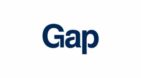
48. Eric Carroll
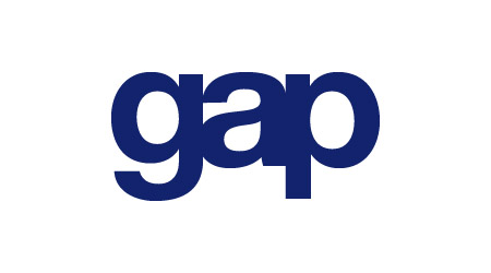
49. Gilbert Ruiz
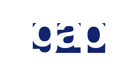
50. Gilbert Ruiz

51. Ruth Ann & michael
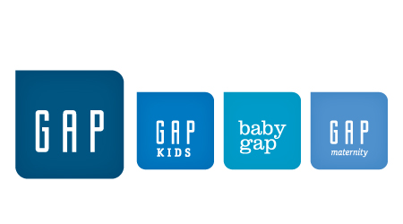
52. Marc Reyes
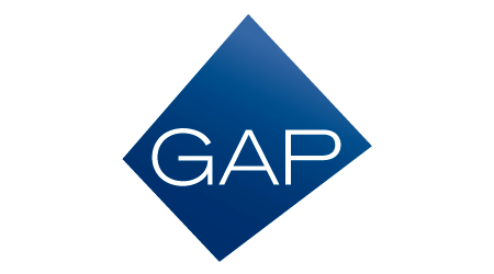
53. Derek Jensen
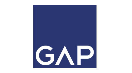
54. Pegaz Toma
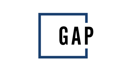
55. Beverly Kitchens
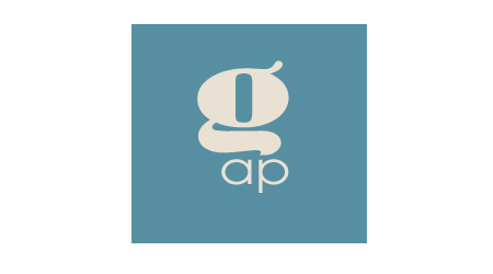
56. Damion Schweizer
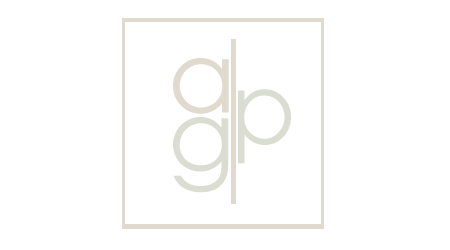
57. Damion Schweizer
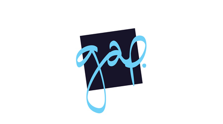
58. Fernando Donato
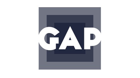
59. Brock Woolsey
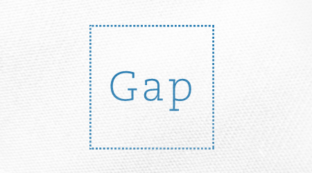
60. Celia Chung

61. Celia Chung
62. Ngoc Ngo

63. Brandon Russell
64. Matt Wrightson
65. Matthew Hollett
66. Alexandre Nami
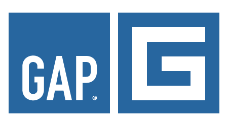
67. Adrian Tache
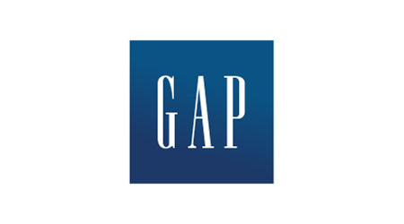
68. Alexis Gabriel Ramírez -Rafteru

69. Brian Son
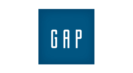
70. Marc Reyes
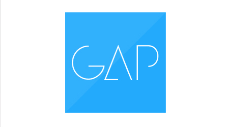
71. Logan Brinkley
72. Brian Sadler
73. Brian Sadler
74. Tom Lehmann

75. Eric Carroll
76. Peter Lim
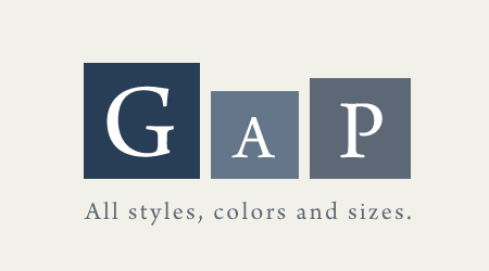
77. Olli Karvonen
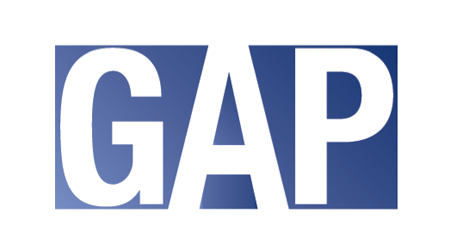
78. David Womack
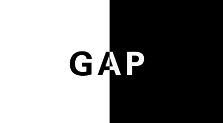
79. Joe Gomez
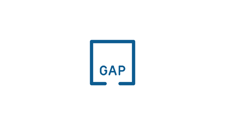
80. Lane Coutell
81. Keith Haun
82. ken
83. ken
84. Clinton and Luey Fleenor

85. Devan Flaherty
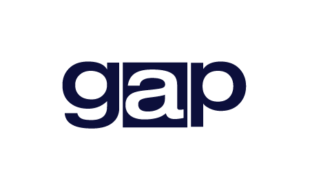
86. Juan Davila
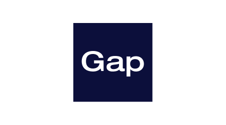
87. Juan Davila
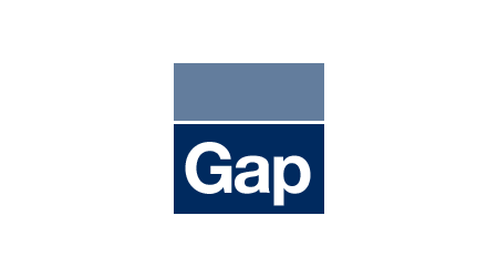
88. Wayne Dahlberg

89. Wayne Dahlberg

90. Victor Eide
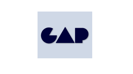
91. Patrik Savko
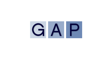
92. Patrik Savko
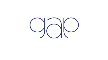
93. matt m
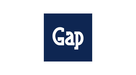
94. Sean Taylor
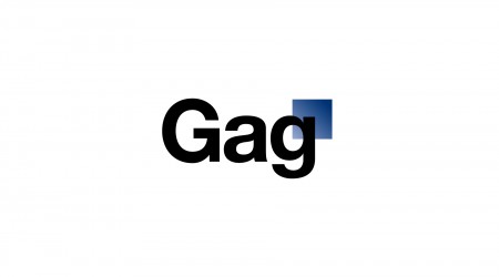
95. George Boutilier
96. Chris Rushing
97. Brendan Bercik
98. Jason Corbin
99. Alex Penny
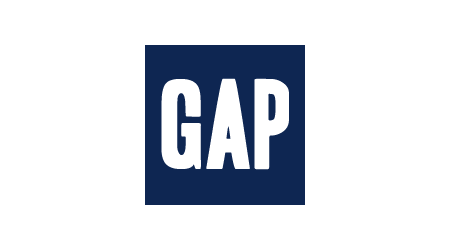
100. Sean Taylor
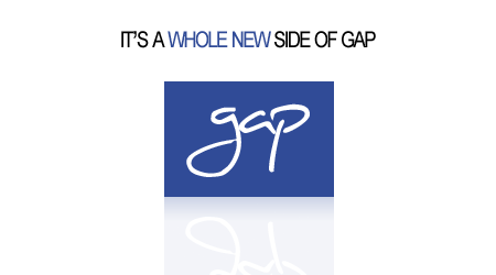
101. Kyle Suss
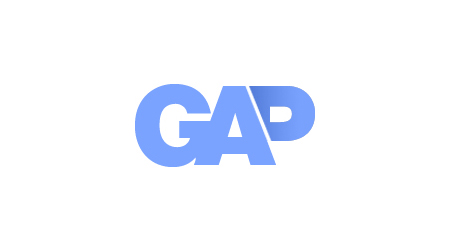
102. Wes Moore
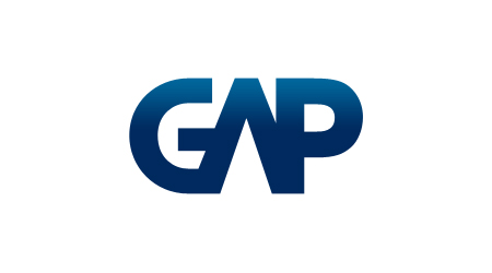
103. Seth Haley
104. Leigh Hibell
105. Leigh Hibell
106. Nathan Regnier-Lange
107. eduardo porfirio
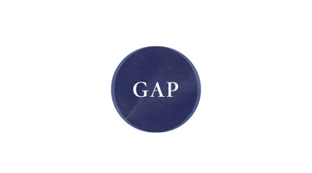
108. Agustin Sanchez
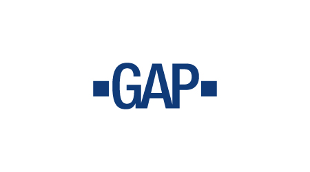
109. Timothy Youngs
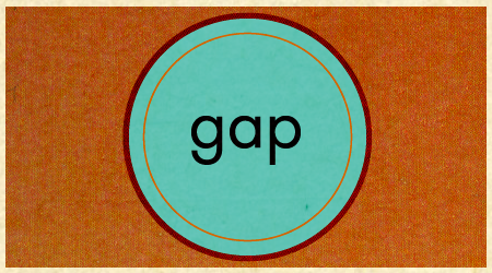
110. Robbie Kanner
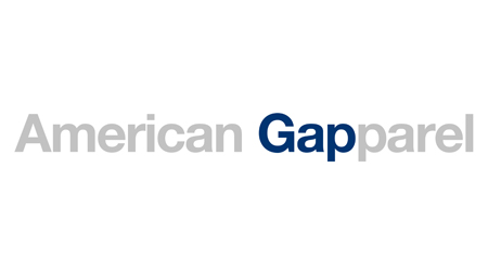
111. Nathan Regnier-Lange
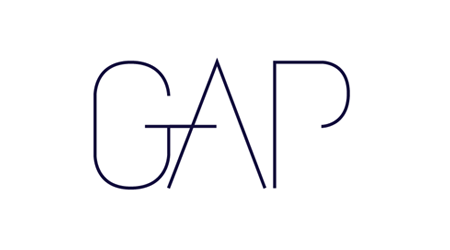
112. Emma Thea Hoop
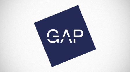
113. Dave Yoon
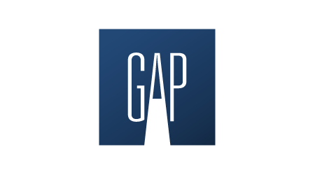
114. David Livingston

115. Jared Hardwick
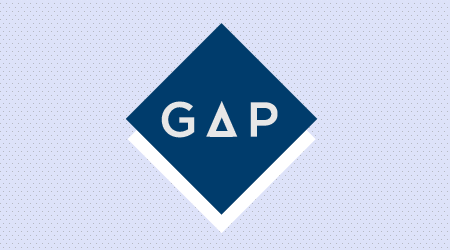
116. Darren Geraghty
117. Éric Le Tutour

118. Travis Nelson

119. Travis Nelson
120. Dominic Leung
121. Dominic Leung
122. Drew Maynard
123. ckilgore

124. Moka Mamlouk
125. Fritz Jones
126. Nicolas Gagliano
127. Justin Skeesuck
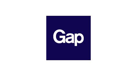
128. Justin Skeesuck
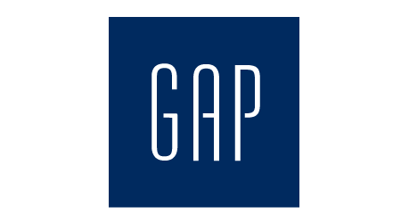
129. Maurice Redmond
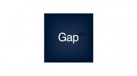
130. Selena Goodwin
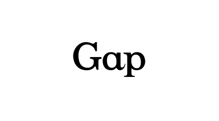
131. Tyler Fawcett
132. Xavier Colomés
133. Moritz
134. Jeremy Pedron

135. Jeremy Pedron
136. Greg Washington
137. John Sullivan

138. Ian MacDonald
139. Steven Shay
140. Danny Garcia

141. Will McNeilly

142. Will McNeilly
143. James Oconnell
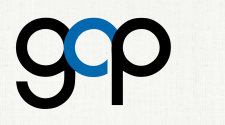
144. Mads Andersen
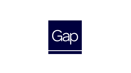
145. Jeff Esterby
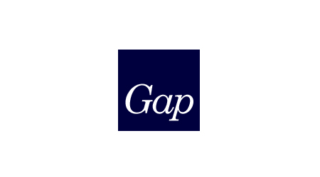
146. Jeff Esterby
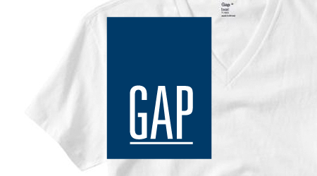
147. Josu Aingeru
148. Jeff McMillioan

149. Jeff McMillioan
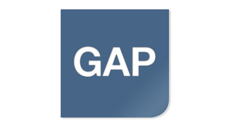
150. Jimmy Costigan

151. Adrian Clement
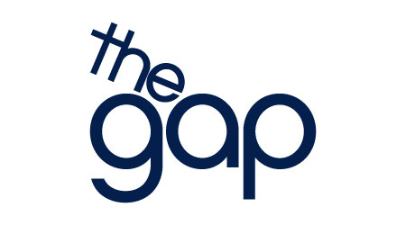
152. John Coulter
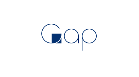
153. Adam Faja
154. Dave Rollins
155. Edwin Tofslie
156. Kevin Anderson
157. Chris Martz
158. Yael Miller

159. Alex Tullis

160. Jarred Bishop
161. Luis Valdizon
162. Chris Tipton
163. Chris Tipton
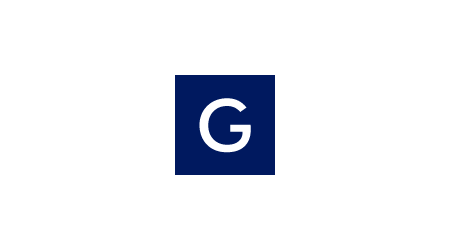
164. Thomas Griffin
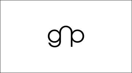
165. Jared Granger
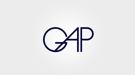
166. Roger Schami
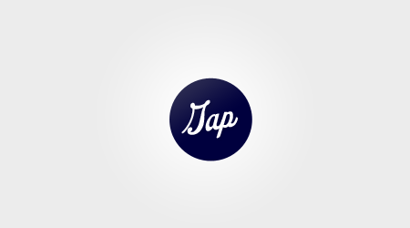
167. Roger Schami
168. Mike Severloh
169. Ryan Lockwood

170. Shenee Howard

171. Chris Reynolds
172. Andrew Hocchradel

173. Psalm Alfafara
174. Eric Cash
175. Jerry Cavill
176. Emily Blackwell
177. Peter Maides
178. Jesse Brew
179. Raciel Diaz
180. Tsurechka
181. Nour Malaeb
182. Dave Sackville

183. Morten Bonde

184. Alexandra M Ronca
185. Odiseo Viveros
186. Guillaume Marais

187. B.Sander
188. Julius Mattsson
189. Steve Kodis
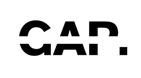
190. Jonas Bergqvist
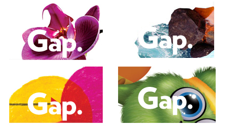
191. Matt Ipcar
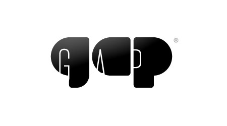
192. Jeff Hendrickson
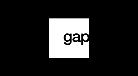
193. Charles Riccardi
194. Robby Ingebretsen
195. Tony Van Groningen
196. Jerry Henderson
197. Chris Leskovsek
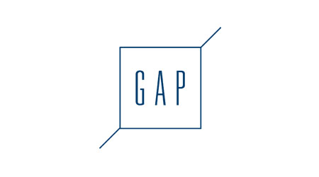
198. Bryce Wilner

199. Eric Ransbottom
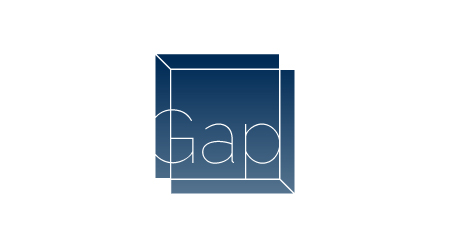
200. Justin Siddons
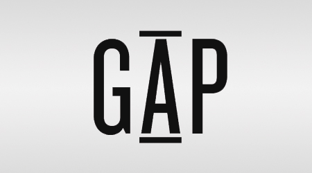
201. Palmer Holmes
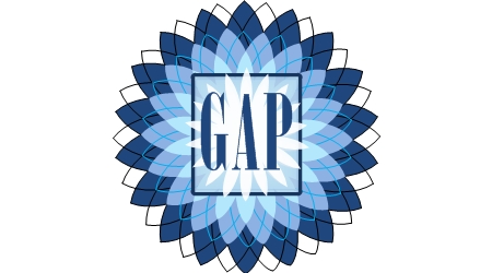
202. Greg Broadhead

203. Gabriel de los Rios
204. Yudonomi Yo

205. James D. Nesbitt

206. Tom Haynes
207. Nathan S. Hoernig
208. Natalia
209. From The Ohio Dominican University Graphic Design class
210. Scott Warburton
211. Tim Wood
212. Patrick Clark

213. Vern Ian Tan
214. Andres Plashal

215. Jacqueline Steck
216. Ádám Nagy
217. Yu Lien Foo

218. Andrew Kim
219. Cam Morgan
220. Lisa Amowitz

221. Fernando Machado
222. Richard Lee
223. Nick de Jardine
224. Greg Vickers Design
225. Huw Gwilliam
226. Willie Lin

227. Mauro Mura
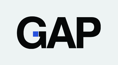
228. Doug Fowler
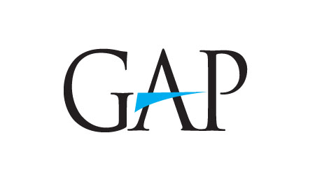
229. Shawn Patrick Hall
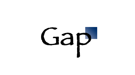
230. Brian Sadler

231. Chris Borchert
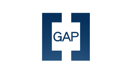
232. Trey Connally

234. Charles Mertens

235. Takahiro Kawaguchi
236. Christian Stewart

237. Daniel James

238. jonom
239. Casey Van Dyck
240. Simon Breese

241. Ariadna Giralt Duran
242. Charles Bergquist

243. jamie mahoney

244. Frederik Schumann

245. Nicolae Florin Scarlat

246. Iain Greaves
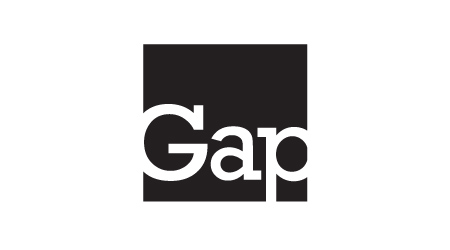
247. Tom Brauch

248. Kev Adamson
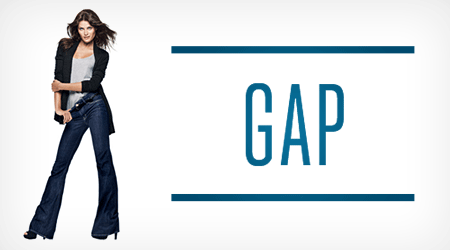
249. Adam J Drake
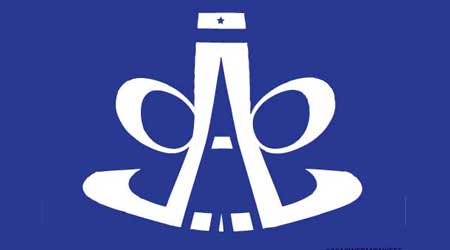
250. Charlie
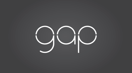
251. Cayce Richardson
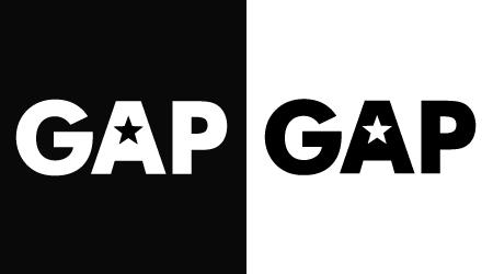
252. Marco Palma
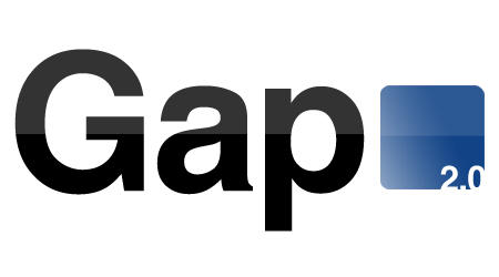
253. Timothy Lang

254. Manuel Jimenez
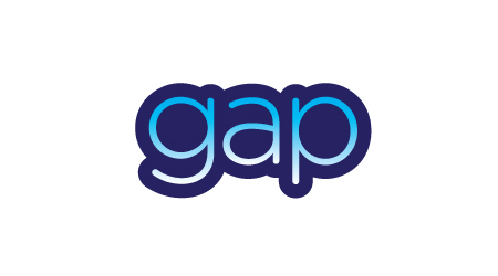
255. Dave Schneider
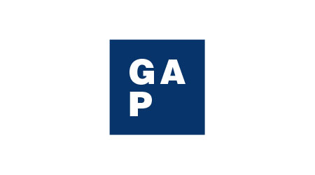
256. Pierre Stéphan
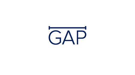
257. Rodrigo Müller

258. Frederik Schumann

259. Tony Teske
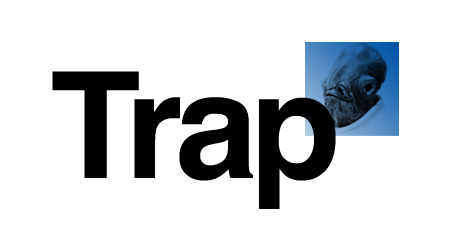
260. Jeff Bell

261. Steve Nguyen

262. Tyler
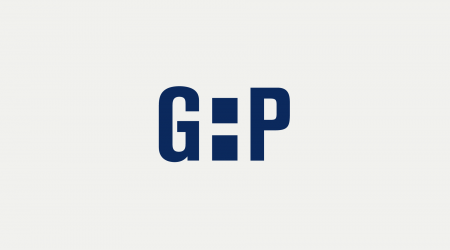
263. Yoann Pigny
264. Darren Geraghty
265. Markus Long
266. Markus Long
267. Utpal Pande

268. ben arroyos
269. Kwame Busia

270. Jerad Raines
270. Mike Speero

271. Ernesto Acosta
272. L.D. Sumulong

273. Mark Miller
274. Amjad El-Geoushi
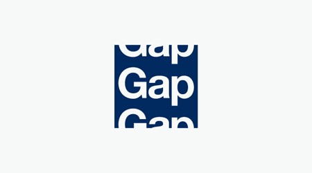
275. Mustafa Al-Qinneh
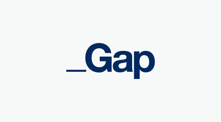
276. Mustafa Al-Qinneh
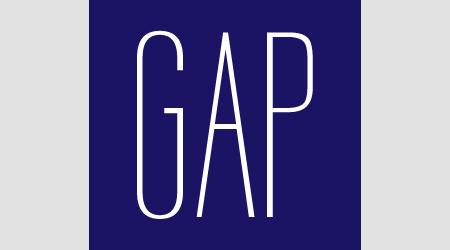
277. Mike Sturgeon

278. Justin Floyd
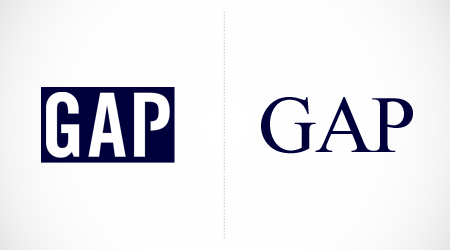
279. Herbert Joyce, Jr.
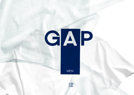
280. Joshua Hibbert
281. Min Hye Lee
282. Min Hye Lee

283. Alvas Rawuther
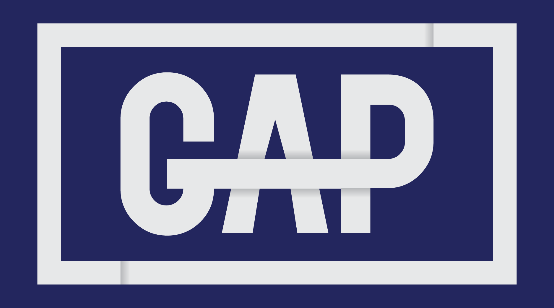
284. Tom Morgan
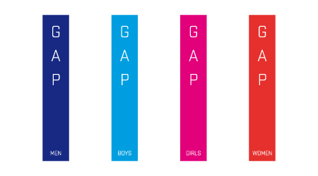
285. Toufik Yefrane
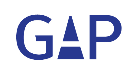
286. Rochelle Weiner

287. Mark Howson

288. Di
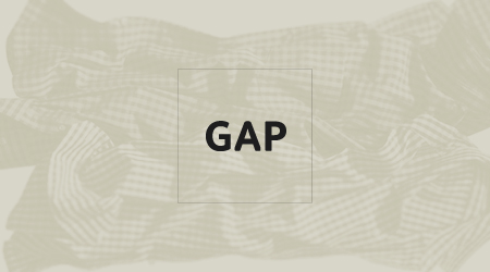
289. Steven Shultz
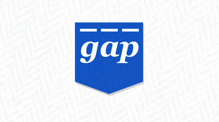
290. Oscar Espinoza
291. Simon Bird
292. Jessica Martin

293. Mark McCarthy
294. Hammam Alyamani
295. Lysimachos Maltoudoglou
296. angela cantrell

297. Landon Lee

298. Eamonn Burke
299. Joshua Barbato
300. Joshua Barbato
301. Ernesto Alonso

302. masato nakada
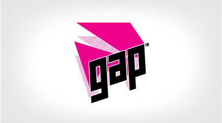
303. Mike Dobbin
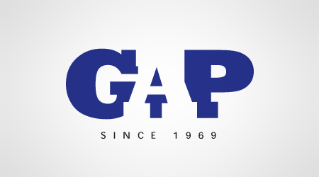
304. Gary Schroer
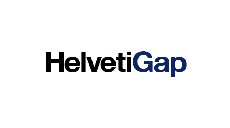
305. Jeff Bowling
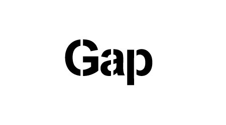
306. Harityas Wiyoga

306. Sagnik Sengupta
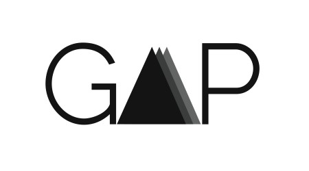
307. Brock Woolsey
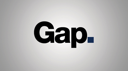
308. Carl Rosekilly
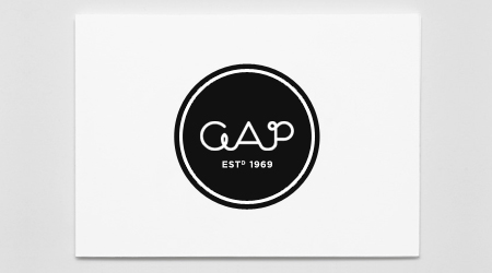
309. Victor Brave
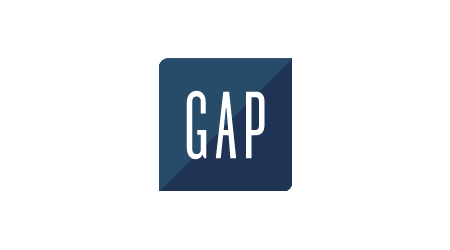
310. Monte Mitchell
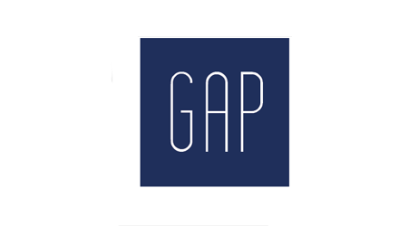
311. Henrik Rypkema
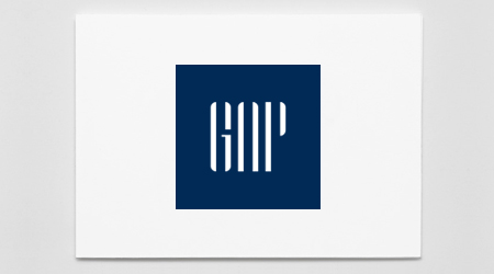
312. Victor Brave
Watch this space, we’ll continue to post batches as they come in.


Just opened up google reader, first words were “what the fuck.” This logo is terrible indeed. I’ve had my eye on some of those giclees so count me in.
man, that’s really so bad. First thing I thought of when I saw it was the polaroid logo. I remember reading a while back about how gap was struggling, I guess a redesign is an obvious step to reviving a dying brand but this looks almost auto-generated. I would honestly like to hear the reasoning behind the choices made here, there doesn’t seem to be enough here to even discuss though. I don’t pretend to understand the process of designing for a huge, ubiquitous brand like this, but I can’t really imagine any line of reasoning that would convince me this could have any sort of positive effect.
oh man… that is BEYOND horrible… I really like the old logo. Simple. Classy. Nice font… That new one looks like it’s trying to sell me pantone colors…
I love this little dialog between two nameless nobodies. If anything sounds/is fishy/robotic it’s these two funny guys. Moving on.
Alex, good post. If I have time I’m definitely jumping into the pit. I follow Brand New a lot and always enjoy the blog audience participation. Looking forward to what ISO readers got!
ha! You beat me Scott!
now my comment looks like I’m crazy…or just a jerk for calling anyone a “nameless nobody”. (just so everyone knows! they were “Anonymous” comments 🙂
The logo feels like I’m entering a website or something o_O
Excellent idea. I’d like to participate.
Maybe I’m out of it because it’s early but how do we submit? I don’t follow this: “Instructions: with your redesigned Gap logo (leave subject line intact).”
Thanks.
The logo looks like it has been pushed towards a sort of American Apparel-ish attempt. The gradient square maybe an attempt at keeping the connection to the old logo?
It would be a hard task with a brand like Gap. But this can’t have been the best direction to take it.
Not nice.
I would think a stronger connection to the original brand would be better.
It kind of has the look of a project where the client has interfered with the process, pushing horrible ideas they think work.
Check out our recent blog post in reaction to the re-brand. We’d be interested to hear your thoughts…
http://www.matdolphin.com/blog/2010/10/06/bridging-the-gap/
Jeez, The new GAP logo would be the right for a corporate website or a Saas vendor. Obviously forgot that their working for a clothing retailer.
If it aint broke, don’t fix it, Their is more likely a better way to boost The GAPS sales then re-branding.
Well, it’s better than all the competition entries so far – there are some HOWLERS in there! Money where your mouth is and all that…
I tried my hand at this redesign and came up with something I like to call “App Art” to mock todays app friendly look and feel.
I am liking Jaime Lopez’s design. It’s a jump, not a leap: which is key when rebranding a major brand.
im pretty sure they used that thin helvetica in the 90s though
i am curious to see how this new logo pans out. for example, how would they screen a 1 color version of that onto the inside of pants or sew it on a label? if a logo can not exist in 1 color, generally speaking, its crap.
I like – Jason Caldeira’s render with the reflection. Nice
I actually went to a Gap yesterday to see if they were incorporating the logo into the clothes already, and it appears they are. But, it’s simply just the logo text without that awful square. It did appear extremely minimal inside the clothing…which was nice. Although, their sign at the front of the store was still using the old logo…so, still not very consistent unless this is just some sort of test or they haven’t gotten around to changing all the store signs.
Is it sad that I went to check this out in person? 🙂 I’m a bit of a design fanatic.
i dunno, i hate the new logo, but… i also hate all the entries.
I wish the people doing the entries would actually research the company and develop a concept instead of meaningless font and shape choices.
Alex: As I mentioned earlier, remember the mantra in corporate design settings:
“Creating good design is easy. Getting good design approved is hard.”
…
Now, put on a tie, comb your hair and carry those nine presentation boards and easels into the conference room, please. You brought the PowerPoint presentation, right?
Mike: agreed.
Not to say my entries are by any means perfect – I did after all create the logos in less than an hour – but I have given thought to Gap as a brand.
The way I see it, there are basically two directions you can go: 1) An evolution of the most memorable/iconic brand attributes (i.e. the blue square) or 2) a re-thinking of where Gap lives amidst the other brands in their category, not to mention where Gap fits within the other brands owned by the same company: Old Navy and Banana Republic.
For me, Gap is all about American heritage and closet staples. Granted, I haven’t actually purchased anything from Gap in several years, but when I think of Gap I think denim, white t-shirts, effortless flannels… comfortable, no-fuss clothes. Old Navy is the trends (cheap, fun, don’t last but who cares) and Banana Republic is the polished, refined line. Gap needs to be neither, otherwise you might as well pull them out of the line altogether.
My two logo entries are meant to represent this line of thinking – one an evolution of the current brand and the other a nod to Gap heritage, more serious than Old Navy and less refined than Banana Republic.
I’d be curious to read the other designers’ rationale – otherwise back to Mike’s point, we’re just making new shapes and dropping in new typefaces. And that’s not design. (And certainly no better than the new Gap logo.0
(Sorry for the typo – hit send too soon.)
i really love the first of andrew j clark’s, lovely 🙂
If Gap wants to know how someone else would have done it I say let them pay us for our ideas. You can have whatever you want in this world just as long as you’re willing to pay for it.
In reply to Mike’s comment.
That’s a fine to make a sweeping critique of everyones entries, esp when there may actually be some reasons for the direction they were taken in.
Having said that, there are some scary entries…
..but lets see what you’ve got Mike. Submit an entry after your careful background research…
X2 Jack the Lad: Well said. Lets see what Mike comes up with. I would like to see the creative process.
#18 is brilliant.
Logo designs 3, 24 or 29 are all far better than the one Gap are using. Wow what have they done…
#18 clearly is fantastic. Well done. Brilliant.
Should open it up to a vote after all suggested new logos are in! I love, love, love #18! Love the logo and the all-inclusive branding thought behind it!
#5.Stephane Rangaya
Deserve it. You win. Fatality.
#18 is my favorite!
The new logo looks fine. I hate the old one. If I were Gap I would be more worried about the design of their clothes.
#18: solid concept, but less-than-stellar execution. I’d love to see this concept truly explored, with more finesse and attention given to type selection, deliberate integration of the small g into the big G, etc. I think it could be a winner. (At the very least it’d make a clever ad campaign.)
I think this exercise goes to show that A) just because you have Photoshop does not mean you’re a designer and B) there are a lot of people out there with solid ideas. In one day this blog’s community has generated multiple design solutions for a ubiquitous brand, several of which are leaps and bounds ahead of where Gap ended up.
Wow, you all bitch the new logo “FAILS” yet none of you can come up with anything more inspiring. These are all just as boring. Blue boxes? Really? thats better?
Some interesting stuff so far! It is interesting that people are staying very close to the square/blue situation. Of course this would probably have been most realistic as an actual corporate rebrand, but I’m curious if there are some more “out there” directions…out there.
Love #1. Can you imagine if they actually did just have the blue square sans-type as their logo? Could be awesome…or could be like that time TMobile tried to “own” magenta.
Did you get my submission Alex?
11, 18, 21 and 31 are the best/most realistic.
does this count?
Number #18 shouldn’t even count since the interesting thing about it is the theme across all brands, which is not what this contest is. The Gap logo proper is just a blue square with a G in it.
http://mexist.com/img/portfolio/logomashups_gapple.jpg
Alex: (FYI) Gap does, in fact, “own” blue… they worked with Pantone to develop “PMS-Gap Blue” (formerly PMS-655 — interestingly enough, the name of their first scent (655))…
nº58. simple and fresh
I think #19 redesign looks brilliant.
liked 14,18,19,24..
really like #64. Its a bit more of a departure from the original while sill maintaining some elements from the original. It feels a lot more “current”.
Also agree with Alex that having a plain blue square (#1) would be pretty sweet. anti-logo?
Without knowing what GAP truly was trying to do with the advent of this new logo, the result of the logo with the new website and messaging is a bit of a departure. A new look for the sake of a new look? They have had great advertising, but it should always come back to the classic, traditional aspect of the original logo. Messaging, clothes, people—always change. But when a company as large as GAP makes such a drastic change; it’s a desperate move.
That being said, I submitted something based off the original but “updated.”
First Ikea with their hideous font switch, then Tropicana and now GAP? What’s going on? Tropicana doesn’t look so bad now. They must be so happy.
@ Hunter – Wow cool! If they do own PMS-Gap Blue then I say go with the Blue Square! Forget the type. Go crazy. That would be pretty darn legit.
Also, to everyone that has submitted recently: we are getting a lot of submissions! Will take me a moment to get them all up but I will do so as soon as I can. Keep ’em coming
Just a guess, but the new logo may be a creative metaphor for GAP’s business intentions. I don’t follow fashion and I have no idea what their business intentions are, but if you put into context the blue gradient square is the old square GAP logo, one could assume it is expanding/escaping and breaking free of the long held mindshare and stigma of the GAP brand. Again, just a guess.
#39 reminds me of the Burton logo.
some good entries and some really weird ones… i do like #29 because it reminds me of a point in a time-line which could refer to “the generational Gap”
i surprised i havent seen any entries with “the GAP” in them. its known as that and im pretty sure it use to be called “the Gap” and then it changed to GAP in the ’90s ?
i think ill try and start something tonight 😀 , great idea btw!
As Brian Son said, unless there is an understanding of what GAP is trying to accomplish here, this just boils down to an exercise of aesthetics.
Is anyone aware of an explanation behind the redesign?
The current logo is so iconic – I wonder why they went for such a departure.
Some good. Lot’s of bad. Fun to see all the ideas. For me, number 23 is the clear winner.
Number 18 is brilliant in tying together all the Gap brands. Number 19 is an amazingly good refresh of the classic logo.
41 all the way.
I know we’re not voting yet, but Jeff Knowles’ logo(s), #27 – 28, is the most logical step for brand progression, while retaining hints of the long-standing mark we know so well. Kudos Jeff.
It would seem to me that only drastic business decisions and shifting corporate focus would allow the Gap brand to stray so far from its established perch.
#18 is clearly the only one that actually thought it all through, which is exactly what a designer should do. Don’t just be a pair of hands and do only what you are asked to do. A client comes to you because you have what they lack – a creative mind.
Agree that no.18 is cute but that is not the challenge here.
The main logo needs to stand on its own. The idea is good but would need t be developed to work on its own.
Chris, I’m not looking for an argument here, but I think you have to be careful with such definitive statements. Saying that #18 is the only one who thought it all the way through simply isn’t true. Yes, I agree that a lot of these designs seem to be arbitrary and without thought, but we can’t make a blanket statement about them all.
#75 FTW.
I think Eric Carroll (#75) said it all.
Everyone is a critic but no-one here has shown anything worthy of a redesign.
if you had made this logo and it got approved, everyone would be hating on it just the same.
everything here is redundant and borrowing ideas from the original logo.
It’s easy to judge.
Having said that, Steve Juliano’s solution is fantastic. I definitely paused when I saw that and continued to scroll through the rest very quickly.
It’s interesting to see the debate, but really, what are your points in arguing at all? Based on the previous long-established logo versus the new one, any of these may have been a contender. That being said — we have no clue what the creative brief was that was given to whoever designed the new logo. Perhaps, just perhaps, it was dead-on with what GAP wanted. Wait, I guess it was…because it’s live.
It’s useless to argue which logos are best although there are many submissions that exemplify what a huge company with a well-established mark should do, tweaks and edits; but still maintain the overall integrity of the logo. Although, I would probably nix out half of these submissions because they dared to not keep the GAP blue. No, that is not “open-minded,” that’s just branding FAIL.
Arguing the level of creativity is futile as well, who is to say that #75 isn’t the most creative, I mean you have like 10 crazy effects going on! Now, that’s “creative.”
(And before anyone tries to point out my submission, it was for fun and touched on aspects of the old logo but moved forward several repositionings. But based on the difference between the original and the new, it’s fair game.)
*Thanks for doing this Alex/ISO50 crew, the results are extremely impressive and I for one, am inspired by seeing the number of variations that people are creating.
It’s certainly easier to judge – which is why there are more music critics than musicians.
But I think there are several options here that could be taken quite seriously, and if given the benefit of time and money I’d say a solid 10 of these could really be successful redesigns.
You’re taking it way too seriously, Shawn.
You might want to consider most of the submission up here have been posted for fun, unlike the murderer who designed or agreed to the new official GAP logo and got plenty of time and –probably– money for it.
And I agree with most of Brian’s comment for the rest.
I love how humorous some of these have become…
Gapparel, GAG! nice…
Hmm Still looks like my entry I submitted a long time ago is not showing up? You must have received a ton?
http://es.tinypic.com/?t=postupload
pol
#18 …vur vur cute!!! (especially the “Baby Gap” logo)
I saw the new logo on 9gag this morning and thought it was a joke, literally!
But seriously, #21 FTW.
David Airey is simply genius.
This sums up the new logo 🙂 http://9gag.com/gag/39957/
I really like #51! It may not be exactly the look The Gap is going for, but I think it’s very elegant in its own way and quite a creative (yet subtle) reference to the name.
Thats some ugly Gap logo. Is it really official?
#117 and #136 definitely catch my attention.
definatly #75
Come on, someone do a logo with a vagina inside a box…
It’s interesting that there is so much conversation surrounded around gap not knowing their identity or branding, yet almost every new logo has stayed conservative to their original design. I switched it up on #110, mostly because I thought the general color was too plain (even if it is their original pantone), because they clearly wanted to “reinvent” themselves.
Robbie, I’m not sure Gap is looking to reinvent themselves. I think they’re looking to evolve. (I certainly don’t know this for sure, just taking an educated guess.) So it makes logical sense to start with what they had and improve on what’s working, removing what isn’t.
When it comes down to it, they’re still selling the same product. And the logo/brand should reflect the product they’re selling. This is where I think the large majority of these design options fail. They simply don’t feel like Gap.
Still can’t believe no one hasn’t pulled out a London Underground parody with “Mind the Gap”…
Travis – Good call! Maybe you could…
75 is a nightmare that’s not even funny.
75 is absolutely brilliant.
I’m # 101. I feel like Gap is trying to reach out to a younger, hipper market than their previous efforts so I designed my logo to signify the same class and simplicity of the original with a little more pizazz.
Can’t believe # 159 is the only one with a black background so far!
Attention Designers: Gap plans to crowd source for a new logo idea read here. This situation is all too funny, looks like they will be pulling a tropicana after all.
http://www.facebook.com/gap/posts/159977040694165
@Anna – Sorry, the idea came much too late, my two entries have come and gone…
Number 75 wins! Absolute genius.
So when are they going to roll this out across their stores?
I can’t really criticise, my gap logo design is still on a post-it note. And it’s rubbish.
http://www.craplogo.me/
Some great designs!
Looks like this is what Gap might have had planned all along.
http://www.etchd.com/new-gap-logo-botched-design-or-clever-social-media-marketing-experiment/
52, 68.
I am also suspicious about the re-design, in part because #75 might actually do a better job than it 🙂 but also because there seems to be no credited agency or designer for it. The London Olympics 2012 logo as bad, in my opinon, as it is, at least had the responsible party (Wolff Olins) admitting responsibility. The original Gap logo still works and all this probable stunt seems to do is reenforce and confirm this and give them lots of interweb chatter. Nice one. If not, at least the designer can get a nice corner office over with the Olins boys. m
Why the hell are you all doing this!? Don’t devalue yourselves as designers by contributing to this crowd source project!!
This is a cheap and nasty stunt by Gap and they should be forced to either stick with that monstrosity of a logo or commission a single agency / designer to work closely with them to create something that is memorable and versatile (it does need to be applied across a variety of media after all), something that holds true to the brand they’ve built over the years with the old logo.
Designers! Have some self respect and stop giving away you ideas for free!
————————-
Reply: Anonymous, this isn’t for Gap, read the original post. This one, however, is for and by Gap. If you would like to “whore” yourself out, head over there. The contest on this blog is purely an exercise. Also, if you think Gap is using a random design blog to crowd source their new logo, you’re an idiot.
@ANONYMOUS: To quote Chip Kidd ““Never fall in love with an idea. They are whores: if the one you’re with isn’t doing the job, there’s always, always, always another.” – Ideas come from process, they don’t run out. I just want a print from Scott lol.
Hi Scott,
If you’re going to say “I don’t pretend to understand the process of designing for a huge, ubiquitous brand like this,” then don’t.
Unfortunately you the next sentance you wrote – “but I can’t really imagine any line of reasoning that would convince me this could have any sort of positive effect.” – presupposes you DO have some sort of knowledge regarding brand design. Why should it “convince” YOU that it should work.
I suggest everyone read http://www.identityworks.com/forum/logo-design/what-they-dont-teach-you-about-identity-design-in-design-schools/ before you make a quick “it sucks!” “I bet we can do better”.
“We are a community of designers and I’m sure someone here can come up with something better”
Yes, most of us most probably could come up with something that looks better in form, but do any of you have the skills to “diplomatically negotiate personal egos, tastes, and aspirations of various invested individuals against their business needs, their pre-formed expectations, and the constraints of the market place”
-Paul Scher
now get schooled.
This is a really tough crowd! There’s some pretty good entries in here. Most aren’t too far from the original though but I guess that’s their point.
No. 6 and 106 probably stand out the strongest to me.
holy crap that’s a lot of entries
and holy crap some of the people here are good designers 🙂
“75. Eric Carroll” -> better than the current GAP new logo! 😀
“75. Eric Carroll” -> better than the current GAP new logo! 😀
Following their announcement to ‘crowd source’ logo design, we’ve written an open letter to Gap.
http://www.matdolphin.com/blog/2010/10/07/an-open-letter-to-gap/
Nice. #16 is great!
Don’t mind #55 either,
I find it amazing how many submissions feature an actual “gap.” It’s not clever.
don’t think any of the redesigns are any better, if anything a lot of them are worse because they simply recycle old ideas.
Bottom line. People do not like change. So change things people care about at your peril.
But Chris, I don’t seem to remember any outcry when Gap moved from the original “fall into the Gap” logo to what we know now. Maybe that’s largely due to lack of internet at the time. Or maybe that’s because people don’t mind change… as long as the change is in the right direction. There are plenty of redesigns that are successful… this simply isn’t one of them.
I’m a little disappointed my Comic Sans masterpiece was not included here. I guess Alex doesn’t want to make the other designers look bad…
I have to say, I really love #158.. a simple, effective identity family.
@Maurice Redmond 99.
My thoughts exactly, it takes a special skill to do a redesign that’s so bad it ends up on every other design blog and people talking about it all over twitter. It’s probably the most publicity they’ve had since they were found to be using child sweatshop labour a few years ago.
Well, all you critics and redesigners…. pls come up with something more exiting and innovative. Not one single logo of the above is better than Gap’s new logo…. they are all “same same but different”. Where’s all the great ideas?
Ha! Thanks for the comments on #75.
Obviously that’s a joke. I sent it to Alex with a note about staring at that ugly star logo can actually make the official new Gap logo look better.
I don’t really mind their choice of Helvetica (could do better), but I actually used Swiss 721 in #48.
Out of all of these:
Like: #68 #171, #168
Love #162 & #163
#111 is funny and clever
These are ALL worse than the terrible new logo….no seriously…is this a joke?
My top two:
55. Beverly Kitchens – I think you’ve got a winner 😉
182. Dave Sackville – LOVE it – but might be too ‘clever’ for the general mass. lol.
182 is the best
Lots of nice alternatives, here’s the list of the ones I liked the most. I tried to include the ones that made an effort to ditch the blue box in a clever way 🙂
96. Chris Rushing
102. Wes Moore
107. eduardo porfirio
114. David Livingston
124. Moka Mamlouk
153. Adam Faja
158. Yael Miller
163. Chris Tipton
181. Nour Malaeb
182. Dave Sackville
Can’t wait to see where this whole outsource contest will end up.
The best was #187
hahaha #18 is genius lol…so are alot of these lol
I just really dislike the methodology to this design. You can hear the designer’s inner monologue: “I’m thinking outside of the box.”…Helvetica has plenty appropriate uses where it looks clean & beautiful. This is not one of them.
I dig Chris Rushing’s (92) & Wes Moore’s (10). All these folks making a “gap” between GA & P are creating what appears to be a Georgia (GA) based company, though.
And for heaven’s sake, recognize when your design looks like a software company identity.
stop complaining and don’t design them something for free… your retarded if you do.
“…Not one single logo of the above is better than Gap’s new logo…. they are all “same same but different”. Where’s all the great ideas?”
I completely disagree. I think there are several solutions above that unfortunately are getting a bit lost amidst the hundred-or-so mediocre solutions.
A logo like this doesn’t need to be innovative to be effective. It’s not always about creating something that’s never been done and nobody’s ever seen before. It’s about creating an identity that’s consistent with the brand. That’s where most of the above designs file miserably: they don’t fit the Gap brand. That’s also where the current logo fails. It feels more like a corporate technology company than a mainstream clothing manufacturer.
I hope 99% of these are a piss take because quite frankly they’re all terribad excluding 2/3 of them.
I’d be embarrassed to put my name anywhere near most of those!
…does 180 (Tsurechka) intentionally say crap?! :/
there really is a lot of logos in here that shouldn’t be. im hoping that for the contest they will be narrowed down. the ones i like the most are:
01. Benoit Henken
18. Steve Juliano
29. Trisha Salge
mayves:
106. Nathan Regnier-Lange
136. Greg Washington
18 is my favorite though. it has the most potential.
Personally I think a lot of these logos are way better than gaps new logo. The ones that stuck out to me are the submissions by; Andrew J Clark, Steve Juliano, Jason Caldeira, Jach LeBar, and Olli Karvonen.
Sincerely,
Emily Beck
No Avante Garde! Not relevant. 🙂
I enjoy 131…but I think the serif off the back of the “a” should be taken back a bit. Simplicity and elegance are important. Not many of these logos have that but the one that do are more relevant to Gap’s brand. Nice work to quite a few of you.
I vote for the number 186 iGap
I’m wary of providing the Gap with new logos on spec. THey already got what they wanted and paid for. They briefed the designer, provided feedback and then accepted the current logo. How does this contest help designers?
It seems that most people like the original blue square with a simple san-serif typeface inside. (examples: 31, 72, 85, 87, 130, 173)
I see a bunch of General Motors logo.
In light of the current crowd source fiasco, I’m starting to wonder if this contest isn’t adding fuel on the fire. I understand that it’s all in good fun, and I submitted my entries here in good faith, but it seems that people are starting to point their fingers here for an example of “crowd sourcing” and I doubt that was the original intention.
They only gave me $5. What did you expect?
http://www.horriblelogos.com/gap/
180 made me laugh so hard! CrAP! brilliant
No. 152 is the original seventies Gap logo
I’m a fan of #178. I like the simplicity and elegance of it. It’s also very flexible since the single “g” character could be used as an accent in a lot of different ways. The font and simplicity could carry a lot of weight.
I can’t believe the buzz around this whole rebrand. I guess I’m glad to be apart of it though. I wonder if this will make people shop there more, or less. Bad press is better than no press.
WOW. i got halfway thru these and just wanted them to stop. Some are really really really bad. I ‘like’ #1 & 2 & 145. #136 & 143 are kinda cool.
You guys are all so funny! You bag on gap for changing their logo cause well evidently it’s way too corporate “Target” looking. Gap’s old logo was them. That is why a brand is so powerful. Cause you see it and no who it belongs to. Some of these rebrands as well including the new official Gap logo are way off base.
Are you doing a rebrand? Or redesign of the logo. Cause like a few post above I see a lot of GM logo redesigns not Gap. And for those of you who are going out side the “blue” box (yes that was a pun), I give you high fives for being creative, but sometime you have to draw back the reigns and remember who your designing for. You want to keep the Gap brand alive, you want to revive it, not destroy it.
Any ways this is quite interesting and love the community of designers on this blog. Every one has done a pretty swell job.
134 and 135 catch my eye even as I scrolled down through all of the different designs. If one of those were the gap logo I would start buying more things from gap.
I expected more from ISO50 and Scott. Perhaps Scott is off on tour. You guys make fun of crowd-sourcing, then do it yourselves? This is a disgrace to the design profession to show hundreds of these logos (most of them NO better than the new Gap logo btw). you are condoning crowd sourcing, demeaning the design profession, and actually making Gap look good.
http://bit.ly/ai1RuX
Settle down, JAYPARRY. This contest isn’t sponsored by Gap. Sharing ideas on a design blog isn’t crowd-sourcing.
And it’s not ISO50’s fault that the submissions suck (for the most part). Can’t you at least see value in the discussion?
Nice work.
These are uniformly awful. There only seem to be a few strategies here. Some people are keeping the old box but making some minor font, color or positioning change. Most of them feel arbitrary and none are a clear improvement on the original.
Then there are a bunch of people who chose to make some cutesy reference to the back pocket of jeans or to denim in general. The problem there is that the Gap doesn’t just sell denim and isn’t primarily known for their jeans. And most of the stylized back pocket logos are too pointy and actually look nothing like the back pockets on Gap jeans.
And of course, some people threw it all out and did some random thing without any apparent thought for the brand history.
I haven’t yet seen anyone give a coherent critique as to what’s wrong with the new logo other than “ugh, it sucks.” Yes, it looks like American Apparel, but that’s fitting considering that AA’s stores look a lot like the Gap did in the ’80s with lots of basic T-s and sweatshirts in a rainbow of primary colors. The new typeface is way better than the old one: clearer, friendlier, more modern and readable. To be honest I don’t see any reason why the Gap even needs a fancy mark or logotype beyond the name in Helvetica. Their brand is based on simple, inoffensive clothes in a limited range of bland colors. It’s the place to go for generic staples, and the new logo reflects that.
Wow, I just read the article that Pablo posted about “what they don’t teach you about identity design in design schools” and he nailed it. Design is not art, and it’s not the end result that matters. It’s a service, and the process is what’s important.
It’s Gap, not THE Gap. I hate when people say that. 🙂
So much arrogance in the comments, so many uptight reactions… I’m impressed.
“It’s Gap, not THE Gap. I hate when people say that. :)”
How old are you?
Eric Carroll rocks 🙂
This my friends, is ridiculous. Do you honestly think the agency of record (which I assume there is) produced just this one logo? This has poor marketing decision/brand manager written all over it. We’ve all had clients art direct a project to the point where we won’t even include in our portfolio.
Blaming a designer for a marketing decision is naive. But, creating your own, equally awful interpretation of the mark is plain embarrassing.
Taking the time to tell you all this, well, that’s pretty sad too I guess.
Here’s another thing, the people that care about the logo don’t shop at GAP, and the people that shop at GAP don’t care about the logo.
@JAYPARRY – Listen to “Just my two cents,” you can relax.
The singular voice of “it sucks” in regards to the new Gap logo has rung loud and clear, but the design community stuck with hyperbole (As Mat Dolphin exmplified – “The new GAP logo makes me want to cry. OMG. WTF. I’m puking blood.” and “Note to Gap – you have made a mistake beyond the realms of what was thought humanly possible if ‘that’ remains’”) instead of reasoning.
This little contest simply highlights something important: Designers need to let go of the ego and be able to justify their point of view. Hardly ever to projects go the way we want them to, and that’s in regards to far less known/established brands. Let this exercise be what it is: an opportunity to share experience and perspective…and win some sweet stuff from one of the best designers around.
Design number 75 is it. Hands down.
Not to add fuel to the fire but this article brings up a good point:
http://www.struckaxiom.com/blog/2010/10/your-logo-is-not-your-brand/
Hey Guys a hand full of our designs got chosen for the Headline of an article written by Fastcodesign, you can check it out here. – http://www.fastcodesign.com/
I didn’t realize the gap was a gas station?
I’m liking these entries:
1. Benoit Henken, 96. Chris Rushing, 107. Eduardo Porfirio
Crowdsourcing professional services is exploitive and unsustainable. GAP’s new logo is hideous, but their decision to ask thousands to take a stab at designing a better one is insidious.
I’d vote for:
27. Jeff Knowles (clean, same proportions, an evolution)
99. Alex Penny (funnier and still quite cool)
117. Éric Le Tutour (brings up visually what the brand is about)
And 75. Eric Carroll of course 🙂
What typeface did #187 B.Sander use?
I’ve seen it before, I believe, but can’t place it.
Now anyone can be a top GAP designer! lol
http://www.craplogo.me/
http://www.aiga.org/content.cfm/position-spec-work
This isn’t spec work. Sometimes, design can be fun
It isn’t spec work only in the sense that the people participating clearly aren’t professionals. It’s spec work in every other sense of the term though.
I tried to send mine but the email didn’t work!
Here’s my version on my design website’s homepage.
http://humblebunny.com
I hope you guys like it.
the agency worked 2 years with gap on this. hah.
how much do you think they payed them? so why are you working for FREE?
How are some of you so confused and arrogant about this? It’s not spec work for GAP in any way shape or form, GAP is not taking advantage of anyone in this contest, it’s for a fun contest to win some nice ISO50 stuff. Nobody entering this contest is working for GAP, or for the promise of potentially getting paid to work for GAP, anybody entering this contest just wants to have some fun and take a stab at winning some nice free stuff.
Nothing wrong with any of that.
Lets all take a deep breath.
This is just a bit of FUN
I’m sorry FR, did you say the people participating clearly aren’t professionals? I’m a professional and I decided to participate. I think your comment was very harsh and rude to assume. These are great ideas without having guidance directly from Gap itself. I’ve been in the industry over 17 years. I know your response will be something against “crowd sourcing” because clearly it cannot be a critique against the work of these artists. That would be ignorant wouldn’t it?
When I look at submission #139, I automatically think grainedit.com , haha. There is definitely a ton of quality work in here. Best of luck to everyone!
There’s a clear winner for me…
171. Chris Reynolds
Simple, On Brand, and forward thinking.
Hi-5 to you!
Apart from that… I think we should all have a chat about the new Logo in depth over a cold beer!
Your Buying!
This is the best response I’ve ever seen to crowd sourcing or design contests. http://www.craigslist.org/about/best/den/1625610355.html
Several are better than the new logo. None are better than the old one. Still… fun to give it a shot.
#182 is GENIUS. So simple, so efective.
Our shortlist:
1. #182 – a little difficult to read the GAP but still an excellent, solid alternative. Appears to be an evolution of #171…
2. #171 – A strong logo that works on the photo background, like it alot.
3. #198 – Simple, beautiful. Like it.
4. #66 – Quite like this one somehow.
5. #148 – Another circular choice, nice font.
how do i submit my idea to this catastrophe?
Love #121 because Gap sooooo sponsored the ’69 winter Olympics
A couple others would be pretty cool too
2nd #22
3rd #43
@Alex: You’re correct — what you’re doing isn’t spec-work as it wasn’t requested by Gap (unless you’re a double agent) and the intent is not for the company to actually use it. However, Gap is indeed hinting at chasing down spec-work through their Facebook page (re: “crowdsourcing”)… but remember: the entries above /do/constitute individual, published intellectual property — you could likely check with the lawyers to add some language to this post protecting individual copyrights… (something like: “logo submissions posted here remain copyright of the individual submitters”). Interestingly enough, (1) if they do indeed re-re-design the logo and (2) the new-new one resembles any of the above, folks might have grounds for a lawsuit as this little exercise has been widely publicized… the “power of social media” is a double edged sword.
Thanks to all of you who like my entry (182) ..I admit it is a bit hard to read after looking at it again – a literal 15 minute job on my behalf for a bit of fun 😀 With a bit of work I’m sure you could take the concept to make the negative space more obvious and legible. That’s not the point though, I figure hell, why not try something a bit different if it’s not ever going to be used…
Loving:
#19
#28
#29
#148
Some interesting logos in the list. Not happy with whats been picked by gap.
These are all great and raise a much more interesting competition.
Can anyone make a worse logo than the new Gap logo?
107 kicks ass.
“I’m sorry FR, did you say the people participating clearly aren’t professionals?”
Yes, in the sense that spec work is unprofessional.
haha, wait that didn’t make sense. never mind. personally I wouldn’t do this but if you think it’s fun, go nuts.
the reason GAP would “crowd source” is because they are losing the ‘young generation’ that made the company so successful since 1969.
223 & 171 are my favs
I think the idea 62 is really the best
but I s
What the fuck! Let me finish!
So I put another version for the new Gap logo, it’s not my work, I just saw it and think it’s good.
http://picasaweb.google.com/jacksonlcarlos/Logos#5525590077439453506
But my first choyce still go to the 62 version!
I can see about 3 potential designs there, most of them are not suitable though. My favourite deisgn is 176. I also think 23, 117 and 219 are pretty good.
There are a lot of really nice logo designs Here….way better than the current new one!
Daisy~
#18 is original, creative, and smart.
KEEP THE ORIGINAL, why change something that is recognised worldwide.
Its plain, simple and timeless, CRAZY! wasts of money.
cjadesignconsultants.co.uk
IF I HAD TO CHOOSE, 171 – WELL DONE
I think this is half hilarious and half creative. The ones where they’re making fun of like “gag”, “gay”, or “fail” are hilarious. But the serious ones are very creative and I believe they could actually be used for the logo of GAP today.
The two that got the biggest laughs from me are: Gap Tropicana and Gap Papyrus. Hilarious!
I like the color pallette idea of #155. 143 is a good design for a sub-category.
182 is a nice rework.
112 is neat.
faves:
18,23,107, 108, 66 112, 122
I send my logo twice but is not in the post
These all suck, except for 1.
ARGH!! someone beat me to the Papyrus Gap logo…..awesome.
I like 159. and 211, and your right Gap’s new logo is the worst! this needs to be done!
I have to give it to Steve Juliano # 18, “Gap maternity” is genius.
Whooo, I am loling at the Papyrus one. Well done!
#18 FTW!!
why cant anyone think outside the blue box?
This logo just keeps getting more and more traction as the days go by.
How long until the GAPocalypse? http://twitpic.com/2vppgs
107 and 121 are my favorites.
Sorry, but I like the new logo. Better than any other proposal. “Des goûts et des couleurs!”
old logo seems more modern than the new. best: 47 !!, 41 and 192
http://www.underconsideration.com/brandnew/archives/follow-up_gapgate.php
This contest is being talked about all over
Some decent ideas in there, but honestly most of them are just as bad, if not worse, than the new logo.
Props to Eric Carroll, nice to see someone with a sense a of humor. If Gap wants to really break ties with their solid brand image, they might as well! Well done.
“So much arrogance in the comments, so many uptight reactions… I’m impressed.”
LOL
This whole thing is either A. a brilliant marketing scheme to get the world to recognize the gap brand again or B. exactly what they wanted for a logo and in the end the client is right no matter how hard you try to tell them otherwise.
You can lead a horse to water doesn’t mean they will drink it.
I’m really digging # 178. I like Jesse’s simple design; that actually links the clothing company logo to the literal meaning of their brand name.
It’ll be funny when GAP drops by here and uses an idea for free. I hope they do.
# 1 wins my vote, and I even designed one. Good job Benoit. Good Job.
Well, I personally don’t believe any are “better”. It’s a tougher project than most would think, and was very risky to begin with.
LOL! John Coulter No. 152 wins for sure.
If you don’t know.. what he’s posted is the original gap logo.
http://marketing-case-studies.blogspot.com/2008/12/how-do-you-wear-it-campaign.html
I love lamp.
Don’t encourage ‘free’ ideation!!!!
Designers do their work for a living!
We are trained to be creative, insightful, intuitive, impactful. That expertise comes at a cost.
NO FREEBIES!
Don’t encourage ‘free’ ideation!!!!
Designers do their work for a living!
We are trained to be creative, insightful, strategic, intuitive, impactful. That expertise comes at a cost.
NO FREEBIES!
I agree with ‘PAM’ don’t give away design. Just unsubscribe from their emails unfriend them and buy your stuff somewhere else.
This may help you strategize for what you create for the contest or it may even give you a completely different take on the new Gap logo. See for yourself: http://bit.ly/aWZ7LN
No more censure
Look at this true GAP story :
http://twitpic.com/2vqy6s
http://twitpic.com/2vr8i1
these r all much better than the new one.
#96 my favorite
I love lots of these logos but I guess my favorite ones are 6. Andrew J Clark and 23. Jason Caldeira !
My favorites
#28 (as recognizable as the current one)
#171 (similar as #28)
#99 (as they’re profesional with denim jeans)
#3 (interesting for “gap”)
#145 (interesting and simple)
#147 (simple)
#96 (interesting but maybe not esthetic enough)
#169 by Ryan Lockwood is beautiful. Nice work. I love the modern take on the old logo. They typography is extremely well thought out, and the angle on the A gives it enough movement that expresses the Gap’s desire to be progressive and forward thinking. Yet it still retains enough of the former identity that we don’t feel it’s left it’s past behind. Good job my friend.
I LOVE the old logo….leave it! It’s not broken…it’s what we know and LOVE!
#18 is good ECCEPT for the Gap maternity logo… That little ‘g’ sits a bit too clumsily in the big ‘G’.
And conceptually it’s not that new. I saw this ‘nested’ concept many times in sophomore level design classes.
There’s a lot of logo hate out there in the world!
#260 FTW
i pretty much like the 11 and the 55 designs best cant decide wich one for the win though
Ye, most of the entries are noobish and bring shame to the design industry. Please stop!
http://pics.livejournal.com/matrix_reflex/pic/000p1tss
got gap?
http://pics.livejournal.com/matrix_reflex/pic/000p02p4
AAᴬᴬ
Has anyone forwarded the link of this thread to Gap? I know this contest is not affiliated, but Gap has asked people on their facebook page to submit designs to possibly be considered in the light of everyone hating their own redesign. Might prove beneficial to some of you folks to do that.
Yes, there are some really good logos in here. But, honestly, most of them are no better than a haggled old tractor’s rusted rear – don’t ask me what the means. The ones that caught my eye were 11, 182, 265
171. hands down wins. perfection. I had started working on my own, but then ran across this and realized the work is done. If anyone at Gap had a brain they would use this. Way to go Chris Reynolds.
Runners up & creative props go to:
34. Putting a gap in gap is seems somewhat cliche and was incorporated by many, but with the bar over the space something about it just works. props.
124. Like the concept of the cohesive body of logos, very aesthetically pleasing as a whole, but doubting that just the original logo has any stand-alone power without its counterparts. The overbearing quality of the font would probably make me feel like I’m being screamed at.
130. Very nicely done. Gradient that works, and perfect color combo. Out of all the 1969 incorporations, this one is my favorite.
143. Beautiful design work. Very fresh. Typically rebranding for a company that’s had 40 years of building its brand works best with subtle changes, but if Gap wanted to just abandon everything and run with a whole new idea, I’d support this logo.
163. Nice. Cohesive. Each works on its own and side by side. It does leave a little something to be desired though.
168. Love the subtlety of this blue. Much more aligned with Gap’s product than the original blue. The font doesn’t do a whole lot for me, but it definitely works for Gap.
236. If the blue were to be abandoned altogether, this is a new hue that works. when I think Gap I think very crisply pressed khaki chinos…this logo embodies that. But if they truly are moving in a new direction….who knows if it’s what they’re looking for. It would be nice to know their rebranding strategy.
251. Another gap in gap that’s bearable. This is close to working, but the color and font need tweaking. Or something.
Chris Reynolds I’m rooting for you. Your design is true to the brand yet fresh and veryyyy appealing, and leaves so much room for play with each new season. Lovely.
Another thought, 18 has received a lot of praise. The idea was nice, and I found it clever as I scrolled down the page, but it does not have any lasting power. This strong conceptualization with such disregard of design may likely bore the masses before Gap finishes changing out the signage.
It seems I may have put on my super opinionated pants today. 18 is still a design dream compared to the crap Gap came up with.
I had an attempt at this myself, it’s in that spirit they you try and challenge yourself and see if you really do cut the mustard.
I thought the old logo was fine, consumers / buyers / shoppers are already built a relationship and affinity with the brand, and it came to represent American casual apparel at a price we could afford.
Which is why I was surprised in see GAP re-branded in the first place, someone in an earlier post mentioned the design agency had been working for two years on this, and surly they must have come up with a lot of good work during that time, it just came down to the client at the end, just like the London Olympics Logo, I’m sure Ollins can design a good logo, but us as designers and creatives are faced with pressures to keep the client happy and give them what they want, so long as this culture exists you will see a lot of what you don’t like.
As for Gap, I submitted something here and it’s a mix of the old and new, It’s a clothing company, it’s a ticket stitched to your shirt/trousers etc.. and that’s where the logo lives most of the time, on an item you wear, so it has to be fit for purpose. it gets worn and washed and a neon sign on a shop or window display follows on from that.
just a thought on this, and there is some really nice work submitted here with a few cheeky ones
seriously number 75 wins. Everything else looks the same 😉
@Topher/291: This thread has received *so* much attention that I suspect Gap made the move/announcement to “crowdsource” (in part) because of it… The internet is a small place.
That said, I’m glad Scott/Alex put up the “editor’s note” above… it could still be strengthened with the reminder/mention that the work remains property (copyright of) of the individual submitter and that by posting here under your name, you’re “publishing” your work, so to speak… which will hopefully protect you in court when/if Gap decides to use your mark and (1) not credit you for it and (2) not pay you for it.
i am loving number 18. I really like the gap and baby gap logos. the maternity one is a bit meh for me. i love the concept of this one and i feel like it could be part of a nice branding execution. well done mr juliano.
WOW it’s remarkable to see the attention this has gained! It’s understandable that not everyone will be pleased with this debacle — but hell, at least people are calling out a brand for shitty design decisions. I can respect that.
@Alex — glad you mentioned “this is for fun” I’m sure about every entry here could attest to that.
@Logan Brinkley — Hive five, I’m in for the cold beer.
@MONOmoda — Thanks, I could see this working across many different applications, this being just one idea.
@Amanda @Carl @MrFreeze — Thanks!
@StephanieK — I <3 you. come join Logan and I for beers.
“This is not a secret conspiracy by Gap and the Freemasons to get you to design free logos. This is not [crowd-sourcing].”
Scott/Alex: You’re correct. /This/ is not “crowd-sourcing” — it’s a fun, what-if project and you’ve received a lot of good designs, but Gap has stated they’re considering it… and potentially, in part, because of this thread (or this thread has validated their previous theory/strategy).
ISO50: “This is not [crowdsourcing]”
Gap: “Stay tuned for this crowd sourcing project” http://www.facebook.com/gap/posts/159977040694165
My hope is that you do what you can to protect the IP of the submissions here… like it or not, you’re on of the guest list: http://www.fastcodesign.com/1662446/the-gap-falls-into-a-new-logo + http://www.fastcodesign.com/1662452/gap-on-disastrous-new-logo-were-open-to-other-ideas
I like #3
# 281 & #282 are defintely my favorites so far. Nice work, Myn!
128
There actually some nice logos here!
Hunter-
Agreed.. Honestly we didn’t really consider the ramifications going into this, Alex came up with the idea, I said I’d throw a poster and some shirts on it, and within 2 hours the post was up. We certainly didn’t have any idea “Gapgate” (as brand new has dubbed it) would get so blown out of proportion that it would be deserving of the “gate” appendage.
I guess we figured anyone taking this on would realize it was totally for fun. But yeah, if Gap ended up trying to steal any of the ideas here I would definitely do my best to see to it that the original creator got what was coming to them.
Also, I was joking about the crowd surfing. I just can’t stand a lot of web 8.0 buzzwords and “crowdsourcing” is one that seems to make people’s heads explode and incite web-based rioting of 4chan proportions — as was evidenced here if you were around for the initial barrage of completely insane, tin-foil-hat-clad comments. I guess it’s just crazy to see how serious some people are taking this.
I really can’t believe you’re persuing this…
None of these submissions are a rebrand of the Gap logo, and with that said, they’re all just as effective as the crap Gap just released.
As much as i appreciate the attempts being made here, a brand is a lasting mark that goes beyond ink on paper. It requires extensive research and forward thinking, none of which will or can be applied here in this blog.
“a fairly open brief” that’s a copout because even you can’t name what the brief would be.
This is an art contest.
Some of them are clearly better than the crappy new logo.
Hope they will make the good choice 🙂
These redesign contests (think back to the London2010 branding) seem to prove that, its not just GAP who don’t have a clue what they are doing.
Why does everyone think they are a graphic designer?
Maybe this is what Gap wanted, call people’s attention with their little gradient randomly falling over the “p”.
Maybe that’s their strategy, at least people is talking about the brand again. Who buys in Gap nowadays? Maybe people will go inside the store to see if the clothes were redesigned too..
Anyways, thanks for posting my entry, it was fun
Looking forward to see who wins this thing
I think most would agree that any of these might be a welcome departure from the current offering – however, considering their heritage, 2 general executions stick out for me.
1. the infamous blue square – perhaps using it in isolation is enough, perhaps not, but making it the central device could be an interesting exploration. Surely Gap has become enough of an icon that devices other than the name can speak for themselves.
2. the cube – maybe a nod to how the brand is evolving, a 3 dimensional representation of the traditional blue square.
I liked maybe 2 out of all these submissions. The new gap logo is not looking to bad to me now. I could do with out the gradient in the new gap logo box. That takes me back about 10 years. I think we will all get over the changing of the logo and gap will still be a billion dollar company.
just because the name of your company looks pretty in Helvetica (whos doesn’t, right?) – doesn’t mean you should put it in helvetica. And it definitely doesn’t mean you should make that your logo.
The tropicana orange one made me laugh
See STARMEN’s branding solution for Gap’s logo redesign: http://www.starmenusa.com/blog/2010/10/11/gaps-logo-redesign…-a-panic-move
GAP finally heeds to customers request to scrap its new logo. Announcement here: http://bit.ly/amfVru
Love #221s thinly veiled Tropicana hint!
Here’s my design: http://img221.imageshack.us/img221/1081/gap3.png
OUT WITH THE NEW, IN WITH THE OLD.
They reverted back!
http://news.cnet.com/8301-1023_3-20019279-93.html?part=rss&subj=news&tag=2547-1_3-0-20
Still time to submit? Even just for fun? I didn’t know if it was still a valid contest with the recent news.
I can’t believe they reverted back. And so quickly! And does this mean David Airey (#21) wins? Haha.
Fascinating! I’m no designer, I just like to watch. What strikes me is that a great majority of the logos on this page are superior to the Gap’s own redesign. YMMV.
The “new” Gap logo might work as branding for a faceless holding company; a corporate ID aimed at their brethren on Wall Street. GAPCO Industries, yah think?
But it’s just too cold to wear. Sorry.
Just look at the clothes they’re selling and the prices they charge. That’s the problem at Gap… not their logo.
Gap used to be a reliable shop for well-made, classic clothing. Now they’re leering at the skanky kids staggering into Abercrombie (just the other side of the food court) and have lost their minds, clearly, by sourcing the cheapest-possible clothing that they mark up to the rafters.
The coveted urban hipster-types aren’t so stupid they’ll pay retail to own laundry like this.
This ‘contest’ is a great response, though, to the abortive lurch.
I design logos for products and companies weekly. There were a ton of GREAT logo redesign ideas here — really, some very clever and/or aesthetic ones. Why GAP chose the crappy ass one they did is beyond me. Now they backtrack and revert to the old one. A total waste of everyone’s time and money. Design to be bold and unafraid and stop asking for opinions post facto.
I vote for #30.
#260… Fantastic. Instant classic.
I had a quick scroll through these. They all miss the point and are predicable solutions. None of them would take the brand anywhere. You have to look at something completely different like the London Olympics logo to see what truly innovative thinking is like, not something that is just off the shelf. They are certainly better keeping what they had, but was it a serious (though misguided) attempt to change anyway or just a superficial game?
Love
#166
#270
#282
#299
#301
#309
My GAP design
http://www.maanu.co/images/GAP.png
ALEX: Are you even a designer? The comments you make are not only awful but are pointing people in the completely wrong direction. Stop being an idiot and acting like you know anything about logo design because if you did then you would know to shut your own mouth and let pros deal with it…
You say, “Wow, you all bitch the new logo “FAILS” yet none of you can come up with anything more inspiring. These are all just as boring. Blue boxes? Really? thats better?”
and now you want to just make a blue box?!?! are you a F-ing idiot?
Please do the design world a favor and turn your computer off forever.
I’m referring to Alex in comment 35.
Poor people at the end of the post, their designs may have been good but I got so sick of reading the word gap that I didn’t even want to finish looking. Gap isn’t even a real word in my brain anymore. Its like fej or afv or asldfjas or zzzz. Meow.
Certainly got GAP back in the public mind. Just like AOL before it.
As for the crowdsourcing offerings… it’s “mind the gap logo” for me. Special mention to “helvetigap” and “american gapparel”.
75!
I like 182, 185, 189, 197, 206, 271, 282, 285
I like these whereas they do not try to change the square if there is one. They kept it very simple and updated trying to add a completely new element into the logo or character.
I like 96 and 270 the best. 96 because it looks like pocket stitching a bit and is still readable.
Sorry to the folks looking to get some Gap recognition, but it looks like they decided to go bad to their old logo. It was probably for the best though. This competition was fun none-the less. You can see for yourself on the Gap website, or check out this article: http://mediadecoder.blogs.nytimes.com/2010/10/12/gap-inc-puts-gap-back-in-logo/
Sorry again, go back* to their old logo.
There are some good logos here. Last I heard Gap was withdrawing from the crowdsource option though.
I resent the email including my logo design, because I still find this post interesting.
#18 is easily my favourite.
The Gap brand is so recognisable that I think the concept that you only need the letter ‘G’ is ingenious, and it ties in with the way people communicate these days with words being replaced by a letter. Plus the baby ‘g’ is cute and actually does resemble a baby. All in all perfect.
75. Eric Carroll all the way
Many of these would make great Gap t-shirts, even with the logo staying the same.
Many of these would make great Gap t-shirts. New logo or not.
These are really nice:
4
96
107
167
308
eric carroll for the win!
#178
#72
#304
Where is the rest of them?
.30
.282
i voted for 18. if that eric carrol one wins, it will be a disgrace to this blog. no offense to the artist but its obviously a joke. i like reading this blog and i look forward to seeing the thought process post of the winning designer. unfortunately i don’t think 95% of these will be able to present their rationale anyway. that’s why i’m voting for 18. i want to see more.
Some of these designs are fresh, spot on and well done. BUUUUT… hilariously, many of these are much worse than the original, now rescinded design. I mean, sheesh. Imagine some of these showing up on GAP’s Website and then imagine the backlash. I’m assuming a simple type update within a square (perhaps with or without a gradient) will be the salve the Great American Pant company (or whatever the hell “GAP” means) is looking for.
My apologies, I see some of these were obviously created in jest. Still, there are a lot of duds there folks.
A Bunch of you did not do your homework, “Gap’s name originated from “the generation gap,” a popular phrase in the late 1960s used to describe the generational differences between baby boomers and their parents.” Its about filling the “gap” between styles, and A LOT of you decided to put a GAP in you logo concepts which goes completely against the meaning.
I like your blog, but my respect completely disappears when you do stuff like this. This makes you worse than Gap.
The worst thing about this whole affair is the whole reaction to what Gap did, not what they did to cause it. People who are clearly not equipped to produce considered identity work are shooting from the hip and firing their awful “my idea is better” logos and you should be ashamed for encouraging them.
Please stop it.
I’m loving #18.
107 and 117
Ha Dan relax its ok.
I think no. 18 is the only original. It’s new. It’s fun and it goes beyond those three letters.
Lol. looks like u didn’t do your research Tom because their very famous tagline was, “fall into the gap” which infers that there is a “gap” which people are representing. think before your write please.
302 is slick and new
I love #18. Most creative!! It would be a great new look.
#18 Feels very Herb Lubalin…
http://i754.photobucket.com/albums/xx188/electricink/Typograms/ex-4.gif
260 is pretty darn hilarious. Kudos on the Star Wars reference!
# 18 it is so clever!
#258 is my favorite. I’d like to actually get the designer’s contact info for some work. Thanks!
# 75 FTW. 😀
my vote is http://i36.photobucket.com/albums/e24/snooz3r/ricogap1.png
which unfortunately didn’t make it even though I submitted it before the deadline 🙁
LOL -#33 Monkey!
pathetic choice
Please Visit this web for logo inspiration.
#204. clearly the most appropriate. love it.
I vote for T.62
Argh! Too late to win, but not too late to submit. I demand a recount!! 🙂
http://thisisdavelilly.blogspot.com/2010/10/unofficial-logo-gap.html
Didn’t know about this contest but here’s a v quick design I did at the time.
http://www.flickr.com/photos/stevem78/5074968451/
If this display does nothing else at least it demonstrates clearly why designing a logo is not the simple task so many claim it is.
@ Steve Haines – Bingo.
I don’t consider I have ever found some sort of weblog with this lots of remarks in it!
The designs are all so nice! They can all pass as logos for GAP. They all have great minds.
I’ve viewed many blogs and I can sure enough state that this one is my favourite.Custom logo designs
Custom Website designs
Website Design Templates
yea, make it 3D, put a drop shadow on it, and make it “reflective,” and it’s like new. SO TIRED of those tricks. No one wants a web button as their logo. Ick. On a positive note, some of these are good. I honestly think their new logo just needs a slight modification, nothing major. A successful brand is just that. If it aint broke, don’t fix it. It’s a timeless brand, with a timeless look, and a timeless product.
Thank you for your awsome article. I’ll keep an eye about your own blog, i allready saved it to own list 🙂
Thank you for your awsome article. I will keep an observation about your site, i allready bookmarked it to personal list 🙂
Hiya! You some form of pro? Great message. Can you inform me how to subscribe your blog?
It had been a while since I visited web site with such high quality information. Thansk a lot for the useful information
My version of the GAP logo:
http://www.youtube.com/watch?v=q7YIKkdeL4s
These games are great to play. I love playing these games and the t shirts are awesome.
Gaming is such a good activity on computer specially for kids because it creates passion in them to win the war.