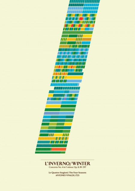
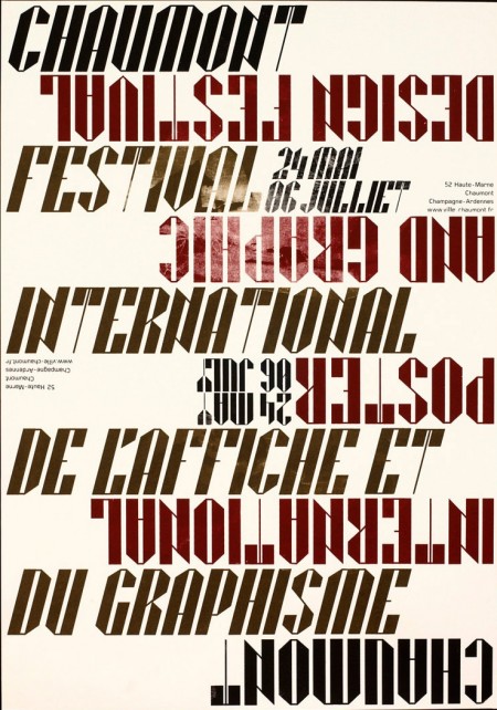
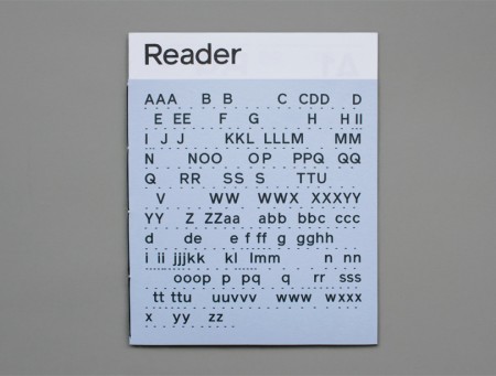
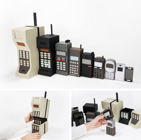
The University of Brighton has a nifty website up displaying the work of their Spring 2009 design and illustration graduates. I’ve placed some of my favorite pieces above, but there is a lot of impressive work to be seen. I think it’s great that the school puts this together for the graduates. While each student seems to be very web-capable (at least in terms establishing an online presence), this kind of collective resource allows each student to benefit from the aggregate buzz of the project. This institution-sponsored online portfolio presentation is something I think we will be seeing more and more of (in conjunction with, or probably as a replacement for, the onsite end-of-semester shows).
The work above is by the following designers, in this order: Kirsty Hole, Richard Carey, Edd Harrington, Kyle Bean. Those old school phones remind me of some of the work by Dan Mcpharlin.



They should make a skin/cover/case/thing for the iPhone that looks like one of those old phones…and is as big….
Some nice work indeed…but the UX for the site and previewing the work is painful. Back, forth. Where am I?
Amy- Agreed, the interface is super weird. I kind of like the little icons, but it really isn’t very effective if you want to get a sense of all the work. They could take a page out of Cargo’s book…
Hey,
I am in the year below these guys at Brighton. Unfortunately, the website and show are nothing to do with the University, it’s all put together and funded by the students. We’re in the process of doing the same thing this year. It’s hard work but we’re learning a lot. It’s a shame that there isn’t the funding from the University to help us, but that’s life. Just thought the students should get credit for more than just their work. It’s hard to organise a class of 80 people to get their work on a website, in a catalogue and in a show, plus 3 years worth of fundraising.
Very nice 🙂 . Great tehnique!