Update: If you’re looking to purchase the print it is now available here: studio.iso50.com
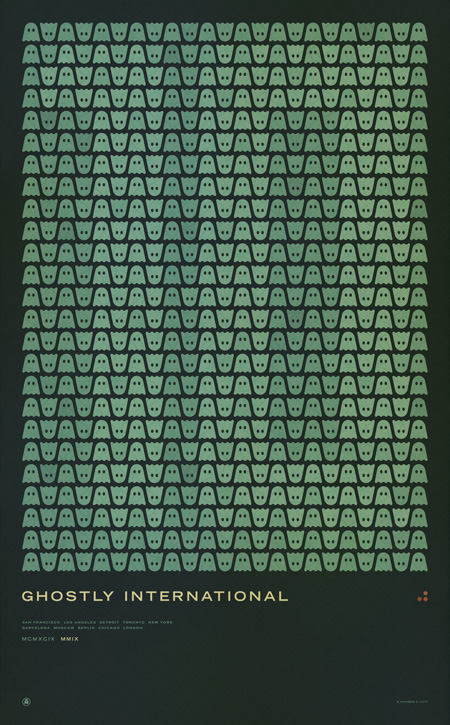
Ghostly International (the label I record for as Tycho) asked me to design a commemorative poster for their 10th anniversary concert series. This is the first print in a series I created for the events. The others will be released over the coming week with the flyer hopefully coming tomorrow. This print will be available soon as a limited edition large-format Giclee; pricing and availability will be announced next week. If you would like to reserve a print please contact studio [at] iso50 [dot] com.
The next poster will be the individual design for the upcoming Chicago 10 Year show where I’ll be playing a Tycho set along with Solvent, Kill Memory Crash, and Dark Party. More information is here.
This first poster lists all the Ghostly 10 year show cities:
San Francisco
Los Angeles
Detroit
Toronto
New York
Barcelona
Moscow
Berlin
Chicago
London


Nice poster Scott; love the spacing between elements, or rather, the composition.
What happened to your trinity looking symbol / logo, has it been replaced with these three dots?
Did I miss the NY show?
what do the 3 orange/red dots signify?
I like the way number 10 isn’t obvious (“ghostly”, indeed) until you move a bit further from the screen 🙂
yea, nice job on the 10. well done.
Beautiful, very nice for a very good label.
Nice Work!!!
your style seems to have evolved with more elegance in simple patterns and subtle typography with extra kerning… I really like the direction you are leaning towards.
What typefaces are used here specifically those narrow ones on the Chicago poster??
PS: congrats on your Layer Tennis play =)
I agree with Vladimir, your layer tennis matches were a blast to watch this season. I personally feel you should be in the final.
ghostly international typeface looks like trade gothic extended. cant really see the smaller type underneath. trade gothic condensed 20?
the best narrow typeface ever is knockout by hoefler jones.
I’ve been tilting my head for quite a while before I could actually see the “ghostly” 10 appear. Really nice work, I particularly like the color pallette.
Love the poster. What is the name of the primary font?
This poster is incredible!
(perhaps you should’ve put the silhouettes of the number 10 in the background) 🙂
loving the ghostly 10, really lovely colours too
The primary font used there, the one used for “Ghostly International”, is Trade Gothic Extended.
See you there.
how much is a print? 🙂
I usually love your designs, but i must say i dont really like this one, its not my intention to be rude, but i found it boring. :s
those 3 red little dots are driving me nuts. what ARE those?
really love it, I want a print;)
Breathtaking, Scott. The ghosts are super-cute.
I love this, and your music. Please please please come to Orlando FL!
Hi, love this print. Will there be any chance to send a copy to sweden?
If you’re looking to purchase the print it is now available here: http://studio.iso50.com
I don’t understand… when are these shows taking place?
“San Francisco
Los Angeles
Detroit
Toronto
New York
Barcelona
Moscow
Berlin
Chicago
London”