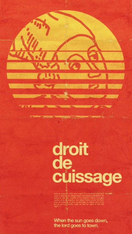
You may recognize Alex Koplin (not to be confused with the Alex who writes for this blog), aka H34dup, as a frequent commenter here. I was checking out his blog today and came across this wonderful image which I just mistook for a vintage piece that Alex had simply blogged about. But after reading on I realized that this was actually created by Alex for Typcut. I see people use textures and aging techniques all the time, but they’re usually pretty transparent and obvious. This, on the other hand, is spot on authentic. Loving the color, type, and composition. This would feel right at home on my kitchen wall or a wine store in the Rhône.
I’ve spent a good portion of my career working on distressing and aging techniques. It’s one of those things that you just shouldn’t even be doing unless you can totally nail it (and that’s not to say I’ve always gotten it right; I cringe at the sight of some of my older stuff). I see people try to use Photoshop brushes to achieve this sort of style but I think if you’re using brushes to distress, you need to turn back because that path leads nowhere. Who knows, maybe it’s possible to get decent results with brushes, I’ve just never never seen it done. That is to say, whenever I see work done with brushes, it always screams “hey, look at these brushes”. Anyways, Alex’s piece is a great example of how to do it right. Now here’s the part where Alex comments and says he did use brushes and I look like an idiot.


That would look a bit weird in a kitchen 🙂
Hello from France 🙂
Can i just ask, whats the way to go then if you don’t use brushes? 🙁
Brushes work well for a quick fix though.. And of course it’s not always supposed to look perfectly authentic. But I do agree this poster looks freaking amazing.
I turned a lot of my scanned and photographed splatter and distress into personal brushes and that work fine for me.
Can’t see the problem in that, on the contrary even, it can be quite helpful in the ‘sketch’ stage.
Great looking poster, the creases are great, though the widow in the paragraph is a bit unsightly.
I’m the curator of Typcut, and i was blown away when Alex killed submitted this piece. He’s a very talented chap. Thanks for linking to Typcut Scott.
Looks to me like he just scanned an old piece of paper that was creased and worn and then went to work on top of it using one blending mode or another. Very nice piece, but I’m not exactly mystified as to how he did it.
Also, the tongue-in-cheekiness of the “When the Sun Goes Down…” line at the bottom gives it away as being something that was done more recently.
great image. definitely impressive with the distressing effect though. I’d be surprised if it was just a brush…
I must admit I’m blown away by all the positive feedback this piece has gotten. Thanks a lot Scott, for including this on ISO50! It goes without saying that seeing your work inspired me back in 07, such that this path I’ve gone down is undoubtedly a result of the inspiration you’ve given me!
It’s cool to be able to do work that is free from constraints, which is why I’m glad to be a part of Typcut. Scott refers to a blog post that details my process and what is becoming my preferred personal style (creating images that appear to be scanned-in, and not created using CS4), that can be found here for those interested: http://blog.h34dup.com/?p=1215
In short, there is a little bit of brush work in there, but by no means is it the sole source of this texture. There may be 2 or 3 layers of brushed-in textures, but they make up a fraction of the actual texture, and are only at about 5% opacity. I utilize paper textures with different blending modes, a few filters and adjustment layers, some very subtle but important compositional tweaks, and in some cases (like the creases and folds) I edit up my own textures from other resources I’ve collected. There’s a lot of experimentation involved.
As for that orphan, I need to be more disciplined with addressing those, but believe it or not that was intentional…I could have beefed up that paragraph a little to get rid of the orphan being so prominent, but I didn’t really want a clean-cut block of text either, I wanted to bring out the citations at the very end. The end result was an orphan, but I don’t think it takes too much away from the design.
Thanks again, I’m really glad this piece was so well-recieved!
I used to do a decent amount of distressed work, sometimes a sort crinkled, worn paper look. I can’t say I feel I ever totally nailed it, but I think some pieces turned out pretty good. Generally I found myself scanning in actual pieces of worn paper and/or cardboard and using little bits and pieces to manually built the worn look. The gray scale versions are also very useful when applied with the Displace filter to add some of the shape that the original had. Like Alex said above, it always involved a lot of experimentation and minor tweaks including subtle, nearly transparent brushes.
That said, this is an excellent piece and looks like someone just pulled it out of their pocket and unfolded it.
I fancy it.
Yeah, nice work Alex. Top class really.
Yea I had my “grunge” and “worn” photoshop phase too. Every once in a blue moon I’ll do something like that for fun. You can get some nice effects with mixed brushes, choosing the right colors and then layering that up with subtle effects and modes.
Some of my favorite uses were when people made photos look like something out of a NIN video. Kind of like how 555 design does his stuff. A somewhat new trend I like that I’m seeing now is people photoshopping album artwork to make it look like a worn record sleeve with record pressed wear on it.
That looks so much like the work of Joseph Muller Brockmann. But it looks good.