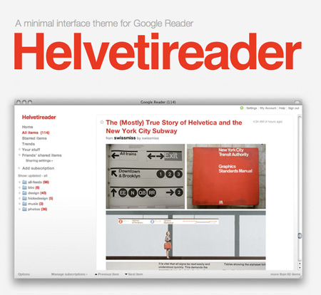
 If you read anywhere as many blogs as me, you probably use an RSS reader. My absolute favorite is Google’s Reader; it’s web-based, lightweight, and has all the functionality I could ever need. The only problem is that, like all other Google products, it looks like a Google product. Enter “Helvetireader”, a minimal, Helvetica-themed interface for Google Reader. The theme works with most browsers, more info is here.
Helvetireader
12.17.2008


This looks pretty nice, I’m using it right now. I like Google reader too. Eventually Google is going to bring the themes from Gmail into Google reader, but Helvetireader is much nicer.
looks pretty clean indeed, I’m using bloglines witch works okay, but it has allot of options i don’t ever use + it is not as fast as i hoped it would be. I was wondering if it was possible to export all my feeds into another reader?
Melvin. Yep, I did it several months ago, and I’m very glad I did. Google reader’s lightyears ahead of bloglines, especially the bloglines beta redesign. http://www.bloglines.com/help/faq
The funny thing is, based on your screen cap it looks as if you don’t have Helvetica 🙂 Looks like arial…
anyway, it is a nice looking reader and I’m going to try it out
Very nice. Does anyone know how to get this working in Fluid?
Brian-
that’s the official screen-cap from the helvetireader site… I am no font expert, but I’ll take a wild guess and say that they probably used helvetica for that screen cap.
Wow that sure spiced it up a bit. Thanks for the tip 🙂
YES!
Ive been using it for a few weeks now and love it so much more then the standard google reader. Now I need to start organizing all my subscriptions….How many do you currently have? Favorites?
This is awesome, I just saw this post while searching for a new online rss reader. I was trying to find an alternative to Google Reader because it was so damn ugly, but I really did like its features. I had no idea it could be customized. Now I just have to figure out how to get it working with Chrome…
Brandon-
here is my current list. there are a lot of unread posts in there, mainly because I’ve been somewhat addicted to Digg lately.
John-
shouldn’t be too hard with chrome, google makes both!
Looks nice, and feels a little faster too. I changed the css a little bit though, because Helvetica doesn’t look very nice for web text in Windows. I chose Trebuchet instead.
Does anyone know how to make Helvetica look nice in small sizes in Windows?
I’ve been using this for a few weeks as well, about the same time as I pared down my subscriptions. Coincidence?
Scott, your blog is by far my favorite, and has long been a staple on my bookmarks bar. I’d love to see a post about your favorite/most frequented blogs 🙂
Scott,
Sorry, I just assumed it was your screencap. I’m no font expert either, and after further review I was bass ackwards on fonts. It is Helvetica. I was looking at the “r” and thought I remember that arial “r’s” ended at 90 degrees instead of at an angle. But it is the other way around.
This skin is changed my life.
My eyes will thank for it.