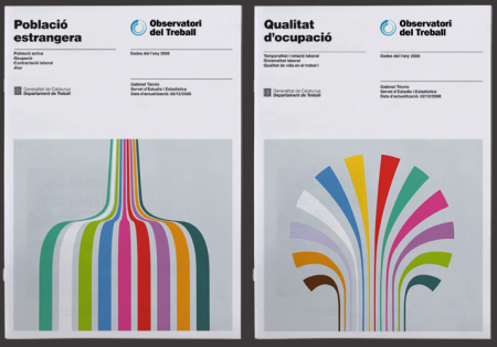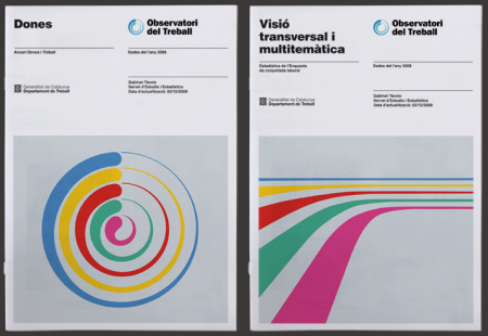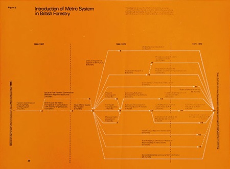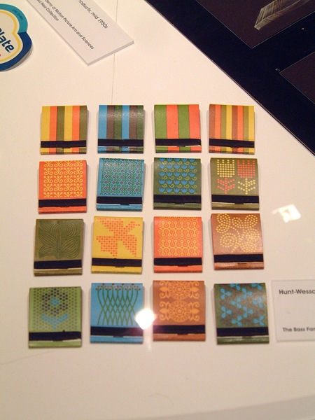

I hope everyone had a great Thanksgiving holiday last week (or weekend if you’re abroad)! I just got back from DC tonight after a nice long break and was greeted by this excellent work by Hey Studio. Their entire portfolio is filled with incredible work, but I was especially attracted to this piece for the Observatori del Treball. I love information graphics more than most things in the world and these illustrative forms reminded me of some really beautiful graphs I’ve seen in the past. Of course they aren’t providing any “info” here, but they look so good I don’t mind at all.
Check out the rest of their portfolio here. (The Playboy poster, third one down, made me smile…). Via Changethethought.


Oh my, I love that style and they nailed it. Hot.
love the design.
super clean…easy to read and the grid he follows throughout the series is great.
Good post, like mentioned… clean style! I really enjoy the stationery work he does too. Thanks for more inspirations 😀
This style feels familiar almost like a ripoff.. i’ve seen it before but i can’t remember where.
I LOVE info graphics! But I feel stupid asking this but what is the process.
like how do they get started? idea wise and info. I use to just get info from a marketing person saying these two need to line up but I would love to be able to make something like this. If you have any advice from the very basic start point it would be life changing!
thanks