
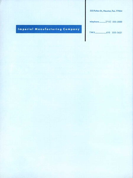
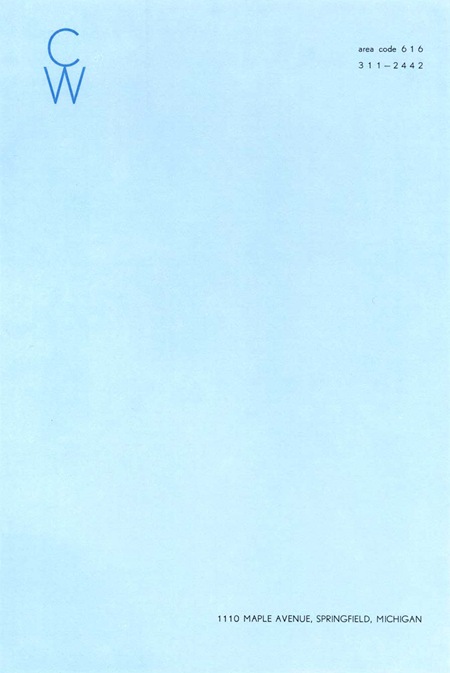
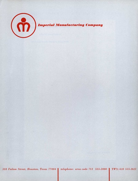
Afiler’s Flickr has some excerpts from a book by Ladislav Sutnar aptly entitled How To Show Telephone Numbers On Letterheads. As you may have guessed, the book features various examples of type placement in letterheads. It’s a very nice set of classic examples of a dying art form and is designed by one of the key architects of information design. I’ve always seen letterheads as a great opportunity to get away with being a minimalist in an otherwise standard design scenario. It’s pretty easy to convince a client that clean, efficient design is the answer in the case of a letterhead as most of the page is required to be blank by default. Of course they will probably still ask you to make the logo bigger. View the entire set on Flickr
How to Show Numbers On Letterheads
07.30.2008



awesome simplicity
The first one is beautiful in its focus – it’s not afraid to use extreme kerning and that virgule (slash) in the footer is fantastic, the most ostentatious part of the whole design.
Thanks for putting these up Scott, sometimes simple things like this are a joy to look at!