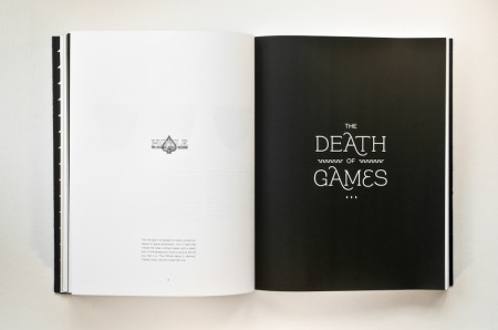
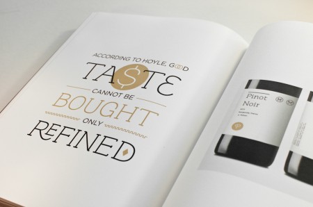
Continuing my new year’s resolution, I wanted to share my experience working on a rebranding project for school. This project was completed over the course of Spring 2011, and the assignment was to choose a dying or defunct brand and breathe new life into it. Throughout the semester we developed a logo, letterhead, visual identity, and brand extensions for the revamped company, and the final deliverable was a brand guidelines book. Alex described his process working with Playboy, and I highly recommend you check them out if you haven’t yet.
I had a lot of fun designing the deck of playing cards for Beast in a Neon Cage, so I thought it would be interesting to work with a playing card company. Once I chose my industry, I looked at brands like Kem and Copag and ended up choosing Hoyle. Hoyle is part of the United States Playing Card Company, which also owns the Bicycle and Bee playing card lines.
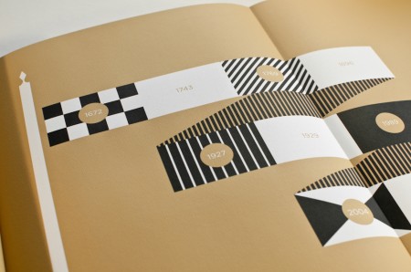
Hoyle’s namesake comes from Edmond Hoyle (1672-1769), a writer, tutor, and lawyer by trade. In Hoyle’s day, card games were activities enjoyed by the wealthy, and he gained notoriety teaching aristocrats the rules and strategies of various games. Hoyle became such an authority on the subject that the phrase, “According to Hoyle…” became commonplace when describing the rules or procedures of a given activity.
Hoyle currently positions itself as the “#1 Family Entertainment Brand” and has expanded its line to include electronic versions of puzzle and board games, casino games, slots, and more. While the company has roots in card games, I feel like the brand has lost the spirit of the man it represents. Hoyle never made a playing card in his life, and he was inducted into the Poker Hall of Fame despite passing away before the game was even invented.
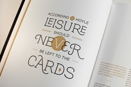
With that in mind, I started to imagine what Hoyle would be like if he were alive today. He was a highly educated man: a writer, tutor, lawyer, and a symbol of authority among the upper class. I thought it would be interesting to return Hoyle to its roots, to move beyond games, and to refocus the brand on informing the leisure activities of men and women. I saw Hoyle as a lifestyle brand that focused on educating its consumers on the importance of cultivating one’s own tastes.
To come up with the logo I looked at historical symbols of authority: crests, flags, banners, etc.
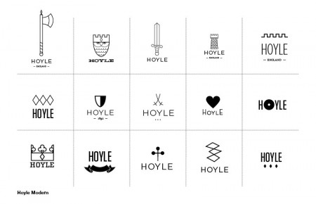
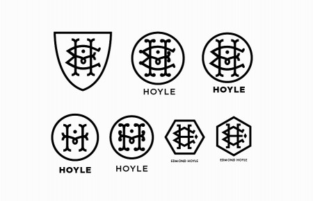
While I liked some of the graphics and thought they could be used as additional illustrations in a system, none of them were strong enough to stand on their own. Most of them were too simple or playful, so I began experimenting with monograms. I liked the monogram as a historical mark and a seal of authority. I used the initials E.H. to emphasize the man behind the brand, but I felt the design was too cluttered, so I simplified it to a single “H.” The three bars in the “H” represent Hoyle’s three professions. The loop in the middle helped make the mark more distinct and served as a visual tie for his three different trades.
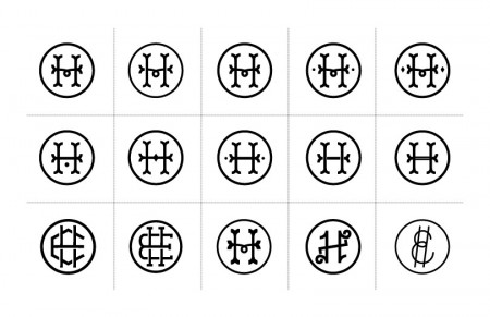
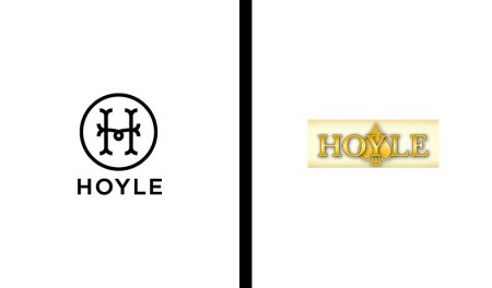
After multiple stages of refinement I arrived at the final mark shown side by side with Hoyle’s current logo. Now it was time to apply it to the business card and letterhead. In my previous project I learned how to use an Epilog laser to cut and etch my pieces, and I was very happy with the results. I’ve always loved the feel of letterpressed objects, so I decided to take some letterpress classes at the San Francisco Center for the Book.
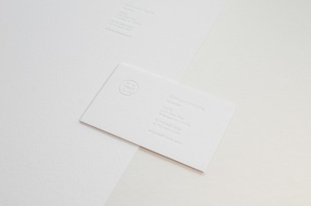
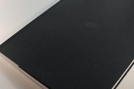
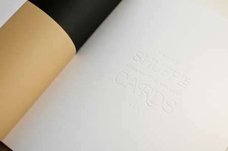
Repositioning a playing card company as a lifestyle brand is a pretty big stretch, so I felt the identity system had to make an immediate impact. The all-white business card symbolizes a clean slate for the brand and highlights the attention to detail the company now brings to all its services. Although the cards appear to be blind debossed, I printed with transparent ink to help the text pop a tiny bit more. The same technique was used for the cover and chapter openers.
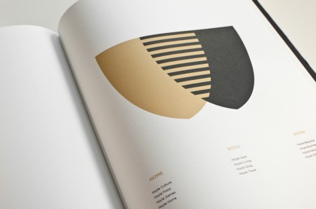
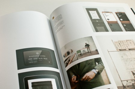
Being that Hoyle was a writer, language was an important part of the brand’s new identity. Names and extensions revolve around card terms: the clothing line is Hoyle: Well Suited, and the monthly food and wine club is called Hoyle: Full House. Below is a spread with some examples of brand extensions. Unfortunately the scope of the project meant that most of my photography was found imagery (or rather ffffound).
That about wraps it up. This class was another great learning experience for me, and I wholeheartedly recommend the staff and services at the SFCB. Thanks for reading, and a big thank you as well to Gaston Yagmourian for his guidance on this project.


great to see your development and able to compare to what I would do.
awesome final result, though would like to see the letterhead and business card in full glory 😀
thanks for the link for the San Francisco Center for the Book, i’m actually heading back to the states for a road trip all the way to CA, definitely would be interested in checking out their letterpress classes.
…and ffffound is my time portal goddess :|……
cheers!
Beautiful work Jon! you should be very proud of this
Hi Jon! I’m a GD student at AAU and I’ve always admired your work in the cases. Nice job and thanks for being a great designer and inspiration.
Great work Jon, thank you for taking the time to post the process behind the work. I always feel I learn so much from reading about the creative decisions that take place “behind the scenes”
Thank you!
Great stuff! Out of interest, have you attempted to get in touch with the people at Hoyle to show them your attempt at a rebrand?
J
Thanks for reading and for the comments everyone.
@Stained Eye – Awesome, you should definitely check them out.
@Yesenia – Thanks, always great to hear from fellow AAU students. Good luck in the program, maybe we’ll run into each other in the halls sometime!
@Jake – No I haven’t. It would be interesting to hear their reaction, but I’m a little hesitant based on the fact that the brief was to pick a “dying or defunct” brand – not sure if they would appreciate that!