

So we all download and save images of items, graphics and photos from the internet daily and some of the time you have no idea where to give credit besides maybe the guy that posted it first or second randomly on a blog. I ‘d like to get some answers on a few of these but also just post some interesting pieces that we come across that might have been sitting on our drives for awhile that are go to for inspiration or just found randomly on a forum with no info attached and just look great. Either way hopefully the point that gets across here is that they are inspiring in some sort of way to you as well.
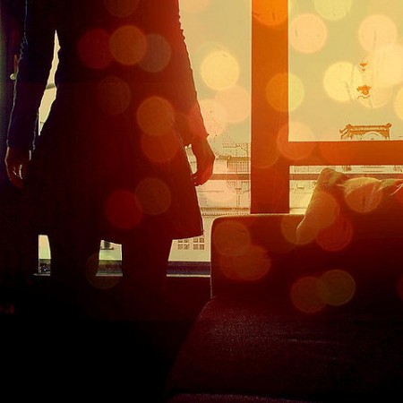
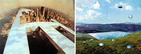
For the 3 images up here: the first one we’ve tried to replicate for an album cover for Shigeto, the second one always grabbed me and made want to put blurry dust spots on everything, the third one is perfect looking, if you could see it on a large screen it’s just stunning in detail, i wish i would illustrate like that, reminds me of Scott’s post a few weeks ago with the space colony.
Maybe while you rack your brain looking for who we should give credit to for doing certain designs you can listen to one of my favorite songs by someone I can’t believe we haven’t posted about but its good because we can spotlight him here on this post.
[audio:sommeil.mp3]


i think i can help with the second one 😉
http://ultraviolett.tumblr.com/post/23299025/hello
In cases like these, I usually turn to TinEye.
http://tineye.com/
It’s not perfect, but it’s a start.
Classic track. I have recently been listening to this as well due to my discovery of his New Models side project.
check it out!
http://forever-awesome.blogspot.com/2009/04/new-models-busy-signals.html
On the third one I was thinking Hipgnosis album cover at first, and then maybe Archigram but if you look at the image name you can see it’s from superstudio.
http://agglutinations.netfirms.com/images/mack.casey/superstudio03.jpg
http://www.designmuseum.org/design/superstudio
http://artabase.net/exhibition/1441-in-situ
the third one is from italian think-tank Superstudio, they did some great utopian megastructures and whatnot in the 60s.. kinda like archigram, but not really.
http://agglutinations.com/archives/000015.html
very influential to rem koolhaas.. i actually though that the image was his, but i was thinking of this one:
http://www.arslife.com/common/imgfoto/foto_2959.jpg
Third image on the left is a projection by Rem Koolhaas from the book Delirious New York, based off his thesis at the Architectural Association in London.
I fell for that one for you vito mf.
As doug says, the third is from Rem Koolhaas, and it’s one of his earliest projects called the Voluntary Prisoners of Architecture. It consists of various collages of different cityes made in collaboration with Elia Zenghelis & Madelon Vriesendorp. The fourth looks like some of the collages of the office superstudio in the late sixties. They made utopic prosposals for the landscape similar like this. Despite they never built anythin, they were very influential probably to koolhaas too.
To avoid yor problems i recommend you http://vi.sualize.us/, a tool to keep track of the images you like: the photographic delicious. And stop accumulating.
I checked out the portfolio of the girl who shot the second picture. It’s briliant: http://sarahbernhard.de/
I like Sarah Bernhard’s photography, but am I the only one who thinks that bokeh effect in the photo Jakub posted looks artificial? I don’t see what would be causing that effect in that shot…maybe it’s just me tho
read this on Sarah Bernhard’s site…so I think the image has to be taken with a grain of salt…
>>>>>>>>>>>
Some of my pictures (except the analogue ones) are digitally edited, recomposed, remixed.
<<<<<<<<<<<
The first one was done by moving the photo while scanning it. I used to do similar stuff years ago, pre-Photoshop, with a Xerox machine at the copy shop.
Actually, Vito is correct — those are Superstudio images and NOT Rem Koolhaas.
The blurry dust spots actually have name!
http://en.wikipedia.org/wiki/Bokeh